import warnings
import os
import tskit

import workshop
workbook = workshop.StdpopsimII()
display(workbook.setup)| ✅ Your notebook is ready to go! |
To access material for this workbook please execute the notebook cell immediately below (e.g. use the shortcut +). The cell should print out “Your notebook is ready to go!”
import warnings
import os
import tskit
import workshop
workbook = workshop.StdpopsimII()
display(workbook.setup)| ✅ Your notebook is ready to go! |
This workbook is intended to be used by executing each cell as you go along. Code cells (like those above) can be modified and re-executed to perform different behaviour or additional analysis. You can use this to complete various programming exercises, some of which have associated questions to test your understanding. Exercises are marked like this:
In the previous workbook we were introduced to stdpopsim, a package for making population genetic simulations. Here, we will build upon what we learned and make some more advanced models. We will look at a selective sweep model, and also simulate data from a nonmodel organism. We will make use of a sweep model that actually can be simulated with msprime (namely msprime.SweepGenicSelection), thus avoiding the need to rely on SLiM in this particular instance.
Import the relevant libraries
import numpy as np
import pandas as pd
import msprime
import stdpopsim
import tskit
import os
and get a chimpanzee demographic model which includes a ghost population. We plot the demographic history with demesdraw as before to get an overview of the model.
species = stdpopsim.get_species("PanTro")
model = species.get_demographic_model("BonoboGhost_4K19")
msprime_demography = model.model
contig = species.get_contig("chr3", mutation_rate=model.mutation_rate)
sample_sizes = {"bonobo": 20, "central": 20, "western": 20}
import demesdraw
demesgraph = msprime_demography.to_demes()
demesdraw.tubes(demesgraph);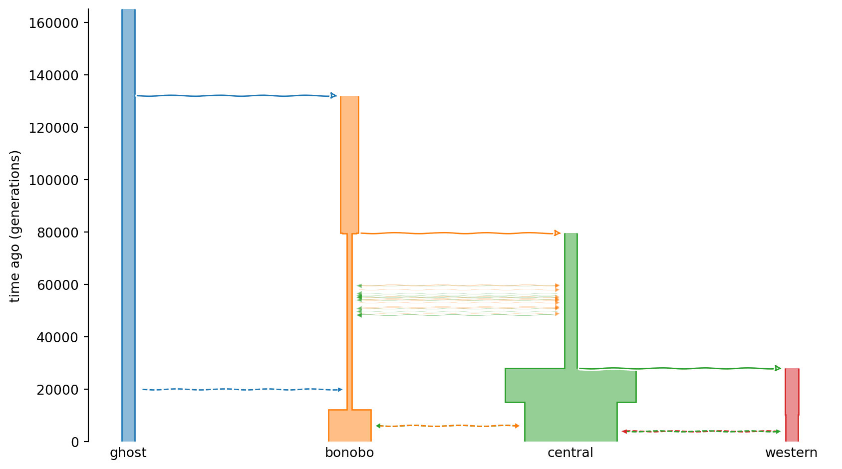
We specify a chromosome length and a time \(G\) ago in generations, from which point we assume populations are isolated and of constant size. Furthermore, we define two loci that are subject to selective sweeps.
L = 10e6  # Simulate 10 Mb
G = 4000  # A time ago in generations: we assume populations from time
          # 0..G are isolated and of constant size

sweep_params = {
    "bonobo": {"position": L//3, "s": 0.05},
    "western": {"position": (2 * L)//3, "s": 0.1},
}
Here we define a chromosome of length 10Mb with different sweep locations and selection parameters for populations bonobo and western.
Now that we have defined sweep parameters for bonobo and western populations we simulate sampled individuals from the populations with defined sample sizes in sample_sizes. Briefly, we loop through the populations defined by the model and initialize a population if it is defined in sample_sizes. Moreover, we specify different simulation functions (SweepGenicSelection vs StandardCoalescent) depending on settings in sweep_params. Finally, we add independent simulations to independent_pop_ts and combine the results tree sequence objects to combined_ts. Note that we here only simulate the ancestries (trees); mutations will be added on top later on.
# Make independent populations, some with selective sweeps
independent_pop_ts = []
for name, pop in model.model.items():
    if name in sample_sizes:
        Ne = pop.initial_size
        demog = msprime.Demography()
        demog.add_population(name=name, initial_size=Ne)
        if name in sweep_params:
            p = 1 / (2 * Ne)
            freqs = {"start_frequency": p, "end_frequency": 1 - p, "dt": 1 / (40 * Ne)}
            sweep_model = msprime.SweepGenicSelection(**freqs, **sweep_params[name])
            models = (sweep_model, msprime.StandardCoalescent())
            print(f"Adding {name} population to demographic model, "
                  f"sweep at {int(sweep_params[name]['position'])}bp, "
                  f"selection coefficient s={sweep_params[name]['s']}")
        else:
            models = msprime.StandardCoalescent()
            print(f"Adding {name} population to demographic model, neutral")
        independent_pop_ts.append(msprime.sim_ancestry(
            sample_sizes[name],
            model=models,
            demography=demog,
            recombination_rate=contig.recombination_map.slice(right=L, trim=True),
            sequence_length=L,
            end_time=G,
            random_seed=123,
        ))
combined_ts = independent_pop_ts[0]
for ts in independent_pop_ts[1:]:
    combined_ts = combined_ts.union(ts, node_mapping=np.full(ts.num_nodes, tskit.NULL))

# Now recapitate: initial_state uses the population names in the
# combined_ts to figure out which are which
ts = msprime.sim_mutations(
    msprime.sim_ancestry(initial_state=combined_ts,
                         demography=msprime_demography, random_seed=123).simplify(),
    rate=model.mutation_rate,
    random_seed=123,
)
print(f"Simulated under a complex demography: {ts.num_sites} ",
      f"sites for {ts.num_samples} genomes")
treesfile = "data/chimp_selection.trees"
if not os.path.exists(treesfile):
    print(f"dumping {treesfile}")
    ts.dump(treesfile)  # or could save a smaller file using tszip.compress(ts, "chimp_selection.tsz")
Adding western population to demographic model, sweep at 6666666bp, selection coefficient s=0.1
Adding central population to demographic model, neutral
Adding bonobo population to demographic model, sweep at 3333333bp, selection coefficient s=0.05
Simulated under a complex demography: 134640 sites for 120 genomes
dumping data/chimp_selection.treesAs noted, the assumption above was that populations were isolated. We used the parameter \(G\) to stop the simulation early; this means we simulate backwards \(G\) generations, but the populations do not coalesce. We end by adding history backwards in time to the three populations until coalescence with the function msprime.sim_ancestry using the stdpopsim model specifications in model. (which, as you will see if you print the msprime_demography object, has mass migration events defined 4003 and 6202 generations ago). Finally, we add mutations with msprime.sim_mutations.
msprime_demography object.
# Use this cell to display the msprime_demography objectworkbook.question("msprime_demography")Before proceeding, let’s make some sanity checks to confirm that the results make sense. We expect the central population to have undergone neutral evolution, whereas bonobo and western have selective sweep signatures at different loci (at 3.33Mb and 6.67Mb, respectively). We can investigate the effect on nucleotide diversity by making windowed plots along the chromosome.
Import matplotlib, setup color schemes and plotting parameters and finally plot diversity in 100kb windows.
import matplotlib.pyplot as plt
import matplotlib.colors as mcolors
mpl_colors = mcolors.TABLEAU_COLORS
ts = tskit.load(treesfile)
# Make population metadata dict, skipping non-sampled ghost population
popmd = {p.id:p.metadata for p in ts.populations() if p.id != 3}
# Add all samples as extra sample set
popmd[len(popmd)] = {'description': 'All samples',
                     'id': 'ALL', 'name': 'ALL',
                     'sampling_time': 0}
# Use same colors for populations as in demesdraw graph
demesdraw_colors = ["tab:red", "tab:green", "tab:orange", "tab:blue"]
for pop, color in zip(popmd, demesdraw_colors):
    popmd[pop]["color"] = color
    popmd[pop]["mpl_color"] = mpl_colors[color]
sample_sets = [ts.samples(i) for i in popmd if i != 3] + [ts.samples()]
num_windows = 200
window_size = ts.sequence_length / num_windows
windows = np.linspace(0, ts.sequence_length, num_windows + 1)pi_win = ts.diversity(
sample_sets=sample_sets,
windows=windows
)fig, ax = plt.subplots(1, 1, figsize=(12, 7))
for i in range(3):
plt.stairs(pi_win[:, i], windows, label=popmd[i]["name"], color=popmd[i]["mpl_color"])
plt.axvline(ts.sequence_length / 3, color=popmd[2]["mpl_color"], linestyle="dashed")
plt.axvline(2 * ts.sequence_length / 3, color=popmd[0]["mpl_color"], linestyle="dashed")
plt.legend(bbox_to_anchor=(1, 1), loc="upper left")
plt.xlabel("Genomic position (bp)")
plt.ylabel("Diversity (pi)")
plt.show()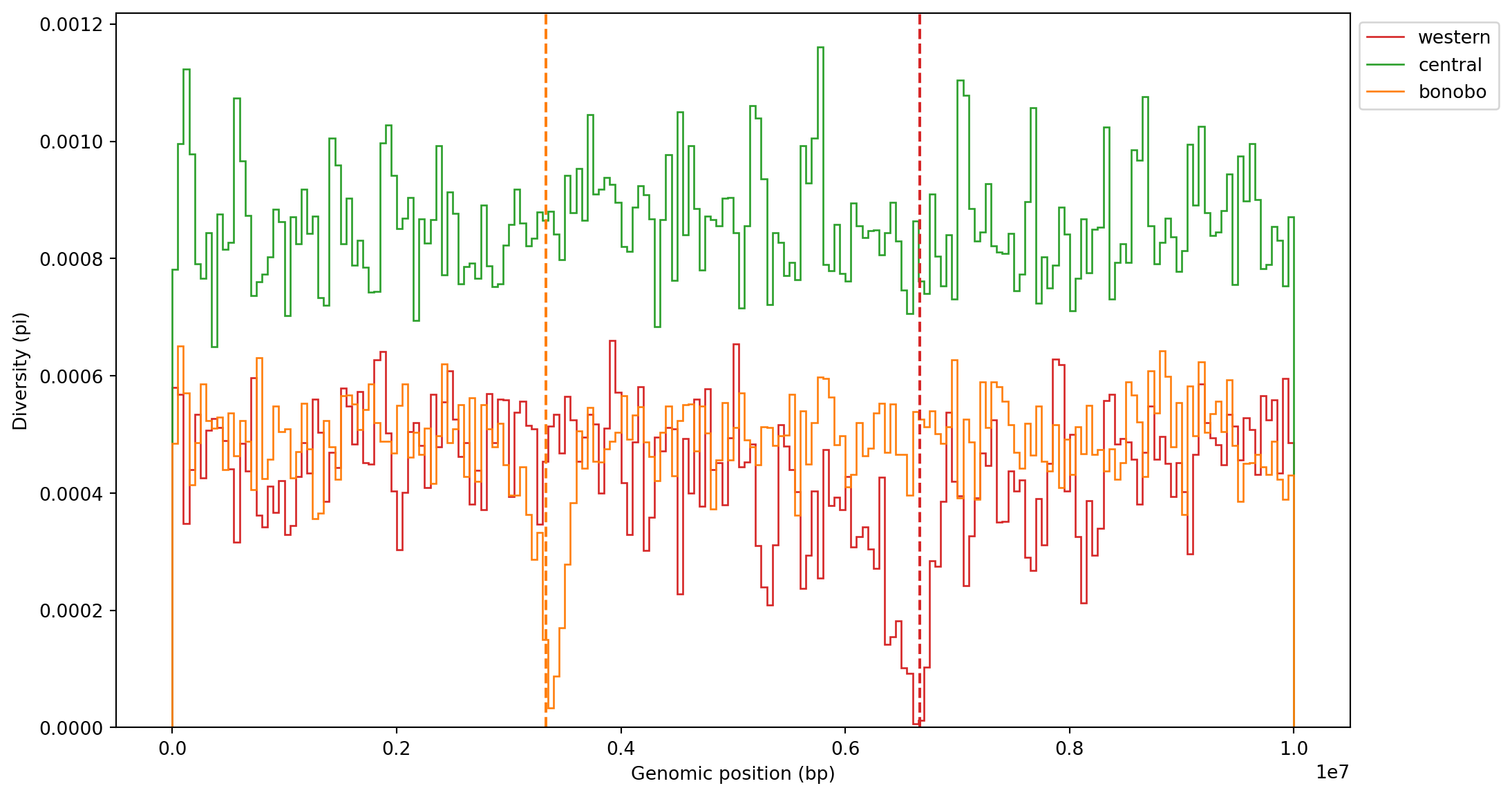
For clarity, we added the locations of sweeps (dashed lines) for both populations. There is a clear drop in diversity at both sites (and for the correct populations too!), so the simulations make intuitive sense. We could also zoom in on one of the sweep locations for increased resolution:
num_windows = 2_000
windows = np.linspace(0, ts.sequence_length, num_windows + 1)
pi_win_zoom = ts.diversity(sample_sets=sample_sets, windows=windows)
pad = 0.03
fig, ax = plt.subplots(1, 1, figsize=(12, 5))
for i in range(3):
plt.stairs(pi_win_zoom[:, i], windows, label=popmd[i]["name"], color=popmd[i]["mpl_color"])
plt.axvline(L / 3, color=popmd[2]["mpl_color"], linestyle="dashed")
plt.axvline(2 * L / 3, color=popmd[0]["mpl_color"], linestyle="dashed")
plt.xlim(2 * L / 3 - L * pad, 2 * L / 3 + L * pad)
plt.legend(bbox_to_anchor=(1, 1), loc="upper left")
plt.xlabel("Genomic position (bp)")
plt.ylabel("Diversity (pi)")
plt.title("Nucleotide diversity, site statistics")
plt.show()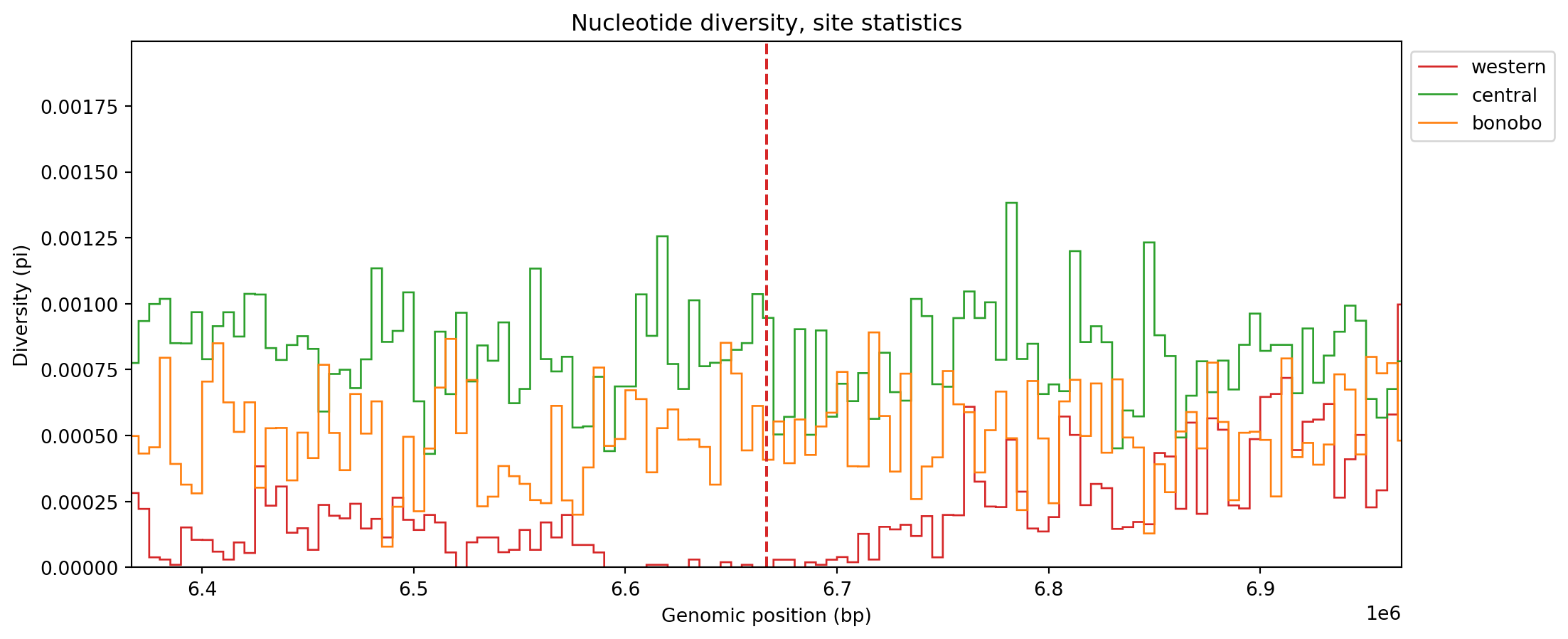
Here the pattern of reduced diversity is more prominent for the western population - in particular there is a stretch of windows where it is consistently low. For comparison’s sake, we reproduce the plot but using branch length statistics.
pi_win_branch = ts.diversity(sample_sets=sample_sets, windows=windows, mode="branch")pad = 0.05
fig, ax = plt.subplots(1, 1, figsize=(12, 5))
for i in range(3):
plt.stairs(pi_win_branch[:, i], windows, label=popmd[i]["name"], color=popmd[i]["mpl_color"])
plt.axvline(L / 3, color=popmd[2]["mpl_color"], linestyle="dashed")
plt.axvline(2 * L / 3, color=popmd[0]["mpl_color"], linestyle="dashed")
plt.xlim(2 * L / 3 - L * pad, 2 * L / 3 + L * pad)
plt.legend(bbox_to_anchor=(1, 1), loc="upper left")
plt.xlabel("Genomic position (bp)")
plt.ylabel("Diversity (pi)")
plt.title("Nucleotide diversity, branch statistics")
plt.show()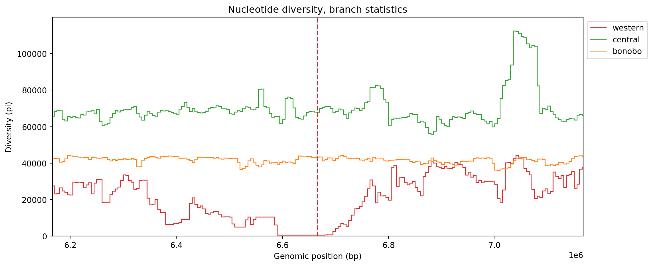
As we alluded to earlier, the plots are now smoother since the stochastic noise added by mutations has been eliminated.
Selective sweeps are mutations that spread quickly in a population and they leave characteristic traces in the tree sequences surrounding a sweep. Let’s investigate the patterns by plotting trees around the sweep location. We first load the necessary python library and define color styles that apply relevant colors to the populations.
from IPython.display import SVGstyles = []
for i in range(3):
p = ts.population(i)
s = f".node.p{p.id} > .sym " + "{" + f"fill: {popmd[i]['mpl_color']}" + "}"
styles.append(s)
print(f'"{s}" applies to nodes from population {popmd[i]["name"]} (id {i})')
css_string = " ".join(styles)
print(f'CSS string applied:\n "{css_string}"')".node.p0 > .sym {fill: #d62728}" applies to nodes from population western (id 0)
".node.p1 > .sym {fill: #2ca02c}" applies to nodes from population central (id 1)
".node.p2 > .sym {fill: #ff7f0e}" applies to nodes from population bonobo (id 2)
CSS string applied:
".node.p0 > .sym {fill: #d62728} .node.p1 > .sym {fill: #2ca02c} .node.p2 > .sym {fill: #ff7f0e}"First we plot a tree at a locus that is not under selection, just to get an idea of what a general tree would look like. You can plot a tree at a specific genomic coordinate using the ts.at syntax.
L / 10.
# Plot the tree at L / 10
kw = {"size": (1200, 400), "y_axis": True, "node_labels": {},
      "x_axis": True, "y_ticks": [0, 50_000, 100_000], "style": css_string}
# ts.at( enter locus here ).draw_svg(**kw)workbook.question("neutral_locus")The genealogical tree of this chromosome interval (999629-1000346) reflects the demographic history of the model. The bonobo population (orange) forms its own distinct clade, whereas western (red) and central (green) share a common ancestor and show little signs of admixture. There are three distinct groups from around 40000 generations ago and looking forward in time.
We now draw the tree at the sweep location:
L / 3).
# Use this cell to plot the tree at position L / 3 (see previous example code block)The plot clearly shows how samples belonging to the bonobo population (orange) coalesce much faster than other samples. In fact, all samples have coalesced within the last 4000 generations. If we calculate the sum of the branch lengths for the different populations, we see that they are much smaller for bonobo:
sweep_pos = L / 3
for pop in list(ts.populations())[:-1]:  # Omit ghost population
    # For a subtree consisting of samples in population pop.id at
    # sweep position, get total branch length
    branch_length = ts.simplify(ts.samples(population=pop.id)).at(
        sweep_pos).total_branch_length
    print(f"{pop.metadata['name']} total branch length: {branch_length}")
western total branch length: 178735.7176787648
central total branch length: 618502.9193431295
bonobo total branch length: 20450.64999999551With ts.simplify we can subset a tree sequence to a list of samples (here corresponding to the samples of each population), and then we, once again, look at the tree at the sweep position and retrieve the total branch length of that tree.
For illustration purposes, we also make a boxplot of branch lengths.
x = []
for pop in list(ts.populations())[:-1]:
    # Get a subtree at sweep position for samples in pop.id only
    tstmp = ts.simplify(ts.samples(pop.id)).at(sweep_pos)
    # Add all branch lengths for the nodes of the subtree
    x.append([tstmp.branch_length(u) for u in tstmp.nodes()])
colors = [popmd[i]["mpl_color"] for i in range(3)]
fig, ax = plt.subplots()
ax.set_ylabel('branch length')
labels = [popmd[i]["name"] for i in range(3)]
bplot = ax.boxplot(x,
patch_artist=True, # fill with color
tick_labels=labels) # will be used to label x-ticks
for patch, col in zip(bplot['boxes'], colors):
patch.set_facecolor(col)
plt.show()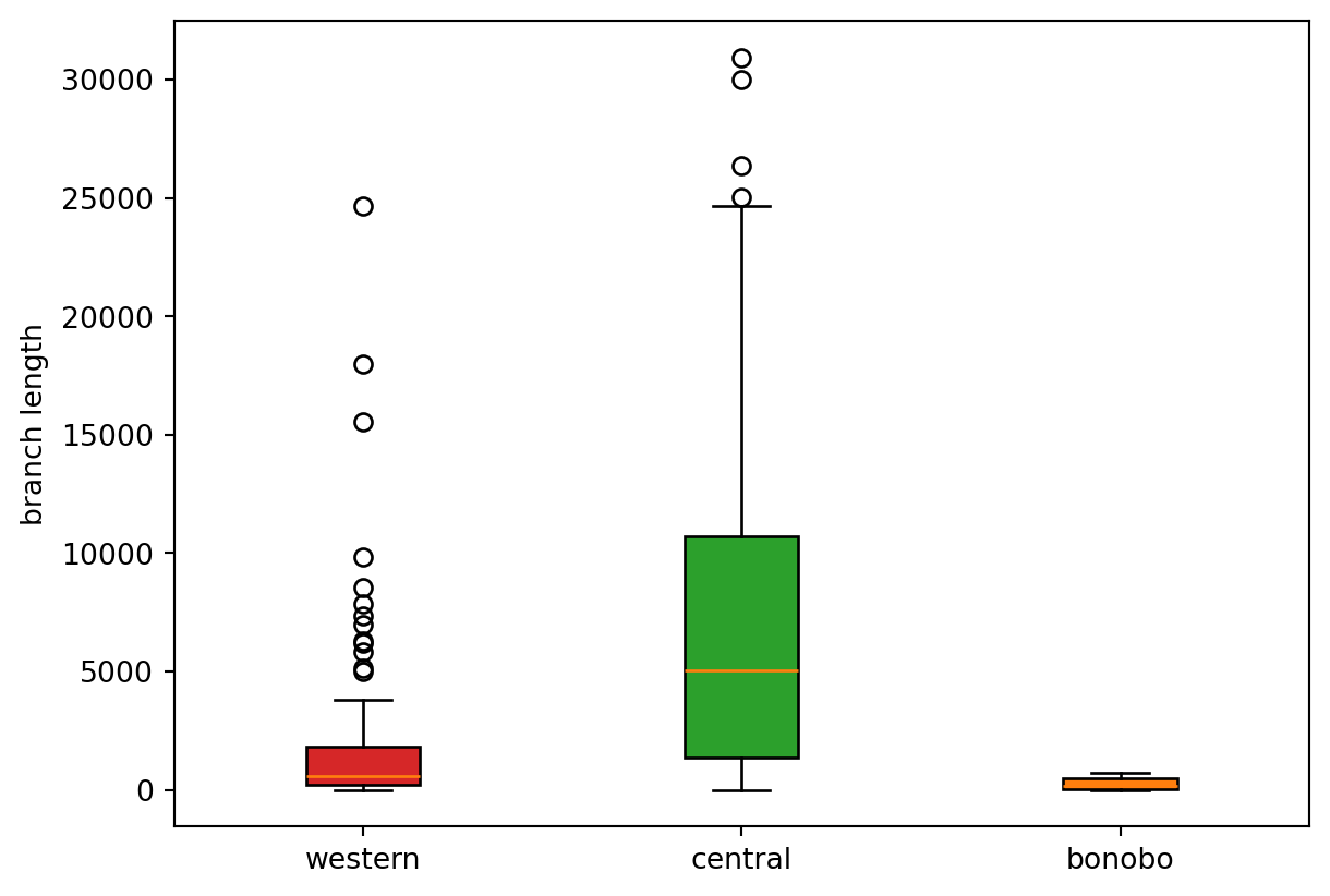
This hints at a way to design a test for sweeps based on branch lengths being much shorter than the background around the sweep locus.
We can also illustrate what happens to trees as we move away from the sweep locus. The intuition is that as recombination breaks down linkage to the sweep locus, genomic segments further away will evolve neutrally and the coalescence times of the samples will increase, leading to trees with longer terminal branches and larger total branch length.
tslist = []
delta = 50_000  # Look this distance left and right
poslist = np.linspace(sweep_pos - delta, sweep_pos + delta, 7)
tslist = [ts.simplify(ts.samples(population=2), filter_nodes=False).at(pos) for pos in poslist]
max_time = 15_000  # Find suitable max time to rescale plots
ticks = np.linspace(0, max_time, num=6)
ticks = {t: f"{t/1_000:.0f}k" for t in ticks}
from IPython.display import HTML
HTML("".join(
    tree.draw_svg(
        max_time=max_time,
        size=(200, 350),
        node_labels={},
        symbol_size=1,
        y_axis=True,
        y_ticks=ticks,
        x_axis=True,
        style=css_string,
        mutation_labels={},
        omit_sites=True,
        root_svg_attributes={"style":"display: inline-block"},
    )
    for tree in tslist
))There are still a lot of short terminal branches, but clearly the height of the tree increases as we move away from the sweep locus.
We conclude this session by showing how one can plot GNN proportions for individuals or .across chromosomes. This visualization can be useful to highlight cases of introgression or admixture, in which case chromosomes show up having segments with vastly different GNN proportions and therefore coloring composition.
We begin with calculating GNN proportions across all individuals. This is trivial. We simply need to list samples grouped by population, which then constitutes our samples set to pass to ts.genealogical_nearest_neighbours.
samples_listed_by_group = [ts.samples(population=pop_id) for pop_id in range(ts.num_populations)]
gnn = ts.genealogical_nearest_neighbours(ts.samples(), samples_listed_by_group)
We plot the GNN proportions as stacked bar charts.
fig, ax = plt.subplots(1, 1, figsize=(15, 2))
nhap = gnn.shape[0]
xlab = np.arange(nhap).astype(np.float64)  # Define x labels
bottom = np.zeros(nhap)  # Keep track of the "bottom" coordinate
for popid in range(3):
    y = gnn[:, popid]
    p = ax.bar(x=xlab, height=y, label=popmd[popid]["name"], bottom=bottom, color=popmd[popid]["mpl_color"])
    bottom += y
ax.set_xlabel("Sample id (haplotype)")
ax.set_ylabel("GNN proportion")
ax.set_title("GNN proportions for all sample haplotypes")
ax.legend(loc="upper right")
plt.show()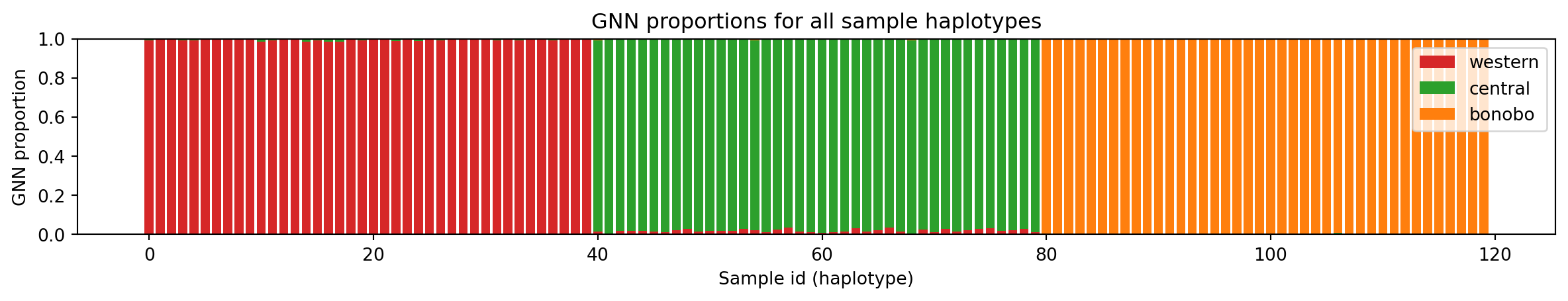
Take some time to look at the figure to make sure you understand what each bar represents and how the relate to the different populations.
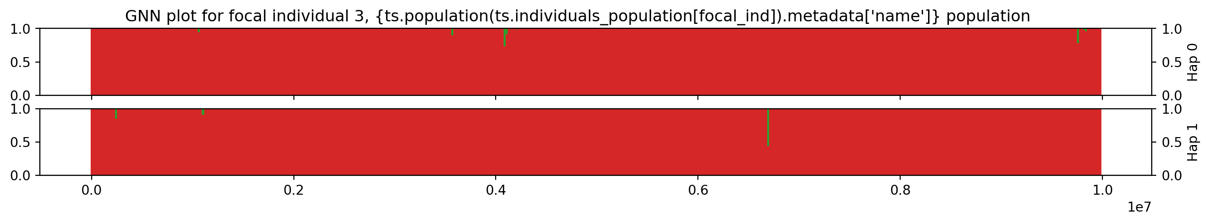
Next, we plot the haplotypes of an individual (recall that the x axis above refers to haplotypes). The GNN proportions will be calculated in windows, so we decide on a the width of chromosome segments to plot; increase the number of windows for higher resolution.
# Setup windows
n = 500
windows = np.linspace(start=0.0, stop=ts.sequence_length, num=n)
window_size = windows[1] - windows[0]
Thereafter, we pick a focal individual, arbitrarily choosing id=3:
Individual 3 has two chromosomes encoded by nodes 6 and 7. The workshop.haplotype_gnn is a function that traverses the tree sequence along the genome and calculates the GNN proportions for each tree, binning the results in our pre-defined windows, for both chromosomes, returning the result as a Pandas DataFrame.
focal_ind = 3
df = workshop.haplotype_gnn(ts, focal_ind, windows, sample_sets[0:3])
df.columns = [popmd[i]["name"] for i in range(3)]
df.head() # Print the first lines of the table| western | central | bonobo | |||
|---|---|---|---|---|---|
| haplotype | start | end | |||
| 0 | 0.000000 | 20040.080160 | 1.0 | 0.0 | 0.0 |
| 20040.080160 | 40080.160321 | 1.0 | 0.0 | 0.0 | |
| 40080.160321 | 60120.240481 | 1.0 | 0.0 | 0.0 | |
| 60120.240481 | 80160.320641 | 1.0 | 0.0 | 0.0 | |
| 80160.320641 | 100200.400802 | 1.0 | 0.0 | 0.0 |
The haplotype index is either 0 or 1, indicating the two haplotypes. We plot the haplotypes:
fig, axes = plt.subplots(2, 1, figsize=(15, 2), sharex=True)

for hap, index in zip([0, 1], [211, 212]):
    ax = plt.subplot(index)
    data = df[df.index.get_level_values("haplotype") == hap]
    bottom = np.zeros(data.shape[0])
    for i in range(len(data.columns)):
        p = ax.bar(data.index.get_level_values("start"),
                   data[popmd[i]["name"]], width=window_size,
                   label=popmd[i]["name"], bottom=bottom,
                   color=popmd[i]["mpl_color"])
        bottom += data[popmd[i]["name"]]
    ax2 = ax.twinx()
    ax2.set_ylabel(f"Hap {hap}")
    plt.suptitle(
        f"GNN plot for focal individual {focal_ind}, " +
        f"{ts.population(ts.individuals_population[focal_ind]).metadata['name']}" +
        "population"
    )
plt.xlabel("Genome position (bp)")
plt.show()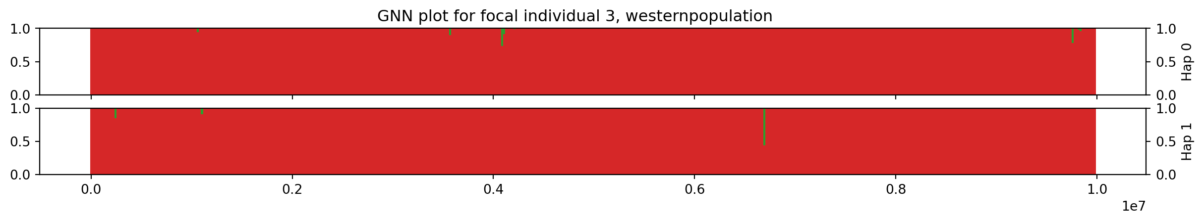
# Change the focal individual and rerun
focal_ind = 3
df = workshop.haplotype_gnn(ts, focal_ind, windows, sample_sets[0:3])
df.columns = [popmd[i]["name"] for i in range(3)]

fig, axes = plt.subplots(2, 1, figsize=(15, 2), sharex=True)

for hap, index in zip([0, 1], [211, 212]):
    ax = plt.subplot(index)
    data = df[df.index.get_level_values("haplotype") == hap]
    bottom = np.zeros(data.shape[0])
    for i in range(len(data.columns)):
        p = ax.bar(data.index.get_level_values("start"),
                   data[popmd[i]["name"]], width=window_size,
                   label=popmd[i]["name"], bottom=bottom,
                   color=popmd[i]["mpl_color"])
        bottom += data[popmd[i]["name"]]
    ax2 = ax.twinx()
    ax2.set_ylabel(f"Hap {hap}")
plt.suptitle(
    f"GNN plot for focal individual {focal_ind}, " +
    "{ts.population(ts.individuals_population[focal_ind]).metadata['name']} " +
    "population"
)
plt.xlabel("Genome position (bp)")
plt.show()