VCF=variants.vcf.gzPrincipal component analysis
Generate a PCA plot of data to get an overview of population structure
About
In the analysis of population structure, one of the first algorithms employed is often principal component analysis (PCA). Here we will use plink2 to generate principal component eigenvalues and eigenvectors and plot the results to assess whether there is structure in our data.
Commands have been run on a subset of the data
The commands of this document have been run on a subset (a subregion) of the data. Therefore, although you will use the same commands, your results will differ from those presented here.
Intended learning outcomes
- cluster data with a Principal component analysis (PCA) to detect population structure
- plot output and color samples by population assignments
Tools
Choose one of Modules and Virtual environment to access relevant tools.
Modules
Execute the following command to load modules:
module load \
    plink/2.00a5.14 PDC/24.11 R/4.4.2-cpeGNU-24.11
Virtual environment
Run the pgip initialization script and activate the pgip default environment:
source /cfs/klemming/projects/supr/pgip_2025/init.sh
# Now obsolete!
# pgip_activate
Then activate the full environment:
# pgip_shell calls pixi shell -e full --as-is
pgip_shell
Copy the contents to a file pixi.toml in directory population-structure, cd to directory and activate environment with pixi shell:
[workspace]
channels = ["conda-forge", "bioconda"]
name = "population-structure"
platforms = ["linux-64", "osx-64"]

[dependencies]
plink2 = ">=2.0.0a.6.9,<3"
r = ">=4.3,<4.5"
r-tidyverse = ">=2.0.0,<3"
Data setup
Make an analysis directory population-structure and cd to it:
mkdir -p population-structure && cd population-structureUsing rsync
Use rsync to sync data to your analysis directory (hint: first use options -anv to run the command without actually copying data):
# Run rsync -anv first time
rsync -av /cfs/klemming/projects/supr/pgip_2025/data/monkeyflower/selection/large/vcftools-filter-bqsr/ .
Using pgip client
pgip exercises setup e-population-structureMake an analysis directory population-structure and cd to it:
mkdir -p population-structure && cd population-structureThen use wget to retrieve data to analysis directory.
wget -r -np -nH -N --accept-regex all.variantsites* --cut-dirs=7 \
     https://export.uppmax.uu.se/uppstore2017171/pgip/data/monkeyflower/selection/large/vcftools-filter-bqsr/
Principal component analysis
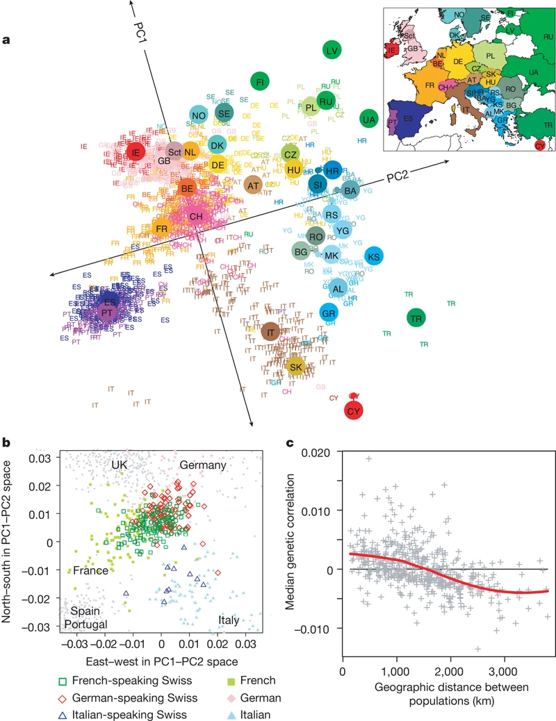
Principal component analysis (PCA) can be used to highlight population structure, often in relation to geography (Figure 1) or ethnicity (McVean, 2009). It is a common first analysis to make as it is fairly easy to perform. In addition to shedding light on population structure, it can be used for quality control, for instance to identify mislabelled samples.
However, despite its widespread use, it is not clear that you would get a consistent description of what a PCA is if you asked around1. For neutral SNPs, it can be shown that the projection of samples onto principal components relate directly to average coalescent times (McVean, 2009). Here, we will think of a PCA as a dimensionality reduction technique that projects a high-dimensional dataset (samples \(\times\) variants) onto a two-dimensional space, in which samples genetically cluster in groups related to population labels / geographic structure.
Linkage disequilibrium pruning
One of the core assumptions of PCA is that markers are independent. In practice, this means we want unlinked markers. Therefore, the first thing we need to do is to prune our markers based on linkage disequilibrium (LD).
To save typing, we set an environment variable to point to the input VCF.
We then run plink2 on the input VCF and explain the options below.2
plink2 --vcf $VCF --double-id --allow-extra-chr \
       --set-missing-var-ids @:# \
       --indep-pairwise 50 5 0.1 \
       --out monkeyflower_pca > /dev/null
Error: This run estimates linkage disequilibrium between variants, but there
are less than 50 samples to estimate from. You should perform this operation
on a larger dataset.
(Strictly speaking, you can also override this error with --bad-ld, but this is
almost always a bad idea.)Here, we made use of the following options:
-
--vcf– the name of the VCF -
--double-id– set both individual ID and family ID to the input (sample) ID as some analyses need pedigree information (not relevant here) -
--allow-extra-chr– permit chromosome names other than those expected for human (1-22,X) -
--set-missing-var-ids– assign chromosome and bp-based IDs to unnamed variants according to formatCHROM:BP. Necessary since model organisms often have annotated variant names -
--indep-pairwise– this will generate a list of variants in approximate linkage disequilibrium. The first argument is the window size (kb), the second the step size, and the last the \(r^2\) threshold. Each window is screened for markers with \(r^2\) larger than the threshold, after which the window is pruned such that only one marker remains. -
--out– prefix for output data
As you can see, the program throws an error message, saying that linkage disequilibrium should not be estimated for less than 50 samples. However, a suggested option is provided (--bad-ld), so we apply it, keeping in mind the caveats of calculation of LD for small sample sizes is noisy!
plink2 --vcf $VCF --double-id --allow-extra-chr \
       --set-missing-var-ids @:# \
       --indep-pairwise 50 5 0.1 \
       --bad-ld \
       --out monkeyflower_pca > /dev/null 2>&1
This command has generated two output files, monkeyflower_pca.prune.out and monkeyflower_pca.prune.in. These files list the markers to keep (.in) or remove (.out).
Make a PCA
Now we are ready to generate PCAs. We will apply some new options that we detail here before running the command:
-
--extract– remove any variants not present in the provided file -
--pca– extract top (default=10) principal components
plink2 --vcf $VCF --double-id --allow-extra-chr \
       --set-missing-var-ids @:# \
       --extract monkeyflower_pca.prune.in \
       --pca \
       --out monkeyflower_pca > /dev/null
Error: This run requires decent allele frequencies, but they aren't being
loaded with --read-freq, and less than 50 samples are available to impute them
from.
You should generate (with --freq) or obtain an allele frequency file based on a
larger similar-population reference dataset, and load it with --read-freq.The command fails, once again pointing out that the sample size is small, but also provides a solution. We calculate allele frequencies (--freq option, zs tells plink2 to compres output)
plink2 --vcf $VCF --freq zs --out monkeyflower_pca > /dev/null 2>&1and use the generated allele frequencies as input to the pca command:
plink2 --vcf $VCF --double-id --allow-extra-chr \
       --set-missing-var-ids @:# \
       --extract monkeyflower_pca.prune.in \
       --pca --read-freq monkeyflower_pca.afreq.zst \
       --out monkeyflower_pca > /dev/null 2>&1
This will generate monkeyflower_pca.eigenval that holds the eigenvalues and monkeyflower_pca.eigenvec that holds the eigenvectors, or directions, of the principal components (PCs).
Plotting the PCA
Now we turn to plotting the results in R. We first load necessary libraries for plotting and data manipulation.
We then load the eigenvectors and eigenvalues and use dplyr magic to transform the data frames into a format suitable for subsequent analyses.
eigenvec <- read.table("monkeyflower_pca.eigenvec") %>%
    select(-V1) %>%
    rename(sample = V2) %>%
    rename_with(~paste0("PC", 1:10), -sample) %>%
    as_tibble
eigenval <- read.table("monkeyflower_pca.eigenval") %>%
    rename(value = V1) %>%
    mutate(pve = value/sum(value) * 100) %>%
    mutate(PC = factor(paste0("PC", row_number()), levels = paste0("PC", row_number()))) %>%
    as_tibble
# Print tibbles to check contents
head(eigenvec, n = 3)
# A tibble: 3 × 11
sample PC1 PC2 PC3 PC4 PC5 PC6 PC7 PC8 PC9 PC10
<chr> <dbl> <dbl> <dbl> <dbl> <dbl> <dbl> <dbl> <dbl> <dbl> <dbl>
1 ARI-159_… 0.157 -0.208 -0.179 0.259 0.142 0.142 0.0308 -0.0302 -0.0321 0.0140
2 ARI-159_… 0.168 -0.217 -0.187 0.271 0.148 0.151 0.0247 -0.0394 -0.0356 0.0104
3 ARI-195_1 0.162 -0.217 -0.184 0.260 0.146 0.139 0.0320 -0.0450 -0.0340 0.00656head(eigenval, n = 3)# A tibble: 3 × 3
value pve PC
<dbl> <dbl> <fct>
1 5.31 21.2 PC1
2 3.07 12.2 PC2
3 2.78 11.1 PC3 Note how we add a new column pve to the eigenvalues that corresponds to the relative fraction of an eigenvalue in %. The eigenvectors are labelled by sample name, but we would like to add population labels. The following code does just that:
pca <- read.csv("sampleinfo.csv") %>%
    rename(sample = SampleAlias) %>%
    mutate(species = as.factor(gsub("ssp. ", "", Taxon))) %>%
    select(sample, ScientificName, Taxon, Latitude, Longitude, species) %>%
    left_join(eigenvec) %>%
    as_tibble
head(pca, n = 3)
# A tibble: 3 × 16
sample ScientificName Taxon Latitude Longitude species PC1 PC2 PC3
<chr> <chr> <chr> <dbl> <dbl> <fct> <dbl> <dbl> <dbl>
1 LON-T33 Diplacus long… ssp.… 34.3 -119. longif… -0.142 0.0698 0.0500
2 LON-T8 Diplacus long… ssp.… 34.1 -119. longif… -0.146 0.0634 0.0398
3 PAR-KK1… Erythranthe p… ssp.… 34.0 -120. parvif… 0.150 -0.267 0.126
# ℹ 7 more variables: PC4 <dbl>, PC5 <dbl>, PC6 <dbl>, PC7 <dbl>, PC8 <dbl>,
# PC9 <dbl>, PC10 <dbl>Now we have a pca object that for each sample has an assigned species column.
We begin by plotting the eigenvalues of the PCs. Basically, the eigenvalues tell us how much of the variation is explained by a given PC.
ggplot(eigenval, aes(x = PC, y = pve)) + geom_point() + scale_y_continuous(limits = c(0,
    25), expand = c(0, 0)) + ylab("Variance explained (%)")
If we cumulatively sum the percentage variance explained, we see that the total sum is 100%, as expected, and that PC1-3 explains ~44%.
cumsum(eigenval$pve) [1] 21.19097 33.44037 44.55386 54.59826 64.01348 72.12809 79.63308
[8] 86.85687 93.74426 100.00000Before we proceed to plotting the eigenvectors we define colors for our population labels. Here, we use the same color scheme as in Stankowski et al. (2019) for easier comparison.
species <- as_tibble(data.frame(species = levels(pca$species), color = c("#000000",
    "#65c3ca", "#0f4e8b", "#8282d8", "#008b00", "#ff9d00", "#b400f7", "#ff0100",
    "#b9a030")))
With coloring scheme in place, we can finally plot some of the principal components:
ggplot(pca, aes(PC1, PC2, color = species)) + geom_point(size = 3, alpha = 0.8) +
    scale_color_manual(values = species$color)
In this particular example, we see that the outgroup M. clevelandii separates from the other species, both in PC 1 and 2. Also, grandiflorus separates from two other clusters that consist of multiple species. Interpreting the principal components can be tricky but at least we get a general picture of the population structure.
Things to try
If you have time over, here are some additional things you may want to try.
- Try plotting more combinations of PCs. Do the results align with your expectations (compare with (Stankowski et al., 2019, Figure 1))?
- Change LD pruning settings, or even run a PCA without pruning. Do you see any changes?
- At the pruning stage, use
--macto filter input data on minor allele count. - Exclude M.clevelandii from the PCA (you can use the
--removeoption to remove samples).
Remarks
Helpful as PCA is in identifying population substructure, it is important to keep in mind that it is not model-based and therefore gives limited information about the underlying demographic process (Novembre & Stephens, 2008) in the context of analysing spatial data. Another potential issue is that PCA is sensitive to unequal sampling (McVean, 2009) which may distort clusters in the resulting plots.
References
Chang, C. C., Chow, C. C., Tellier, L. C., Vattikuti, S., Purcell, S. M., & Lee, J. J. (2015). Second-generation PLINK: Rising to the challenge of larger and richer datasets. GigaScience, 4(1), s13742-015-0047-8. https://doi.org/10.1186/s13742-015-0047-8
McVean, G. (2009). A Genealogical Interpretation of Principal Components Analysis. PLOS Genetics, 5(10), e1000686. https://doi.org/10.1371/journal.pgen.1000686
Novembre, J., Johnson, T., Bryc, K., Kutalik, Z., Boyko, A. R., Auton, A., Indap, A., King, K. S., Bergmann, S., Nelson, M. R., Stephens, M., & Bustamante, C. D. (2008). Genes mirror geography within Europe. Nature, 456(7218), 98–101. https://doi.org/10.1038/nature07331
Novembre, J., & Stephens, M. (2008). Interpreting principal component analyses of spatial population genetic variation. Nature Genetics, 40(5), 646–649. https://doi.org/10.1038/ng.139
Pachter, L. (2014). What is principal component analysis? In Bits of DNA. https://liorpachter.wordpress.com/2014/05/26/what-is-principal-component-analysis/
Stankowski, S., Chase, M. A., Fuiten, A. M., Rodrigues, M. F., Ralph, P. L., & Streisfeld, M. A. (2019). Widespread selection and gene flow shape the genomic landscape during a radiation of monkeyflowers. PLOS Biology, 17(7), e3000391. https://doi.org/10.1371/journal.pbio.3000391