import warnings
import os
import tskit

import workshop
workbook = workshop.Stdpopsim()
display(workbook.setup)| ✅ Your notebook is ready to go! |
To access material for this workbook please execute the notebook cell immediately below (e.g. use the shortcut +). The cell should print out “Your notebook is ready to go!”
import warnings
import os
import tskit
import workshop
workbook = workshop.Stdpopsim()
display(workbook.setup)| ✅ Your notebook is ready to go! |
This workbook is intended to be used by executing each cell as you go along. Code cells (like those above) can be modified and re-executed to perform different behaviour or additional analysis. You can use this to complete various programming exercises, some of which have associated questions to test your understanding. Exercises are marked like this:
stdpopsim is the standard library for population genetic simulation models. It is designed to run reproducible simulations of genetic datasets from published demographic histories. Under the hood, stdpopsim relies on msprime and SLiM to generate sample datasets in the so-called tree sequence format. It provides a Catalog of species that provide details for one or more published demographic models that can be simulated.
In this workbook, we will use stdpopsim to simulate datasets based on demographic models in a number of organisms.
Let’s start by making a simulation of the Homo Sapiens Out of Africa (OOA) model, as described in the stdpopsim tutorial. Simulations follow the same pattern in that we will perform the following steps:
First import stdpopsim and use stdpopsim.get_species to select Homo sapiens, which has the internal id HomSap:
import stdpopsim
with warnings.catch_warnings():
    warnings.simplefilter("ignore")
    species = stdpopsim.get_species("HomSap")
We can look at what demographic models are available via the species.demographic_models function (the species variable is an object of the type stdpopsim.species.Species):
for x in species.demographic_models:
  print(x.id)
OutOfAfricaExtendedNeandertalAdmixturePulse_3I21
OutOfAfrica_3G09
OutOfAfrica_2T12
Africa_1T12
AmericanAdmixture_4B18
OutOfAfricaArchaicAdmixture_5R19
Zigzag_1S14
AncientEurasia_9K19
PapuansOutOfAfrica_10J19
AshkSub_7G19
OutOfAfrica_4J17
Africa_1B08
AncientEurope_4A21You can look in the catalog for details on each model. Here, we choose the OutOfAfrica_3G09 model from Gutenkunst et al (2009).
model = species.get_demographic_model("OutOfAfrica_3G09")
print(model.num_populations)
print(model.num_sampling_populations)
print([pop.name for pop in model.populations])
3
3
['YRI', 'CEU', 'CHB']There are three populations, YRI, CEU, and CHB from which we can sample individuals. What does the demographic model look like, what do the population codes mean, and how are they related? We could look at the model description
print(model.long_description)
        The three population Out-of-Africa model from Gutenkunst et al. 2009.
        It describes the ancestral human population in Africa, the out of Africa
        event, and the subsequent European-Asian population split.
        Model parameters are the maximum likelihood values of the
        various parameters given in Table 1 of Gutenkunst et al.
to get an idea, or at the model summary for more details.
msprime_demography = model.modelThe msprime_demography variable is a msprime.Demopgraphy object, and the summary prints three tables for populations, migration, and events. The population table describes the populations and corresponding parameters, such as initial size and growth rate. The migration table lists the migration rates expressed as probability of migration per generation per lineage. Finally, the events table describes demographic events backwards in time.
# Use this code block to display the demography objectworkbook.question("msprime_demography")In addition, we can use the demesdraw library to make a plot of the model. The function model.model.to_demes() converts a stdpopsim demographic model to a Demes Graph object that can easily be plotted:
import demesdraw
demesgraph = msprime_demography.to_demes()
demesdraw.tubes(demesgraph);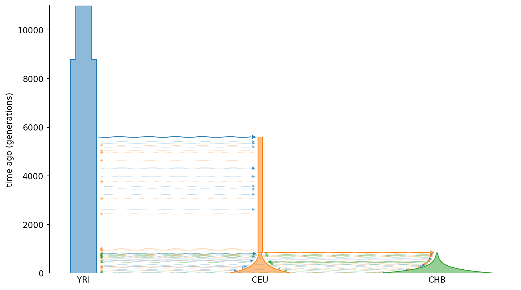
The widths of the “tubes” indicate population sizes, and the y-axis shows time going backwards. Hence, the model describes an ancestral population that expands some 9000 generations ago, and at around 6000 generations ago there is a population split with the Out Of Africa event. Some 1000 generations ago, there is yet another split that gives rise to the CEU and CHB populations, which both undergo exponential growth. During the time from 6000 generations ago to present, there are (small) migration events, indicated by arrows between populations.
As an alternative we also show how to plot the population size histories as line graphs:
demesdraw.size_history(demesgraph);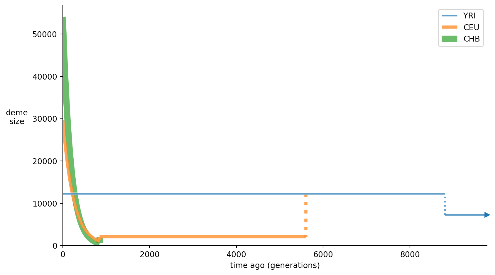
With the species and model at hand, we now need to set up the sequence to simulate. This is done with the species.get_contig function, which takes a chromosome name as argument. In addition, we can specify recombination map (flat by default) and mutation rate. The stdpopsim catalog defines a mutation rate that is not always equal to the rate used in the model. We therefore set the mutation rate to the model mutation rate below.
contig = species.get_contig(
    "chr22", mutation_rate=model.mutation_rate,
    left=0, right=1e7
)
We can also choose to simulate a part of a chromosome by adding the left and right options that specify chromosome coordinates.
Finally, we select the number of samples from each population that we want to simulate (we can choose to exclude populations by setting their number of samples to 0). We retrieve a simulation engine (msprime or slim) with stdpopsim.get_engine and we are ready to simulate!
The simulation may take some 20 seconds to complete.
%%time
samples = {"YRI": 5, "CHB": 5, "CEU": 5}
engine = stdpopsim.get_engine("msprime")
ts = engine.simulate(model, contig, samples, seed=123)
treesfile = "data/ooa.trees"
os.makedirs("data", exist_ok=True)
if not os.path.exists(treesfile):
    print(f"dumping tree sequences to {treesfile}")
    ts.dump(treesfile)
dumping tree sequences to data/ooa.trees
CPU times: user 1.16 s, sys: 10.9 ms, total: 1.17 s
Wall time: 1.17 sThat’s it! The simulate function returns a tree sequence that we then can process with tskit. As you can see, msprime simulations are fast and can easily handle full-length chromosomes. We can quickly look at the number of segregating sites for the simulation.
# Use this code block to print the number of sites. Hint: access the
# num_sites attribute of the ts object to find out.workbook.question("num_sites")However, when we perform forward simulations with SLiM we often need to reduce the sequence size, and set the slim_scaling_factor parameter. Briefly, this parameter reduces the population sizes and rescales time such that the simulations run in a reasonable amount of time.
%%time
with warnings.catch_warnings():
    warnings.simplefilter("ignore")
    engine = stdpopsim.get_engine("slim")
    contig = species.get_contig(
        "chr22",
        mutation_rate=model.mutation_rate,
        left=0.0,
        right=contig.length * 0.01
    )
    ts_slim = engine.simulate(model, contig, samples,
                              seed=123, slim_scaling_factor=100)
print(ts_slim.num_sites)
1792
CPU times: user 646 ms, sys: 100 ms, total: 746 ms
Wall time: 878 msOne advantage of using SLiM is that we can model more complicated scenarios of selection than msprime.
In what follows we will be using the msprime simulation output.
# Reload file for reproducibility
ts = tskit.load(treesfile)
Now that we have our tree sequence and simulation results for the populations, let’s have a look at some of the results.
First import libraries for numerical calculation and plotting and setup a data structure to hold information about populations and their plotting parameters.
import numpy as np  # Numerical library
import matplotlib.pyplot as plt  # Plotting library
import matplotlib.colors as mcolors  # Color library
mpl_colors = mcolors.TABLEAU_COLORS  # Matplotlib default colors
popmd = {p.id:p.metadata for p in ts.populations()}
popmd[3] = {'description': 'All samples', 'id': 'ALL',
            'name': 'ALL', 'sampling_time': 0}
# Use same colors for populations as in demesdraw graph
demesdraw_colors = ["tab:blue", "tab:orange", "tab:green", "tab:red"]
for pop, color in zip(popmd, demesdraw_colors):
    popmd[pop]["color"] = color
popmd[pop]["mpl_color"] = mpl_colors[color]The tree sequence object provides access to functions for quickly calculating summary statistics, such as diversity, divergence and so on. By default, the functions work on all samples, but can target subsets of samples via the specification of sample sets. This feature makes it easy to calculate statistics for populations, as shown below:
sample_sets = [
    ts.samples(population=0),
    ts.samples(population=1),
    ts.samples(population=2),
    ts.samples()
]
pi = ts.diversity(sample_sets=sample_sets)
print(pi)
[0.00016337 0.00012459 0.00011448 0.00014702]Here, we calculate the one-way statistic diversity for all samples and for all populations, where we pass the population parameter to subset samples by population index. We utilize an efficient way of specifying sample sets by passing a list of indexes to the sample_sets parameter.
The result above is a single statistic summarizing the global diversity, but often we want to calculate and plot windowed statistics. The summary statistic functions take an argument windows which defines the breakpoints of windows and can be generated with the np.linspace function:
num_windows = 50
window_size = ts.sequence_length / num_windows
windows = np.linspace(0, ts.sequence_length, num_windows + 1)
pi_win = ts.diversity(
    sample_sets=sample_sets,
    windows=windows
)
for i in range(len(sample_sets)):
    plt.stairs(pi_win[:,i], windows, color=popmd[i]["mpl_color"], label=popmd[i]["name"])
plt.xlabel("Genome position (bp)")
plt.ylabel("Diversity (pi)")
plt.legend(bbox_to_anchor=(1, 1), loc="upper left")
plt.show()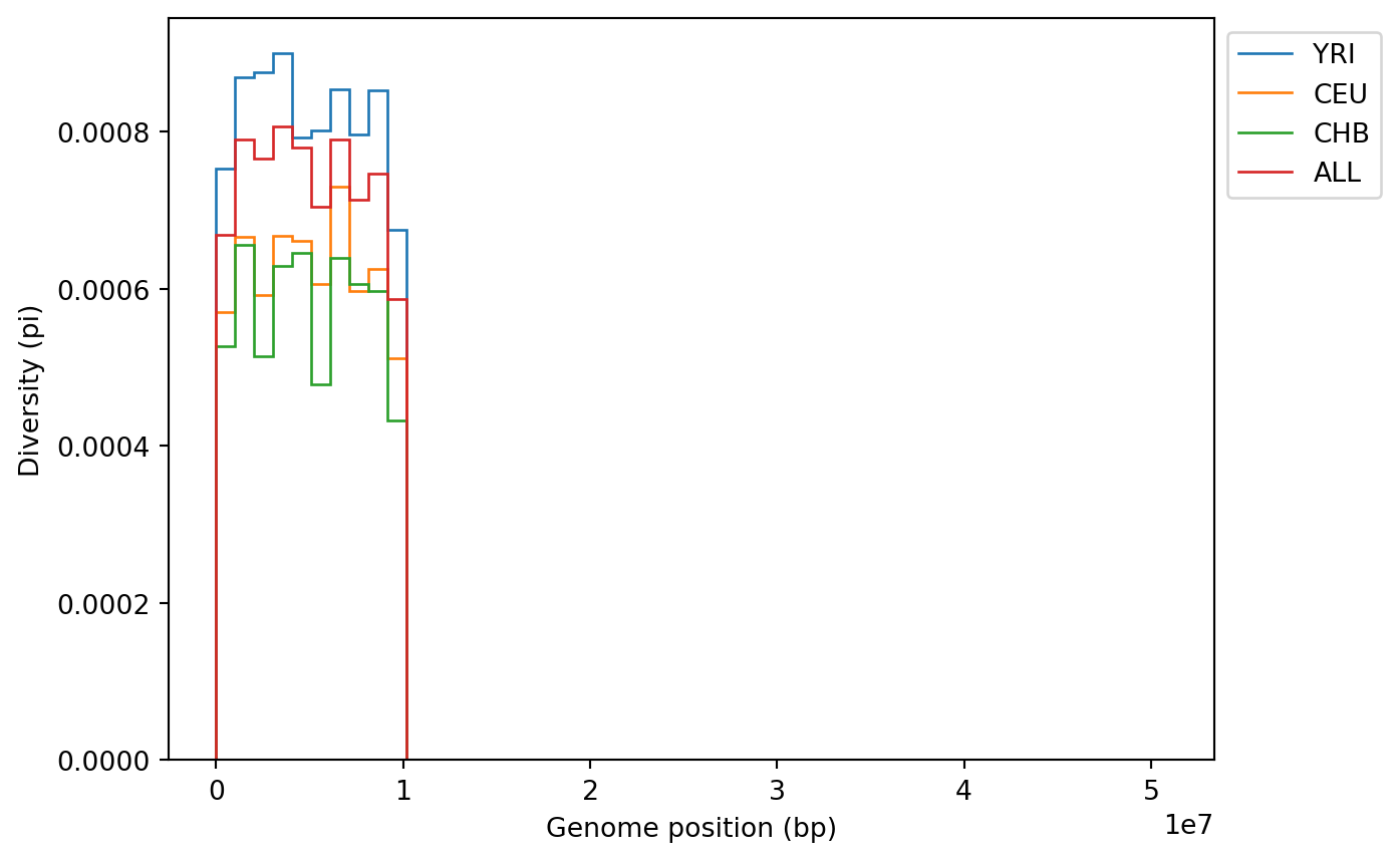
Note how the diversity of the YRI population is higher than that of CEU and CHB.
In addition to one-way statistics, we can calculate multiway statistics that compare sample sets with one another. An example of this is divergence:
indexes = ((0, 1), (0, 2), (1, 2))
div = ts.divergence(sample_sets=sample_sets, indexes=indexes)
print(div)
[0.00016496 0.00016315 0.00013032]A multiway statistical function takes a parameter sample_sets that defines sample sets, and a parameter indexes that here consists of a list of tuples of index pairs that specify which sample sets are being compared. For instance, (0, 1) indicates a comparison of samplesets at indices 0 and 1 of the sample_sets parameter. We can also calculate this statistic in windows and plot:
div_win = ts.divergence(
    sample_sets=sample_sets,
    indexes=indexes,
    windows=windows
)
for i in range(len(indexes)):
    plt.stairs(div_win[:, i], windows)
plt.xlabel("Genome position (bp)")
plt.ylabel("Divergence (dXY)")
plt.legend(["YRI/CEU", "YRI/CHB", "CEU/CHB"])
plt.show()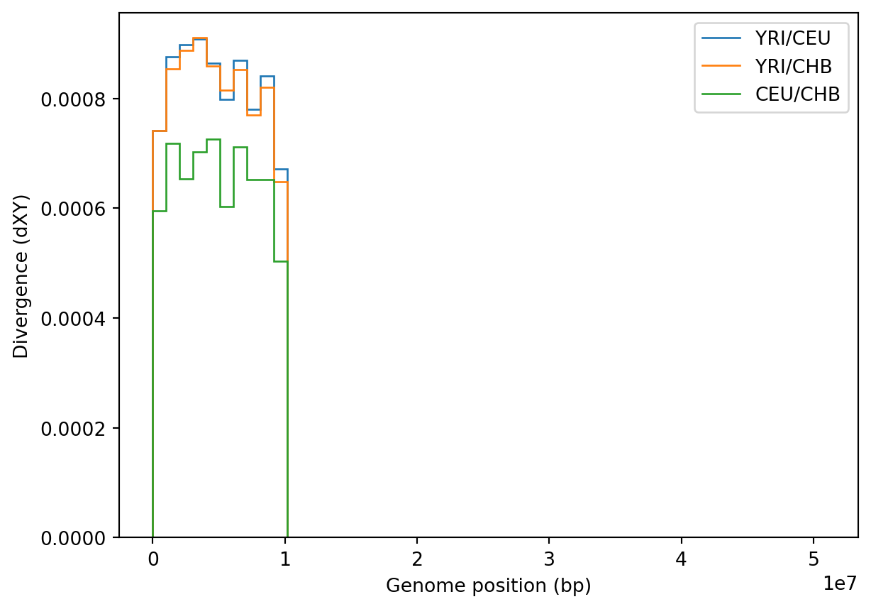
We finish by calculating the allele frequency spectrum (AFS), both for the entire sample set, and for each population individually. Here, the calculations are done separately, as otherwise the allele_frequence_spectrum function would calculate the joint AFS for all sample sets.
kw = {"span_normalise": False}
afs = [
    ts.allele_frequency_spectrum(**kw),
    ts.allele_frequency_spectrum(sample_sets=[ts.samples(population=0)], **kw),
    ts.allele_frequency_spectrum(sample_sets=[ts.samples(population=1)], **kw),
    ts.allele_frequency_spectrum(sample_sets=[ts.samples(population=2)], **kw)
]
fig, axis = plt.subplots(2, 2, figsize=(15, 8), sharey=True)
fig.suptitle("Allele frequency spectrum")
ax0 = plt.subplot(221)
ax0.bar(range(1, ts.num_samples + 1), afs[0][1:])
ax0.set_title("All samples")
for i, index in enumerate([222, 223, 224]):
ax = plt.subplot(index)
ax.bar(range(1, len(ts.samples(i)) + 1), afs[i + 1][1:])
ax.set_title(ts.population(i).metadata["name"])
fig.text(0.5, 0.04, 'Minor allele frequency', ha='center')
fig.text(0.04, 0.5, 'Count', va='center', rotation='vertical')
plt.show()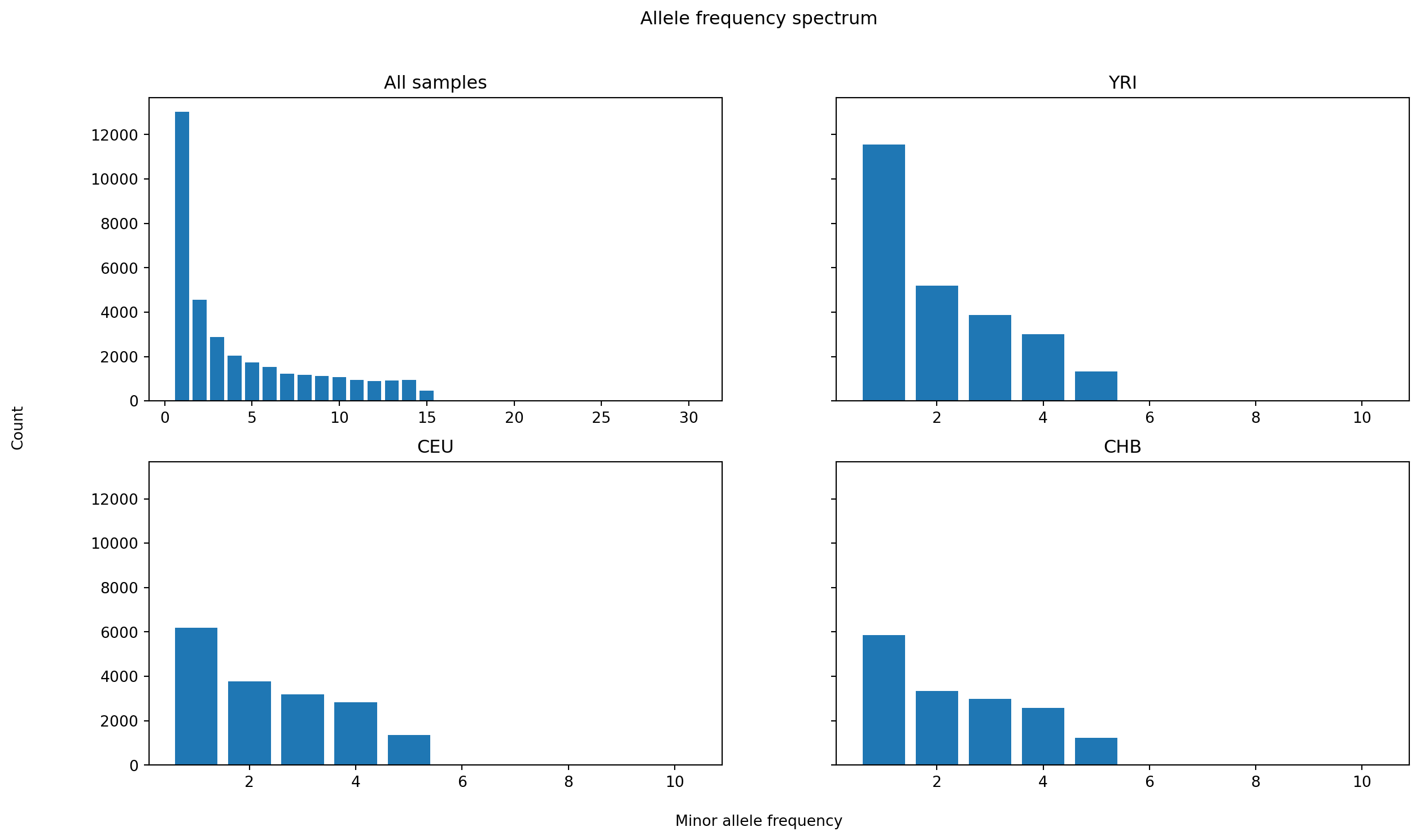
The plots share y-axes and tally the counts of allele frequency classes, showing clearly how there is more variation in the African sample.
Up until now we have calculated so-called site statistics that are based on mutations. Since the number of mutations that fall on a particular branch is proportional to the branch length, one could ask whether we really need any mutations at all? to calculate statistics. The tskit statitics actually come in different modes. Here, we will briefly mention the branch mode, which measures the time since two genomes’ common ancestor.
You change the mode of a statistical function by passing the mode parameter. Let’s apply it to ts.diversity, which will then calculate the average branch length between all samples in a given sample set:
ts.diversity(mode="branch", sample_sets=sample_sets)array([6975.69612337, 5263.94061636, 4886.51993207, 6254.65473533])Since the mutational process is random it adds stochastic noise to measures based on genetic variation. In contrast, genealogy-based measures are less noisy since this random noise component is missing. If the goal is to compare statistical measures of variation, genealogy-based methods should give you more statistical power.
A common way to summarize population structure is to perform Principal Component Analysis (PCA) on the genetic data. Here we briefly show how this can be done on the genotype matrix that we retrieve from the tree sequence. Note that this is a summary treatment and that you would need to perform more filtering, LD pruning and QC on real data.
We start by extracting the genotype matrix and we filter out singletons which are uninformative for PCA.
genotype_matrix = ts.genotype_matrix()
singletons = genotype_matrix.sum(axis=1) == 1
genotype_matrix = genotype_matrix[~singletons]
sample_indexes = np.random.choice(genotype_matrix.shape[0], 1000, replace=False)
genotype_matrix = genotype_matrix[sample_indexes, :]
Next, we load the scikit-allel library and use it to perform PCA:
import allel

coords, pcamodel = allel.pca(genotype_matrix, n_components=2)
plt.figure()
for i in range(3):
    indices = ts.samples(i)
    plt.scatter(coords[indices, 0], coords[indices, 1],
                color=popmd[i]["mpl_color"],
                label=popmd[i]["name"])
plt.xlabel('PC1')
plt.ylabel('PC2')
plt.title('PCA Plot')
plt.legend()
plt.show()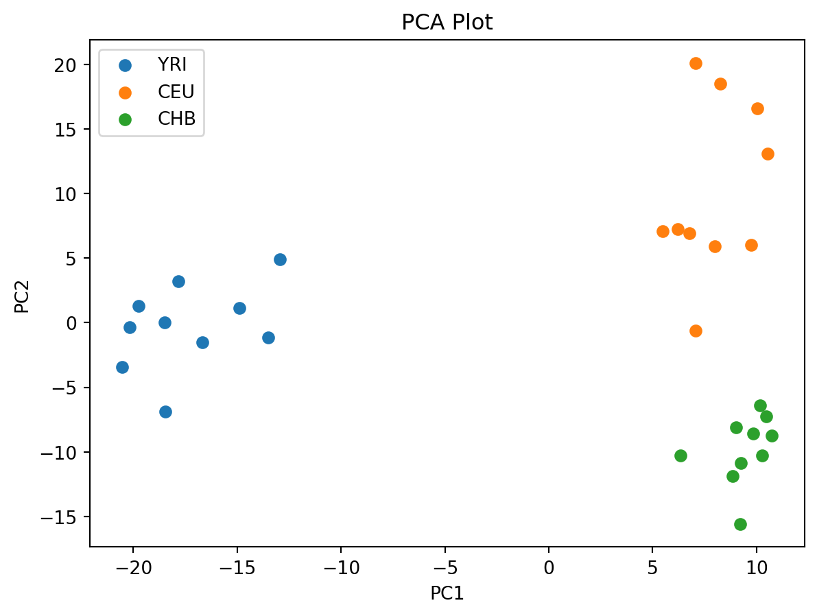
To plot trees, we import the SVG library for plotting
from IPython.display import SVGand plot the first tree
SVG(ts.first().draw_svg(size=(1000, 500), y_axis=True))
We can see that many chromosomes rapidly find a common ancestor (coalesce), but that some of the branches show a deeper history, presumably related to the African samples. Let’s add some styling to the plot to highlight the different populations more clearly (see the tskit visualization docs for more infomation on styling):
styles = []
# Create a style for each population, programmatically (or just type the string by hand)
for i in list(popmd)[0:3]:
    # target the symbols only (class "sym")
    s = f".node.p{i} > .sym " + "{" + f"fill: {popmd[i]['mpl_color']}" + "}"
    styles.append(s)
    print(f'"{s}" applies to nodes from population {popmd[i]["name"]} (id {i})')
css_string = " ".join(styles)
print(f'CSS string applied:\n    "{css_string}"')
".node.p0 > .sym {fill: #1f77b4}" applies to nodes from population YRI (id 0)
".node.p1 > .sym {fill: #ff7f0e}" applies to nodes from population CEU (id 1)
".node.p2 > .sym {fill: #2ca02c}" applies to nodes from population CHB (id 2)
CSS string applied:
".node.p0 > .sym {fill: #1f77b4} .node.p1 > .sym {fill: #ff7f0e} .node.p2 > .sym {fill: #2ca02c}"The SVG output from tskit plots contain classes that can be customized with CSS, as shown above. Briefly, p0 means a node belongs to population id 0, and we specify that the node symbol sym be filled with color #1f77b4 (tab:blue in matplotlib). We specify the style and remove the y axis and node labels for clarity:
SVG(ts.first().draw_svg(
    size=(1000, 500), y_axis=False, style=css_string, node_labels={}, x_axis=True))
As expected, there is some clustering with regards to the populations, in particular CEU (blue) and CHB (green).
The plot above showed one tree (one non-recombining genomic segment). We can include more trees by adjusting the x_lim parameter:
SVG(ts.draw_svg(
    size=(1500, 500), y_axis=False, style=css_string,
    node_labels={}, x_axis=True, x_lim=[0, 1200]))
In the section on summary statistics and population structure we made use of the mutations and branch lengths for the analyses. In this section, we give an example of a topology-based analysis. The topology of a tree describes the branching pattern of the tree, disregarding the lengths of the branches. The analysis makes use of something called Genealogical Nearest Neighbours (GNN) (see Kelleher et al, 2019, Fig 4 for an example application).
Briefly, the genealogical nearest neighbours for a focal node are defined as the sibling nodes descending from the parent of the focal node. By assigning samples to some pre-defined grouping (e.g., population), we can calculate the GNN proportions of a node.
Let’s look at a tree for a concrete example. In the plot below, we focus our attention to three samples 3, 8, and 19.
SVG(ts.simplify([3, 8, 19], filter_nodes=False).draw_svg(
    size=(500, 300),
    y_axis=False, style=css_string, x_axis=False, x_lim=[0, 100]))
Let the sample node 19 (orange, CEU) be the focal node. It has one GNN, sample node 8 (blue, YRI). To see this, ascend to the parent of node 19, which is node 16041, and look at all the descendants (excluding the focal node 19!) of this node, which in this case consists of only one node. If we group samples by population, this means sample 19 has 100% YRI neighbours, 0% CEU and 0% CHB. Similarly, sample 8 has GNN proportions 100% CEU, 0% YRI and 0% CHB.
If we do this for all samples, and all trees, we can summarize the GNN proportions by population to get an overview of population structure, based solely on a topological measure.
workbook.question("gnn")workbook.question("gnn_summary")In the example above we only showed part of a tree covering the first 100 base pairs. However, as we continue along the genome, the trees will change, and along with the change, so will the GNN proportions.
The tskit function genealogical_nearest_neighbours takes a list of focal nodes and a list of sample sets and calculates the GNN proportions over all trees in a tree sequence (here covering the entire DNA sequence):
ts.genealogical_nearest_neighbours([3, 8, 19], sample_sets=sample_sets[0:3])array([[0.62401381, 0.22385628, 0.15212991],
[0.5952955 , 0.21160238, 0.19310212],
[0.09631377, 0.69608364, 0.20760259]])Averaging over the entire sequence gives a different picture, in particular for sample 19. Whereas it had 100% YRI neighbours in the first tree, over the entire sequence, 69% of the neighbours are CEU, 22% CHB, and only 9% YRI, as would be expected given the demographic history.
gnn = ts.genealogical_nearest_neighbours(ts.samples(), sample_sets=sample_sets[0:3])import pandas as pd
df = pd.DataFrame(gnn, columns=[popmd[i]["name"] for i in popmd][0:3])
df["focal_population"] = np.repeat(df.columns.values, len(ts.samples(0)))
gnn = df.groupby("focal_population").mean()
gnn| YRI | CEU | CHB | |
|---|---|---|---|
| focal_population | |||
| CEU | 0.088688 | 0.663669 | 0.247643 |
| CHB | 0.070334 | 0.219212 | 0.710454 |
| YRI | 0.598093 | 0.210413 | 0.191494 |
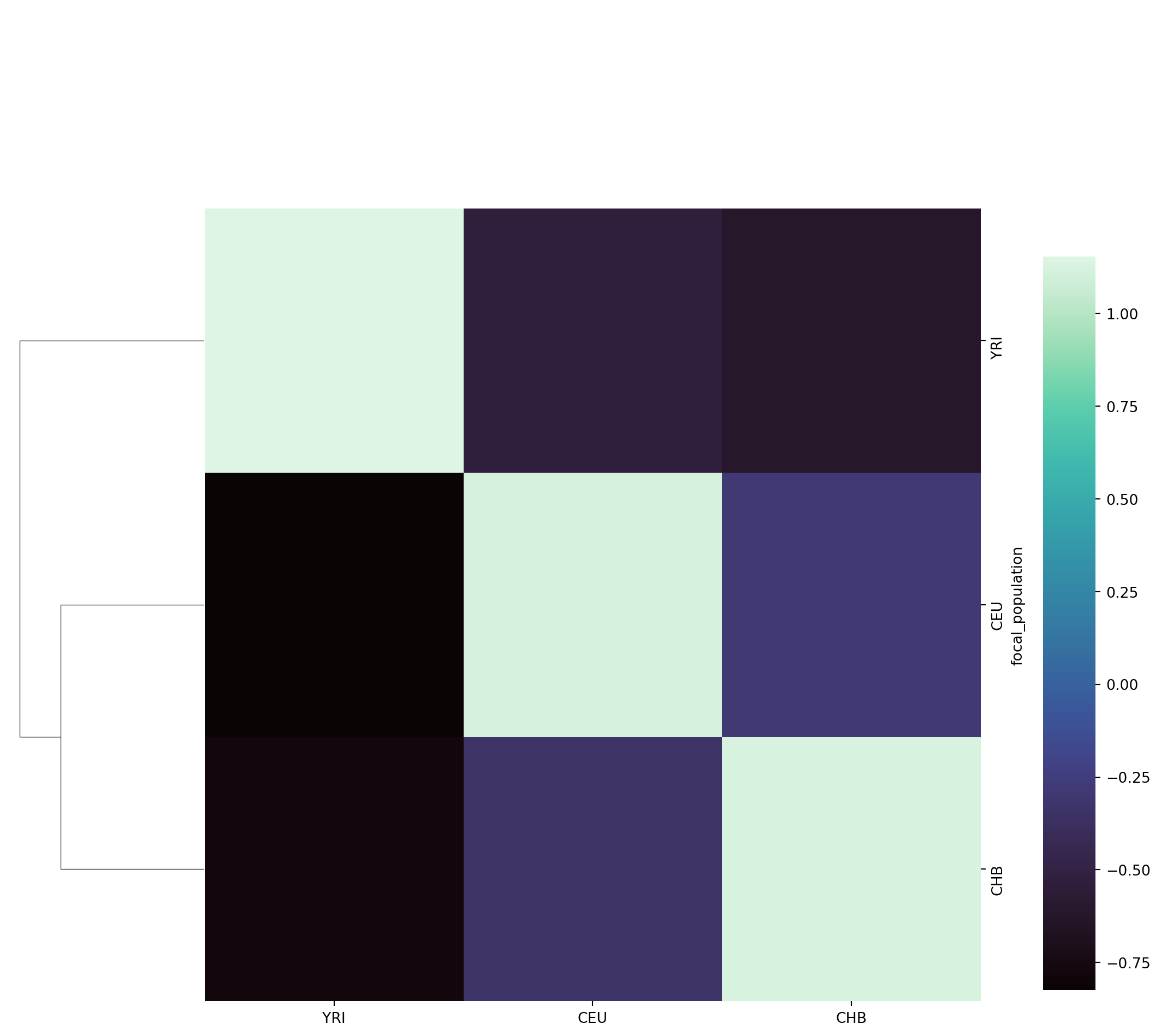
The interpretation of the matrix is as follows: the rows correspond to the focal population, the columns to the GNN proportions of the focal population (i.e., what is the average proportion of genealogical nearest neighbours of the focal population). To reiterate, note that the GNN matrix is asymmetrical! The YRI population on average has more CEU and CHB neigbours than CEU or CHB have YRI neighbours!
Instead of representing the GNN matrix with proportions, we can calculate Z-scores to emphasize over-/underrepresentation, as was done by Kelleher et al. (figure 4a,b). We end this workbook by plotting the GNN matrix as a heatmap of Z-scores, hierarchically clustered by focal population.
import seaborn as snssns.clustermap(gnn, col_cluster=False, z_score=0,
cmap="mako", cbar_pos=(1.0, 0.05, 0.05, 0.7));