Categorical data can be summarized by counting the number of observations of each category and summarizing in a frequency table or graphically in a bar chart. Alternatively we can calculate the proportions or percentages of each category.
Figure 4.1: Example of numerical summaries and graphical visualization applicable to categorical data
Given the diabetes data set we have some categorical data type such as obesity or diabetes status (yes/no), gender (male/female) and location (Buckingham/Louisa) to name few. Taking obesity status as an example, we can:
ask how many study participants we have in each category? I.e. how many suffer from obesity (\(BMI \ge 30\)) and how many have \(BMI < 30\)?
visualize these descriptive statistics as counts or percentages in a bar chart or a pie chart.
4.1 Frequency table
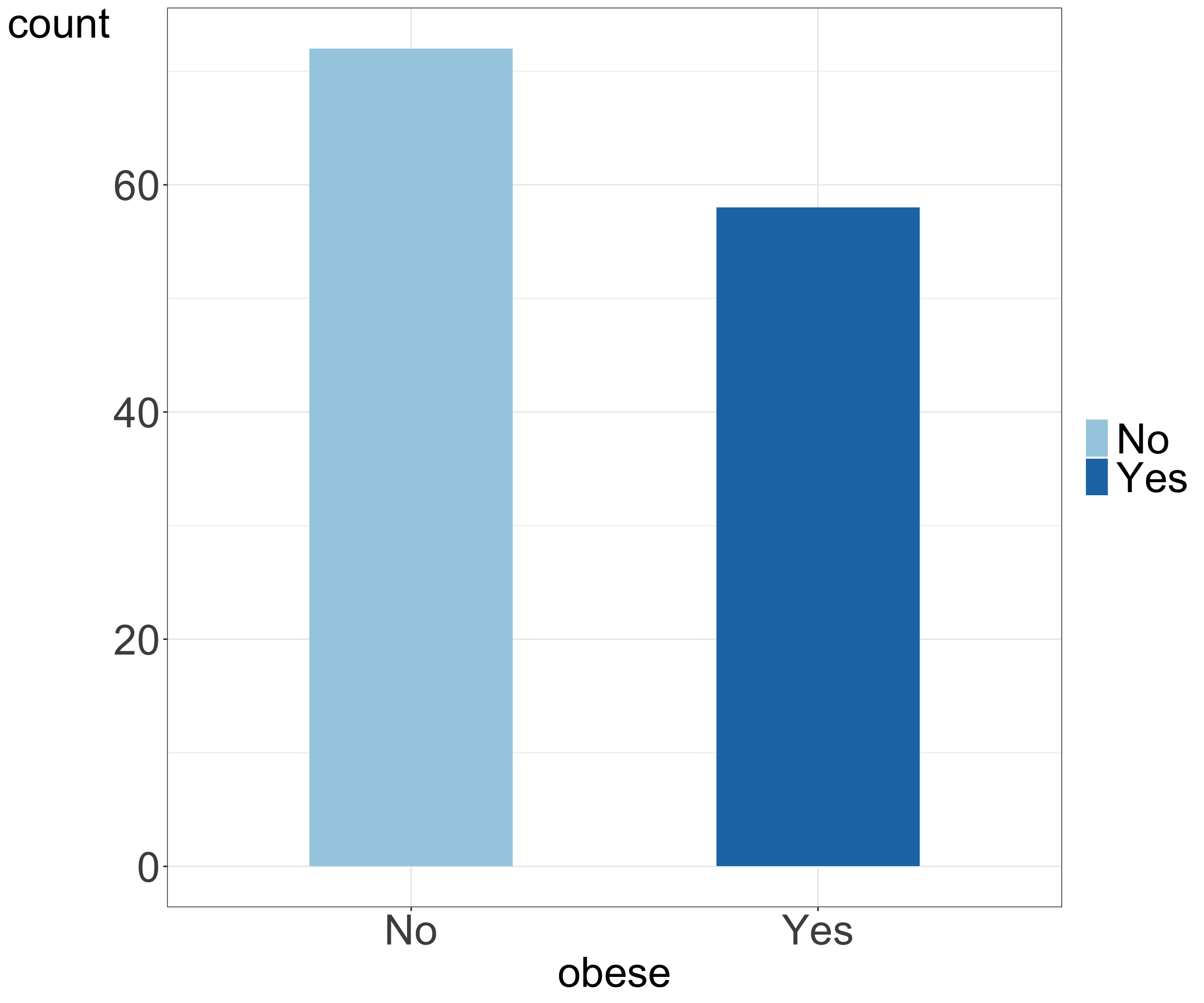
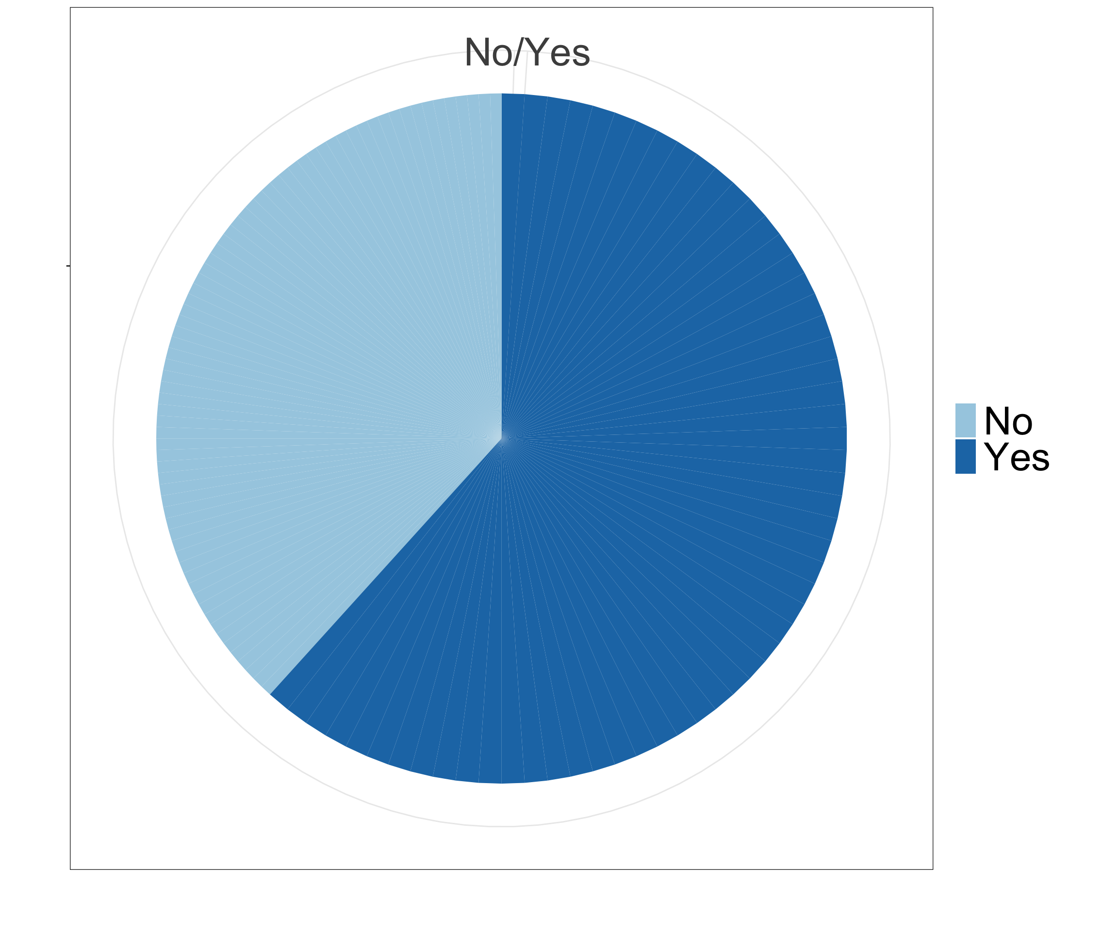
Let’s focus on 130 study participants for which no missing data was observed, i.e. complete case analysis. An example frequency table summarizing study participants by their BMI status is shown below.
Table 4.1: Frequency table showing the number, percentages and proportions of study participants with BMI \(\ge\) 30 and with BMI < 30
4.2 Bar chart & pie chart
To visualize the frequencies (or percentages or proportions) we can use bar chart or a pie chart.
Code
# set a custom ggplot themefont.size <-30my.ggtheme <-theme(axis.title =element_text(size = font.size), axis.text =element_text(size = font.size), legend.text =element_text(size = font.size), legend.title =element_blank(), axis.title.y =element_text(angle =0))# use ggplot to draw a bar chartdata_diabetes %>%ggplot(aes(x = obese, fill = obese)) +geom_bar(width =0.5) +scale_fill_brewer(palette ="Paired") +theme_bw() + my.ggtheme# draw pie chartdata_diabetes %>%ggplot(aes(x="", y = obese, fill = obese)) +geom_bar(width =1, stat ="identity") +theme_bw() +coord_polar("y", start=0) +scale_fill_brewer(palette="Paired") +xlab("") +ylab("") + my.ggtheme
(a) Bar chart
(b) Pie chart
Figure 4.2: Bar and pie chart showing graphical summaries of number and percentage of participants of study participants with BMI \(\ge\) 30 and with BMI < 30
4.3 Summary table: 2 categorical variables
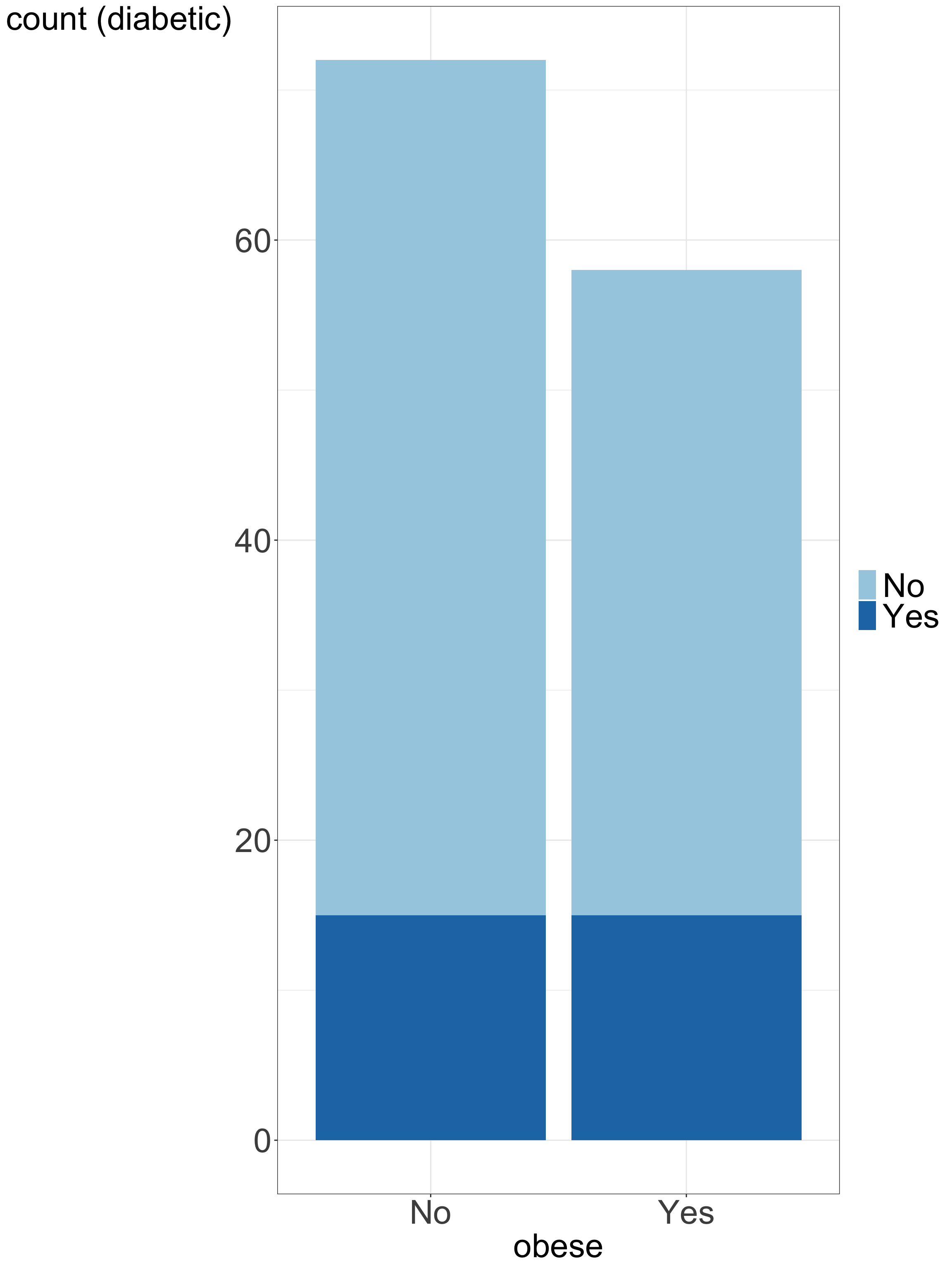
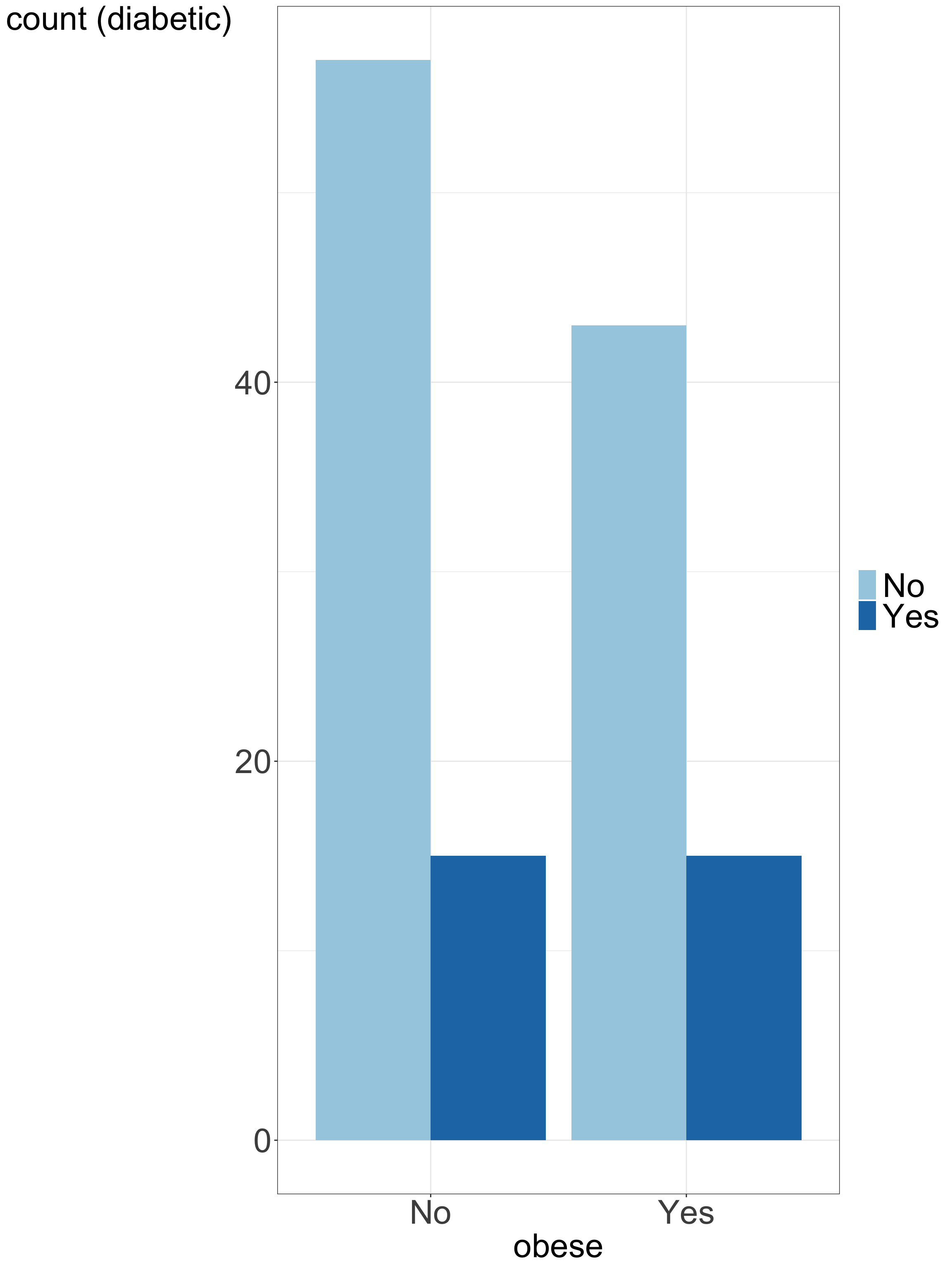
When we are interested in how one categorical variable is related to another categorical variable, we can use a summary table. For instance, we can look at the relationship between obesity (yes/no) and diabetes (yes/no).
Table 4.2: Summary table showing relation between obesity and diabesis status among study participants
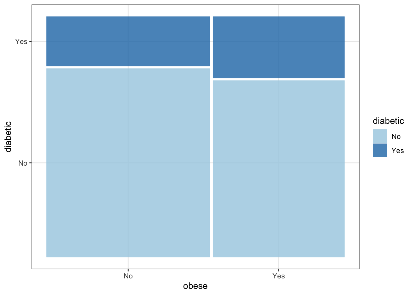
4.4 Contingency table: 2 categorical variables
Shows the multivariate frequency distribution of variables
Code
# use table() function to create contingency tabletable.con <-table(data_diabetes$obese, data_diabetes$diabetic)table.con <-addmargins(table.con)rownames(table.con) <-c("Non-obese", "Obese", "Sum")colnames(table.con) <-c("Non-diabetic", "Diabetic", "Sum")table.con %>%kable(row.names =TRUE) %>%kable_styling(full_width =TRUE) %>%column_spec(4, bold = T) %>%row_spec(3, bold = T)
Non-diabetic
Diabetic
Sum
Non-obese
57
15
72
Obese
43
15
58
Sum
100
30
130
Table 4.3: Contigency table (or cross table) showing multivariate frequency of obesity and diabesis status among study participants
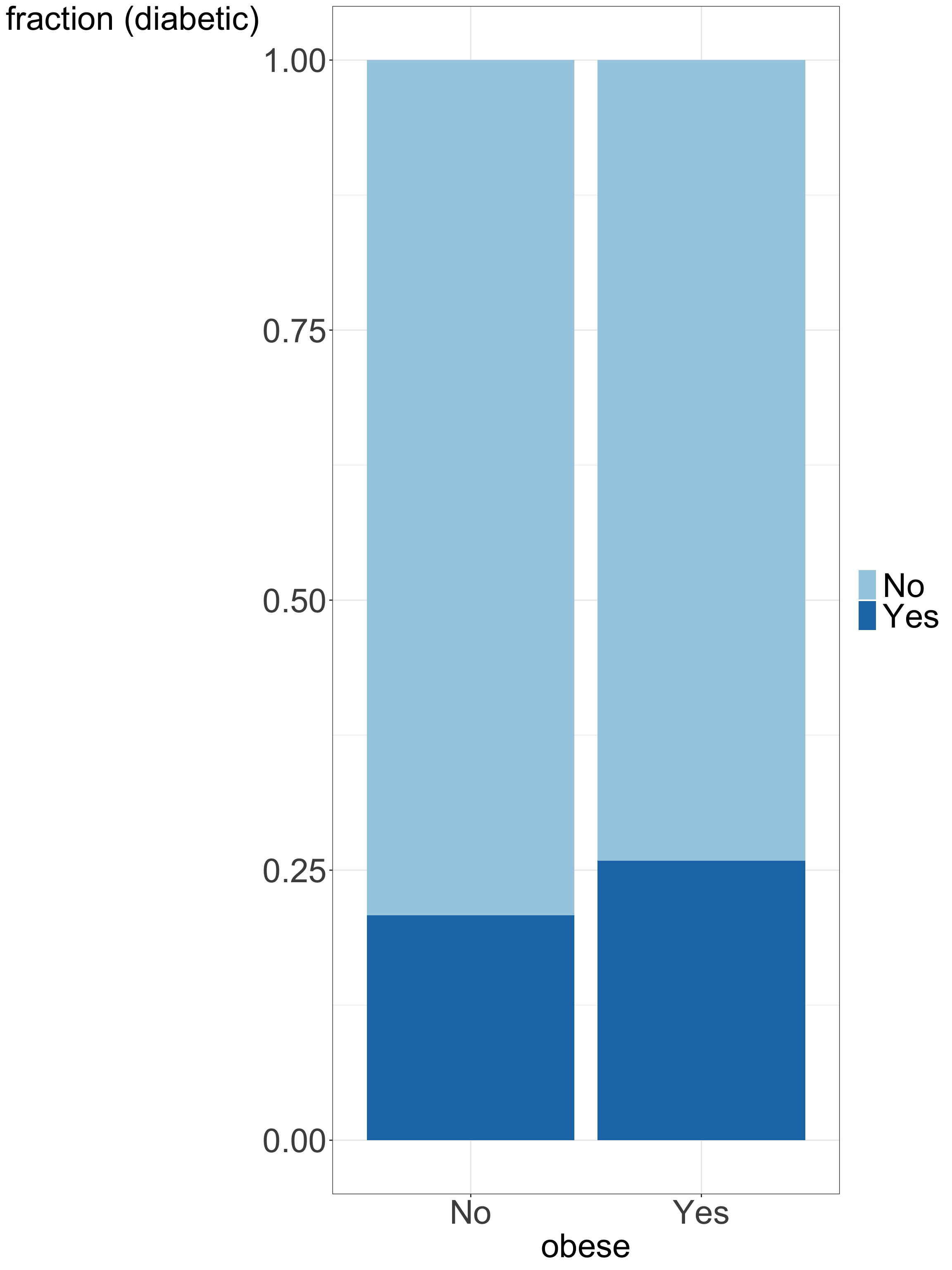
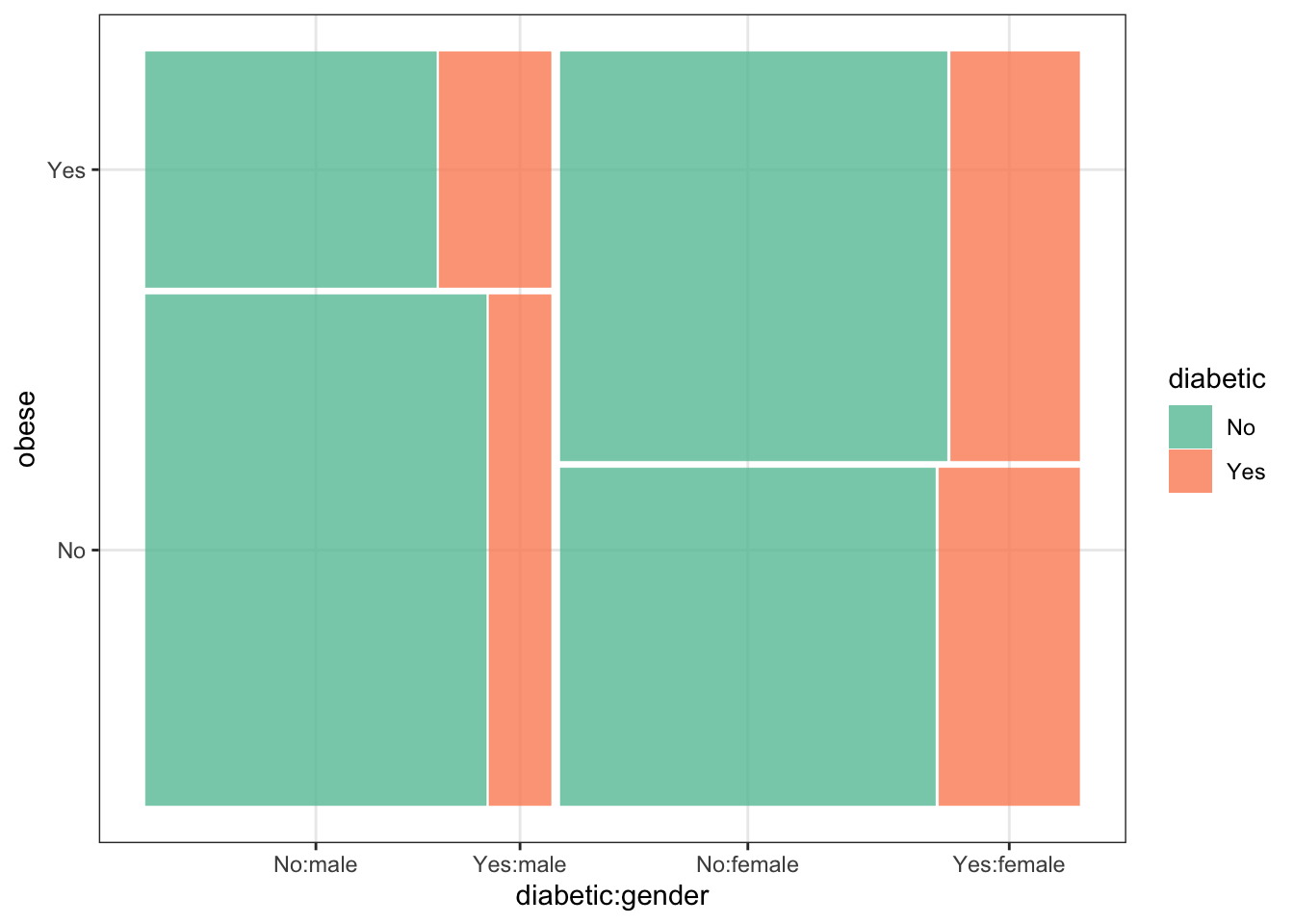
4.5 Bar chart: 2 categorical variables
Bar charts can be used to visualize two and more categorical variables, e.g. by using stacking, side-by-side bars or colors.
Code
data_diabetes %>%ggplot(aes(x=obese, fill=diabetic)) +geom_bar() +theme_bw() +xlab("obese") +ylab("count (diabetic)") +scale_fill_brewer(palette ="Paired") + my.ggtheme# another way of using bar charts: side by side barsdata_diabetes %>%ggplot(aes(x=obese, fill=diabetic)) +geom_bar(position ="dodge") +theme_bw() +xlab("obese") +ylab("count (diabetic)") +scale_fill_brewer(palette ="Paired") + my.ggtheme# another way of using bar charts: showing fractions instead of countsdata_diabetes %>%ggplot(aes(x=obese, fill=diabetic)) +geom_bar(position ="fill") +theme_bw() +xlab("obese") +ylab("fraction (diabetic)") +scale_fill_brewer(palette ="Paired") + my.ggtheme
(a) stacked bars
(b) side-by-side bars
(c) bars showing fractions instead of counts
Figure 4.3: Bar chart showing summary of diabetic status among study participants with BMI \(\ge\) 30 and with BMI < 30
Code
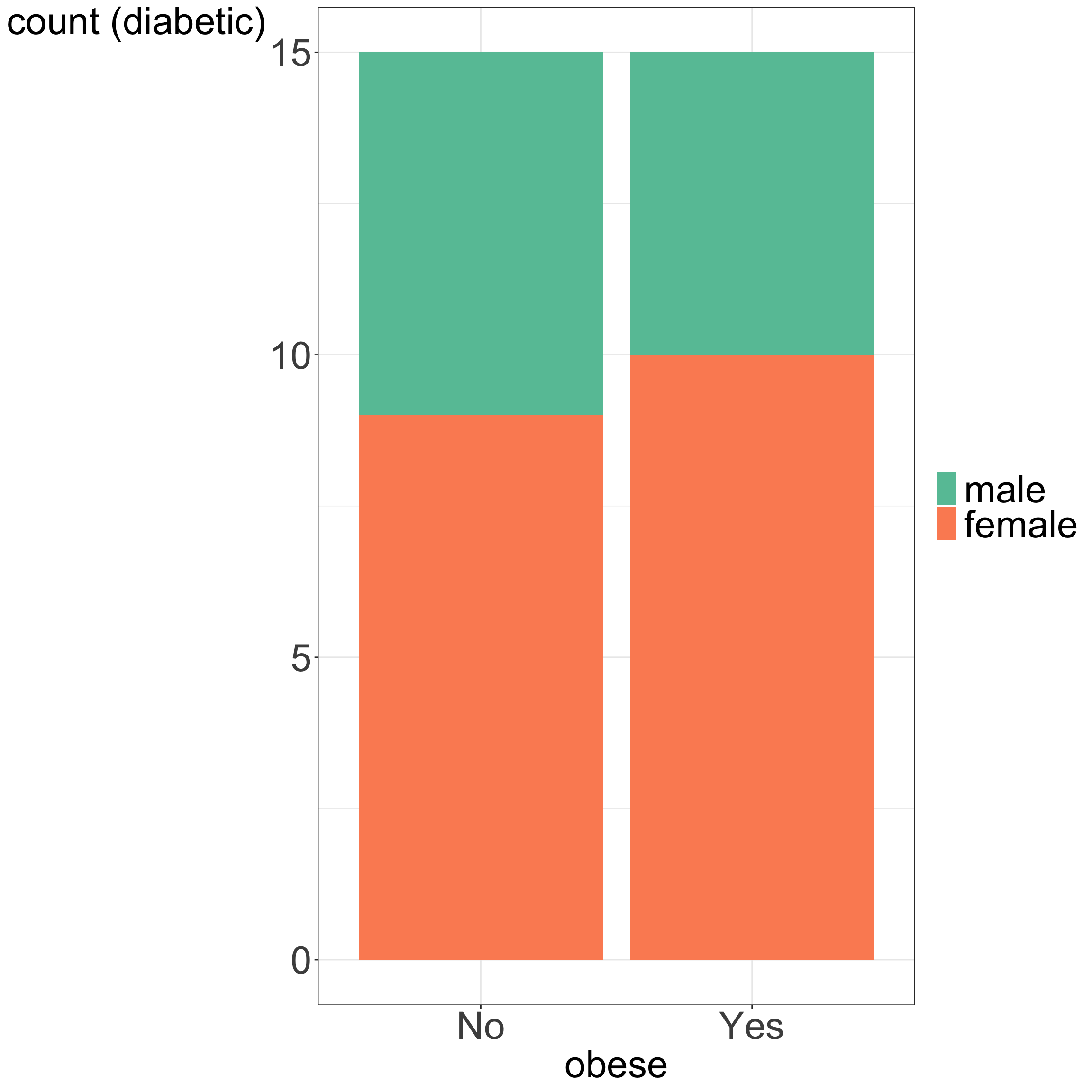
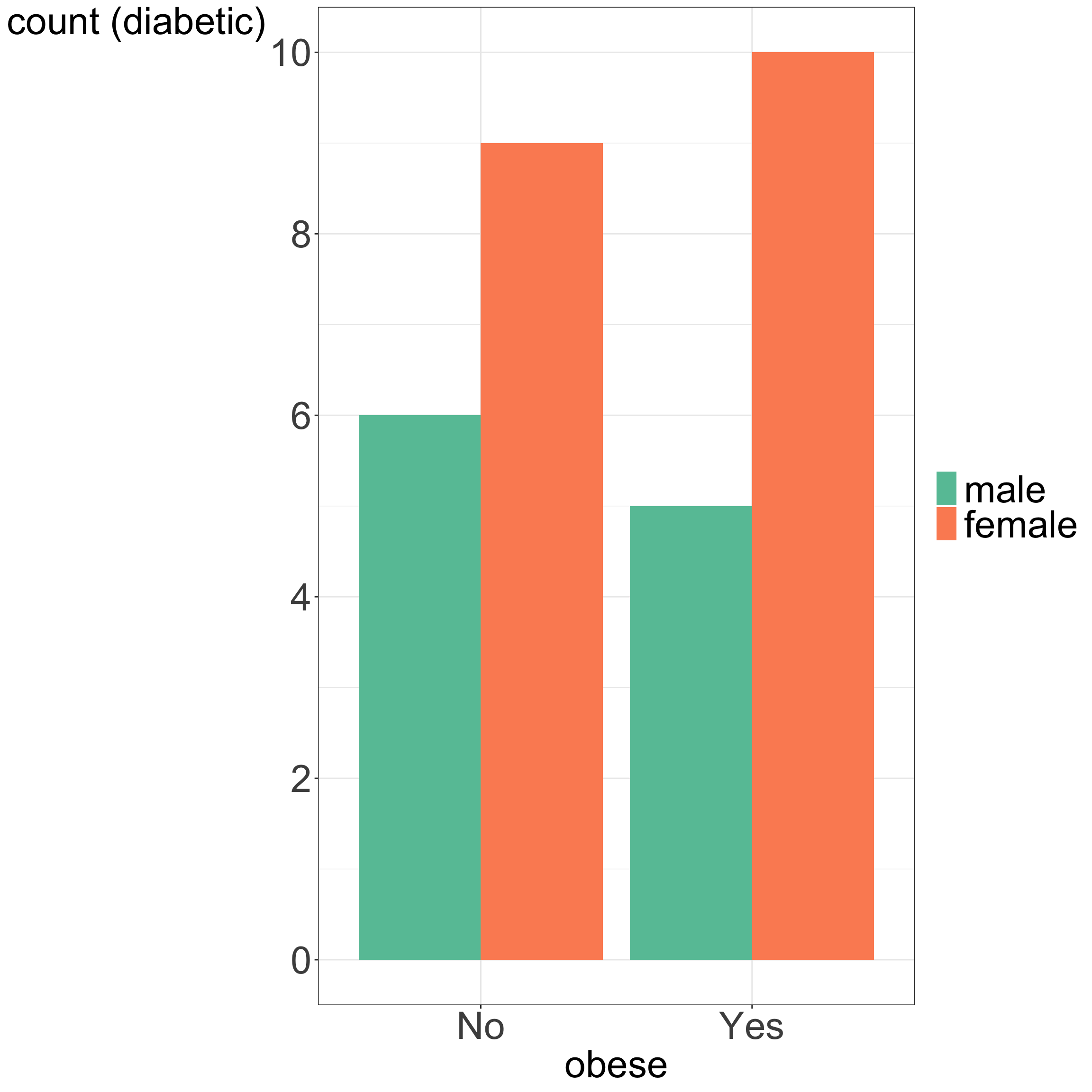
# calculate number of diabetic participants # by among participants with BMI >=30 and stratified by genderdata_plot <- data_diabetes %>%select(gender, obese, diabetic) %>%group_by(obese, diabetic, gender) %>%tally() %>%filter(diabetic =="Yes") #%>%#print()# bar plot (stacked)data_plot %>%ggplot(aes(x=obese, y=n, fill = gender)) +geom_bar(stat ="identity") +theme_bw() +xlab("obese") +ylab("count (diabetic)") +scale_fill_brewer(palette ="Set2") + my.ggtheme# bar plot (side-by-side)data_plot %>%ggplot(aes(x=obese, y=n, fill = gender)) +geom_bar(stat ="identity", position ="dodge") +theme_bw() +xlab("obese") +ylab("count (diabetic)") +scale_fill_brewer(palette ="Set2") +scale_y_continuous(breaks =pretty_breaks()) + my.ggtheme
(a) stacked bars
(b) side-by-side bars
Figure 4.4: Bar chart showing number of diabetic study participants among participants with BMI \(\ge\) 30 and with BMI < 30, stratified by gender