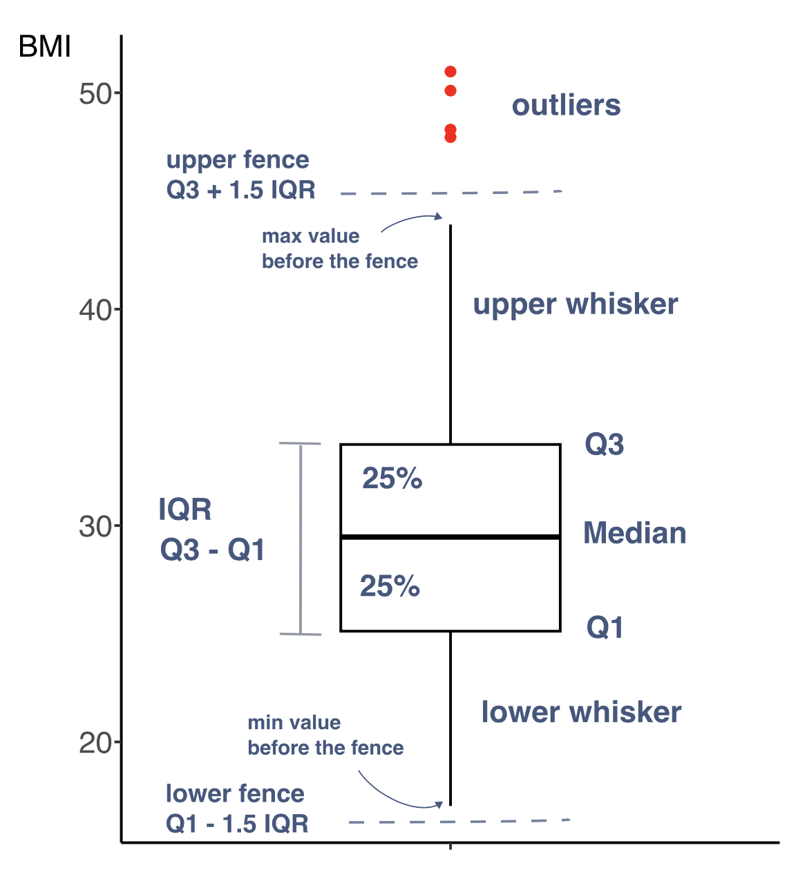
A box-and-whisker plot, commonly referred to as box plot, is a diagram summarizing numerical data through quartiles. It is shown as a vertical or horizontal rectangle box, with the ends of rectangle corresponding to the upper (Q3) and lower (Q1) quartiles of the data values. A line drawn through the rectangle corresponds to the median value (Q2).
In addition to the box, there can be also lines called whiskers extending from the rectangle indicating variability outside the upper and lower quartiles. These can be defined in few ways, for instance they can indicate i) minimum and maximum values or ii) particular percentiles, e.g. 5th and 95th. On the box plot prepared with R function boxplot() or geom_boxplot() the upper whisker extends by default to the largest value no further than 1.5 * IQR from Q3 while the lower whiskers extends by default to the smallest value at most 1.5 * IQR from Q1.
Data beyond the end of the whiskers are called “outlying” points and are plotted individually.
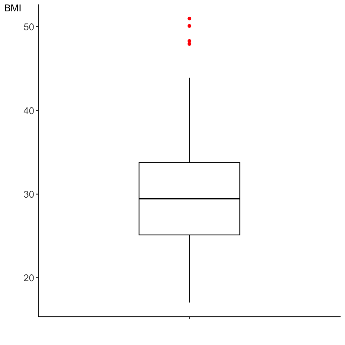
Below, we can see annotated box plot based on the BMI values for the 130 study participants.
Figure 8.1: Box plot
The code to generate the box plot in R is here:
data_diabetes %>%ggplot(aes(x ="", y = BMI)) +geom_boxplot(alpha =1, col ="black", outlier.colour ="red", width =0.4) +xlab("") +theme_classic() + my.ggtheme
Figure 8.2: A box-and-whisker plot for the BMI values based on the measurments for the 130 study participants.
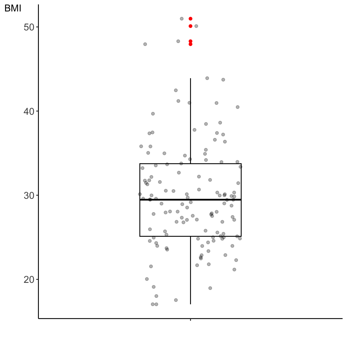
We have previously mentioned that when we are dealing with a relatively small data set it is recommended to visually assess all the observations. We can overlay jitter plot on the box plot to get a complete picture of both the data and the quartiles summary statistics.