gc_vst <- read.table("../../data/counts_vst.txt", header = T, row.names = 1, sep = "\t")
vst_pca <- prcomp(t(gc_vst))1 PCA
Let us first make a PCA object. For this, we will use the VST data, because it makes sense to use the normalized data for building the PCA. To run PCA, we use the R function prcomp(). It takes in a matrix where samples are rows and variables are columns. Therefore, we transpose our count matrix using the function t(). If we do not transpose, then PCA is run on the genes rather than the samples.
Note
In this section, we will talk about PCA and how to plot a PCA object using ggplot. But the idea of plotting the results of any multi-dimensionality reduction methods like MDS/PCoA, NMDS, tSNE, UMAP and many others would in theory be the same as PCA.
After you computer the PCA, if you type the object vst_pca$ and press TAB, you will notice that this R object has multiple vectors and data.frames within it. Some of the important ones are
sdev:the standard deviations of the principal componentsx:the coordinates of the samples (observations) on the principal components.rotation:the matrix of variable loadings (columns are eigenvectors).
Note
There are quite a few functions in R from different packages that can run PCA. So, one should look into the structure of the PCA object and import it into ggplot accordingly!
1.1 Variance of components (Scree plot)
First, let us look into plotting the variance explained by the top PCs.
frac_var <- function(x) x^2/sum(x^2)
library(scales)

vst_pca$sdev %>%
  as_tibble() %>%
  frac_var() %>%
  mutate(Comp = colnames(vst_pca$x)) %>%
  slice(1:9) %>%
  ggplot(aes(x=Comp, y = value)) +
  geom_bar(stat = "identity", fill = "#4DC5F9") +
  geom_hline(yintercept = 0.03, linetype=2) +
  xlab("Principal Components") +
  scale_y_continuous(name = "Variance Explained", breaks = seq(0,0.8,0.1), labels = percent_format(accuracy = 5L)) +
  theme_classic(base_size = 14)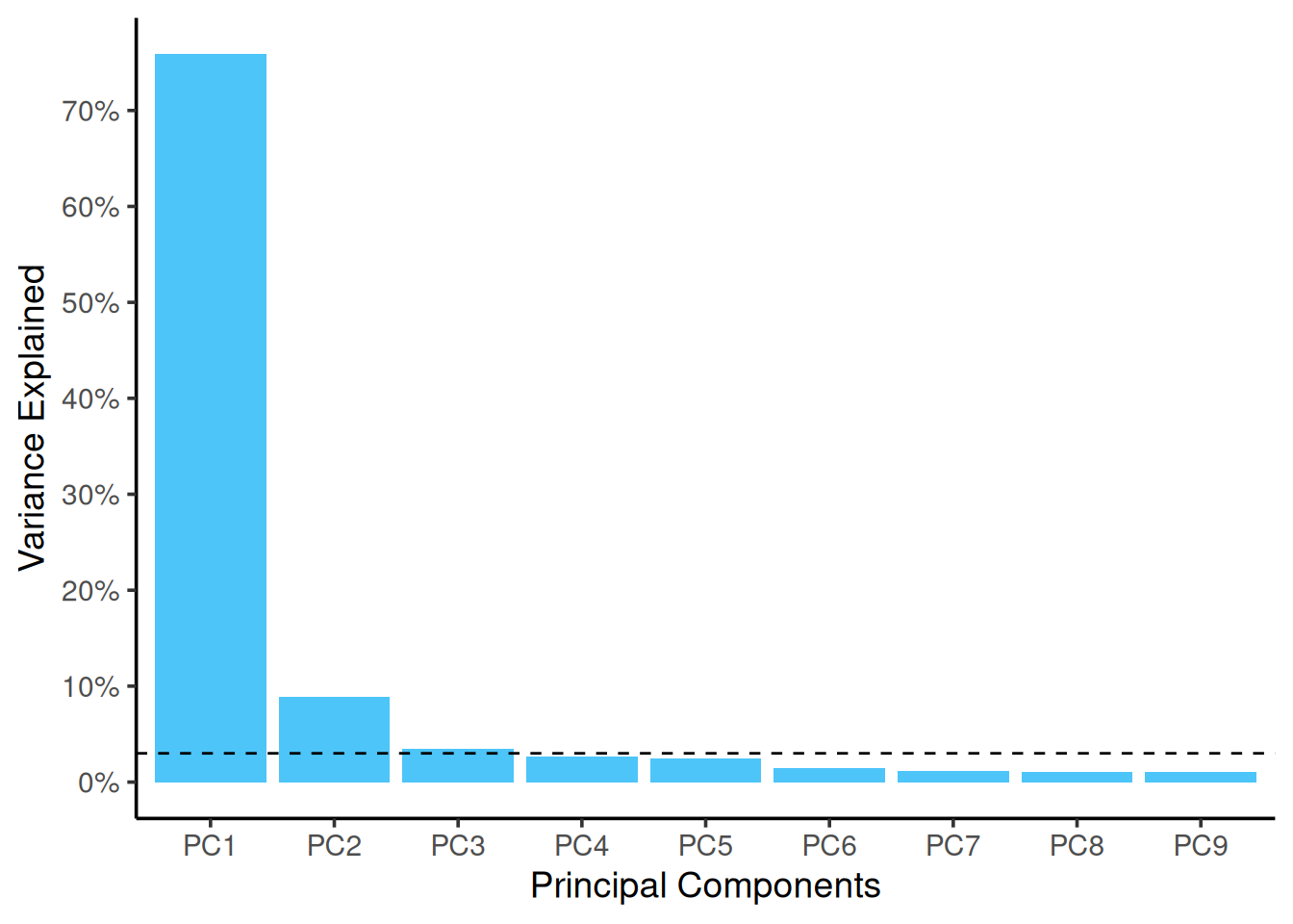
1.2 PCA plot
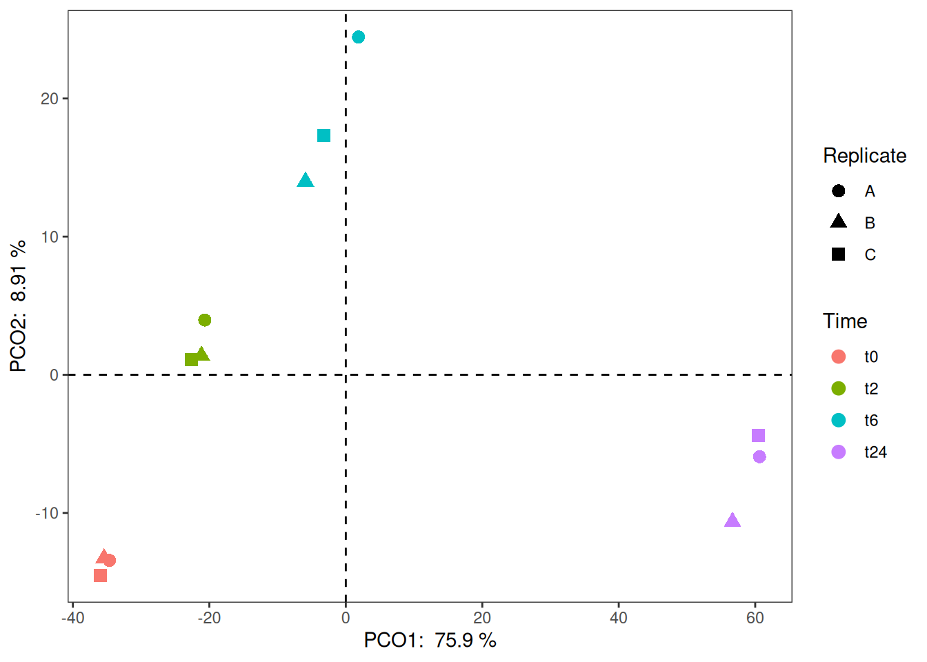
So, looks like the first two components explain almost 85% of the data. Now, let us look into building a plot out of these components. From the above object, to get the scatter plot for the samples, we need to look into vst_pca$x. Then, we combine this data (as shown below) with the metadata to use different aesthetics and colors on the plot.
vst_pca$x PC1 PC2 PC3 PC4 PC5 PC6
Sample_1 -34.641623 -13.435531 6.486032 0.2742477 6.406502 5.6703279
Sample_2 -35.431333 -13.277983 5.171377 0.3540945 3.953216 6.9974341
Sample_3 -35.938795 -14.544994 2.885351 11.3414829 -5.950082 -10.8497916
Sample_4 -20.672358 3.962013 -1.414301 -10.4819194 0.195882 -2.8003847
Sample_5 -21.155503 1.390981 -6.644132 -7.4002617 -6.505502 0.9771040
Sample_6 -22.662075 1.115504 -9.801356 -6.3107519 -7.431833 0.6592987
Sample_7 1.862762 24.449057 12.865650 4.4029501 -5.822040 4.1873901
Sample_8 -5.909698 13.992629 -14.775686 10.9789567 8.967097 2.2612207
Sample_9 -3.233544 17.321871 5.196746 -2.5142966 6.983077 -7.2580550
Sample_10 60.630406 -5.930071 6.993097 -5.7393184 4.254238 -2.6905179
Sample_11 56.669696 -10.638879 -5.860598 -0.4646609 5.216763 -1.3748865
Sample_12 60.482067 -4.404596 -1.102179 5.5594769 -10.267317 4.2208603
PC7 PC8 PC9 PC10 PC11 PC12
Sample_1 -7.6896364 -7.5508580 1.1936551 0.2382806 0.7901002 4.899206e-14
Sample_2 5.8962070 9.0662471 1.0449651 -0.2284545 -1.3982703 5.084128e-14
Sample_3 1.4353811 -0.7461021 -1.4769949 -0.2114041 0.5247079 4.830164e-14
Sample_4 1.2992058 -2.3863551 -6.1089574 0.1510797 -9.1851796 4.973973e-14
Sample_5 -2.7487548 2.7353990 -4.5686381 6.6024251 6.9911571 4.892961e-14
Sample_6 2.1391551 -2.3567136 7.7925047 -6.9400619 1.3499685 5.057196e-14
Sample_7 5.2166866 -4.0805978 -0.2292610 1.4574679 1.2200771 5.066433e-14
Sample_8 -0.1684735 0.1448735 -3.9822133 -2.5610601 0.5182664 4.997044e-14
Sample_9 -5.4663572 5.2056738 6.4295279 1.6062665 -0.5133496 4.986636e-14
Sample_10 0.8277618 0.5767198 -4.9156730 -6.8596253 4.8748004 4.900247e-14
Sample_11 5.8886122 -3.9566331 4.4374522 6.9835771 -0.4457707 4.726081e-14
Sample_12 -6.6297877 3.3483466 0.3836326 -0.2384911 -4.7265074 5.044576e-14And, if you check the class() of this object, you will realize that this is a matrix. To be able to comfortably use tidyverse on this object, we must first convert this to a data.frame.
vst_pca_all <- vst_pca$x %>%
  as.data.frame() %>%
  rownames_to_column(var = "Sample_ID") %>%
  full_join(md, by = "Sample_ID")

# Just to keep the order the right way.
vst_pca_all$Sample_Name <- factor(vst_pca_all$Sample_Name, levels = c("t0_A","t0_B","t0_C","t2_A","t2_B","t2_C","t6_A","t6_B","t6_C","t24_A","t24_B","t24_C"))
vst_pca_all$Time <- factor(vst_pca_all$Time, levels = c("t0","t2","t6","t24"))
vst_pca_all$Replicate <- factor(vst_pca_all$Replicate, levels = c("A","B","C"))

ggplot(vst_pca_all, aes(x=PC1, y=PC2, color = Time)) +
  geom_point(size = 3, aes(shape = Replicate)) +
  geom_vline(xintercept = 0, linetype=2) +
  geom_hline(yintercept = 0, linetype=2) +
  theme_bw() +
  theme(panel.grid.major = element_blank(),
panel.grid.minor = element_blank()) 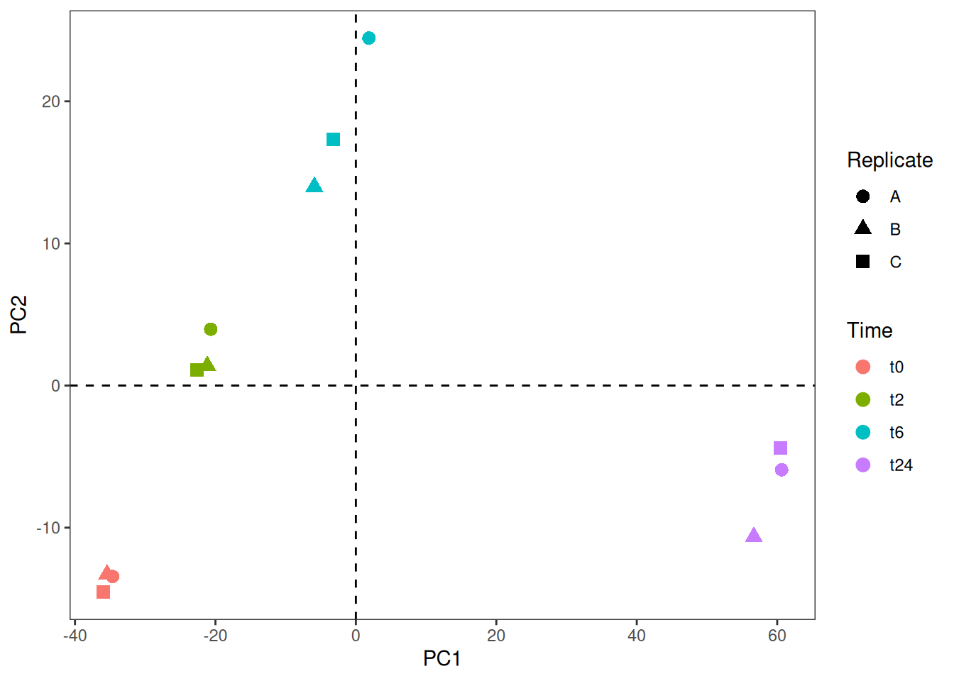
1.3 Loading plot
Now, let us say you want to plot the four genes that contribute the most to the four directions in the PCA plot. We could obtain them by looking at the vst_pca$rotation matrix. We could get those genes and their respective coordinates as follows.
genes.selected=vst_pca$rotation[c(which.max(vst_pca$rotation[,"PC1"]), which.min(vst_pca$rotation[,"PC1"]), which.max(vst_pca$rotation[,"PC2"]), which.min(vst_pca$rotation[,"PC2"])),c("PC1","PC2")]
genes.selected <- genes.selected %>%
  as.data.frame() %>%
  rownames_to_column(var = "Gene_ID")
genes.selected
A loading plot shows how strongly each variable (gene) influences a principal component. As an example, we could plot the four genes we selected.
ggplot(genes.selected, aes(x=PC1, y=PC2)) +
  geom_point() +
  geom_segment(aes(xend=PC1, yend=PC2), x=0, y=0, color="Grey") +
  geom_label(aes(x=PC1, y=PC2, label=Gene_ID), size=2, vjust="outward") +
  theme_bw() +
theme(panel.grid.major = element_blank(), panel.grid.minor = element_blank()) 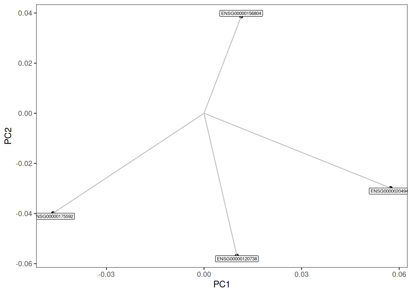
1.4 PCA bi-plot
By merging the PCA plot with the loadings plot one can create a so-called PCA bi-plot.
scale=500
ggplot(data=vst_pca_all, mapping=aes(x=PC1, y=PC2)) +
     geom_point(size = 3, aes(shape = Replicate, color = Time)) +
     geom_vline(xintercept = 0, linetype=2) +
     geom_hline(yintercept = 0, linetype=2) +
     geom_segment(data=genes.selected, mapping=aes(xend=scale*PC1,yend=scale*PC2), x=0, y=0, arrow=arrow(), color="grey") +
     geom_label(data=genes.selected, mapping=aes(x=scale*PC1,y=scale*PC2, label=Gene_ID), size=2, hjust="outward", vjust="outward") +
     theme_bw() +
     theme(panel.grid.major = element_blank(),  panel.grid.minor = element_blank())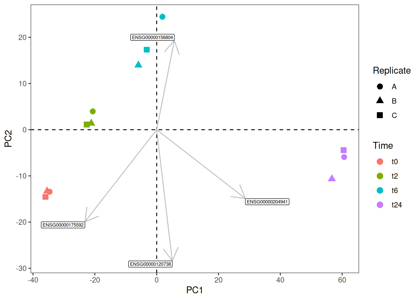
Note
Similarly, let us say, you have environmental variables (continuos variables like pH and so on) from the same samples and you would like to see how they would fit this bi-plot. One can use envfit() function from the vegan package, this function would return both the p-value and the coordinates of each of the variables in your environmental matrix. Then you could subset the significant variables and plot them in the same way as above.
2 Exercise I
Now, as I have mentioned earlier, building a plot similar to PCA really depends on how the object looks like. Now, let us try to make a MDS or PCoA plot from the same data as we have used. Here is how you get the MDS object in R.
gc_dist <- dist(t(gc_vst))
gc_mds <- cmdscale(gc_dist,eig=TRUE, k=2)
Task 1.1
Now, try to replicate the example MDS plot below if you have enough time.
Tip
The mds object gc_mds has “eigenvalues”. You can calculate the variance by Variance <- Eigenvalues / sum(Eigenvalues)
3 Differential Expression
This topic might be of interest to people who work with transcriptomics data specifically, but it is a fun dataset to explore even if you don’t work with this kind of data. There are 3 files similar to Time_t2_vs_t0.txt that basically has the list of genes that are differentially expressed in time-pointt2 vs t0. The other 2 files Time_t6_vs_t0.txt and Time_t24_vs_t0.txt represents the comparisons t6 vs t0 and t24 vs t0 respectively. Let us take a quick look at one of these files:
t2_vs_t0 <- read.table("../../data/Time_t2_vs_t0.txt", sep = "\t", header = TRUE, row.names = 1)
head(t2_vs_t0)
This table was generated from a differential expression analysis using DESeq2. These variables from DESeq2 are explained as follows:
- baseMean: The average of the normalized counts for all samples, a measure of the average expression level of a gene.
- log2FoldChange: The log2-transformed fold change between two conditions, indicating the magnitude and direction of differential expression. In this particular case, a
+vevalue would indicate upregulation of the gene int2and a-vevalue would indicate downregulation of the gene int2. - lfcSE: The standard error of the log2 fold change, representing the variability or uncertainty in the fold change estimate.
- stat: The test statistic used to determine differential expression, typically a Wald statistic.
- pvalue: The p-value for the hypothesis test, indicating the probability of observing the data under the null hypothesis of no differential expression.
- padj: The adjusted p-value (e.g., using the Benjamini-Hochberg method) to control for false discovery rate (FDR) in multiple testing.
When you do these kinds of analysis that involves a lot of parameters, one of the first thing you should do is to look at the distribution of the unadjusted p-values.
t2_vs_t0 %>%
  ggplot(aes(x = pvalue)) +
  geom_histogram() +
  theme_classic() +
  ggtitle("P-value Distribution")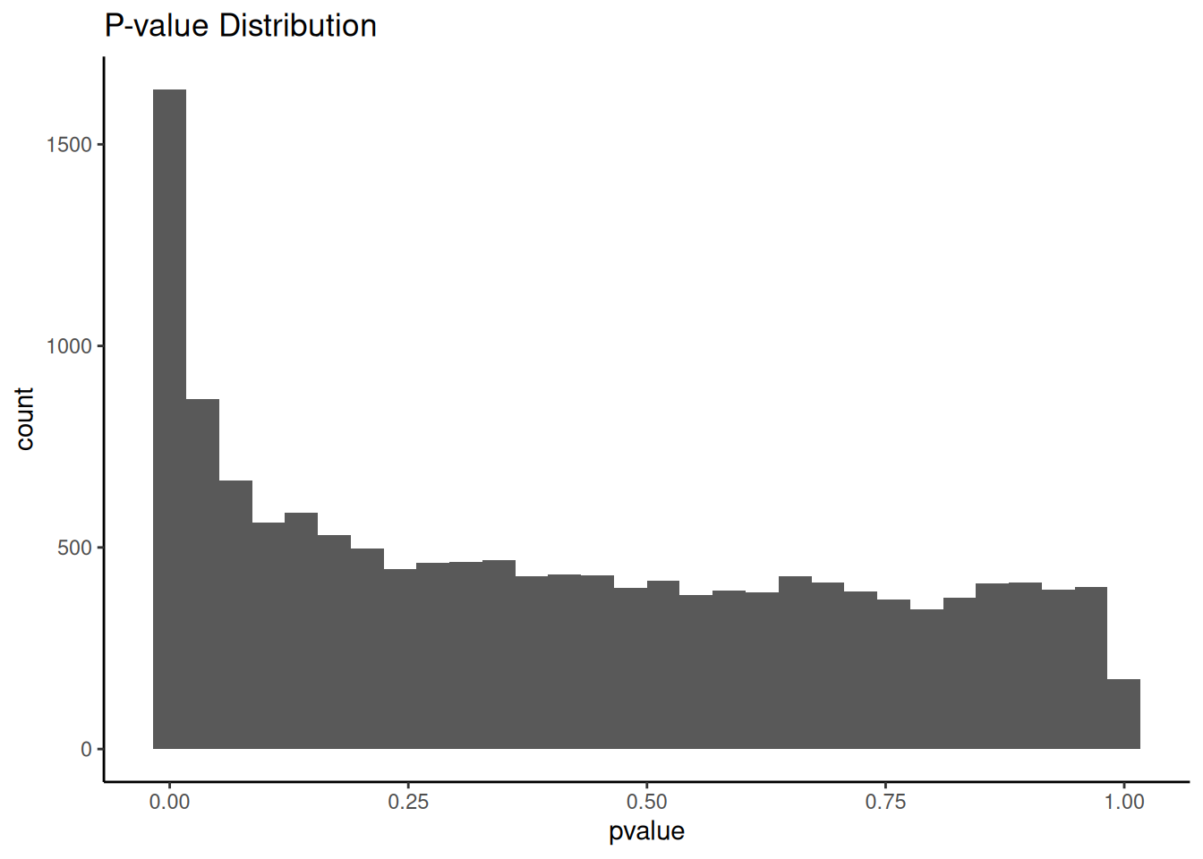
The distribution looks what is expected of an analysis like differential gene-expression.
Tip
If you are interested more in understanding the distribution of p-values, you can read about the possible different outcomes and their reasoning here.
3.1 MA plot.
The MA plot shows the distribution of mean expression vs log fold change for all genes.
t2_vs_t0 %>%
  ggplot(aes(x = baseMean, y = log2FoldChange)) +
  geom_point(color = "grey70") +
  geom_hline(yintercept = 0) +
  scale_x_log10("Mean of normalized counts") +
  ylab("log fold change") +
theme_bw(base_size = 14) 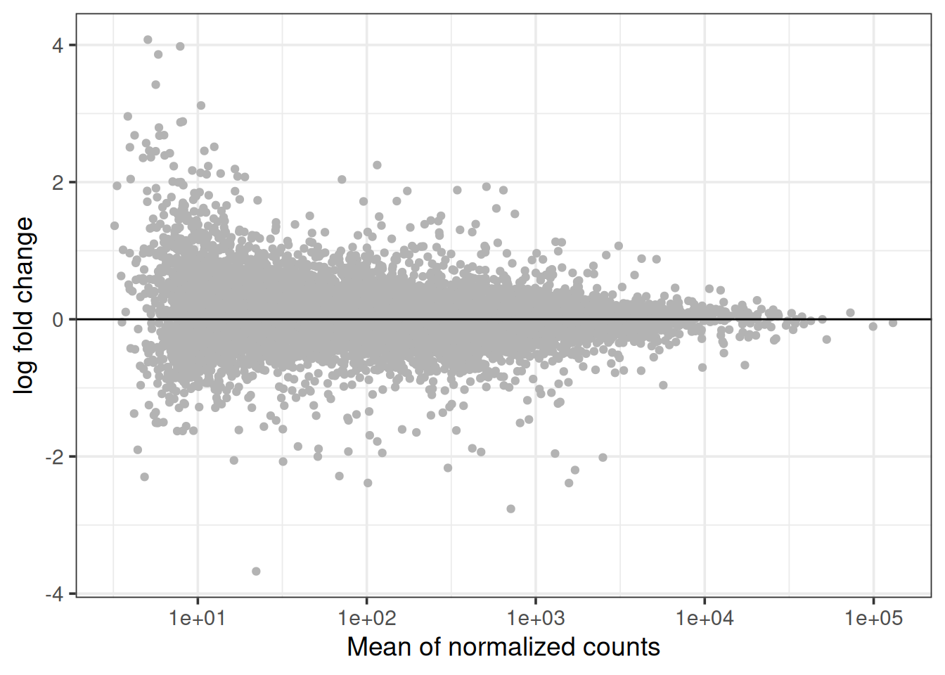
Try to think about each of the line of code that was used to generate the plot and what it’s function is. At the moment, the plot contains all genes that are colored the with same grey scale.
You can read more about MA plot and what it means here
3.2 Exercise II
Task 2.1
This plot would be even more informative when you color the significant genes differently. Would you be able to generate that plot?
Tip
You can filter the data that has adjusted p-value < 0.05 and plot the points with a different color.
3.3 Volcano plot
Similar to MA plot, Volcano plot indicates the relation between the adjusted p-values and the log fold change. The adjusted p-value is transformed with -log10 on the y-axis, so that the smallest p-values appears at the top of the plot. The log2FoldChange values are plotted as they are on the x-axis, so that the down-regulated genes are on the left of the x-axis (-ve values) and the up-regulated genes are on the right of the x-axis (+ve values).
t2_vs_t0 %>%
  ggplot(aes(x = log2FoldChange, y = -log10(padj))) +
  geom_point(color = "grey70") +
  geom_hline(yintercept = 1.3, linetype = 2) +
  geom_point(data=filter(t2_vs_t0, padj < 0.05), color = "red") +
  ylab("Adjusted P-values in -log10") +
theme_bw(base_size = 14) 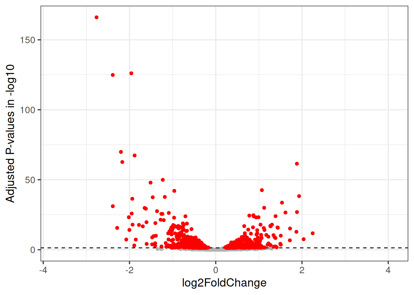
You can read more about Volcano plot and what it means here
3.4 Exercise II
Task 2.2
Try to code the plot below:
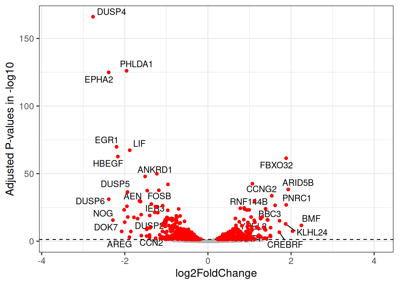
Note
You can find the gene name information in the file data/human_biomaRt_annotation.csv.
Tip
You can filter the data that has adjusted p-value < 0.05 and log2FoldChange > ±1.5 for the text part and use geom_text_repel().
4 Heatmap
4.1 pheatmap
4.1.1 Samples
For heatmap, let us look into pheatmap library which is not part of ggplot, but it is a well known package for building heatmaps. It contains a lot of internal aesthetics that you can add that are very informative and intuitive. Let us first start with making a correlation matrix and plot it.
vst_cor <- as.matrix(cor(gc_vst, method="spearman"))
library(pheatmap)

pheatmap(vst_cor,border_color=NA,annotation_col=md[,"Time",drop=F],
         annotation_row=md[,"Time",drop=F],annotation_legend=T)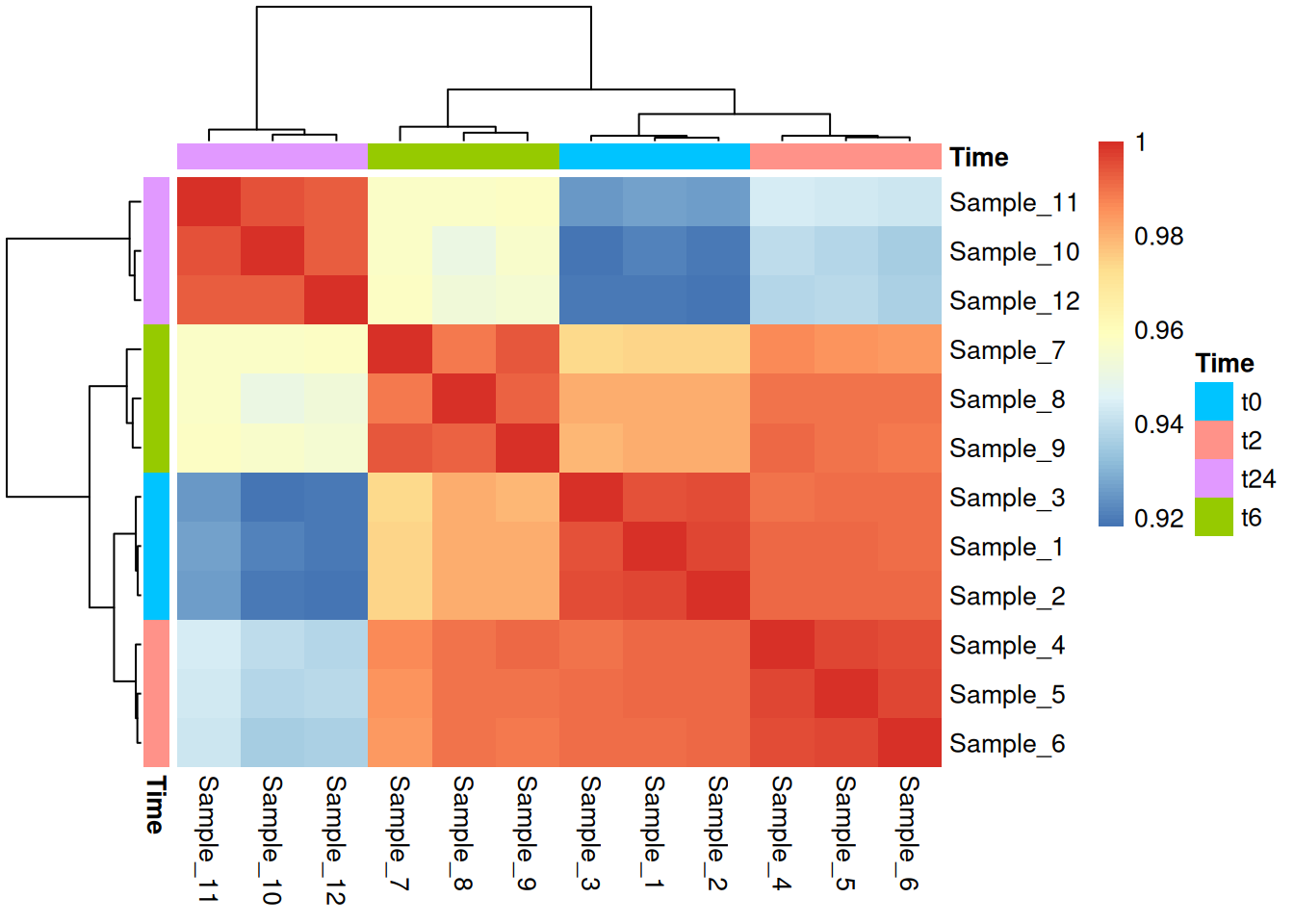
Note
If you get a gpar() error, this is due to the reason that the metadata table you provide here does not have the sample ids as rownames. pheatmap maps the meta-data to the count data using rownames
Now, this is based on a correlation matrix where you have a very simple square matrix with samples and their correlations to each to each other. Now let us look into how we can make a heatmap from an expression dataset.
4.1.2 Genes
For this we will use the dataset: Time_t24_vs_t0.txt here that basically has the list of genes that are differentially expressed in t24 vs t0 and we would like to visualize this in an heatmap. To be more precise, we take the top 200 genes (based on fold change) with adjusted p-value < 0.001. We use just these 200, for the sake of visualization. Let us take the t24 vs t0 here as these are most different based on our PCA.
t24_vs_t0 <- read.table("../../data/Time_t24_vs_t0.txt", sep = "\t", header = TRUE, row.names = 1)

diff_t24_vs_t0 <- t24_vs_t0 %>%
  rownames_to_column('gene') %>%
  filter(padj < 0.001) %>%
  arrange(desc(abs(log2FoldChange))) %>%
  head(200)

hmap_t24_t0 <- subset(gc_vst, rownames(gc_vst) %in% diff_t24_vs_t0$gene)

pheatmap(hmap_t24_t0, border_color=NA, annotation_col=md[,"Time",drop=F], annotation_row=NULL, annotation_legend=T)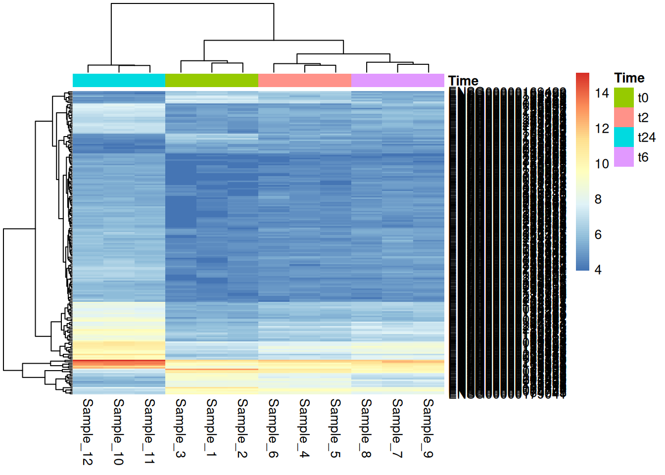
Further, we can also customize using the pheatmap and also use the continuos color options we talked about in the earlier sections.
library(wesanderson)
md$Time <- factor(md$Time, levels = c("t0","t2","t6","t24"))

pheatmap(hmap_t24_t0, color = wes_palette("Moonrise3", 100, type = "continuous"), border_color=NA, annotation_col=md[,"Time",drop=F], annotation_row=NULL, annotation_legend=T, show_rownames = FALSE, fontsize = 14)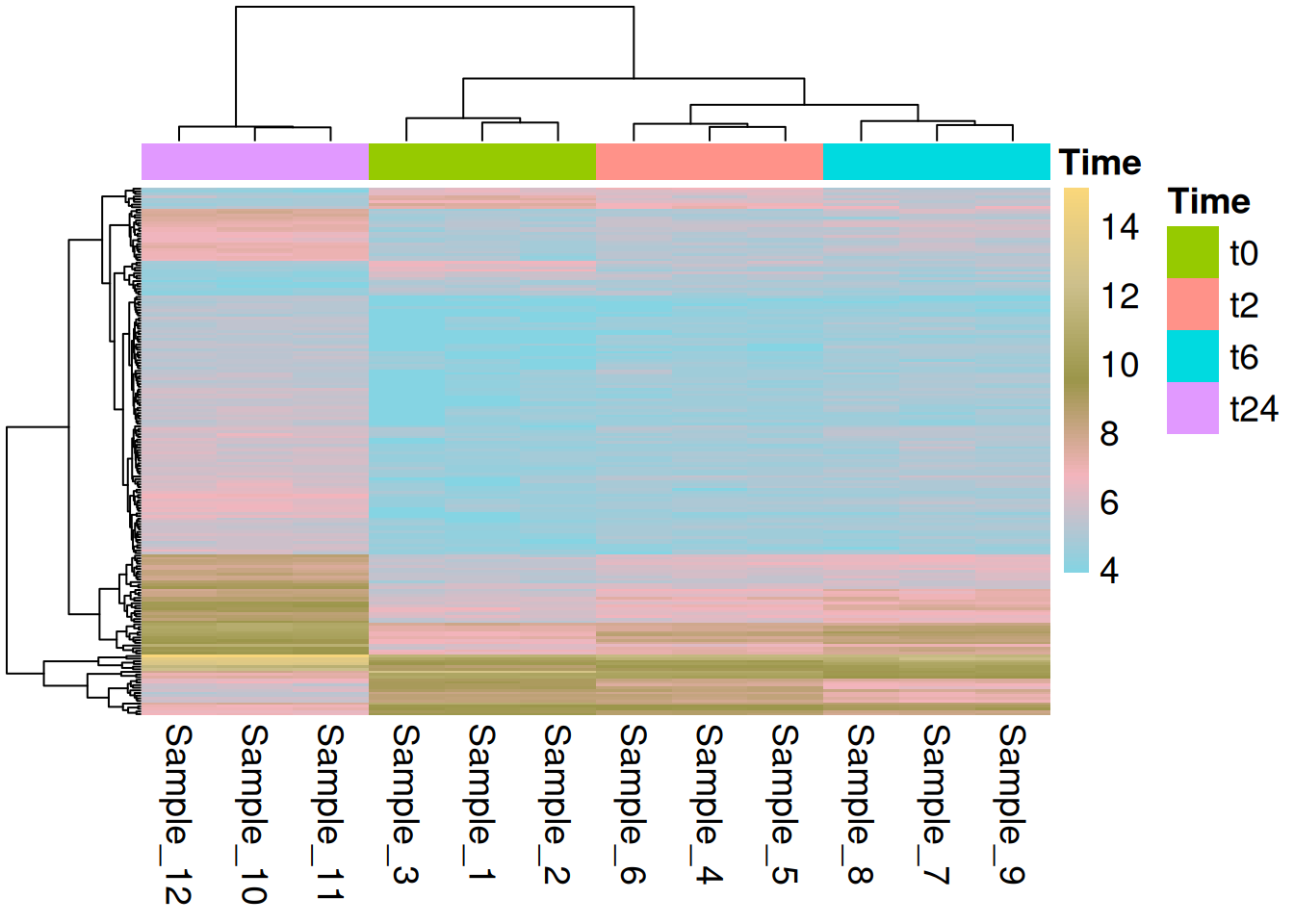
4.2 ggplot
We can use geom_tile() from ggplot to make heatmaps. The ggplot based heatmaps are, as we have seen for other cases, much more easier to customize.
hmap_t24_t0_long <- hmap_t24_t0 %>%
  rownames_to_column(var = "Gene") %>%
  gather(Sample_ID, VST, -Gene) %>%
  full_join(md, by = "Sample_ID")

hmap_t24_t0_long$Sample_Name <- factor(hmap_t24_t0_long$Sample_Name, levels =
                                        c("t0_A","t0_B","t0_C","t2_A","t2_B","t2_C","t6_A","t6_B","t6_C","t24_A","t24_B","t24_C"))
hmap_t24_t0_long$Time <- factor(hmap_t24_t0_long$Time, levels = c("t0","t2","t6","t24"))
hmap_t24_t0_long$Replicate <- factor(hmap_t24_t0_long$Replicate, levels = c("A","B","C"))
hmap_t24_t0_long$Gene <- factor(hmap_t24_t0_long$Gene, levels = row.names(hmap_t24_t0))

ggplot(hmap_t24_t0_long) +
  geom_tile(aes(x = Sample_Name, y = Gene, fill = VST)) +
  scale_fill_gradientn(colours = rainbow(5)) +
  scale_x_discrete(limits = c("t0_A","t0_B","t0_C","t24_A","t24_B","t24_C")) +
theme(axis.text.y = element_blank(), axis.ticks = element_blank()) 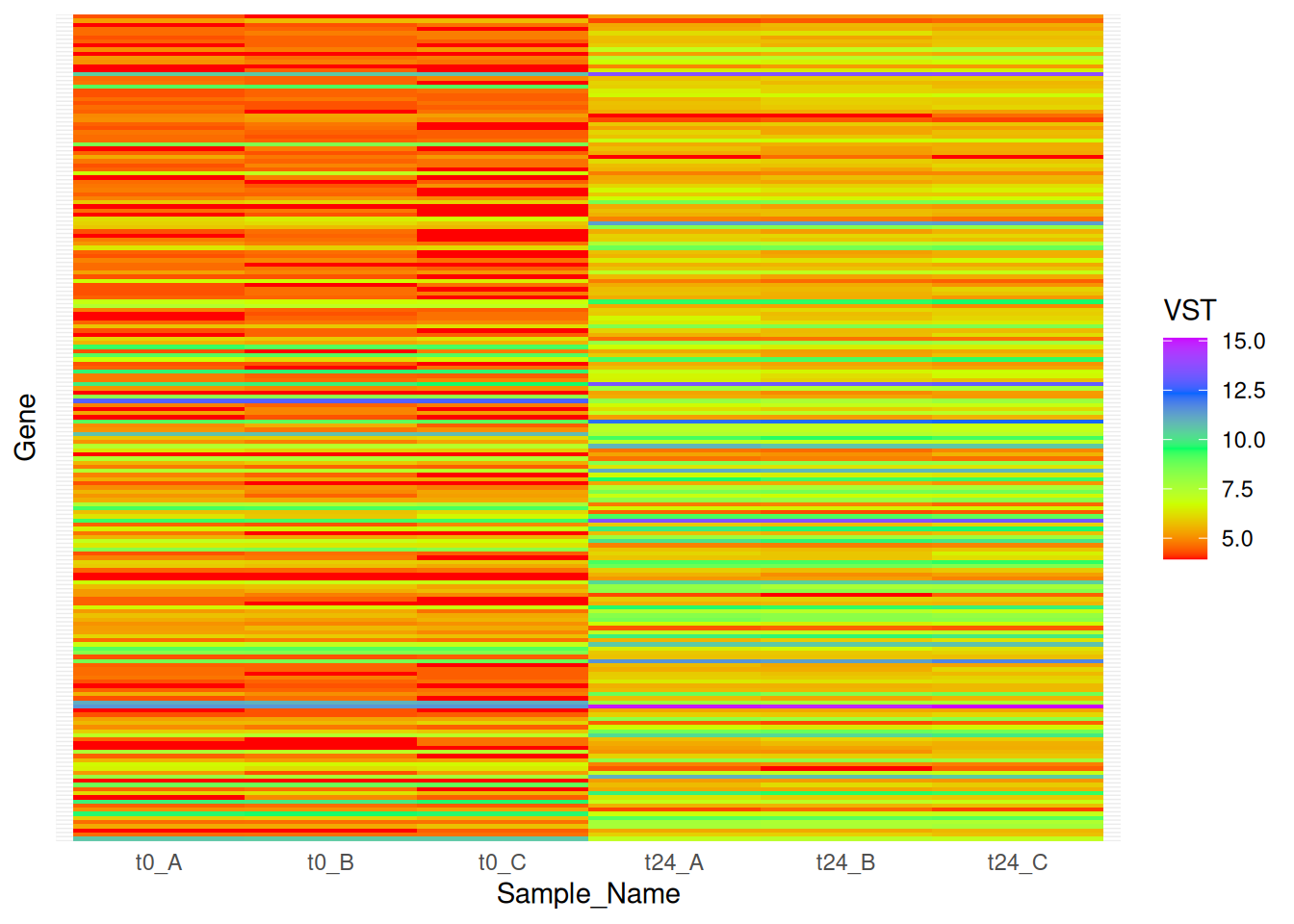
As you can see and compare that the heatmaps produced by pheatmap are way better than ggplot.