ggplot(data=iris,mapping=aes(x=Petal.Length,y=Petal.Width))+
  geom_point(aes(color=Sepal.Width))+
  geom_smooth(method="lm")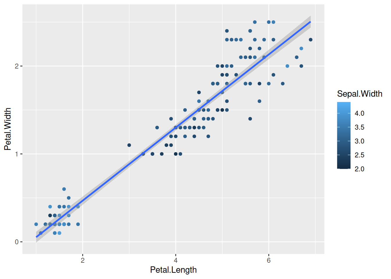
Now that we have covered the important aspects of ggplot, meaning getting the actual plot you wanted, let us now look into secondary elements of the plot.
If we look at the iris data plot that we made before:
ggplot(data=iris,mapping=aes(x=Petal.Length,y=Petal.Width))+
geom_point(aes(color=Sepal.Width))+
geom_smooth(method="lm")
The continuous x axis breaks are with 2,4,6 and so on. If we would like to have 1,2,3… We change this using scale_x_continuous() and breaks.
ggplot(data=iris,mapping=aes(x=Petal.Length,y=Petal.Width))+
  geom_point(aes(size=Sepal.Width, color=Species))+
  geom_smooth(method="lm") +
  scale_x_continuous(breaks = 1:7)
You can do the same with y-axis.
ggplot(data=iris,mapping=aes(x=Petal.Length,y=Petal.Width))+
  geom_point(aes(size=Sepal.Width, color=Species))+
  geom_smooth(method="lm") +
  scale_x_continuous(breaks = 1:7) +
  scale_y_continuous(breaks = seq(0,3,0.5))
By using limits, we can also decide on the parts to plot to be shown:
ggplot(data=iris,mapping=aes(x=Petal.Length,y=Petal.Width))+
  geom_point(aes(size=Sepal.Width, color=Species)) +
  geom_smooth(method="lm") +
  scale_x_continuous(limits=c(3, 7))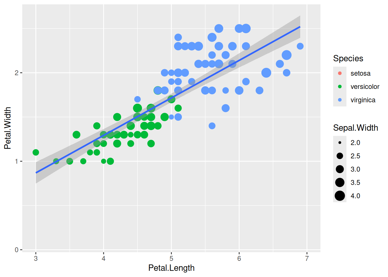
We can do the same with discrete x values like in the case of our gene counts dataset.
gc_long %>%
  group_by(Time, Replicate) %>%
  summarise(mean=mean(log10(count +1)),se=se(log10(count +1))) %>%
  ggplot(aes(x=Time, y=mean, fill = Replicate)) +
  geom_col() +
  scale_x_discrete(limits=c("t0","t24"))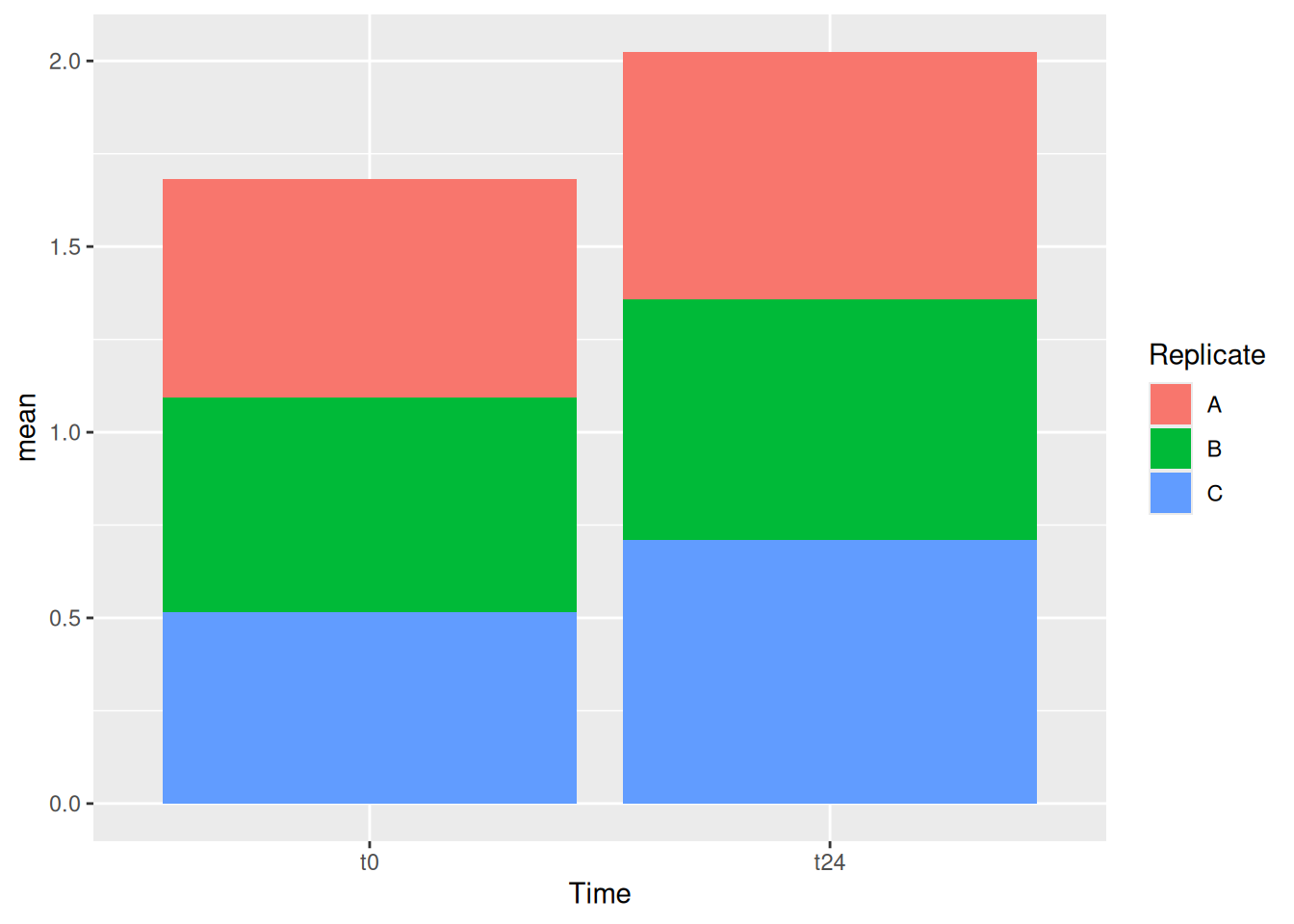
One can also use xlim() and ylim() functions that function the same as limits with scale_x_continous() or scale_x_discrete()
You can also customize the axis labels using the name option within scale_x_continous and scale_y_continous.
ggplot(data=iris,mapping=aes(x=Petal.Length,y=Petal.Width))+
  geom_point(aes(size=Sepal.Width, color=Species))+
  geom_smooth(method="lm") +
  scale_x_continuous(name = "Length", breaks = 1:7) +
  scale_y_continuous(name = "Width", breaks = seq(0,3,0.5))
with labels in combination with the scales package, one can change or make the unit of the axis look more comprehensible, when needed. Like using percentage option or scientific option.
library(scales)
ggplot(data=iris,mapping=aes(x=Petal.Length,y=Petal.Width))+
  geom_point(aes(size=Sepal.Width, color=Species))+
  geom_smooth(method="lm") +
  scale_y_continuous(name = "Width", breaks = seq(0,3,0.5), labels = scientific)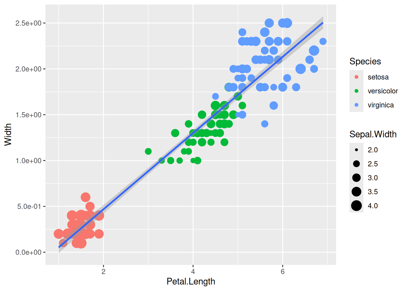
There are many ways to control the legends, below are some of the examples: First by using guides() function.
ggplot(data=iris,mapping=aes(x=Petal.Length,y=Petal.Width))+
  geom_point(aes(color=Species,size=Sepal.Width))+
  guides(size="none")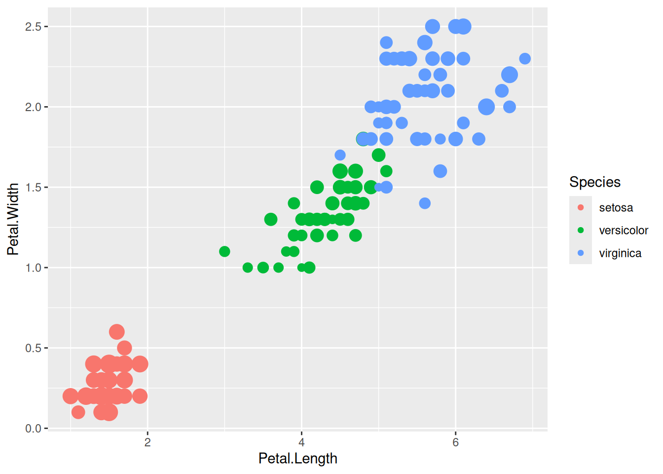
We can also turn off legends by geom.
ggplot(data=iris,mapping=aes(x=Petal.Length,y=Petal.Width))+
  geom_point(aes(color=Species,size=Sepal.Width),show.legend=FALSE)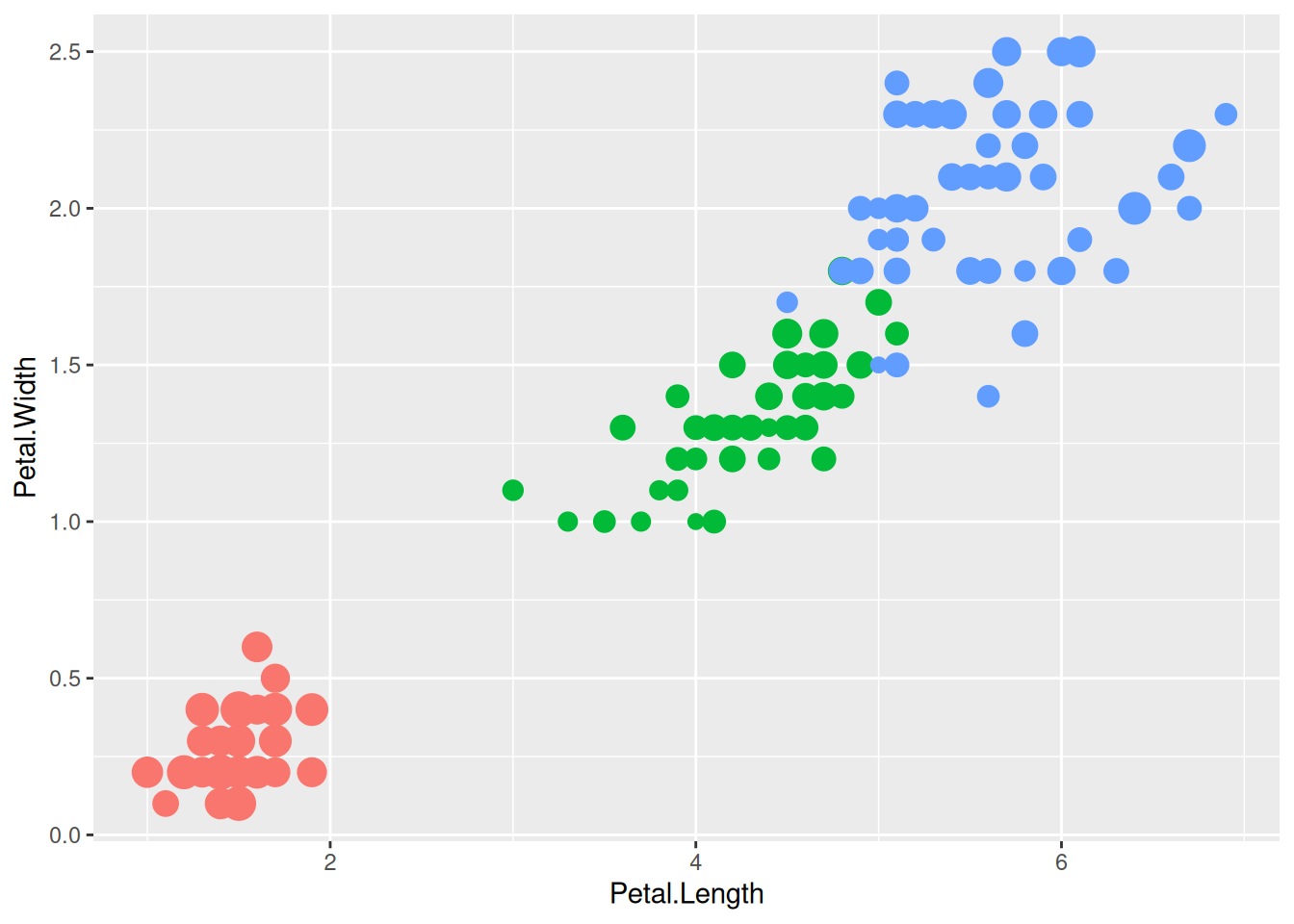
The legends can be edited by scale_<aesthetic>_<discrete or continous> function that we have been using. Take the below figure for example, we have the Sepal.Width and the Species with the size and color aesthetics respectively.
ggplot(data=iris,mapping=aes(x=Petal.Length,y=Petal.Width))+
  geom_point(aes(size=Sepal.Width, color=Species))+
  geom_smooth(method="lm")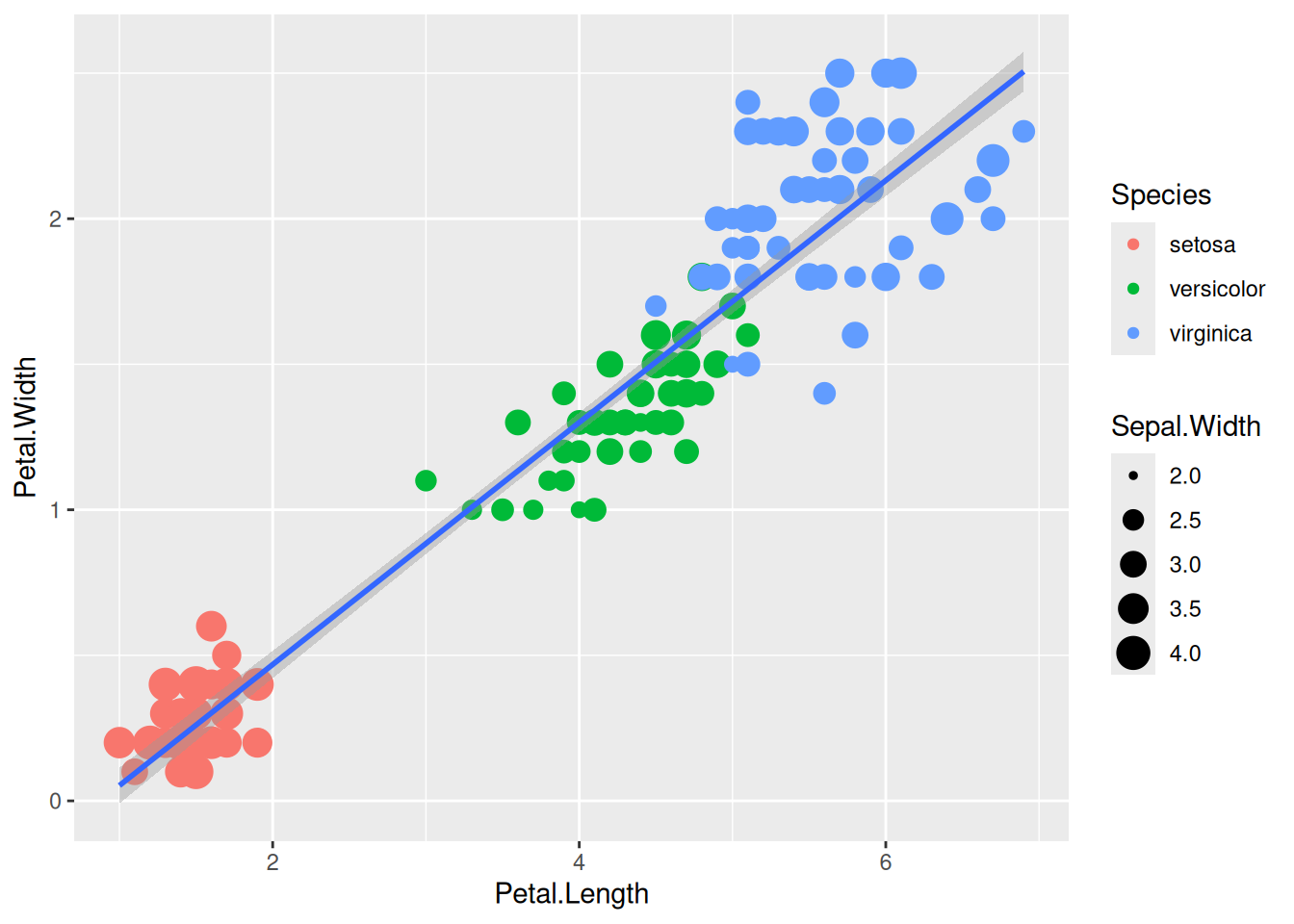
Let’s try to edit the legends here like mentioned before:
ggplot(data=iris,mapping=aes(x=Petal.Length,y=Petal.Width))+
  geom_point(aes(size=Sepal.Width, color=Species))+
  geom_smooth(method="lm") +
  scale_size_continuous(name = "Width of Sepal") +
  scale_color_discrete(name = "Organism", labels = c("Iris setosa", "Iris versicolor", "Iris virginica"))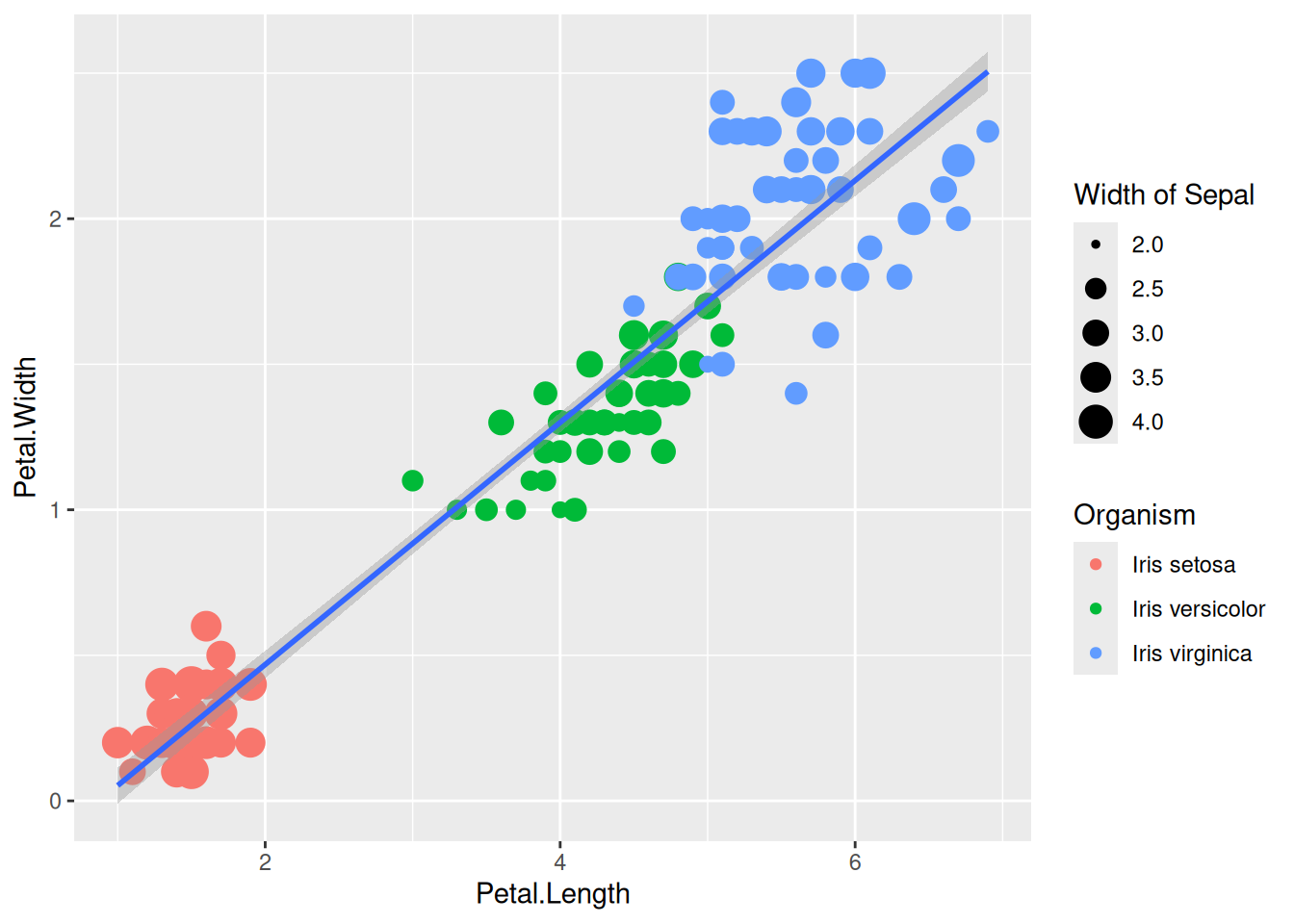
Legends can be moved around using theme.
ggplot(data=iris,mapping=aes(x=Petal.Length,y=Petal.Width))+
  geom_point(aes(color=Species,size=Sepal.Width)) +
  theme(legend.position="top",
        legend.justification="right")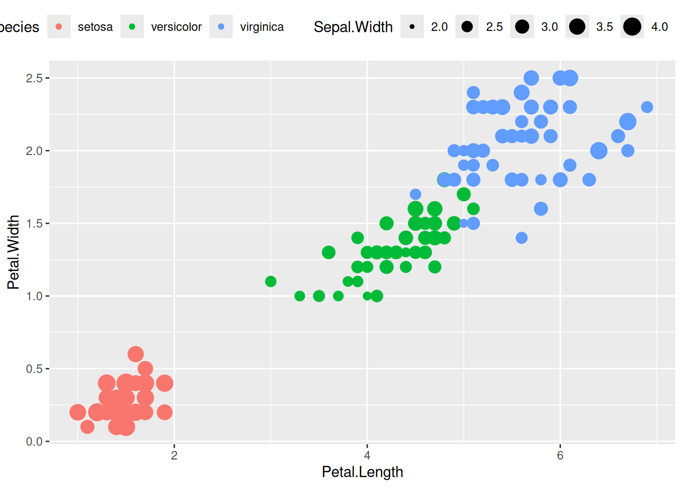
Legend rows can be controlled in a finer manner.
ggplot(data=iris,mapping=aes(x=Petal.Length,y=Petal.Width))+
  geom_point(aes(color=Species,size=Sepal.Width))+
  guides(size=guide_legend(nrow=2,byrow=TRUE),
         color=guide_legend(nrow=3,byrow=T))+
  theme(legend.position="top",
        legend.justification="right")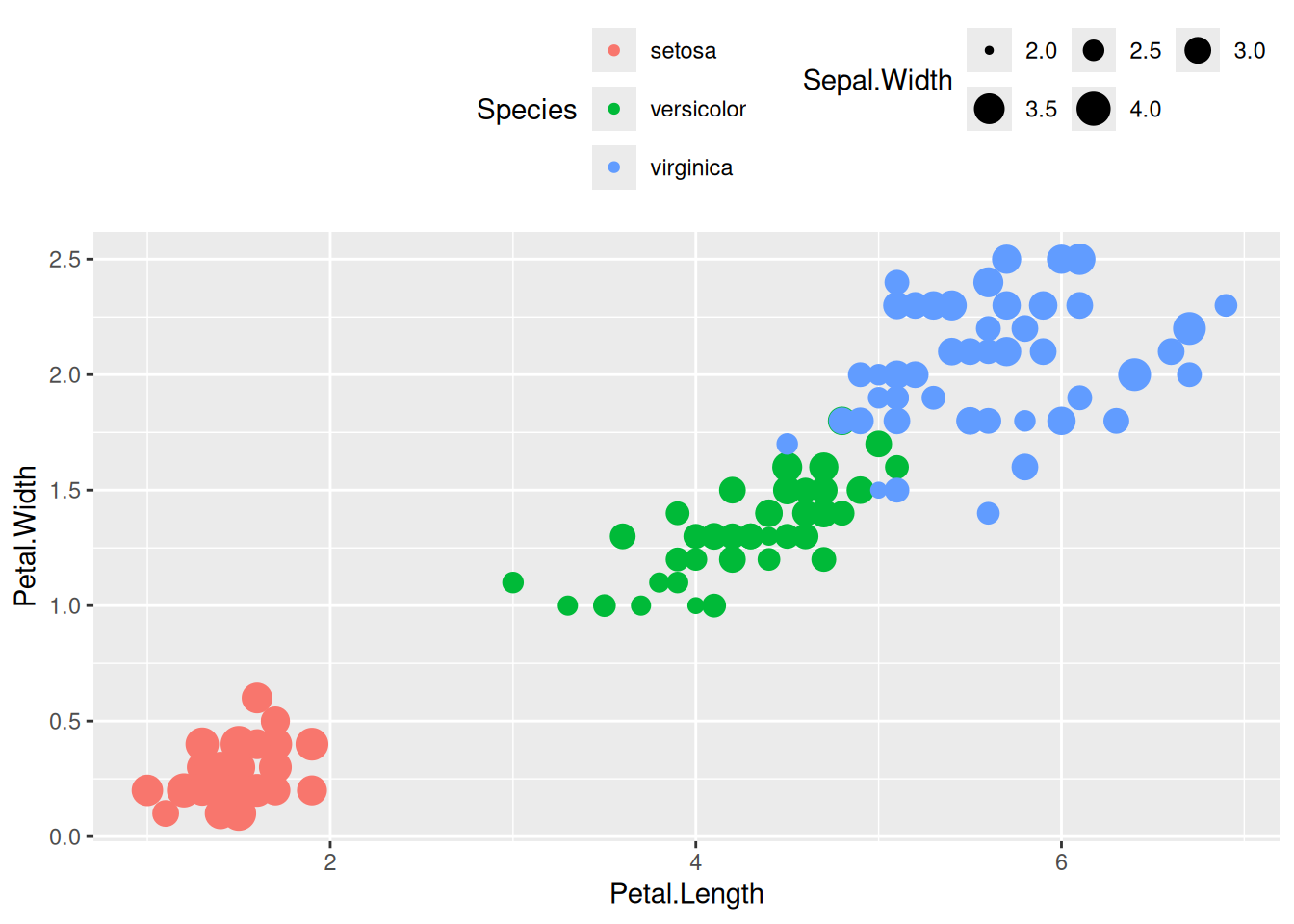
Now that we started into theme(), it is possible to much more editing of the plot with this function. Let us look into some of the parameters that would be very helpful to work with.
You can change the style of the axis texts in the following way:
ggplot(data=iris,mapping=aes(x=Petal.Length,y=Petal.Width)) +
  geom_point(aes(color=Species,size=Sepal.Width)) +
  scale_x_continuous(name = "Length", breaks = 1:7) +
  scale_y_continuous(name = "Width", breaks = seq(0,3,0.5)) +
  theme(axis.text.x = element_text(face="bold", color="#993333", size=14, angle=45),
        axis.text.y = element_text(face="bold", color="#993333", size=14, angle=45))
It is also possible hide the ticks.
ggplot(data=iris,mapping=aes(x=Petal.Length,y=Petal.Width)) +
  geom_point(aes(color=Species,size=Sepal.Width)) +
  scale_x_continuous(name = "Length", breaks = 1:7) +
  scale_y_continuous(name = "Width", breaks = seq(0,3,0.5)) +
  theme(axis.text.x = element_text(face="bold", color="#993333", size=14, angle=45),
        axis.text.y = element_text(face="bold", color="#993333", size=14, angle=45),
        axis.ticks = element_blank())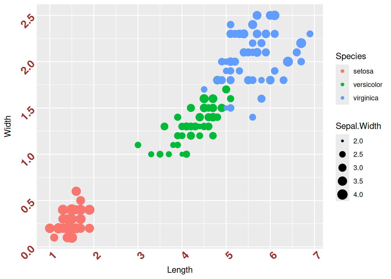
There are many things one can use to style the axis and/or axis labels. Just use ?theme() to look for all the different one can use to stylize the plots.
Let’s consider the plot below and save it as an object P for the sake of simplicity.
P <- gc_long %>%
  group_by(Time, Replicate) %>%
  summarise(mean=mean(log10(count +1)),se=se(log10(count +1))) %>%
  ggplot(aes(x= Time, y= mean, fill = Replicate)) +
  geom_col(position = position_dodge2()) +
  geom_errorbar(aes(ymin=mean-se, ymax=mean+se), position = position_dodge2(.9, padding = .6)) +
  theme(axis.ticks = element_blank())
P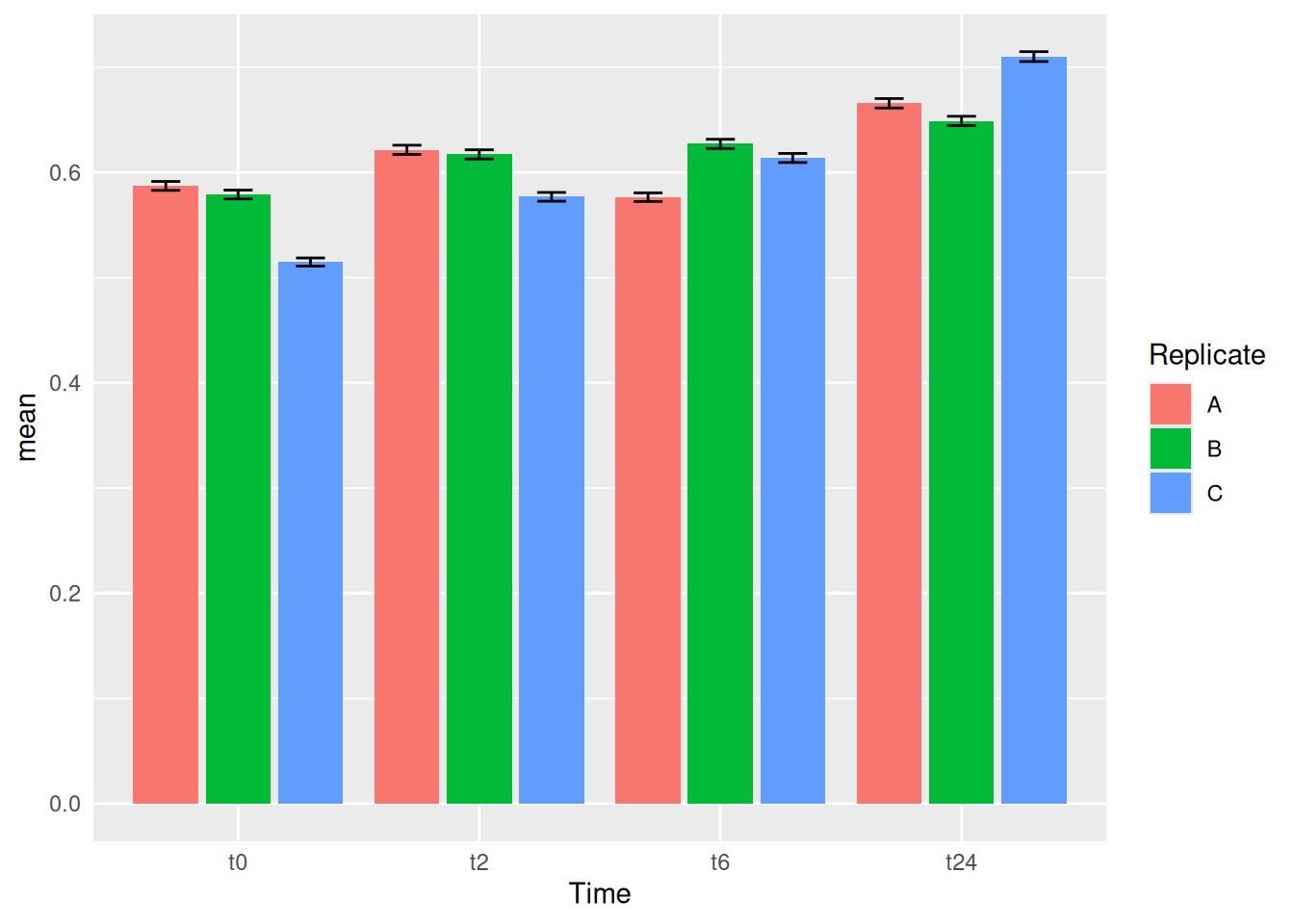
theme_light(), theme_minimal(), theme_classic() and theme_bw() are a couple of themes that are used very often in publications.
P + theme_bw(base_size = 16)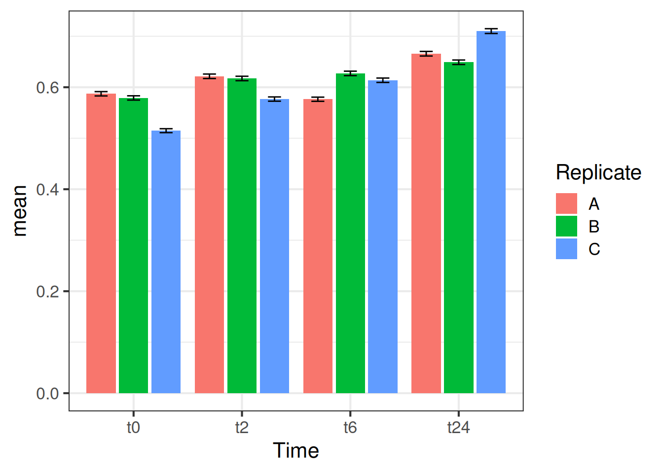
P + theme_minimal(base_size = 16)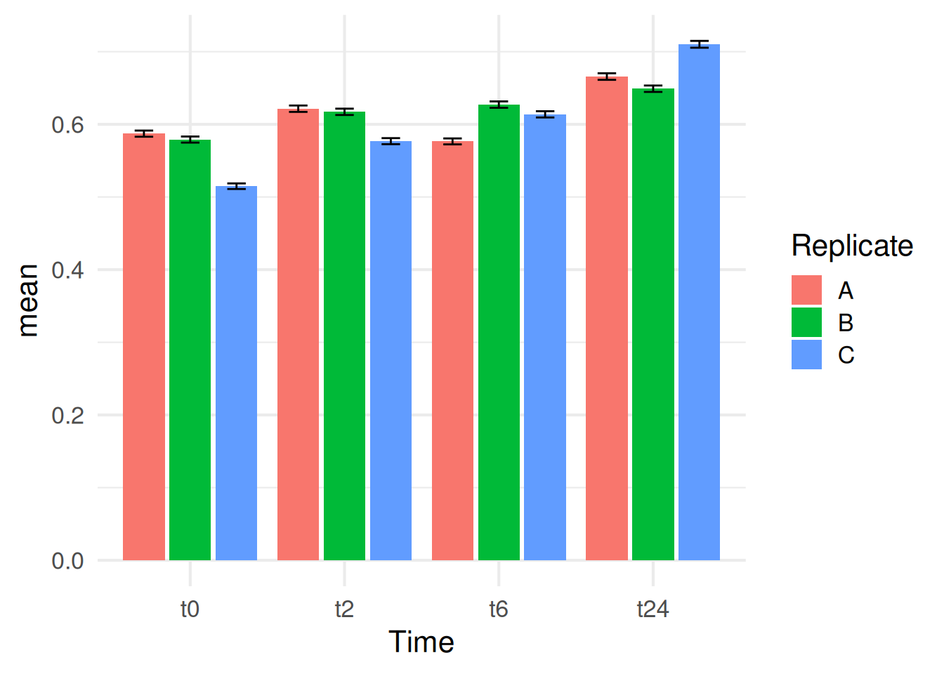
Let’s look into some of the fancier themes that comes in this package
Q <- ggplot(data = gc_long, mapping = aes(x = Sample_Name, y = log10(count + 1), fill = Time)) + geom_boxplot()
Q 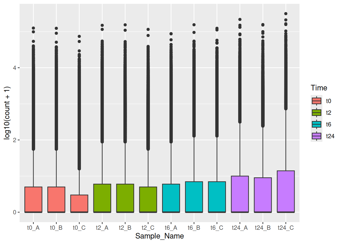
Using the theme_tufte()
library(ggthemes)
Q + theme_tufte()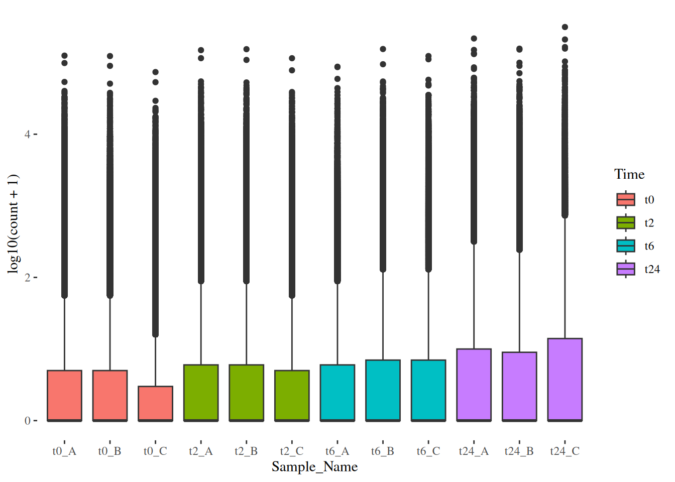
Q + theme_economist() +
  scale_fill_economist()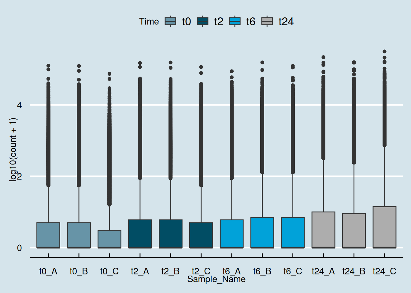
Q + theme_stata() +
  scale_fill_stata()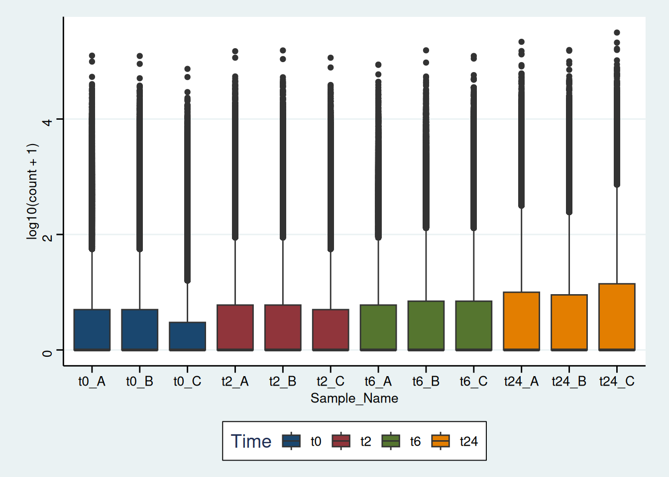
Try to replicate the plot below if you have enough time.
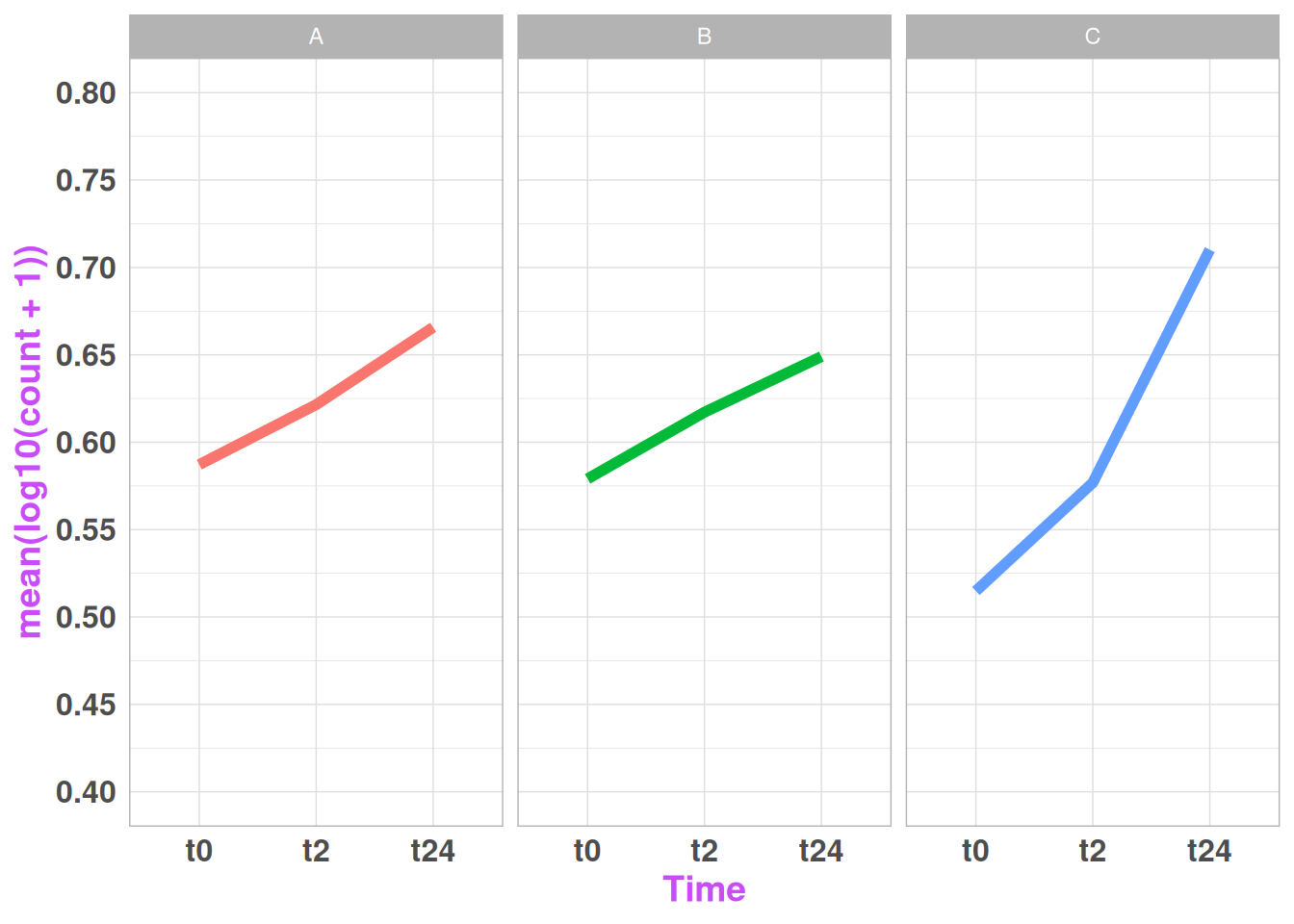
geom_line() is a bit tricky when you use it together with groups. It tries to draw lines within the group. In this case, if you would like to draw lines between the groups (like in the above plot, between t0 through t2 to t24), you initiate the ggplot with aesthetics for the line and add geom_line(aes(group=1)) this way.
This figure has theme_light()
we will now focus on making “publication-type” figures, with sub-plots and such using different tools in R. There are many different ways/packages to do this, but we will mainly focus on 2 packages: cowplot and ggpubr.
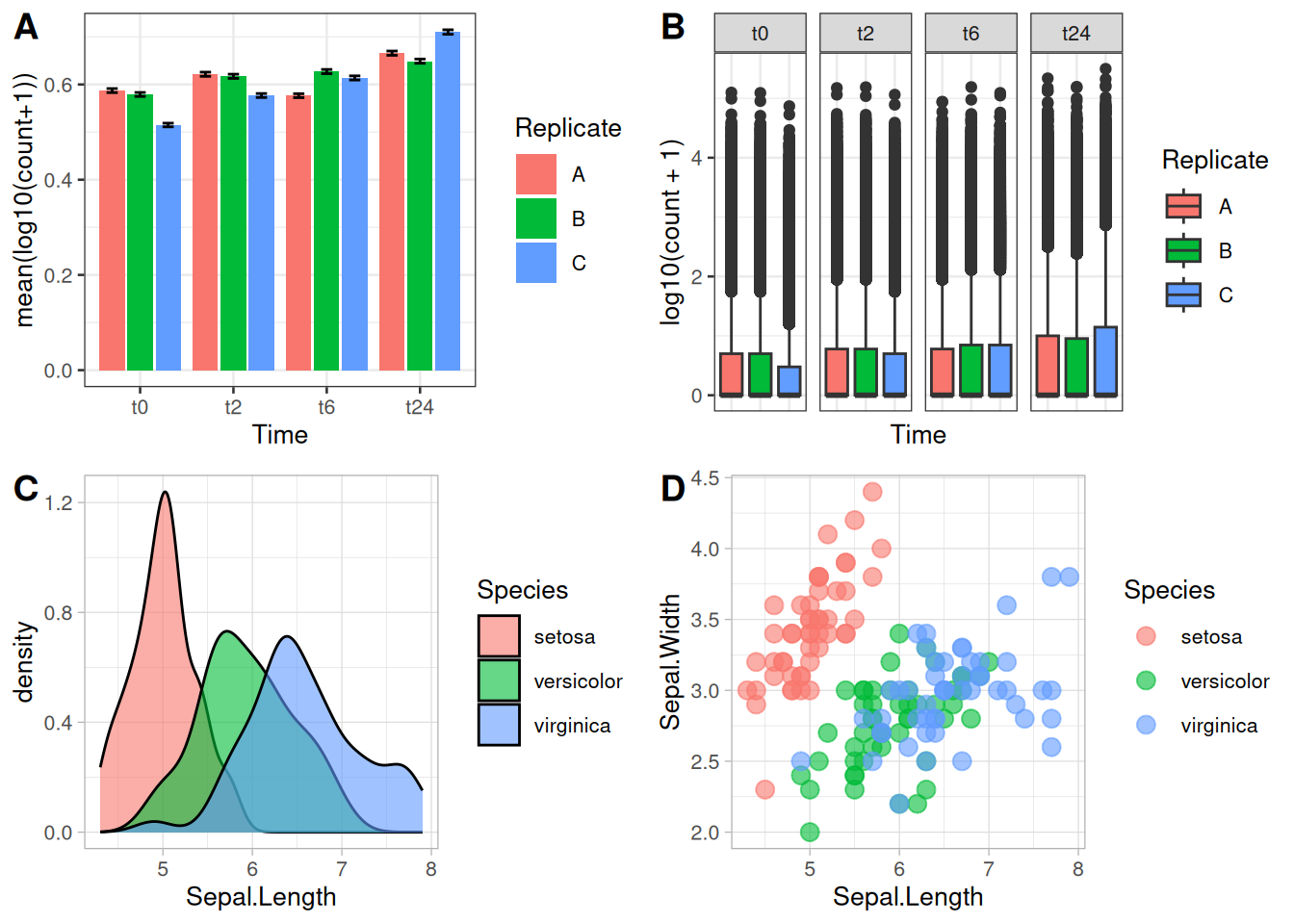
Now let us consider some of the plots we have made so far in the previous exercises. From the picture below, A and B are the figures that was made from the gene counts dataset and the figures C and D are using the Sepal.Length and Sepal.Width from the iris data. Now let us look into how we can combine each of the figures like it is shown here.
Now, let us go step by step. First let us make these plots into R objects. This will make things a lot easier.
p1 <- gc_long %>%
group_by(Time, Replicate) %>%
summarise(mean=mean(log10(count +1)),se=se(log10(count +1))) %>%
ggplot(aes(x= Time, y= mean, fill = Replicate)) +
geom_col(position = position_dodge2()) +
geom_errorbar(aes(ymin=mean-se, ymax=mean+se), position = position_dodge2(.9, padding = .6)) +
ylab("mean(log10(count+1))") +
theme(axis.ticks = element_blank()) +
theme_bw(base_size = 10)
p2 <- ggplot(data = gc_long) +
geom_boxplot(mapping = aes(x = Sample_Name, y = log10(count + 1), fill = Replicate)) +
facet_grid(~Time , scales = "free", space = "free") +
xlab("Time") +
theme_bw(base_size = 10) +
theme(axis.ticks.x = element_blank(), axis.text.x = element_blank())
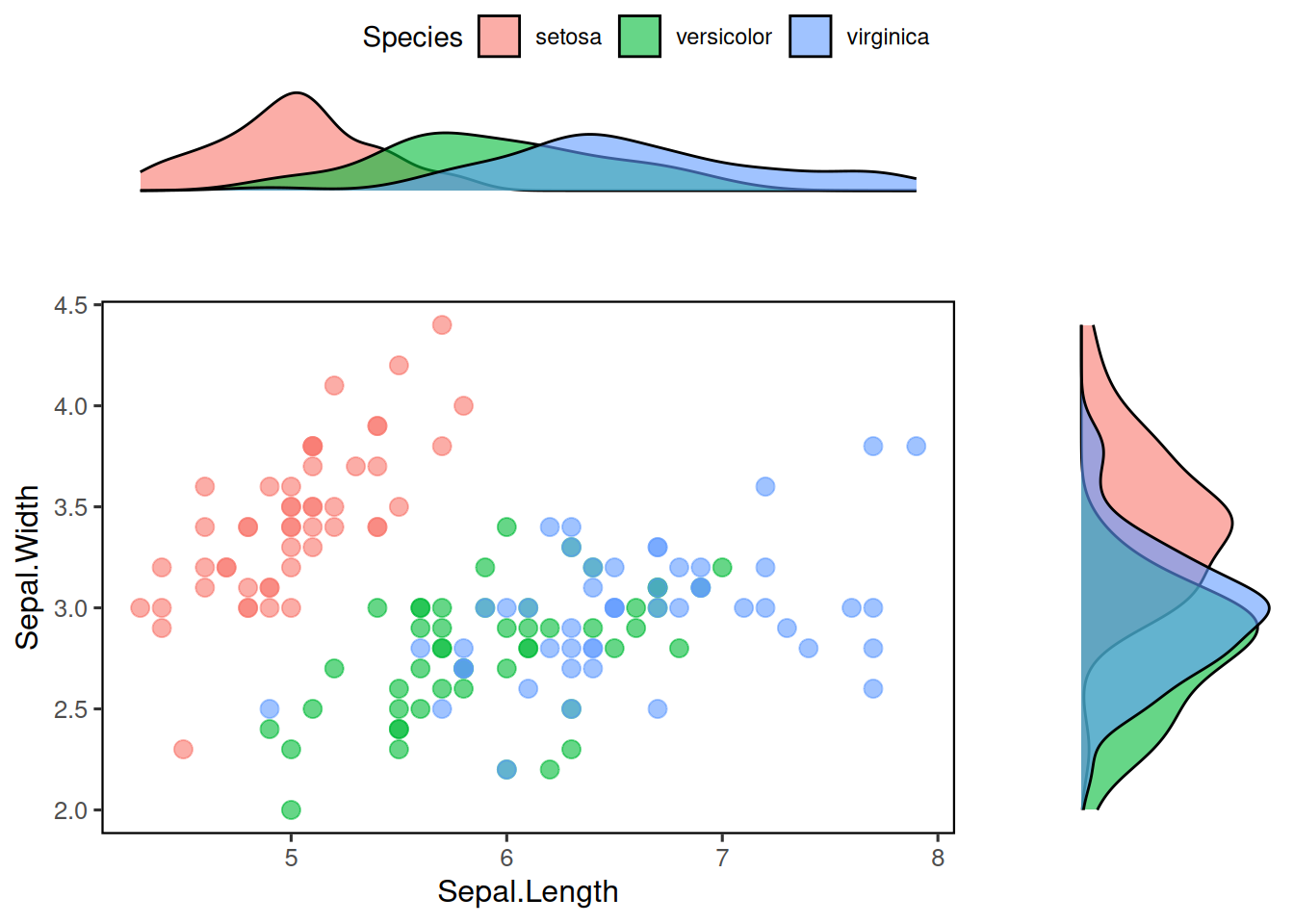
p3 <- ggplot(data=iris,mapping=aes(x=Sepal.Length))+
geom_density(aes(fill = Species), alpha = 0.6) +
theme_light(base_size = 10)
p4 <- ggplot(data=iris,mapping=aes(x=Sepal.Length, y = Sepal.Width, color = Species)) +
geom_point(size = 3, alpha = 0.6) +
theme_light(base_size = 10)The objects p1, p2, p3 and p4 as intuitively represent the plots A, B, C and D respectively.
One can use the simple plot_grid() function from the cowplot.
library(cowplot)
plot_grid(p1, p2)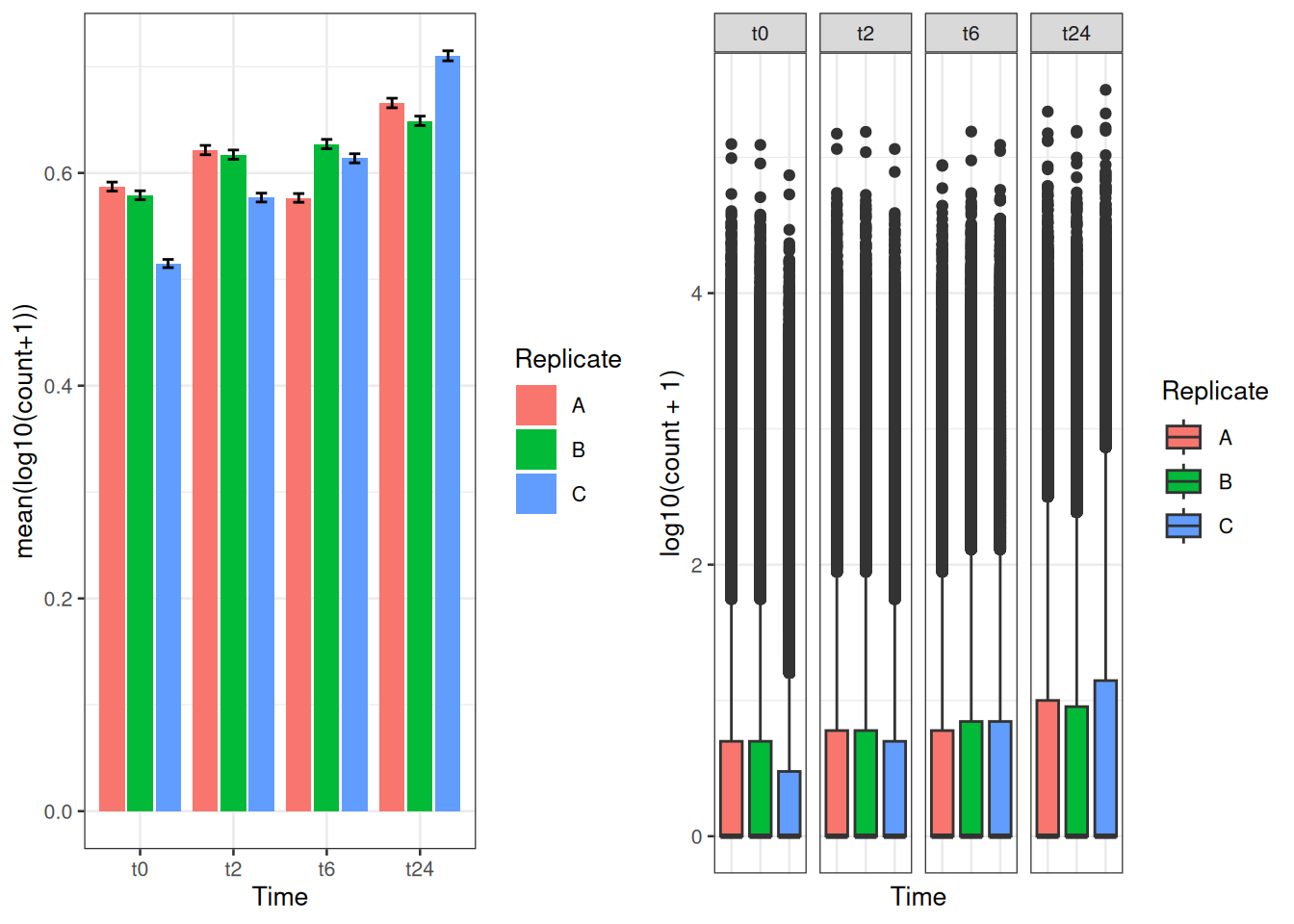
You can also do some simple customizations using nrow or ncol to specify the number of rows and columns and provide labels to those plots as well.
plot_grid(p1, p2, nrow = 2, labels = c("A", "B"))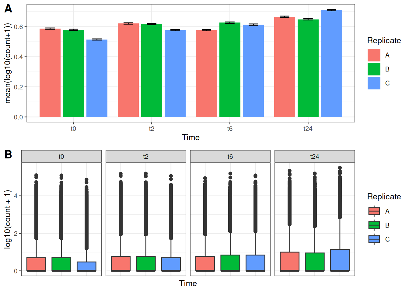
In cowplot, you can also customize the dimensions of the plots in a much more controlled fashion. For this one starts with ggdraw() which initiates the drawing “canvas” followed by draw_plot() that you use to draw the different plots on to the canvas.
Here is how the dimensions of the empty canvas looks like: 
From here, you can draw your plots in the way you want using these dimensions. AN example is shown below, where we plot C and D similar to the plot above:
ggdraw() +
  draw_plot(p3, x = 0, y = 0, width = 1, height = .5) +
draw_plot(p4, x = 0, y = .5, width = 1, height = .5) 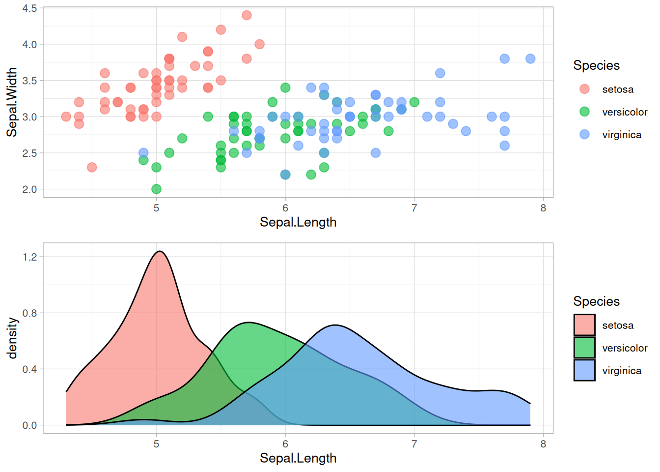
You can also add “labels” to these figures using draw_plot_label() with the same dimensions.
ggdraw() +
  draw_plot(p3, x = 0, y = 0.5, width = 1, height = .5) +
  draw_plot(p4, x = 0, y = 0, width = 1, height = .5) +
  draw_plot_label(label = c("A", "B"), size = 15, x = c(0,0), y = c(1, 0.5))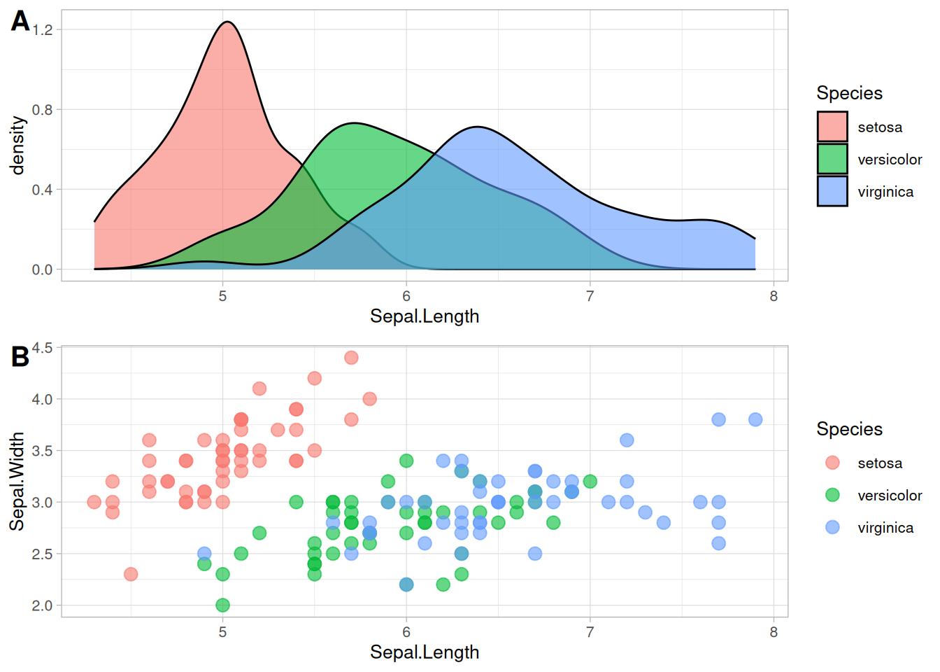
It is easier to draw three (or any odd number) plots in a neat way using this function compared to plot_grid()
ggdraw() +
  draw_plot(p3, x = 0, y = 0.5, width = 0.5, height = 0.5) +
  draw_plot(p4, x = 0.5, y = 0.5, width = 0.5, height = 0.5) +
  draw_plot(p2, x = 0, y = 0, width = 1, height = 0.5) +
  draw_plot_label(label = c("A", "B", "C"), size = 15, x = c(0,0.5,0), y = c(1, 1,0.5))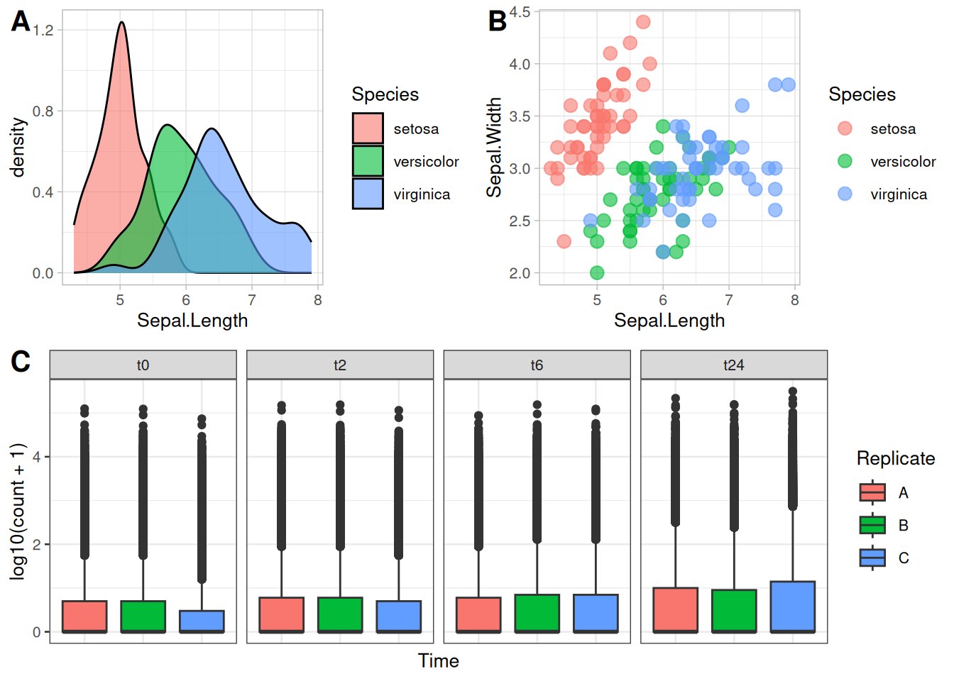
The package ggpubr comes with quite a few functions that can be very useful to make comprehensive figures. To start with the simple function, let’s start with ggarrange() that is used to put plots together.
library(ggpubr)
ggarrange(p3, p4, labels = c("A", "B"), nrow = 2)
One of the nicer things with ggarrange() is that you can automatically have common legends that are shared between the figures.
ggarrange(p3, p4, labels = c("A", "B"), nrow = 2, common.legend = TRUE, legend = "right")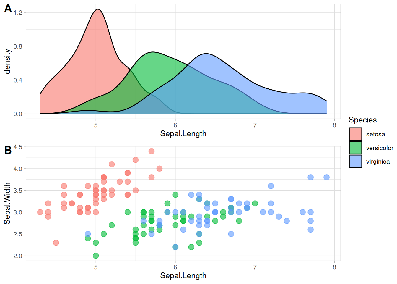
You can include tables and even normal texts to any figure using ggtexttable() and ggparagraph(). Let us look into adding a table that we saw in the previous exercise with the gene counts dataset.
gc_table <- gc_long %>%
  group_by(Time) %>%
  summarise(mean=mean(log10(count +1)),se=se(log10(count +1)))

tab1 <- ggtexttable(gc_table, rows = NULL,
                        theme = ttheme("mOrange"))
gc_text <- paste("In the experiment, RNA was extracted at four time points:",
                 "before the gefinitib treatment (t=0), and two, six and twenty-four hours",
                 "after treatment (t=2, t=6, t=24, respectively).", sep = " ")

tex1 <- ggparagraph(text = gc_text, face = "italic", size = 11, color = "black")Here, for the text part, paste() has been used just to make it a bit easier to show here in the code. It could be used without the paste() command as well.
ggarrange(ggarrange(p1, p2, nrow = 2, labels = c("A", "B"), common.legend = TRUE, legend = "top"),
          ggarrange(tab1, tex1, nrow = 2),
          ncol = 2,
          widths = c(2, 1))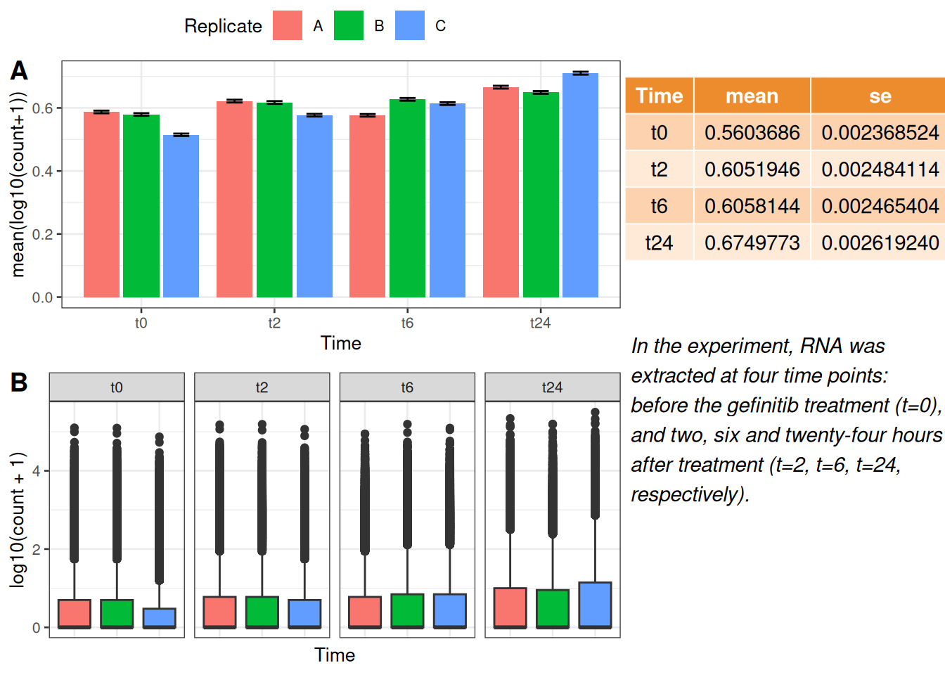
With ggarrange() it is also possible to make multiple-page plots. If you are for example making a report of many different figures this can come quite handy. Then you can use ggexport() to export these figures in a multi-page pdf.
multi.page <- ggarrange(p1, p2, p3, p4,
                        nrow = 1, ncol = 1)
ggexport(multi.page, filename = "multi.page.ggplot2.pdf")
Note From this multi.page R object (which is of class list) , you can get the indivdual plots by multi.page[[1]], multi.page[[2]] and so on.
Let us you have a microscopic image in jpeg or png that you want to add to a normal ggplot plot that you have made from the data.
Let’s take for example the RBC cluster from a SEM that is in data/Blood_Cells_Image.jpeg:

Let us take the following plot that you want to add the image to:
x <- 1:10
y <- x*abs(rnorm(10))
p1 <- ggplot(data.frame(x,y), mapping=aes(x=x,y=y)) + geom_point() + geom_smooth() + ggtitle("The Title") + theme(title=element_text(size=14, hjust=0.5), axis.title=element_text(size=10), axis.text = element_text(size=6))
p1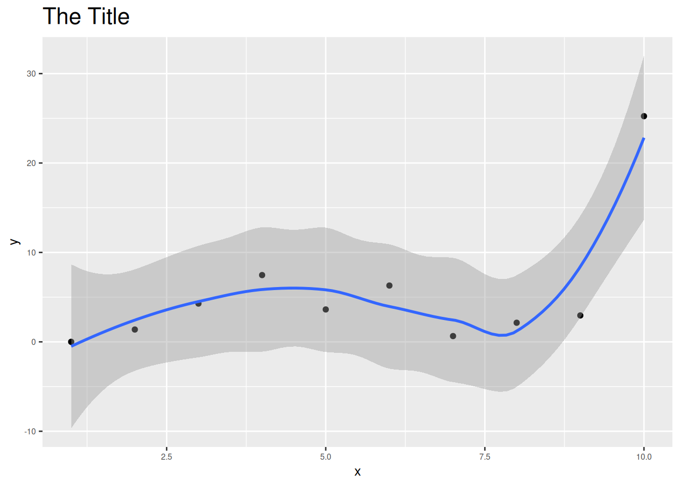
For this first you need to convert the image into a grid object (grob). For this we need a couple of packages grid and jpeg to be able to convert the image into a grid object! We will use the functions readJPEG and rasterGrob from these packages.
library(grid)
library(jpeg)
cells_jpg=readJPEG("../../data/Blood_Cells_Image.jpeg")
p2 <- rasterGrob(cells_jpg)
Now, we can use the grid.arrange() function to plot the grob objects and the ggplot objects.
library(gridExtra)
grid.arrange(p1,p2,nrow=1)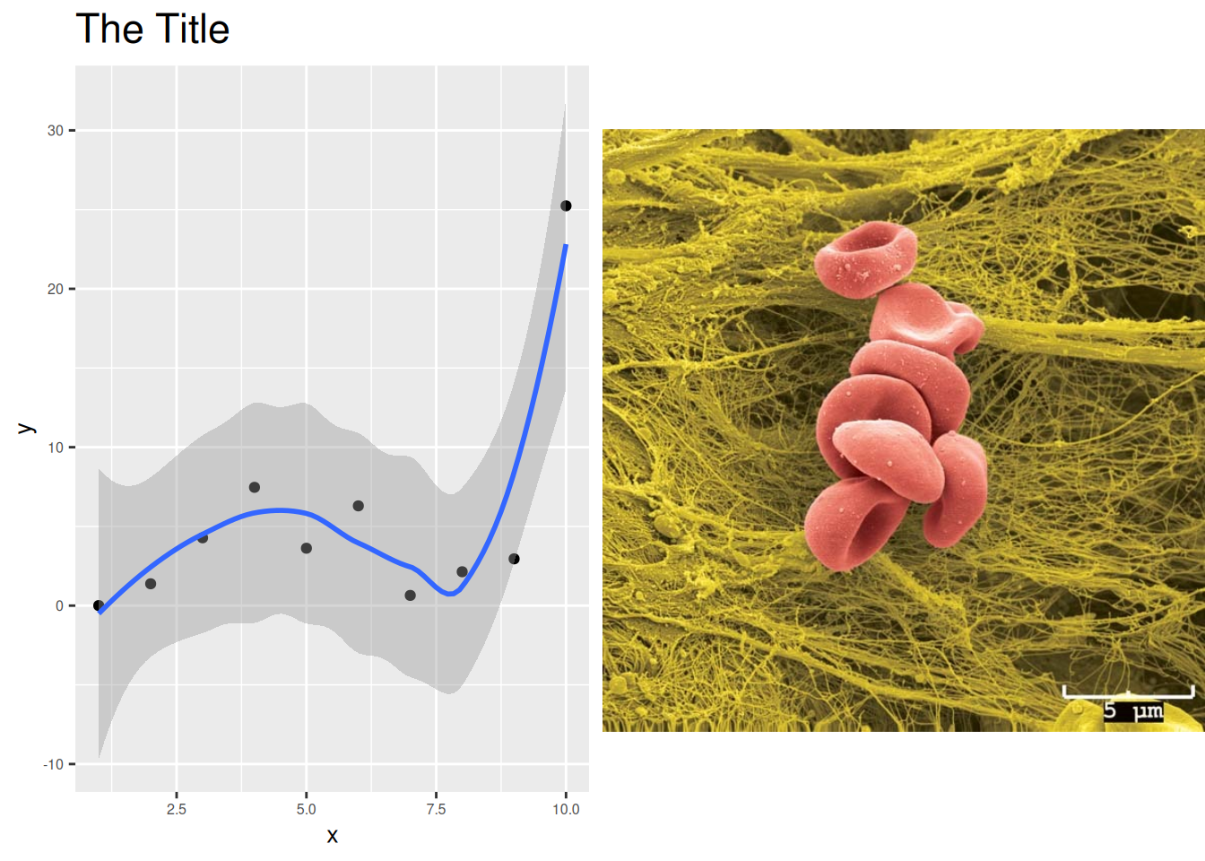
We can also use the annotation_custom to place the image in a particular position of the plot!
p3 <- p1 + annotation_custom(rasterGrob(cells_jpg, width = 0.2),
                    ymin = 10)
p3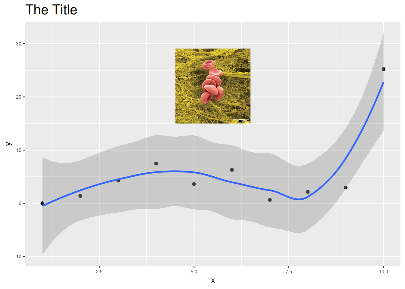
For the exercise in this session, let us look into way of using the tools available for combining plots to make one plot that could be very comprehensive. Try to code the figure below:
Within ggarrange(), it is possible to adjust the dimension of each plot with widths and heights options.
You can plot an empty plot with NULL.