df <- read.table("../../data/counts_raw.txt")We will use R in this course for generating plots from different biological data that are of higher quality and standard for publications. To do this, you will brush-up your memory on some important aspects of R that are important for this course below:
Download course files
Before starting with the lab sessions of the entire course, you must have downloaded all the necessary files from here and make sure that the directory tree looks similar to the one displayed in that page
In that case, you can proceed with the exercise now and remember to have fun 😊
Note
Throughout all the materials in the course the files are read in R with location like in the example below:
This is due to how the GitHub repo for this course is designed to be able to render these webpages. For you, depending on where your current working location on the R terminal is, you might have to change the relative location of the data directory accordingly. For example, if data directory is present when you run dir() in the R terminal, you can just read-in the files to R like following:
df <- read.table("data/counts_raw.txt")Otherwise, you can set the current working directory to the place where you will have all the course-related materials in your computer. You only have to do this once per R session. An example is shown below how this looks in my computer:
setwd('/home/lokesh/workshop_on_advanced_data_visualization/')
df <- read.table("data/counts_raw.txt")
1 Data formats
In terms of the R (and other similar programming languages), the data can be viewed or stored in two main formats! They are called wide and long formats. Below you will see what exactly they stand for and why is it important for plotting in ggplot.
1.1 Wide format
A quick preview:
Counts Table
| Sample_1 | Sample_2 | Sample_3 | Sample_4 | |
|---|---|---|---|---|
| ENSG00000000003 | 321 | 303 | 204 | 492 |
| ENSG00000000005 | 0 | 0 | 0 | 0 |
| ENSG00000000419 | 696 | 660 | 472 | 951 |
| ENSG00000000457 | 59 | 54 | 44 | 109 |
| ENSG00000000460 | 399 | 405 | 236 | 445 |
| ENSG00000000938 | 0 | 0 | 0 | 0 |
And we usually have our metadata related to the samples in another table like below:
Metadata Table
| Sample_ID | Sample_Name | Time | Replicate | Cell |
|---|---|---|---|---|
| Sample_1 | t0_A | t0 | A | A431 |
| Sample_2 | t0_B | t0 | B | A431 |
| Sample_3 | t0_C | t0 | C | A431 |
| Sample_4 | t2_A | t2 | A | A431 |
- Wide format data is called “wide” because it typically has a lot of columns which stretch widely across the page or your computer screen.
- Most of us are familiar with looking at wide format data
- It is convenient and we are more used to looking at data this way in our Excel sheets.
- It often lets you see more of the data, at one time, on your screen
1.2 Long format
Below is glimpse how the long format of the same data look like:
| Gene | Samples | count |
|---|---|---|
| ENSG00000000003 | Sample_1 | 321 |
| ENSG00000000005 | Sample_1 | 0 |
| ENSG00000000419 | Sample_1 | 696 |
| ENSG00000000457 | Sample_1 | 59 |
| ENSG00000000460 | Sample_1 | 399 |
| ENSG00000000938 | Sample_1 | 0 |
| ENSG00000000003 | Sample_2 | 303 |
| ENSG00000000005 | Sample_2 | 0 |
| ENSG00000000419 | Sample_2 | 660 |
| ENSG00000000457 | Sample_2 | 54 |
Or to be even more complete and precise:
| Sample_ID | Sample_Name | Time | Replicate | Cell | Gene | count |
|---|---|---|---|---|---|---|
| Sample_1 | t0_A | t0 | A | A431 | ENSG00000000003 | 321 |
| Sample_1 | t0_A | t0 | A | A431 | ENSG00000000005 | 0 |
| Sample_1 | t0_A | t0 | A | A431 | ENSG00000000419 | 696 |
| Sample_1 | t0_A | t0 | A | A431 | ENSG00000000457 | 59 |
| Sample_1 | t0_A | t0 | A | A431 | ENSG00000000460 | 399 |
| Sample_1 | t0_A | t0 | A | A431 | ENSG00000000938 | 0 |
| Sample_2 | t0_B | t0 | B | A431 | ENSG00000000003 | 303 |
| Sample_2 | t0_B | t0 | B | A431 | ENSG00000000005 | 0 |
| Sample_2 | t0_B | t0 | B | A431 | ENSG00000000419 | 660 |
| Sample_2 | t0_B | t0 | B | A431 | ENSG00000000457 | 54 |
- Long format data is typically less familiar to most humans
- It seems awfully hard to get a good look at all (or most) of it
- It seems like it would require more storage on your hard disk
- It seems like it would be harder to enter data in a long format
1.3 Which is better?
- Well, there are some contexts where putting things in wide format is computationally efficient because you can treat data in a matrix format and to efficient matrix calculations on it.
- However, adding data to wide format data sets is very hard:
- It is very difficult to conceive of analytic schemes that apply generally across all wide-format data sets.
- Many tools in R want data in long format like ggplot
- The long format for data corresponds to the relational model for storing data, which is the model used in most modern data bases like the SQL family of data base systems.
- A more technical treatment of wide versus long data requires some terminology:
- Identifier variables are often categorical things that cross-classify observations into categories.
- Measured variables are the names given to properties or characteristics that you can go out and measure.
- Values are the values that you measure are record for any particular measured variable.
- In any particular data set, what you might want to call an Identifier variables versus a Measured variables can not always be entirely clear.
- Other people might choose to define things differently.
- However, to my mind, it is less important to be able to precisely recognize these three entities in every possible situation (where there might be some fuzziness about which is which)
- And it is more important to understand how Identifier variables, Measured variables, and Values interact and behave when we are transforming data between wide and long formats.
2 Conversion between formats
As for the biological data analysis, to be able to use tools such as ggplot, in simple terms we should learn to convert our data:
As per our previous examples: We should learn to convert
From this format
| Sample_1 | Sample_2 | Sample_3 | Sample_4 | |
|---|---|---|---|---|
| ENSG00000000003 | 321 | 303 | 204 | 492 |
| ENSG00000000005 | 0 | 0 | 0 | 0 |
| ENSG00000000419 | 696 | 660 | 472 | 951 |
| ENSG00000000457 | 59 | 54 | 44 | 109 |
| ENSG00000000460 | 399 | 405 | 236 | 445 |
| ENSG00000000938 | 0 | 0 | 0 | 0 |
To this format
| Sample_ID | Sample_Name | Time | Replicate | Cell | Gene | count |
|---|---|---|---|---|---|---|
| Sample_1 | t0_A | t0 | A | A431 | ENSG00000000003 | 321 |
| Sample_1 | t0_A | t0 | A | A431 | ENSG00000000005 | 0 |
| Sample_1 | t0_A | t0 | A | A431 | ENSG00000000419 | 696 |
| Sample_1 | t0_A | t0 | A | A431 | ENSG00000000457 | 59 |
| Sample_1 | t0_A | t0 | A | A431 | ENSG00000000460 | 399 |
| Sample_1 | t0_A | t0 | A | A431 | ENSG00000000938 | 0 |
| Sample_2 | t0_B | t0 | B | A431 | ENSG00000000003 | 303 |
| Sample_2 | t0_B | t0 | B | A431 | ENSG00000000005 | 0 |
| Sample_2 | t0_B | t0 | B | A431 | ENSG00000000419 | 660 |
| Sample_2 | t0_B | t0 | B | A431 | ENSG00000000457 | 54 |
Here we will only cover the conversion from wide to long, as this is more relevant to us. For the other way around, one can look into spread() from the tidyr package.
2.1 Using reshape2
By using the melt() function from the reshape2 package we can convert the wide-formatted data into long-formatted data! Here, to combine the metadata table to the gene counts table, we will also use the merge() function like we did before!
library(reshape2)
gc <- read.table("../../data/counts_raw.txt", header = T, row.names = 1, sep = "\t")
md <- read.table("../../data/metadata.csv", header = T, sep = ";")
rownames(md) <- md$Sample_ID

#merging gene counts table with metadata
merged_data_wide <- merge(md, t(gc), by = 0)
#removing redundant columns
merged_data_wide$Row.names <- NULL

merged_data_long <- melt(merged_data_wide, id.vars = c("Sample_ID","Sample_Name","Time","Replicate","Cell"), variable.name = "Gene", value.name = "count")
head(merged_data_long)
2.2 Using tidyr
If you are more familiar with using tidyverse or tidyr packages, you can combine tables by join() and then use gather() to make long formatted data in the same command. This is a powerful and more cleaner way of dealing with data in R.
library(tidyverse)
gc_long <- gc %>%
  rownames_to_column(var = "Gene") %>%
  gather(Sample_ID, count, -Gene) %>%
  full_join(md, by = "Sample_ID") %>%
  select(Sample_ID, everything()) %>%
  select(-c(Gene,count), c(Gene,count))
gc_long %>%
  head(10)
3 Exercise I
Task 1.1
Here in this exercise we have used the counts_raw.txt file, you can try to make similar R objects for each of the other three counts (counts_filtered.txt, counts_vst.txt and counts_deseq2.txt) in long format. So for example you would have gc_filt, gc_vst and gc_deseq2 R objects in the end.
Tip
Remember to take a look at how these files are formatted, before you import!
4 Base vs grid graphics
4.1 Base
R is an excellent tool for creating graphs and plots. The graphic capabilities and functions provided by the base R installation is called the base R graphics. Numerous packages exist to extend the functionality of base graphics.
We can try out plotting a few of the common plot types. Let’s start with a scatterplot. First we create a data.frame as this is the most commonly used data object.
dfr <- data.frame(a=sample(1:100,10),b=sample(1:100,10))Now we have a dataframe with two continuous variables that can be plotted against each other.
plot(dfr$a,dfr$b)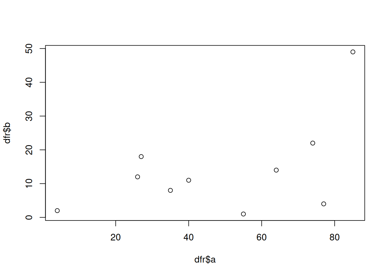
This is probably the simplest and most basic plots. We can modify the x and y axis labels.
plot(dfr$a,dfr$b,xlab="Variable a",ylab="Variable b")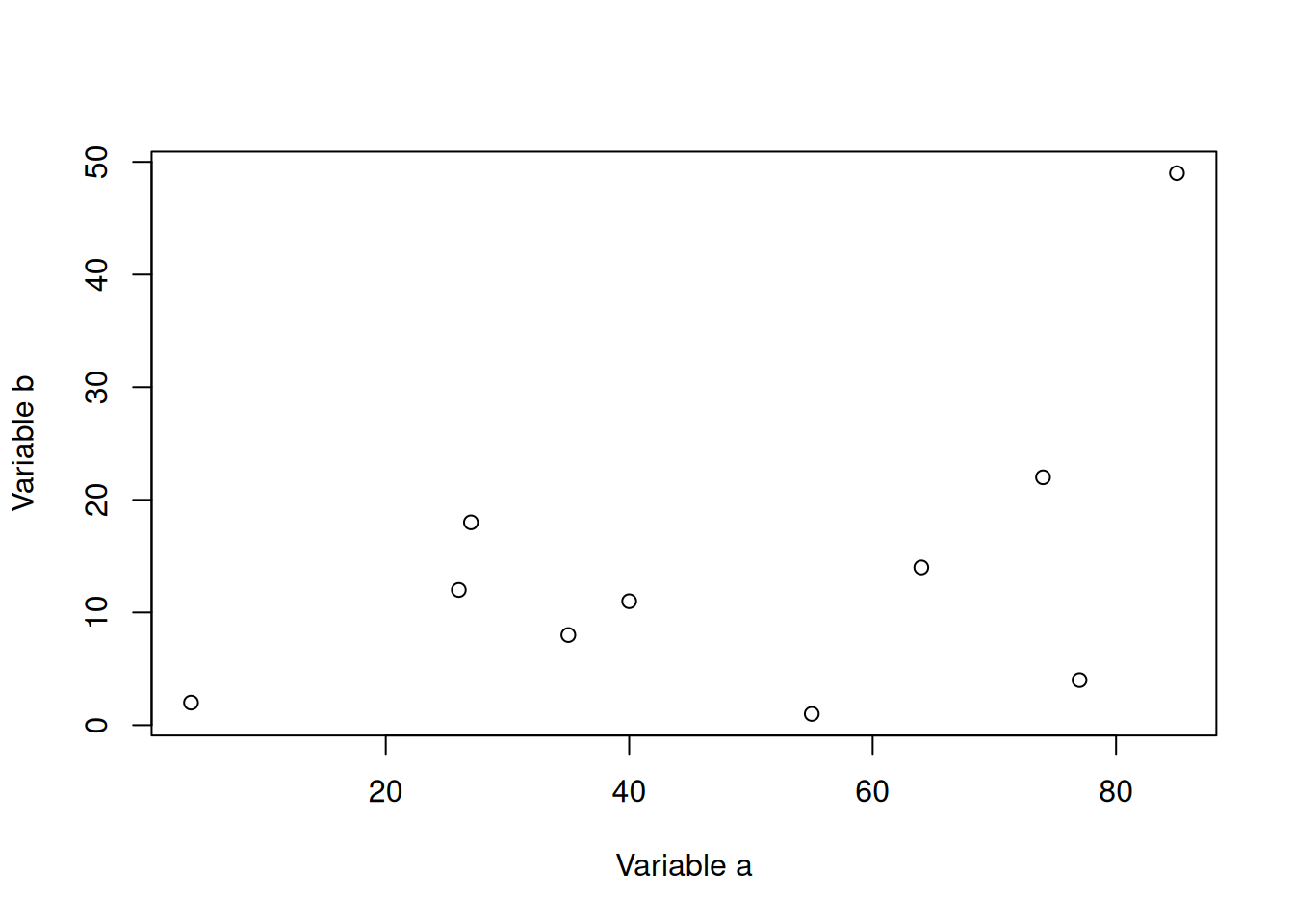
We can change the point to a line.
plot(dfr$a,dfr$b,xlab="Variable a",ylab="Variable b",type="b")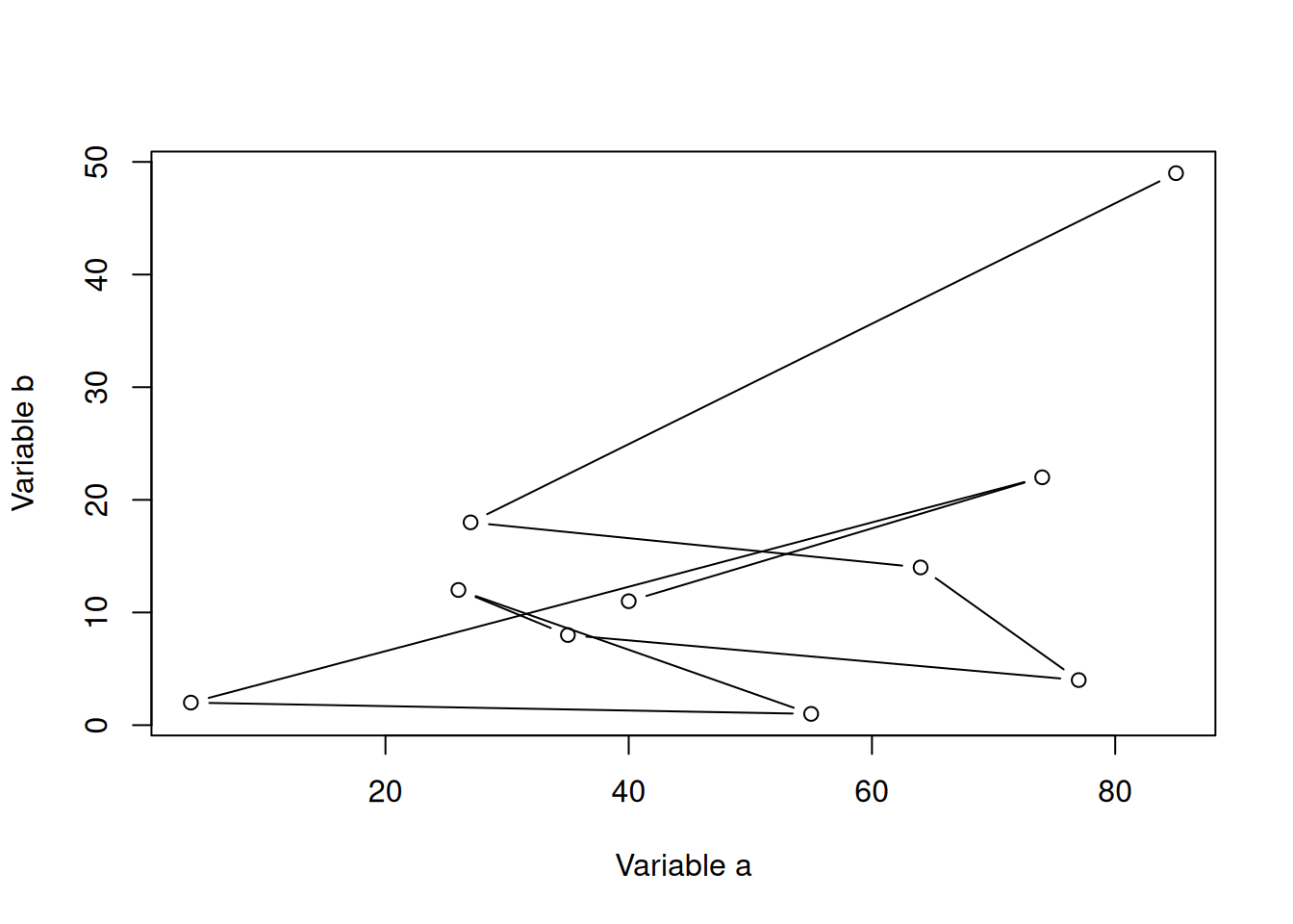
Let’s add a categorical column to our dataframe.
dfr$cat <- rep(c("C1","C2"),each=5)And then colour the points by category.
# subset data
dfr_c1 <- subset(dfr,dfr$cat == "C1")
dfr_c2 <- subset(dfr,dfr$cat == "C2")

plot(dfr_c1$a,dfr_c1$b,xlab="Variable a",ylab="Variable b",col="red",pch=1)
points(dfr_c2$a,dfr_c2$b,col="blue",pch=2)

legend(x="topright",legend=c("C1","C2"),
       col=c("red","blue"),pch=c(1,2))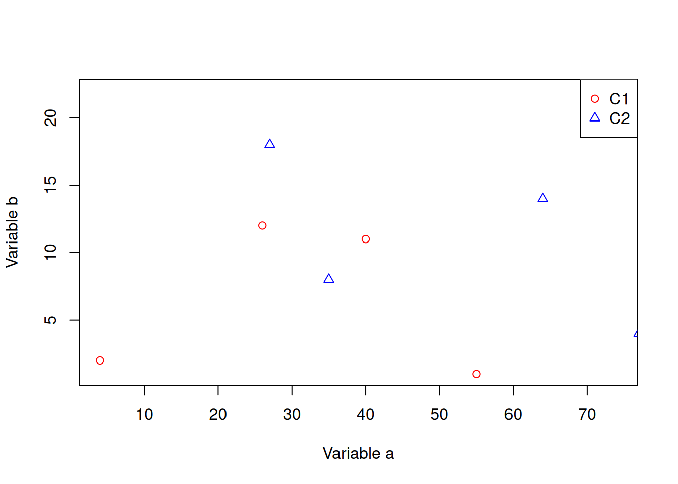
Let’s create a barplot.
ldr <- data.frame(a=letters[1:10],b=sample(1:50,10))
barplot(ldr$b,names.arg=ldr$a)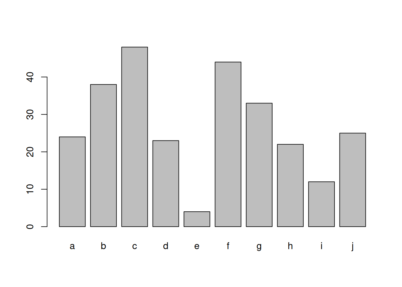
4.2 Grid
Grid graphics have a completely different underlying framework compared to base graphics. Generally, base graphics and grid graphics cannot be plotted together. The most popular grid-graphics based plotting library is ggplot2.
Let’s create the same plot as before using ggplot2. Make sure you have the package installed.
library(ggplot2)

ggplot(dfr)+
  geom_point(mapping = aes(x=a,y=b,colour=cat))+
  labs(x="Variable a",y="Variable b")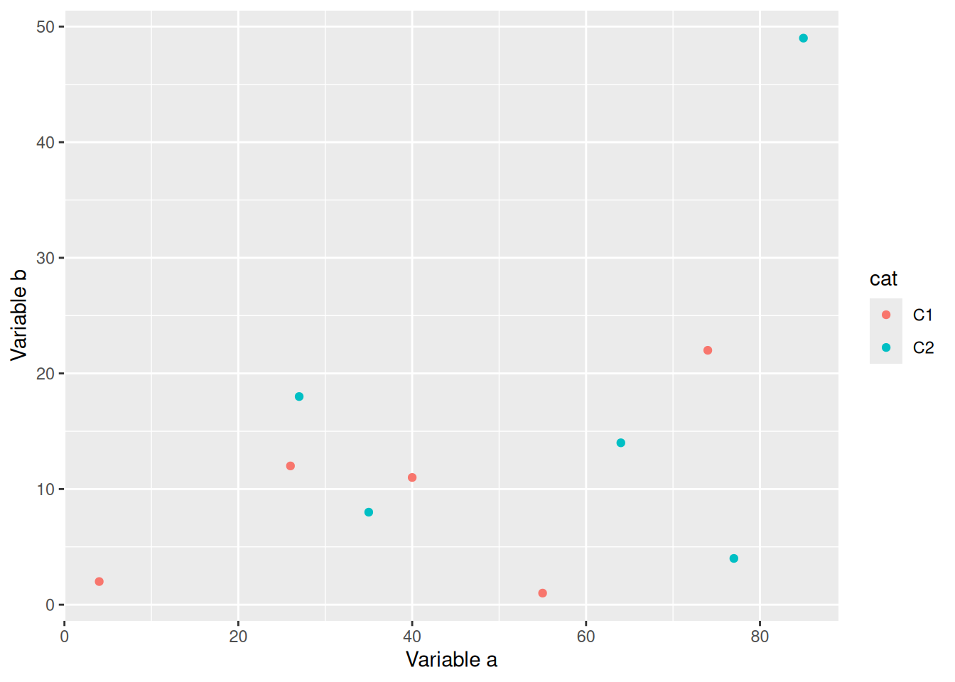
It is generally easier and more consistent to create plots using the ggplot2 package compared to the base graphics.
Let’s create a barplot as well.
ggplot(ldr,aes(x=a,y=b))+
  geom_col()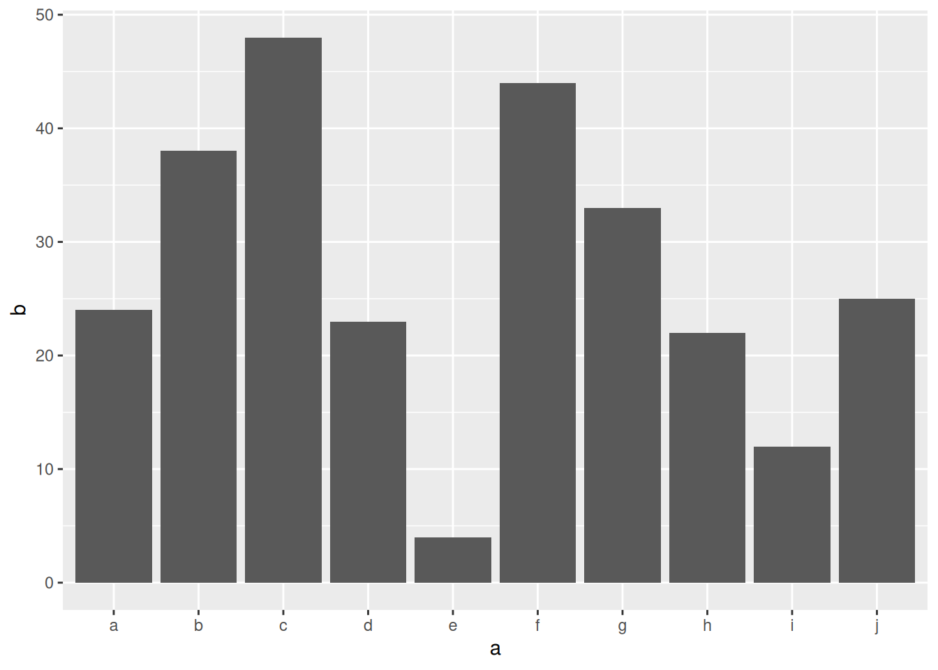
4.3 Saving images
Let’s take a look at saving plots.
Note
This part is just to give you a quick look into how you can save images from R terminal quickly. The different format of images will be explained in a lecture later.
4.3.1 Base graphics
The general idea for saving plots is open a graphics device, create the plot and then close the device. We will use png here. Check out ?png for the arguments and other devices.
dfr <- data.frame(a=sample(1:100,10),b=sample(1:100,10))

png(filename="plot-base.png")
plot(dfr$a,dfr$b)
dev.off()
4.3.2 ggplot2
The same idea can be applied to ggplot2, but in a slightly different way. First save the file to a variable, and then export the plot.
p <- ggplot(dfr,aes(a,b)) + geom_point()

png(filename="plot-ggplot-1.png")
print(p)
dev.off()
Tip
ggplot2 also has another easier helper function to export images.
ggsave(filename="plot-ggplot-2.png",plot=p)5 ggplot basics
Make sure the library is loaded in your environment.
library(ggplot2)5.1 Geoms
In the previous section we saw very quickly how to use ggplot. Let’s take a look at it again a bit more carefully. For this let’s first look into a simple data that is available in R. We use the iris data for this to start with.
This dataset has four continuous variables and one categorical variable. It is important to remember about the data type when plotting graphs
data("iris")
head(iris)
When we initiate the ggplot object using the data, it just creates a blank plot!
ggplot(iris) 
Now we can specify what we want on the x and y axes using aesthetic mapping. And we specify the geometric using geoms.
Note
that the variable names do not have double quotes "" like in base plots.
ggplot(data=iris)+
  geom_point(mapping=aes(x=Petal.Length,y=Petal.Width))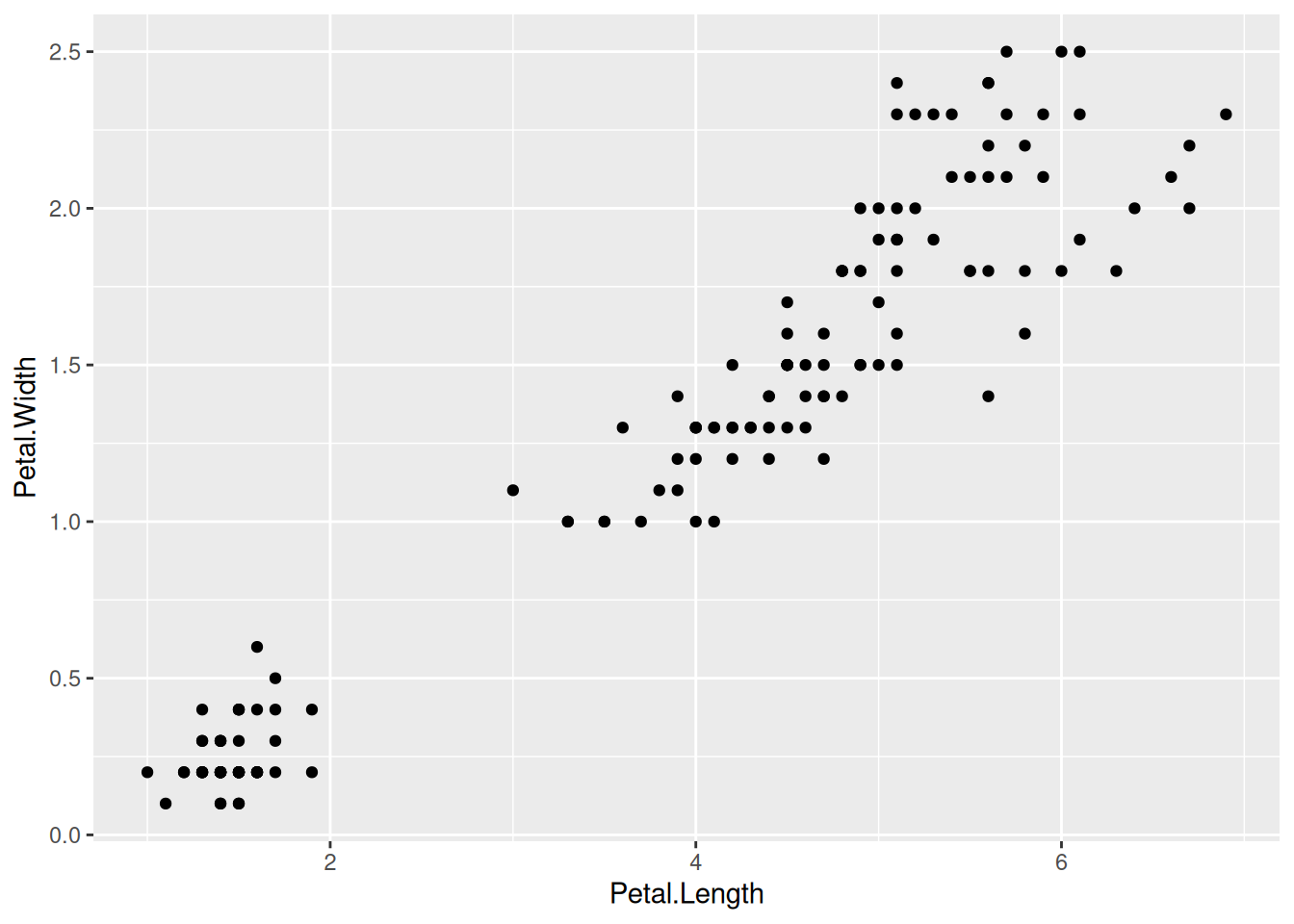
5.1.1 Multiple geoms
Further geoms can be added. For example let’s add a regression line. When multiple geoms with the same aesthetics are used, they can be specified as a common mapping.
Note
that the order in which geoms are plotted depends on the order in which the geoms are supplied in the code. In the code below, the points are plotted first and then the regression line.
ggplot(data=iris,mapping=aes(x=Petal.Length,y=Petal.Width))+
  geom_point()+
  geom_smooth(method="lm")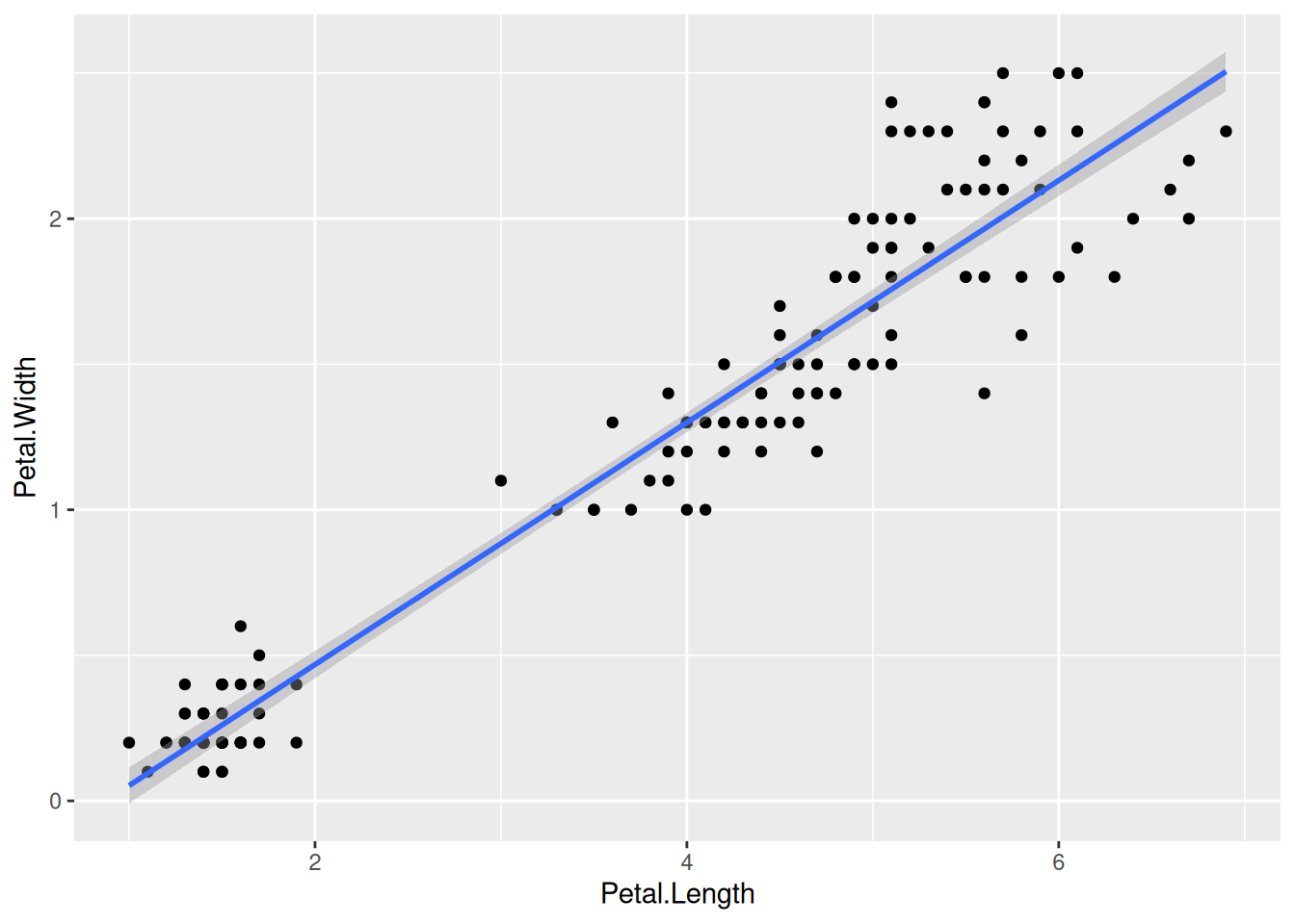
There are many other geoms and you can find most of them here in this cheatsheet
5.1.2 Gene counts data
Let’s also try to use ggplot for a “more common” gene counts dataset. Let’s use the merged_data_long or the gc_long object we created in the earlier session.
ggplot(data = gc_long) +
  geom_boxplot(mapping = aes(x = Sample_Name, y = log10(count +1)))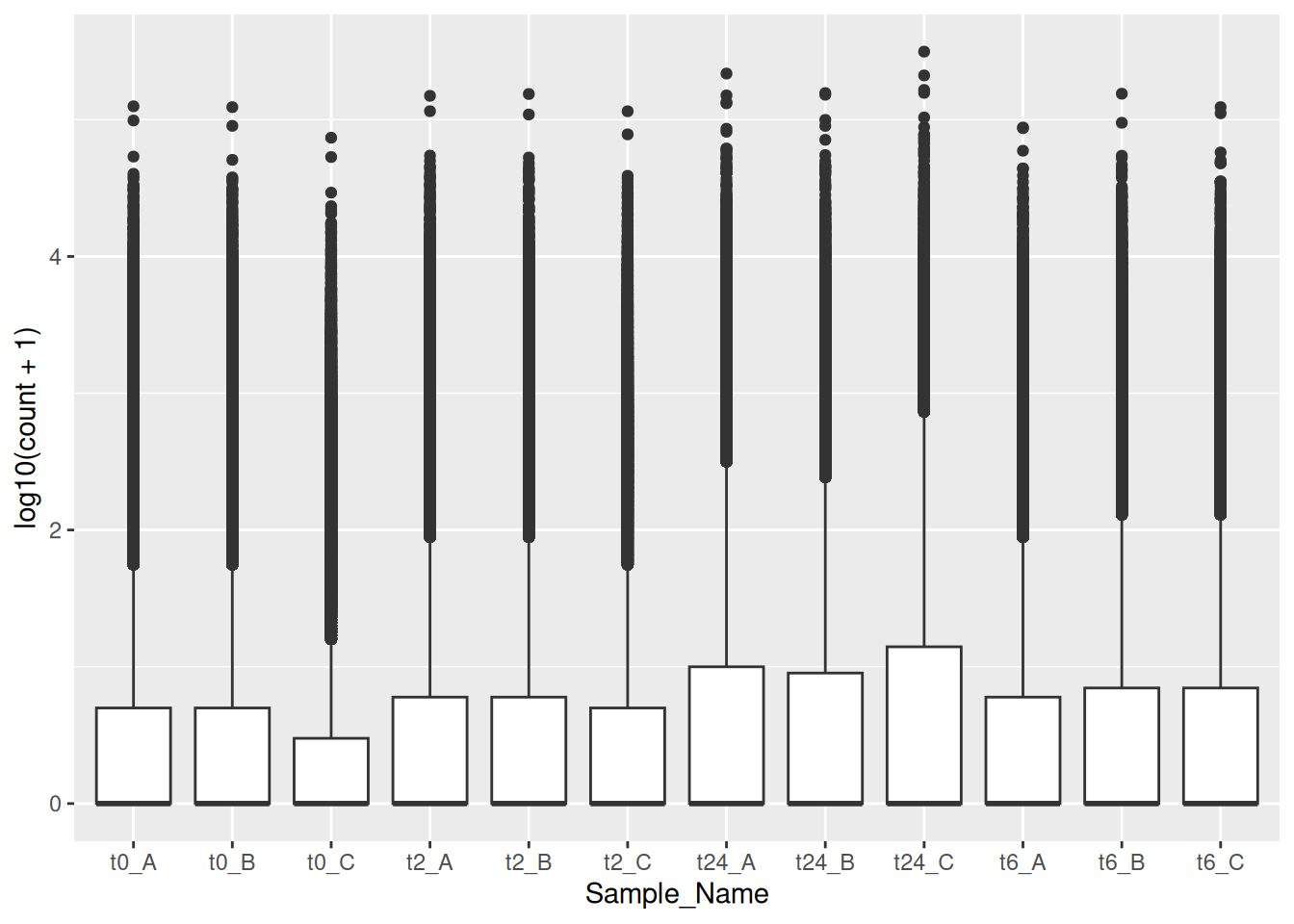
Note
You can notice that the ggplot sorts the factors or variables alpha-numerically, like in the case above with Sample_Name.
Tip
There is a trick that you can use to give the order of variables manually. The example is shown below:
gc_long$Sample_Name <- factor(gc_long$Sample_Name, levels = c("t0_A","t0_B","t0_C","t2_A","t2_B","t2_C","t6_A","t6_B","t6_C","t24_A","t24_B","t24_C"))
ggplot(data = gc_long) +
  geom_boxplot(mapping = aes(x = Sample_Name, y = log10(count + 1)))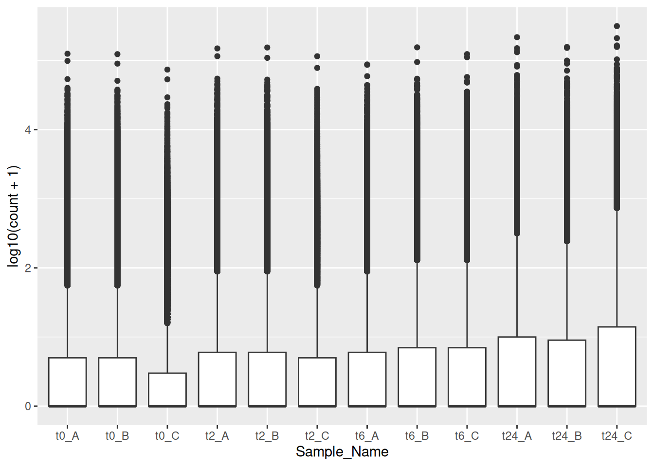
5.2 Colors
5.2.1 Iris data
First, if we look at the iris data, we can use the categorical column Species to color the points. The color aesthetic is used by geom_point and geom_smooth. Three different regression lines are now drawn. Notice that a legend is automatically created
ggplot(data=iris,mapping=aes(x=Petal.Length,y=Petal.Width,color=Species))+
  geom_point()+
  geom_smooth(method="lm")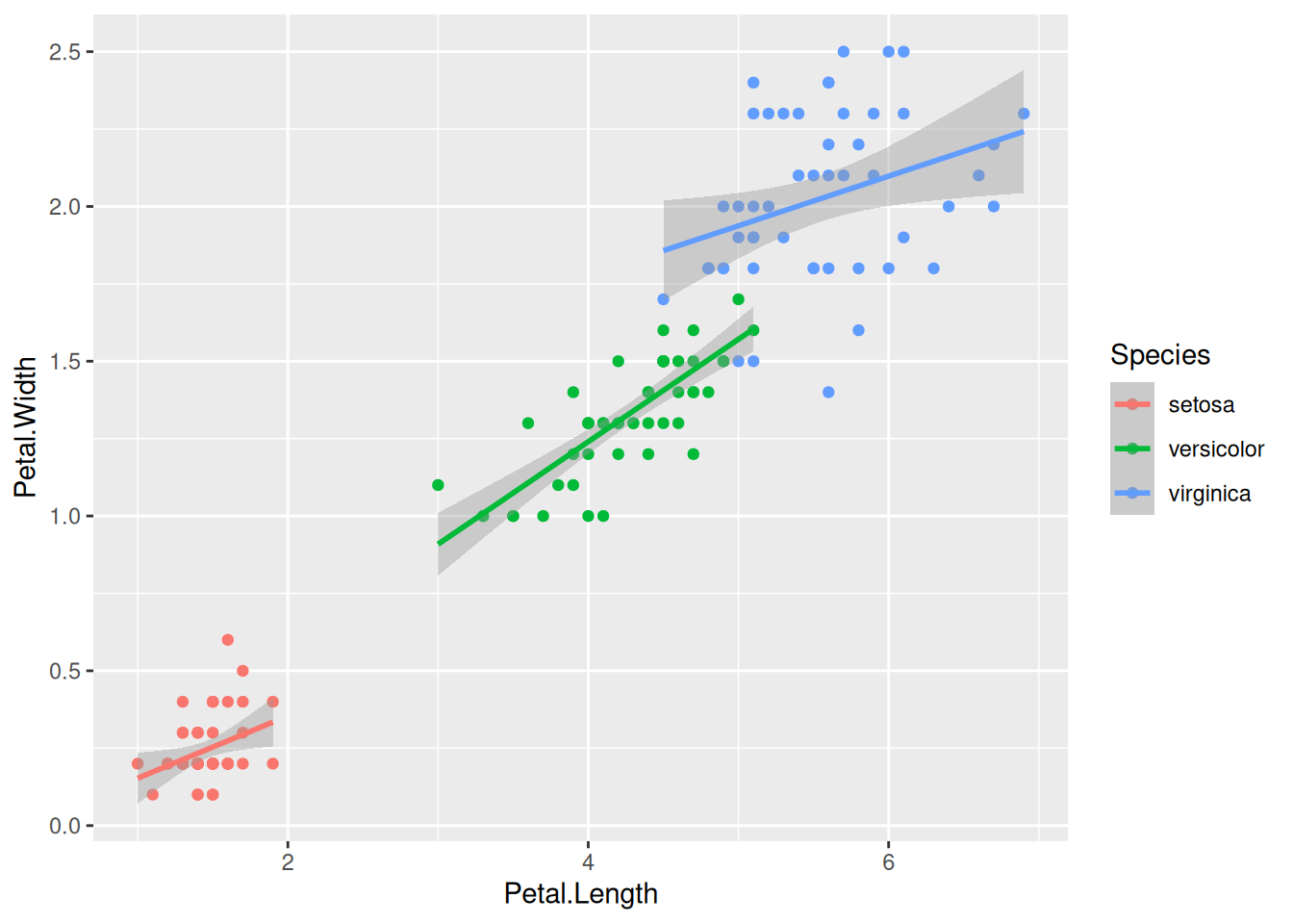
If we wanted to keep a common regression line while keeping the colors for the points, we could specify color aesthetic only for geom_point.
ggplot(data=iris,mapping=aes(x=Petal.Length,y=Petal.Width))+
  geom_point(aes(color=Species))+
  geom_smooth(method="lm")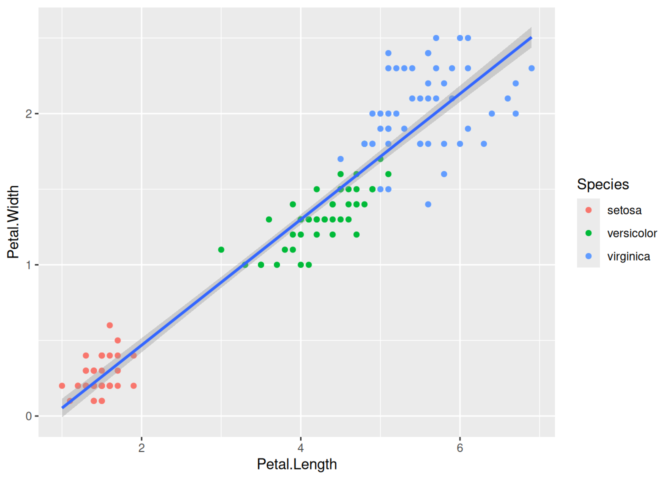
5.2.2 GC data
Similarly, we can do the same with the gene counts data.
ggplot(data = gc_long) +
  geom_boxplot(mapping = aes(x = Sample_Name, y = log10(count + 1), color = Time))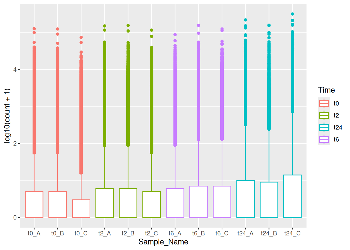
Tip
We can also use the fill aesthetic to give it a better look.
ggplot(data = gc_long) +
  geom_boxplot(mapping = aes(x = Sample_Name, y = log10(count + 1), fill = Time))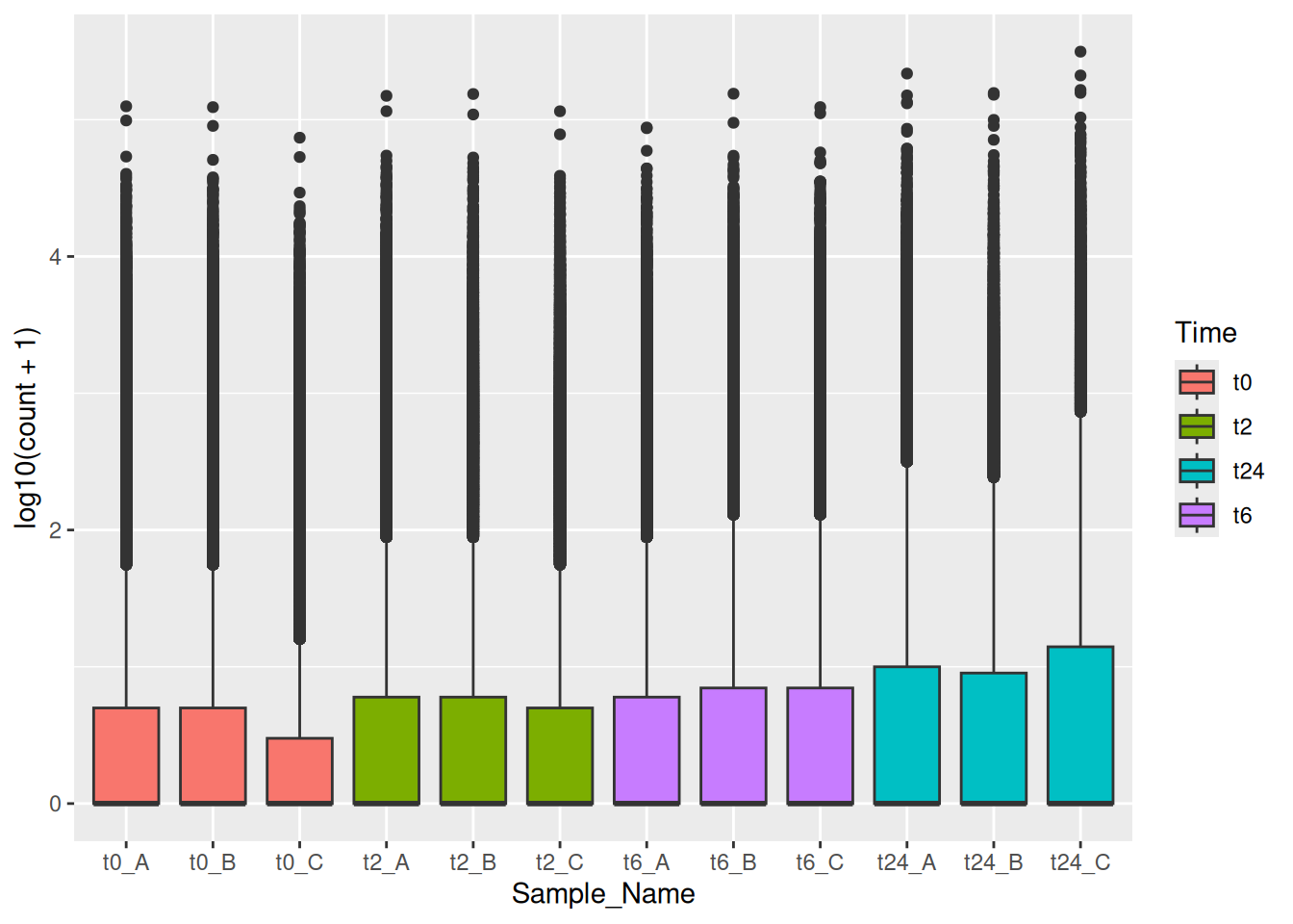
5.2.3 Discrete colors
We can change the default colors by specifying new values inside a scale.
ggplot(data=iris,mapping=aes(x=Petal.Length,y=Petal.Width))+
  geom_point(aes(color=Species))+
  geom_smooth(method="lm")+
  scale_color_manual(values=c("red","blue","green"))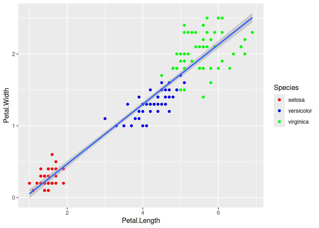
Tip
To specify manual colors, you could specify by their names or their hexadecimal codes. For example, you can choose the colors based on names from an online source like in this cheatsheet or you can use the hexadecimal code and choose it from a source like here. I personally prefer the hexa based options for manual colors.
5.2.4 Continuous colors
We can also map the colors to a continuous variable. This creates a color bar legend item.
ggplot(data=iris,mapping=aes(x=Petal.Length,y=Petal.Width))+
  geom_point(aes(color=Sepal.Width))+
  geom_smooth(method="lm")
Tip
Here, you can also choose different palettes for choosing the right continuous palette. There are some common packages of palettes that are used very often. RColorBrewer and wesanderson, if you are a fan of his choice of colors. 😉
library(wesanderson)
ggplot(data=iris,mapping=aes(x=Petal.Length,y=Petal.Width))+
  geom_point(aes(color=Sepal.Width))+
  geom_smooth(method="lm") +
  scale_color_gradientn(colours = wes_palette("Moonrise3"))
Tip
You can also use simple R base color palettes like rainbow() or terrain.colors(). Use ? and look at these functions to see, how to use them.
5.3 Aesthetics
5.3.1 Aesthetic parameter
We can change the size of all points by a fixed amount by specifying size outside the aesthetic parameter.
ggplot(data=iris,mapping=aes(x=Petal.Length,y=Petal.Width))+
  geom_point(aes(color=Species),size=3)+
  geom_smooth(method="lm")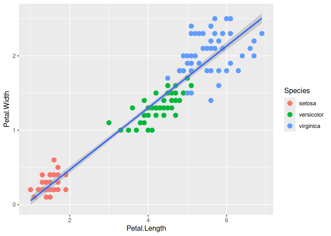
5.3.2 Aesthetic mapping
We can map another variable as size of the points. This is done by specifying size inside the aesthetic mapping. Now the size of the points denote Sepal.Width. A new legend group is created to show this new aesthetic.
ggplot(data=iris,mapping=aes(x=Petal.Length,y=Petal.Width))+
  geom_point(aes(color=Species,size=Sepal.Width))+
  geom_smooth(method="lm")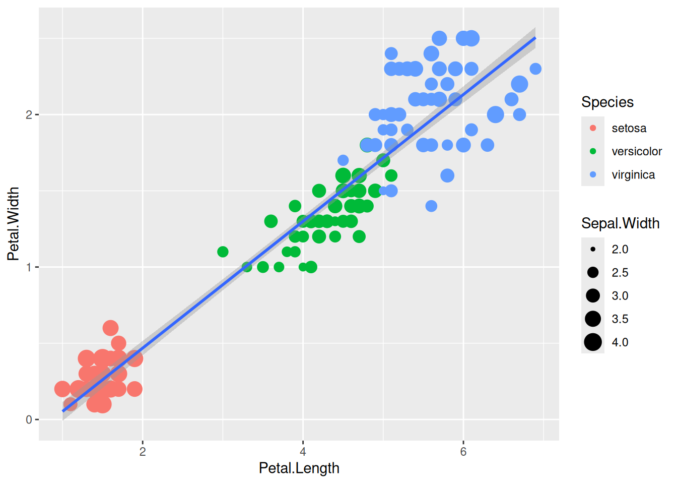
6 Histogram
Here, as a quick example, we will try to make use of the different combinations of geoms, aes and color in simple plots.
Let’s take a quick look at some of widely used functions like histograms and density plots in ggplot. Intuitively, these can be drawn with geom_histogram() and geom_density(). Using bins and binwidth in geom_histogram(), one can customize the histogram.
ggplot(data=iris,mapping=aes(x=Sepal.Length))+
  geom_histogram()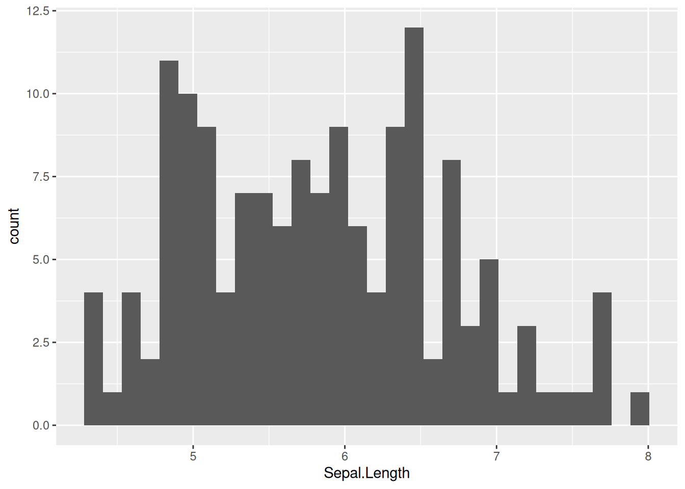
6.1 Density
Let’s look at the sample plot in density.
ggplot(data=iris,mapping=aes(x=Sepal.Length))+
  geom_density()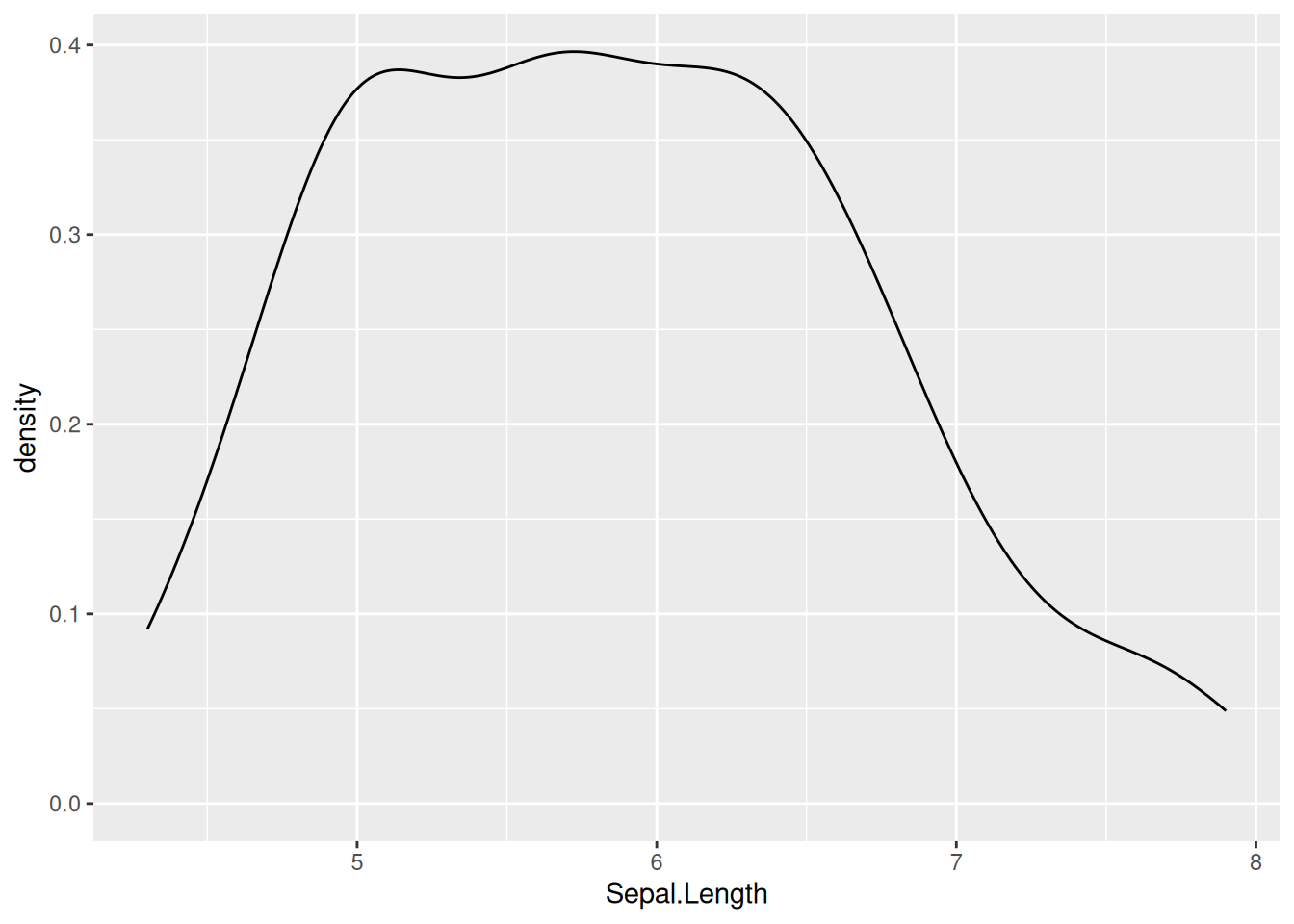
The above plot is not very informative, let’s see how the different species contribute:
ggplot(data=iris,mapping=aes(x=Sepal.Length))+
  geom_density(aes(fill = Species), alpha = 0.8)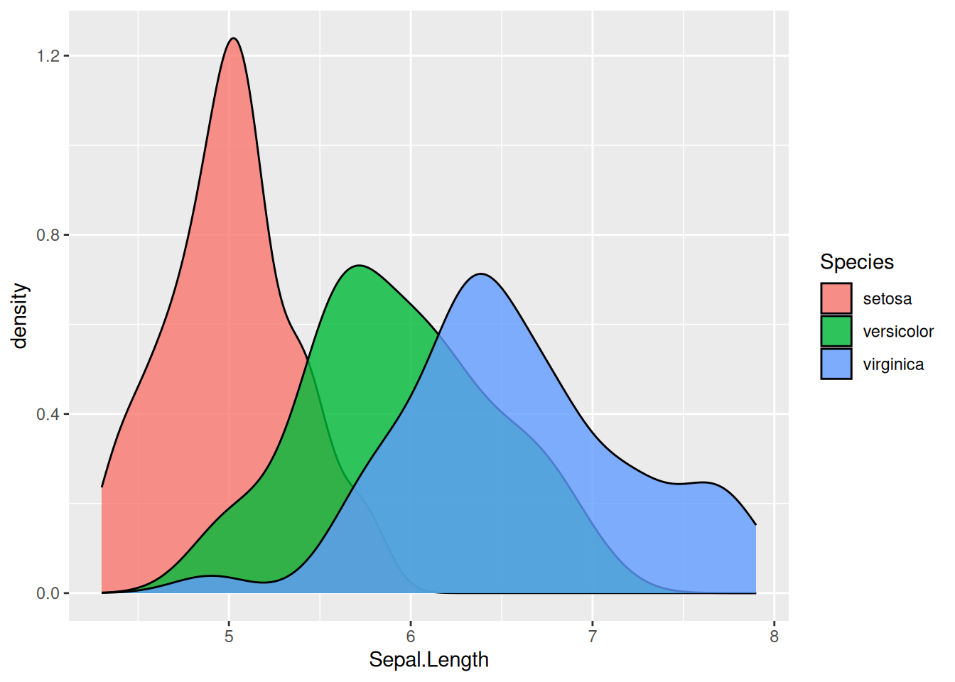
Note
The alpha option inside geom_density controls the transparency of the plot.
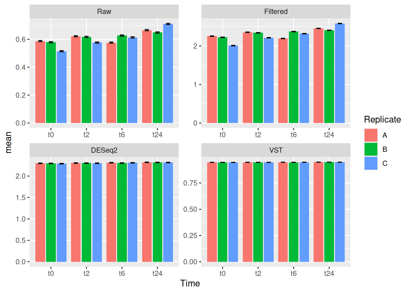
7 Exercise II
Task 2.1
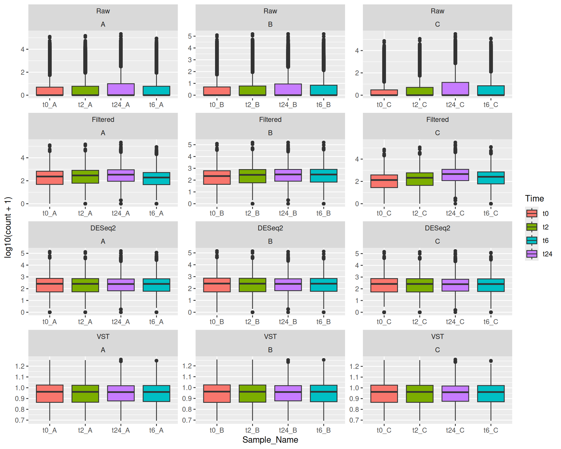
Make boxplots similar to the one we did here in this exercise for the other three counts (counts_filtered.txt, counts_vst.txt and counts_deseq2.txt).
Tip
You can save the plots themselves as R objects. You will get the plot by just calling those objects. You can then add layers to those objects. Examples are shown below:
plot_obj_1 <- ggplot(data=iris,mapping=aes(x=Petal.Length,y=Petal.Width))+
  geom_point(aes(color=Sepal.Width))+
  geom_smooth(method="lm")
plot_obj_1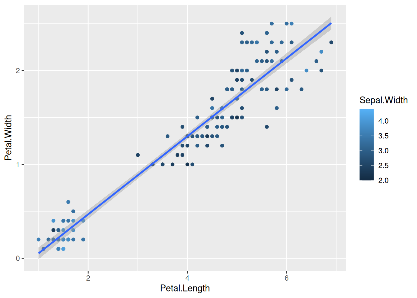
plot_obj_2 <- plot_obj_1 +
  scale_color_gradientn(colours = wes_palette("Moonrise3"))
plot_obj_2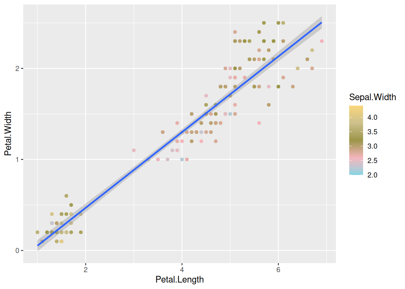
This way, you can create different plot objects for the different counts, we will use them in the later exercises.
8 Faceting
8.1 With wrap
We can create subplots using the faceting functionality.
plot <- ggplot(data=iris,mapping=aes(x=Petal.Length,y=Petal.Width))+
  geom_point(aes(color=Sepal.Width))+
  geom_smooth(method="lm") +
  facet_wrap(~Species)
plot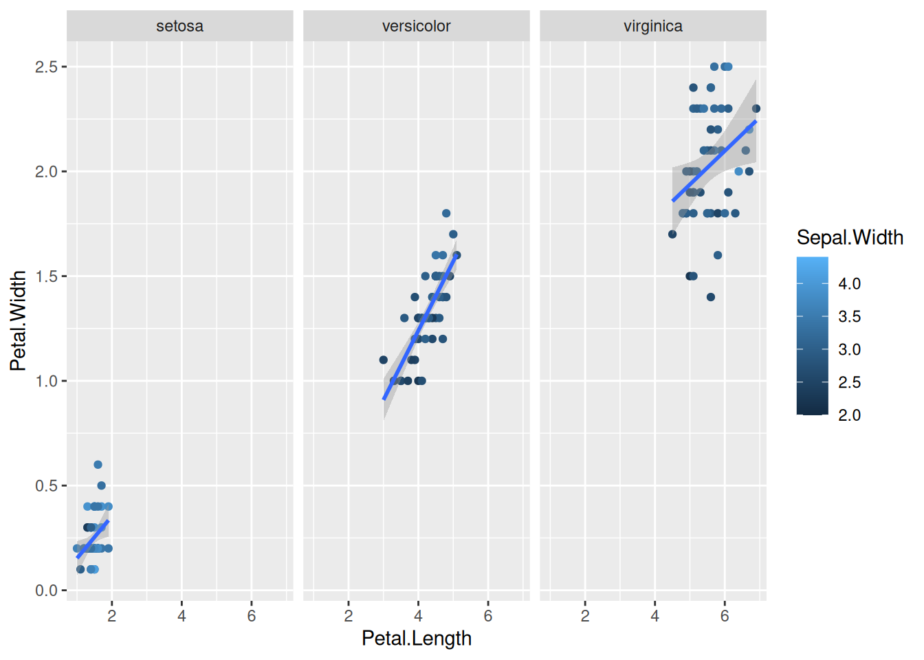
If we try the same with the gene counts data faceted by time.
ggplot(data = gc_long) +
  geom_boxplot(mapping = aes(x = Sample_Name, y = log10(count + 1), color = Time)) +
  facet_wrap(~Time)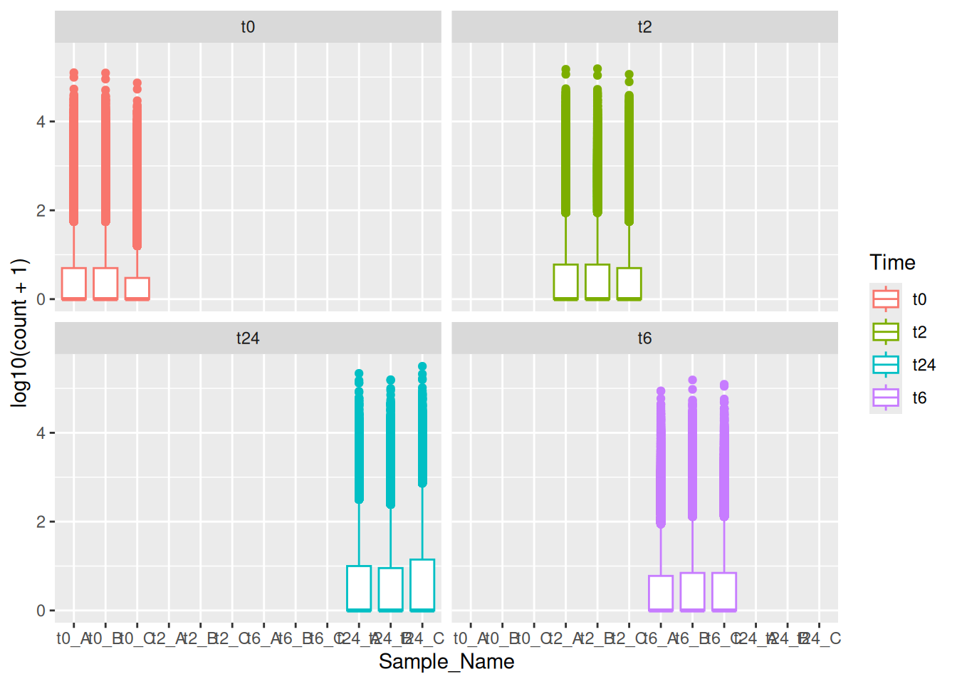
8.2 With grid
Here in the above plot, you see some empty samples in each facet. In this case, you could use facet_grid together with space and scales options to make it look neat and intuitive. You can use ?facet_grid and ?facet_wrap to figure out the exact difference between the two.
ggplot(data = gc_long) +
  geom_boxplot(mapping = aes(x = Sample_Name, y = log10(count + 1), color = Time)) +
  facet_grid(~Time , scales = "free", space = "free")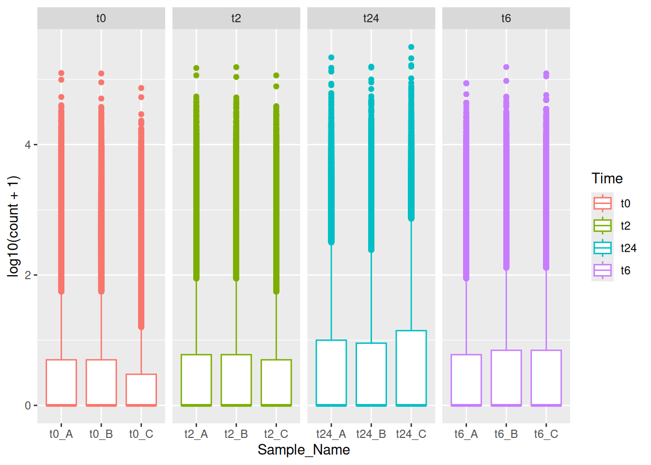
You can also make grid with different variables one might have using vars() function together with rows and cols options!
ggplot(data = gc_long) +
  geom_boxplot(mapping = aes(x = Sample_Name, y = log10(count + 1), color = Time)) +
  facet_grid(rows = vars(Time), cols = vars(Replicate), scales = "free", space = "free")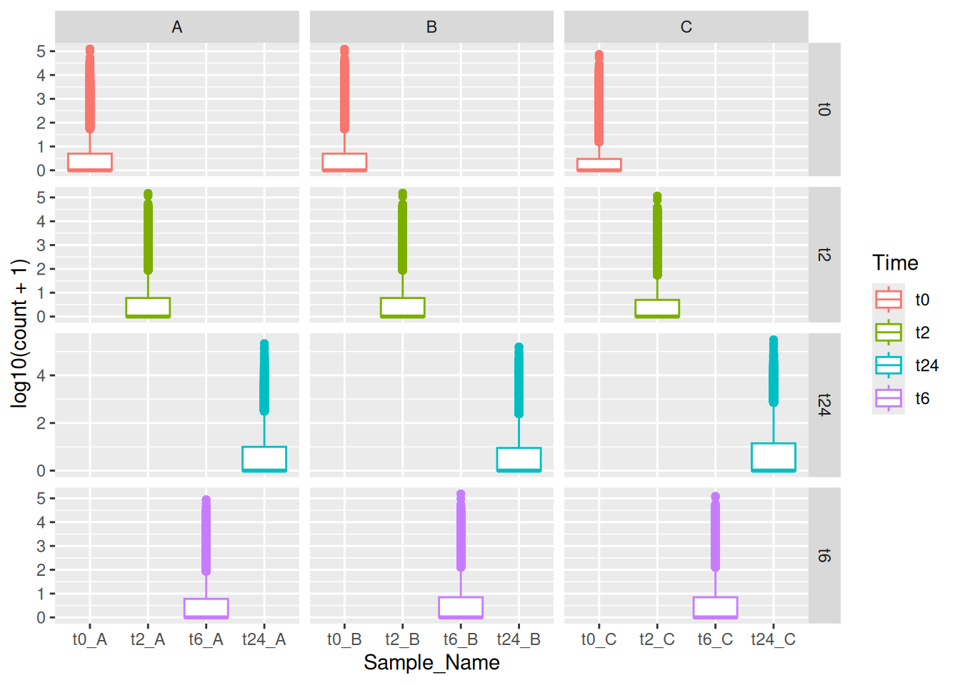
9 Labeling and annotations
9.1 Labels
Here, we will quickly mention, how one can add labels to the plots. Items on the plot can be labelled using the geom_text or geom_label geoms.
ggplot(data=iris,mapping=aes(x=Petal.Length,y=Petal.Width))+
  geom_point(aes(color=Species))+
  geom_text(aes(label=Species,hjust=0),nudge_x=0.5,size=3)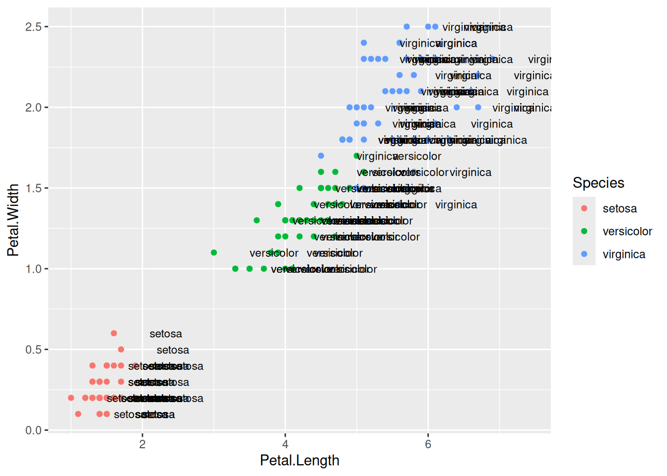
ggplot(data=iris,mapping=aes(x=Petal.Length,y=Petal.Width))+
  geom_point(aes(color=Species))+
  geom_label(aes(label=Species,hjust=0),nudge_x=0.5,size=3)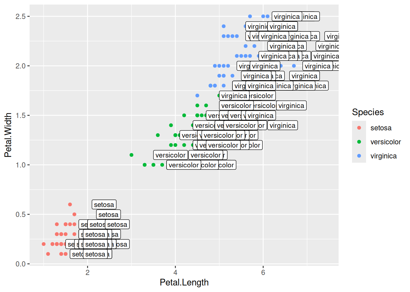
The R package ggrepel allows for non-overlapping labels.
library(ggrepel)
ggplot(data=iris,mapping=aes(x=Petal.Length,y=Petal.Width))+
  geom_point(aes(color=Species))+
  geom_text_repel(aes(label=Species),size=3)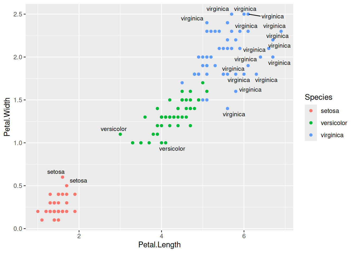
9.2 Annotations
Custom annotations of any geom can be added arbitrarily anywhere on the plot.
ggplot(data=iris,mapping=aes(x=Petal.Length,y=Petal.Width))+
  geom_point(aes(color=Species))+
  annotate("text",x=2.5,y=2.1,label="There is a random line here")+
  annotate("segment",x=2,xend=4,y=1.5,yend=2)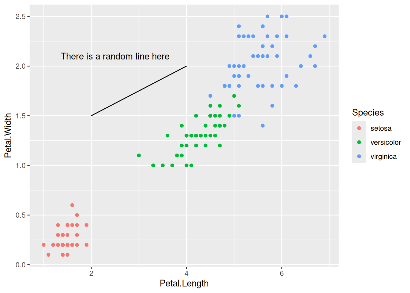
10 Bar charts
Let’s now make some bar charts with the data we have. We can start with the simple iris data first.
ggplot(data=iris,mapping=aes(x=Species,y=Petal.Width))+
  geom_col()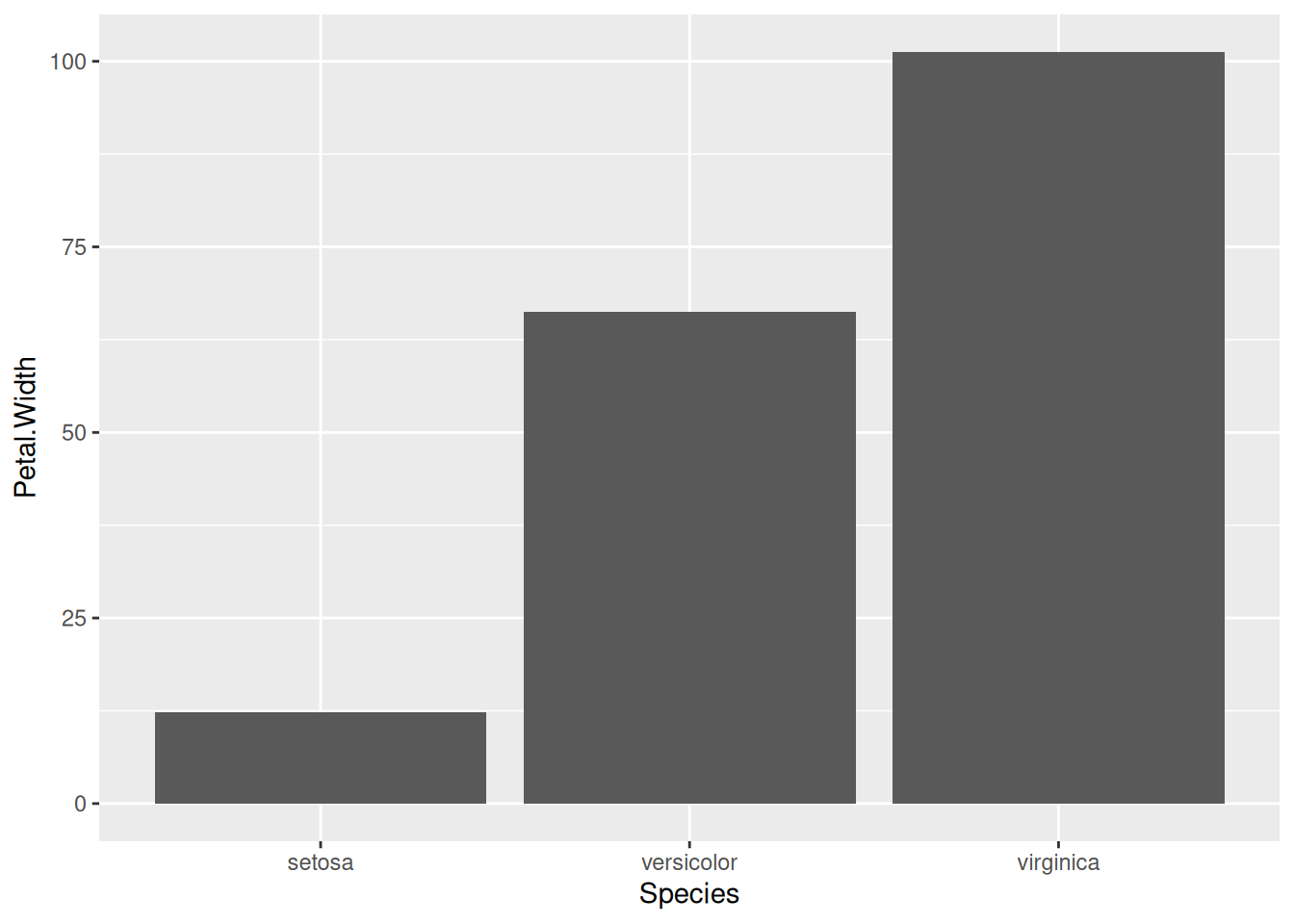
Note
There are two types of bar charts: geom_bar() and geom_col(). geom_bar() makes the height of the bar proportional to the number of cases in each group (or if the weight aesthetic is supplied, the sum of the weights). If you want the heights of the bars to represent values in the data, use geom_col() instead. geom_bar() uses stat_count() by default: it counts the number of cases at each x position. geom_col() uses stat_identity() and it leaves the data as is.
Similarly, we can use the gene counts data to make a barplot as well. But first, let’s make the data into the right format so as to make the bar plots. This is where knowledge on tidyverse would be super useful.
se <- function(x) sqrt(var(x)/length(x))
gc_long %>%
  group_by(Time) %>%
  summarise(mean=mean(log10(count +1)),se=se(log10(count +1))) %>%
  head()
Note
There are a couple of things to note here. In the above example, we use the pipe %>% symbol that redirects the output of one command as the input to another. Then we group the data by the variable Time, followed by summarizing the count with mean() and sd() functions to get the mean and standard deviation of their respective counts. The head() function just prints the first few lines.
Now that we have summarized the data to be bale to plot the bar graph that we want, we can just input the data to ggplot as well using the %>% sign.
gc_long %>%
  group_by(Time) %>%
  summarise(mean=mean(log10(count +1)),se=se(log10(count +1))) %>%
  ggplot(aes(x=Time, y=mean)) +
  geom_bar(stat = "identity")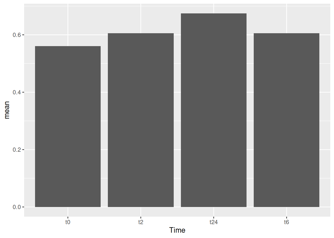
Note
Notice that the %>% sign is used in the tidyverse based commands and + is used for all the ggplot based commands.
10.1 Flip coordinates
One can also easily just flip the x and y axis.
gc_long %>%
  group_by(Time) %>%
  summarise(mean=mean(log10(count +1)),se=se(log10(count +1))) %>%
  ggplot(aes(x=Time, y=mean)) +
  geom_col() +
  coord_flip()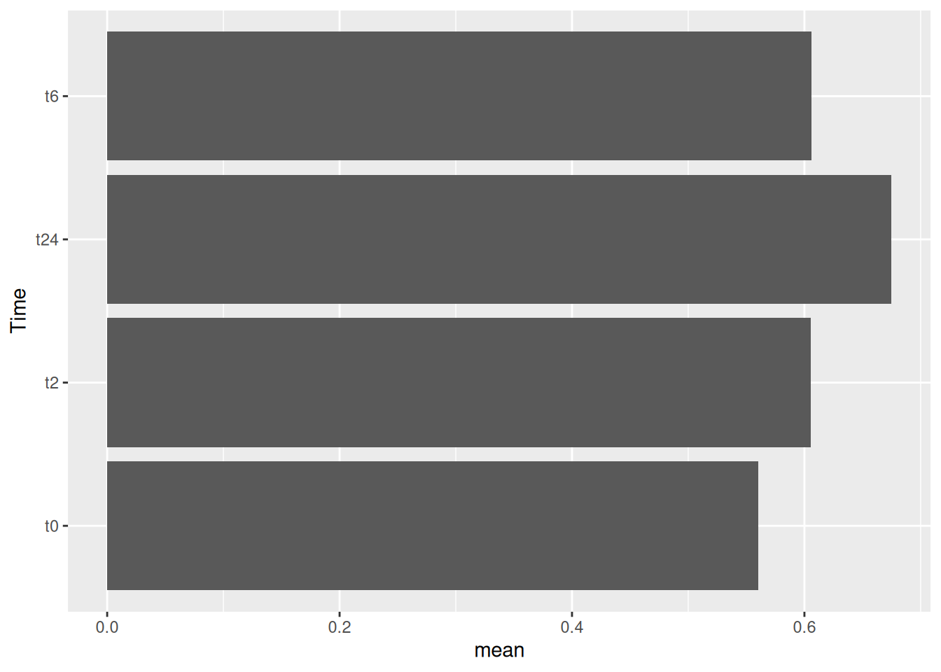
11 Error bars
Now that we have the bar plots, we can also add error bars to them using the sd values we calculated in the previous step.
gc_long %>%
  group_by(Time) %>%
  summarise(mean=mean(log10(count +1)),se=se(log10(count +1))) %>%
  ggplot(aes(x=Time, y=mean, fill = Time)) +
  geom_col() +
  geom_errorbar(aes(ymax=mean+se,ymin=mean-se),width=0.2)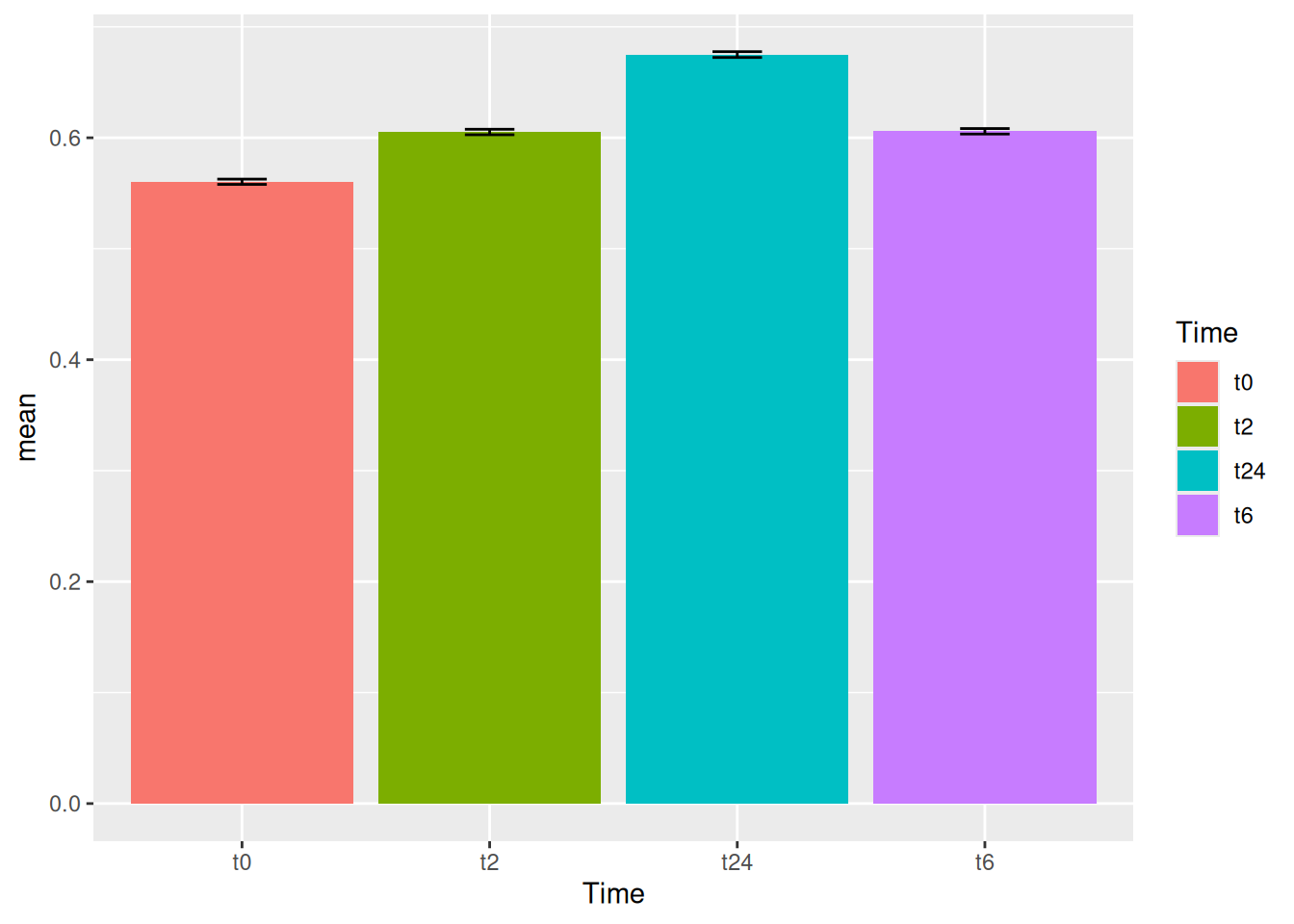
12 Stacked bars
Let’s now try to make stacked bars. For this let’s try to make the data more usable for stacked bars. For this let’s use the group_by function to make the groups based on both Time and Replicate.
se <- function(x) sqrt(var(x)/length(x))
gc_long %>%
  group_by(Time, Replicate) %>%
  summarise(mean=mean(log10(count +1)),se=se(log10(count +1))) %>%
  head()
Let’s build the stacked bars!
gc_long %>%
  group_by(Time, Replicate) %>%
  summarise(mean=mean(log10(count +1)),se=se(log10(count +1))) %>%
  ggplot(aes(x=Time, y=mean, fill = Replicate)) +
  geom_col(position = "stack")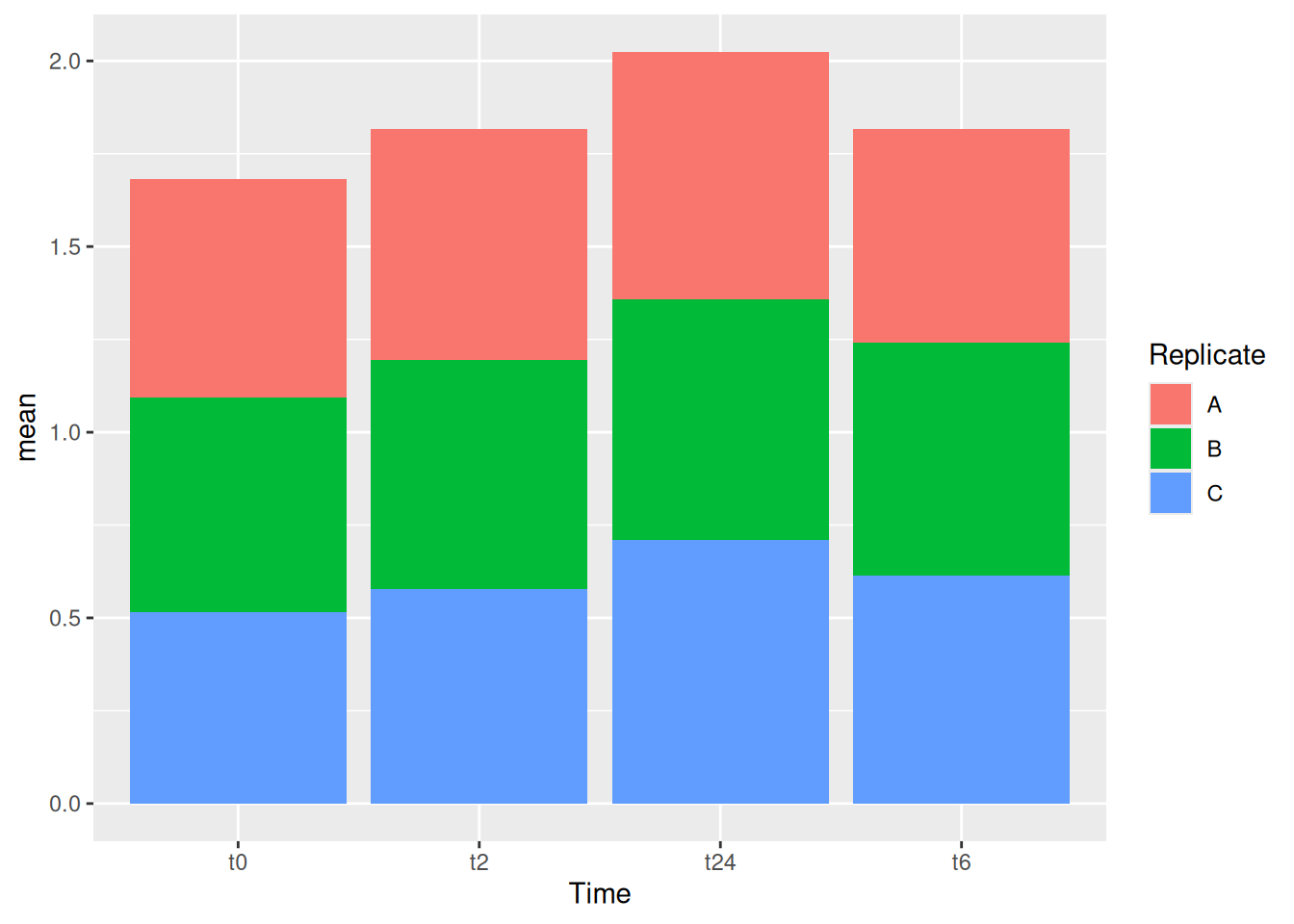
One can also have dodge bars.
gc_long %>%
  group_by(Time, Replicate) %>%
  summarise(mean=mean(log10(count +1)),se=se(log10(count +1))) %>%
  ggplot(aes(x=Time, y=mean, fill = Replicate)) +
  geom_col(position = "dodge")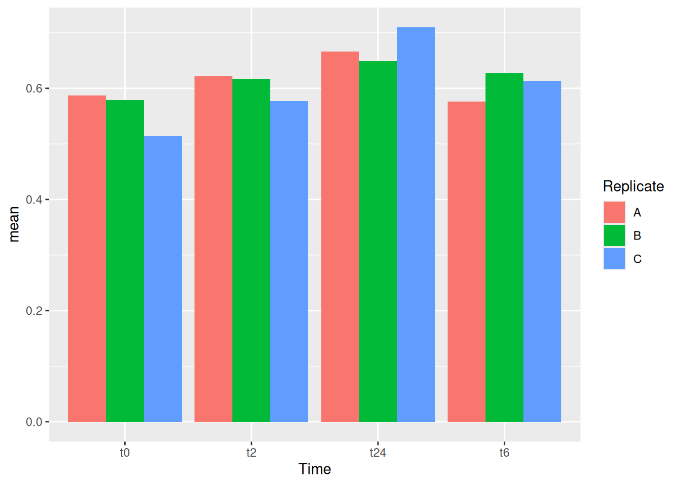
We can try now to plot error bars on them. The errorbars would look weird and complicated if one forgets to add position = dodge to the geom_errorbar() as well.
gc_long %>%
  group_by(Time, Replicate) %>%
  summarise(mean=mean(log10(count +1)),se=se(log10(count +1))) %>%
  ggplot(aes(x= Time, y= mean, fill = Replicate)) +
  geom_col(position = "dodge") +
  geom_errorbar(aes(ymin=mean-se, ymax=mean+se), position = "dodge")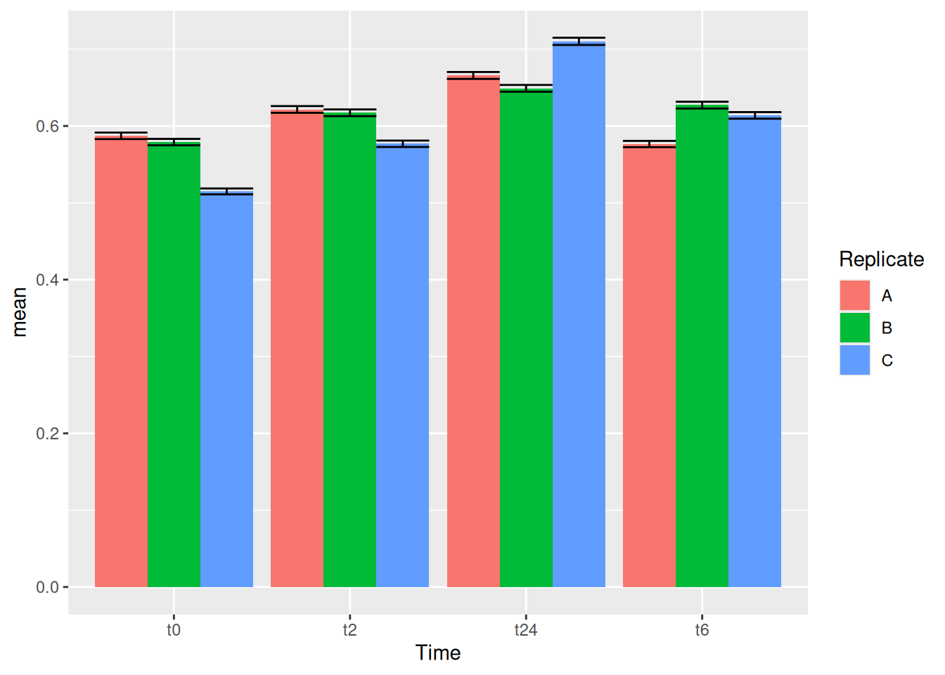
Note
It is important that you keep tract of what kind of aesthetics you give when you initialize ggplot() and what you add in the geoms() later.
You can also make these error bars look nicer by playing around with some of the parameters available, like example below:
gc_long %>%
  group_by(Time, Replicate) %>%
  summarise(mean=mean(log10(count +1)),se=se(log10(count +1))) %>%
  ggplot(aes(x= Time, y= mean, fill = Replicate)) +
  geom_col(position = position_dodge2()) +
  geom_errorbar(aes(ymin=mean-se, ymax=mean+se), position = position_dodge2(.9, padding = .6))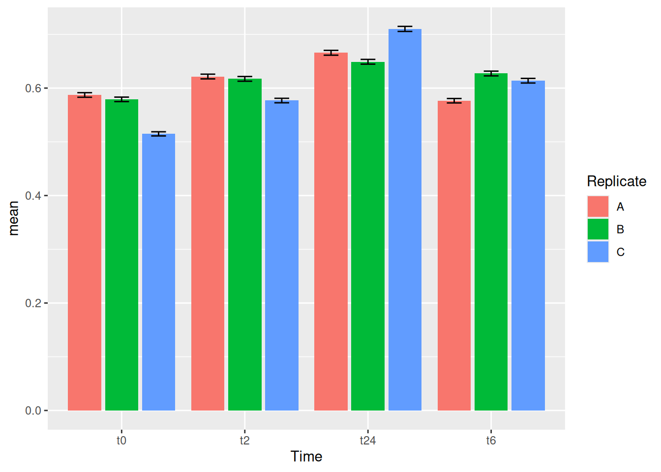
13 Exercise III
Now let us try to make the following plots as exercise before we go further to some advanced ggplot session.
Task 3.1
Tip
It is more of a tidyverse exercise than ggplot. Because to get these plots, you need get the data in the right format.
Task 3.2