Note
In these exercises you will learn how to embed dynamic components, such as interactive plots and widgets, directly into a Quarto HTML document.
By the end of this exercise, you will be able to:
- Embed dynamic plots directly into Quarto documents.
- Discover and apply different techniques for creating and improving dynamic visualizations.
1 Instructions
- Open new Quarto document.
- Create first chunk where you will load necessary R libraries.
- Copy the following into it:
```{r}
#| warning: false
#| message: false
library(palmerpenguins)
library(leaflet)
library(plotly)
library(ggiraph)
library(crosstalk)
library(DT)
library(ggplot2)
```
2 Dynamic maps with leaflet
The leaflet package allows creating dynamic and interactive maps using the Leaflet JavaScript library. The main advantage of using leaflet is its flexibility and that using leaflet in R is really easy.
Let’s have a look into simple example:
```{r}
leaflet() %>%
  addTiles() %>%  # Add default OpenStreetMap map tiles
  addMarkers(lng=13.1870, lat=55.7074, popup="Lund")
```- Start with the
leaflet()function. - New layers are added with the pipe operator (
%>%). - With
addTiles()the default basemap is added. - To add different types of markers to the maps
addMarkers(),addCircleMarkers(),addAwesomeMarkers()can be used. popupargument are used to display important information about a point, they appear when you click over a marker.
The example above results in:
2.1 Exercise:
In the palmerpenguins data, penguins are found on three islands: Biscoe, Dream and Torgersen.
island_coordinates <- data.frame(lng = c(-66.671, -64.225, -64.074100),
lat = c(-66.174, -64.725, -64.772694))- Your goal is to generate dynamic map using the leaflet.
Advice: Start building dynamic map step-by-step, run code after each step and pay attention to what is happening. To get help with some functions, click here.
- Make a marker for three islands.
- Add popup information (Biscoe, Dream and Torgersen island).
- Use
setView()function to set a center point and a zoom level. - Change the marker style to circle markers, and add color.
- Replace
addTiles()function withaddProviderTiles(providers$Esri.WorldImagery), which allows to visualize the map with real images.
3 plotly
We can create a plotly plot using the function plot_ly(). Typical composition of a plotly plot:
plot_name <- plot_ly(data = ..., x = ~ ..., y = ~ ...)
It is also possible to build ggplot object first and then transform it to plotly plot using the ggplotly() function. This works fairly well for simple plots, although it is usually a better option to build plotly plots from scratch.
For example, penguin body mass vs. flipper length, using ggplot() and transformation to plotly plot using ggplotly() function.
```{r}
pp1 <-
    ggplot(data = penguins, aes(x = flipper_length_mm, y = body_mass_g)) +
    geom_point(aes(color = species), size = 2) +
    scale_color_manual(values = c("darkorange","darkorchid","cyan4")) +
    theme_minimal()

ggplotly(pp1)
```
Now, let’s plot using the function plot_ly().
```{r}
plot_ly(data = penguins, x = ~flipper_length_mm, y = ~body_mass_g,
        color = ~species, colors = c("darkorange","darkorchid","cyan4"), size=2)
```
When running this R command may see some red Warning messages appear in the R Console. Often you do not have to worry about these, but if you would like to minimise them, you can add the following arguments to your plot_ly function.
```{r}
plot_ly(data = penguins, x = ~flipper_length_mm, y = ~body_mass_g,
        color = ~species, colors = c("darkorange","darkorchid","cyan4"), size=2,
        type = "scatter", mode = "markers")
```
We have included the additional arguments type = ... and mode = ....
- We set
type = "scatter"to ensure our data is plotted as a scatter plot. - We set
mode = "markers"to ensure that each of our data points is plotted individually.
These additional arguments are often helpful, as sometimes we like to have a little more control over how our data is presented. You will notice however that if these commands are omitted from your function, R will just work out what it thinks is the optimal presentation format (hence the warning messages informing us which options R has selected, since some details have not been user-specified).
plot_ly allows us to plot different plot types, for example, histograms, boxplots, scatterplots… using argument type = ~ .... Example below shows how to obtain boxplot and scatterplot and how to combine these two plots together using the subplot command.
```{r}
p1 <- plot_ly(data = penguins, x = ~island, y = ~flipper_length_mm,
        color = ~island, type = "box", colors = c("#10a53dFF","#541352FF","#ffcf20FF"), size=2)

p2 <- plot_ly(data = penguins, x = ~flipper_length_mm, y = ~body_mass_g,
        color = ~species, colors = c("darkorange","darkorchid","cyan4"), size=2)

fig <- subplot(p1, p2, nrows = 2, margin = 0.1)
fig %>%
    layout(title = "Palmer Penguin Data",
    xaxis = list(title = "Species"),
    yaxis = list(title = "Body mass [g]"),
    xaxis2 = list(title = "Body mass [g]"),
    yaxis2 = list(title = "Flipper length [mm]"))
```
Note that here:
- We are using the
subplotcommand to plot the p1 and p2 plots together. - The
nrows = 2argument tells R to produce these plots in 2 rows. - The
margin = 0.1argument tells R to leave a small margin between the two plots. - The subsequent lines (
layout()) of code are used to add a title to our plot, and add axes labels to the plots - note that we usexaxisto define the x-axis label for the first plot, andxaxis2to define the x-axis label for the second plot (and similarly for the y-axes).
3.1 Exercise:
In this exercise you will use msleep dataset that is part of
ggplot2()package.First check the dataset and familiarise yourself with data structure.
Explore the relationship between REM sleep and total sleep across different dietary categories of mammals. To visualise this, use a scatter plot within
plot_lyand test differentmodearguments.Next, plot the number of mammalian in each diet (vore variable) group using the
plot_ly()andadd_histogram()functions.Then, generate boxplot using the
plot_ly()function where you show total amount of sleep and diet. Add color to each boxplot.Combine both plots using the
subplotfunction. Polish the combined figure, i.e. label axis, adjust box color, adjust legend…
4 ggiraph
This package is a htmlwidget and a ggplot2 extension that allows you to create dynamic graphs. Any ggplot graphic can be turned into a ggiraph graphic by calling girafe() function.
The first step is easy. Create a ggplot just like you normally would.
Note
To run the following example, you need to download the data bcg-immunization-coverage-for-tb-among-1-year-olds.csv. Unfortunately, this was not part of the data.zip you received in the beginning of the course. You can download this file here
```{r}
tb_data <- read.csv("./data/bcg-immunization-coverage-for-tb-among-1-year-olds.csv", sep = ",", header = T)
tb_data_filt <- tb_data[grep("^B", tb_data$Entity), ]

ggplot(tb_data_filt, aes(x = Year, y = Share_of_newborns, color = Entity)) +
    geom_line(linewidth = 1.5) +
    scale_color_manual(values = c("#004488", "#4477AA", "#EE6677", "#228833", "#CCBB44", "#997700", "#CC3311", "#009988", "#66CCEE", "#AA3377", "#BBBBBB", "#6699CC", "#CCDDAA")) +
    theme_bw() +
    labs(title = "BCG Immunization Coverage",
             x = "Year",
             y = "Share of Newborns Immunized (%)",
             color = "Country")
```
tb_data <- read.csv("./data/bcg-immunization-coverage-for-tb-among-1-year-olds.csv", sep = ",", header = T)
tb_data_filt <- tb_data[grep("^B", tb_data$Entity), ]
library(ggiraph)
library(ggplot2)
ggplot(tb_data_filt, aes(x = Year, y = Share_of_newborns, color = Entity)) +
geom_line(linewidth = 1.5) +
scale_color_manual(values = c("#004488", "#4477AA", "#EE6677", "#228833", "#CCBB44", "#997700", "#CC3311", "#009988", "#66CCEE", "#AA3377", "#BBBBBB", "#6699CC", "#CCDDAA")) +
theme_bw() +
labs(title = "BCG Immunization Coverage",
x = "Year",
y = "Share of Newborns Immunized (%)",
color = "Country")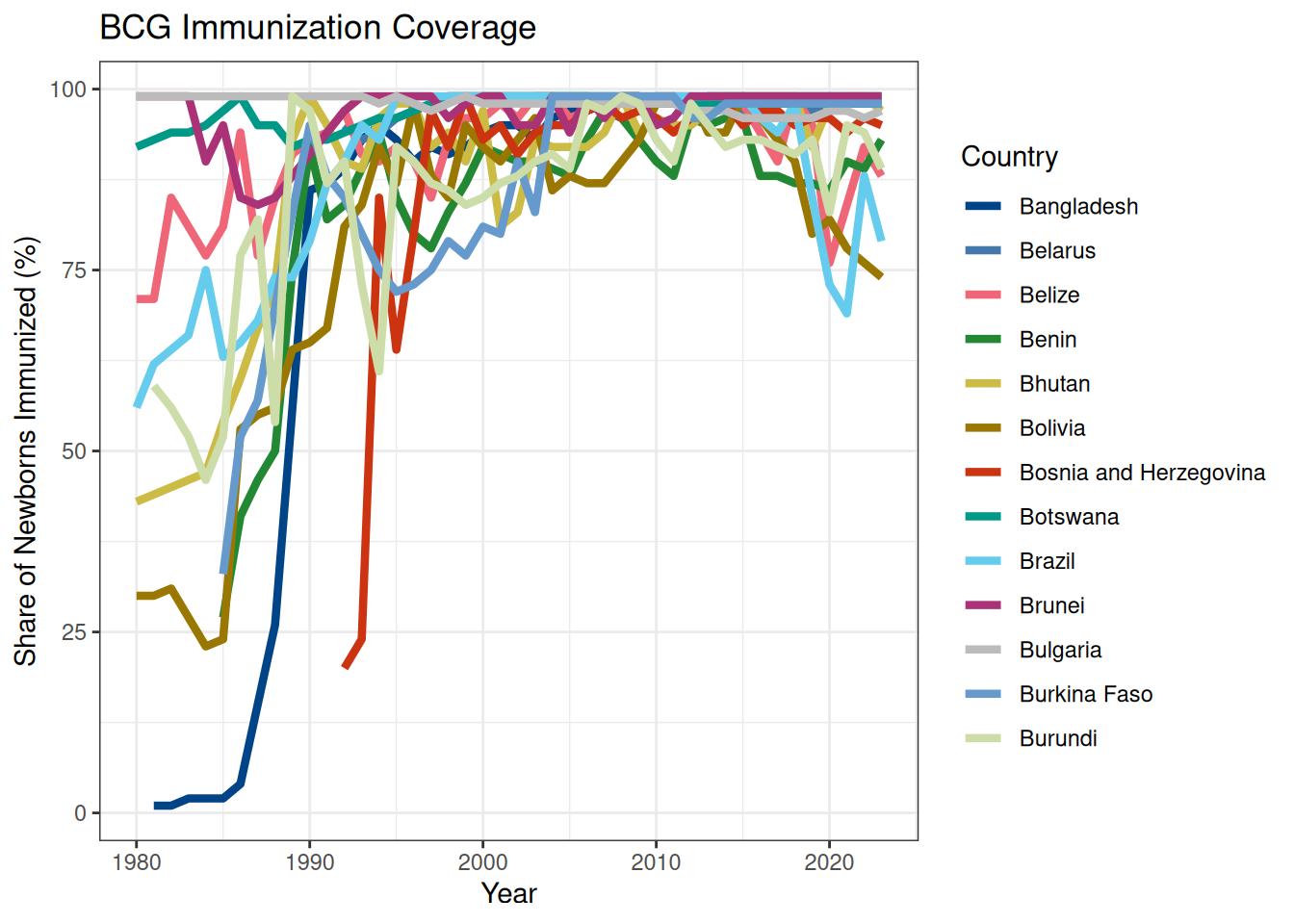
Next, you need to decide what parts become dynamic. Here we want to focus on the lines. Therefore, we need to make geom_line() dynamic. We do this by loading ggiraph and changing geom_line() to geom_line_interactive() and adding one of the following aesthetics in each interactive layer: tooltip, data_id or onclick.
tooltip: column of dataset that contains tooltips to be displayed when mouse is over elements.data_id: column of dataset that contains id to be associated with elements. This aesthetic is mandatory when you want to use an hover effect or when you want to enable selection of points in shiny applications.onclick: column of dataset that contains javascript function to be executed when elements are clicked.
In our case we are going to use tooltip = Entity. We save the plot into a variable instead of generating output from the code. Finally, we pass our new variable, gg to girafe(). You need to call girafe(ggobj = gg) and not girafe(gg).
```{r}
gg <- ggplot(tb_data_filt, aes(x = Year, y = Share_of_newborns, color = Entity)) +
    geom_line_interactive(aes(tooltip = Entity), linewidth = 1.5) +
    scale_color_manual(values = c("#004488", "#4477AA", "#EE6677", "#228833", "#CCBB44", "#997700", "#CC3311", "#009988", "#66CCEE", "#AA3377", "#BBBBBB", "#6699CC", "#CCDDAA")) +
    theme_bw() +
    labs(title = "BCG Immunization Coverage",
             x = "Year",
             y = "Share of Newborns Immunized (%)",
             color = "Country")

girafe(ggobj = gg)
```
With the same logic as described above we can create all kinds of plots. For example, for boxplots the key function is geom_boxplot_interactive().
4.1 Exercise:
- You will now try to use
geom_boxplot_interactive()function using themsleepdataset you already worked with. - Create a boxplot to visualize the total amount of total sleep across different diets, similar to the plotly example above. Enhance the plot’s appearance by applying techniques and options covered in the ggplot tutorial, such as custom color palettes, axis labels, and themes.
5 DataTables (DT)
The DataTables (DT) package provides a quick way to make data tables dynamic. It enables tables to be searchable, sortable, and pageable automatically. The main function in this package is datatable(). It creates a htmlwidget to display R data objects with DataTables.
Table below displays the first 5 rows of the msleep data as rendered by DT. Note the search box and clickable sorting arrows.
```{r}
datatable(msleep, options = list(pageLength = 5))
```
Another helpful tool you can use with DT is the ordering. Using the arrow widgets for each column it is easy to order a selected column in ascending or descending order. We can use the order option to specify how we want to order. For example, we sort the table by columns 6 (ascending) and 9 (descending):
```{r}
datatable(msleep, options = list(
  order = list(list(6, 'asc'), list(9, 'desc'))))
```
To describe what the table displays the caption argument is used. Placing a caption directly in the table provides helpful information for the user.
```{r}
datatable(msleep, caption="Table 1: Mammals sleep dataset")
```
We can also apply CSS styles to the table cells in a column according to the values of the cells using the function formatStyle(). Here, a few commonly used CSS properties as the arguments of formatStyle(), such as color and fontWeight are used.
```{r}
datatable(msleep, options = list(pageLength = 5), caption="Table 1: Mammals sleep dataset") %>%
  formatStyle('genus',  color = 'black', backgroundColor = 'orange', fontWeight = 'bold')
```
In the example above, all styles are applied to all cells in a column unconditionally: the font color is black, the background color is orange, and the font weight is bold. That may not be useful in practice. DT has provided a few helper functions to apply conditional styles to cells, such as styleInterval(), styleEqual(), and styleColorBar().
```{r}
datatable(msleep) %>%
  formatStyle('vore', fontWeight = styleEqual('omni', c('bold'))) %>%
  formatStyle('sleep_total', color = styleInterval(c(11, 18), c('white', 'blue', 'green')),
    backgroundColor = styleInterval(11, c('gray', 'orange'))
  ) %>%
   formatStyle(
    'sleep_rem',
    background = styleColorBar(msleep$sleep_rem, 'steelblue'),
    backgroundSize = '100% 90%',
    backgroundRepeat = 'no-repeat',
    backgroundPosition = 'center'
  )
```
For the column vore, the font weight in cells of which the values equal to omni will be bold. For sleep_total, both foreground and background colors are used: white for values smaller than 11, blue for those between 11 and 18, and green for those greater than 18; gray background for values below 11, and orange for those above 11. For sleep_rem, a bar graph is presented as the background.
5.1 Exercise:
- To test DT package you will use files
counts_raw.txtandmetadata.csv. - Read-in these two files, if not sure how, go back to the material from Day 1.
- Displays the first 10 rows of
counts_raw.txtandmetadata.csv. Once tables are rendered and displayed play around with the search box and clickable sorting arrows. - Add captions to both tables.
- In the
metadata.csvorder columnReplicateby descending order. - Finally, in the
counts_raw.txtforSample_1background use bar graph usingstyleColorBar(). ForSample_3usestyleInterval()and color foreground and background, decide on the interval size yourself.
6 crosstalk
The crosstalk package can incorporate additional dynamic functionality in a Quarto document. As the name implies, it allows linking multiple (crosstalk-compatible) htmlwidgets. This allows functionality that looks interactive as in a Shiny application, but does not require Shiny Server.
The crosstalkpackage is powerful because it lets you create a SharedData object. The primary use for SharedData is to be passed to crosstalk-compatible widgets in place of a data frame. Each SharedData$new(...) call makes a new “group” of widgets that link to each other, but not to widgets in other groups.
The SharedData constructor has two optional parameters. The first is key and the second is group. Detailed explanation is found here.
One dataset, two plots
- Create a
SharedDataobject - Make htmlwidgets with
SharedDatainput- Here, we do this first by making
ggplotobjects… - …and then converting them to
ggplotlyobjects
- Here, we do this first by making
- Output results
For step 3, we use the crosstalk::bscols() function to put the resulting interactive plots in a row (similar to grid.arrange). In the output below, click on a point on one plot and notice that the point related to the same penguin is highlighted in the other plot.
```{r}
library(palmerpenguins)
library(crosstalk)
library(ggplot2)

# make SharedData object
penguins_db <- SharedData$new(penguins)

# make ggplots using SharedData object
gg_plot1 <- ggplot(data = penguins_db, aes(x = bill_length_mm, y = bill_depth_mm)) +
  geom_point(aes(color = species,
                 shape = species),
             size = 2)  +
  scale_color_manual(values = c("darkorange","darkorchid","cyan4"))

gg_plot2 <- ggplot(data = penguins_db, aes(x = flipper_length_mm, y = body_mass_g)) +
  geom_point(aes(color = species,
                 shape = species),
             size = 2) +
  scale_color_manual(values = c("darkorange","darkorchid","cyan4"))

# convert ggplots to ggplotly
plotly_plot1 <- ggplotly(gg_plot1)
plotly_plot2 <- ggplotly(gg_plot2)

# compose output
bscols(plotly_plot1, plotly_plot2)
```
One dataset, two widgets
Crosstalk is not limited to plots; it works with other htmlwidgets, such as DT tables and leaflet maps. To use it, simply pass a SharedData object into the functions of these packages in the same way you would a standard dataframe.
In the following example, we will now make a plot interact with a table instead of another plot.
- Create a
SharedDataobject - Make
htmlwidgetswithSharedDatainput- Before this was two
ggplotly - Now, we have one
ggplotlyand onedatatable
- Before this was two
- Output results
```{r}
library(palmerpenguins)
library(crosstalk)
library(ggplot2)
library(DT)

# make SharedData object
penguins_db <- SharedData$new(penguins)

# make ggplots using SharedData object
gg_plot1 <- ggplot(data = penguins_db, aes(x = bill_length_mm, y = bill_depth_mm)) +
  geom_point(aes(color = species,
                 shape = species),
             size = 2)  +
  scale_color_manual(values = c("darkorange","darkorchid","cyan4"))

# make htmlwidgets
plotly_plot1 <- ggplotly(gg_plot1)
dt_penguins <- datatable(penguins_db)

# compose output
bscols(plotly_plot1, dt_penguins)
```
Multiple datasets: Two datasets, two widgets
To link multiple SharedData objects, we can specify a group argument when constructing the SharedData objects. Group is a character string that servers as a unique identifier for a set of SharedData objects across whom the key information should be transmitted.
- Create a
SharedDataobjects - Make
htmlwidgetswithSharedDatainput - Output results
Important
To run the following example, you need to download the data dream_location_filt.csv. Unfortunately, this was not part of the data.zip you recieved in the beginning of the course. You can download this file here
```{r}
library(dplyr)
library(leaflet)
library(palmerpenguins)
library(crosstalk)

dream_location <- read.csv("./data/dream_location_filt.csv", sep = ",", header = T)
dream_penguins <- penguins %>% filter(island == "Dream")

# make SharedData object
penguins_db <- SharedData$new(dream_penguins, group = "location")
locations_db <- SharedData$new(dream_location, group = "location")

# make htmlwidgets
dt_penguins <- datatable(penguins_db)
lf_stations <- leaflet(locations_db) %>% addTiles() %>% addMarkers()

# compose output
bscols(dt_penguins, lf_stations, widths = c(12, 12))
```
6.1 Exercise:
- Start by creating a SharedData object using the
SharedData$new()function from thecrosstalkpackage. Use themsleepdataset as input. - Create a scatter plot using
ggplot2with the SharedData object. Mapsleep_remto the x-axis,sleep_totalto the y-axis, andvoreto the color aesthetic. - Convert the ggplot object to obtain plotly plot.
- Use
crosstalkfilters to add dynamic applications. Add a checkbox filter for thevorevariable, a slider filter forsleep_total, and a select filter forconservation. - Combine the filters and the plotly plot into a single layout using the
bscols()function. Specify the widths for the filters and the plot.
7 ObservableJS (OJS)
ObservableJS is a relatively new approach that also allows dynamic features to be included in a Quarto document. It is an entirely separate language outside of R that uses JavaScript and allows excellent functionality similar what is provided by a Shiny Server.
OJS works in any Quarto document (plain markdown as well as Jupyter and Knitr documents). Just include your code in an {ojs} executable code block. Similar to what you learned in Quarto lab, there are many options available to customize the behavior of {ojs} code cells, including showing, hiding, and collapsing code as well as controlling the visibility and layout of outputs. Cell options are specified with //|.
The most important cell option to be aware of is the echo option, which controls whether source code is displayed. In the code below echo: false, meaning source code is not diplayed in the final rendered report.
```{ojs}
//| echo: false
data = FileAttachment("./data/palmer-penguins.csv").csv({ typed: true })
```
Let’s have a look into a simple example using Palmer Penguins dataset. Here we look at how penguin body mass varies across both sex and species (the provided inputs to filter the dataset by bill length and island are used).
To begin, we create an {ojs} cell to load data from a CSV file (e.g., palmer-penguins.csv) using a FileAttachment. File attachments support various formats such as CSV, TSV, and JSON, making them a convenient way to load pre-prepared datasets for analysis.
To get pre-prepared dataset palmer-penguins.csv load palmerpenguins library, save penguins data as .csv file and then load this data as described above.
```{ojs}
data = FileAttachment("./data/palmer-penguins.csv").csv({ typed: true })
```
Now we loaded the external CSV file into the Observable environment.
CSV files:
- The
.csv()method parses the CSV file into a JavaScript array of objects, where each row in the CSV becomes an object, and the column headers become the keys. - The
{ typed: true }option ensures that the data types of the columns are automatically inferred. For example:- Numeric columns are converted to numbers.
- Text columns remain as strings.
- Dates are parsed into JavaScript
Dateobjects (if applicable).
Data Sources - R
The data you want to use with OJS might not always be available in raw form. Often you will need to read and preprocess the raw data using R. You can perform this preprocessing during document render (in an {r} code cell) and then make it available to {ojs} cells via the ojs_define() function.
Here is an example. Read the data into R, do some grouping and summarization, then make it available to OJS using ojs_define:
```{r}
library(readr)
library(dplyr)

penguins_filt = read_csv("palmer-penguins.csv") %>%
  group_by(species) %>%
  summarise(mean_body_mass = mean(body_mass_g, na.rm = TRUE))

ojs_define(penguinsdata = penguins_filt)
```
Once JS object is created, it needs to be transposed using the transpose() function. This function will convert column-oriented datasets (like the ones used in R) into the row-oriented datasets used by many JavaScript plotting libraries.
```{ojs}
ojsdata <- transpose(penguinsdata)
```
The example plotted (Palmer Penguins dataset) above does not display the entire dataset but instead a filtered subset. To create this filter, we need inputs and the ability to use their values in our filtering function. This is achieved using the viewof keyword along with standard Inputs.
```{ojs}
viewof bill_length_min = Inputs.range(
  [32, 50],
  {value: 35, step: 1, label: "Bill length (min):"}
)
viewof islands = Inputs.checkbox(
  ["Torgersen", "Biscoe", "Dream"],
  { value: ["Torgersen", "Biscoe"],
    label: "Islands:"
  }
)
```
The range input above (created with Inputs.range()) specifies the total range of values a user can choose from (32 to 50), along with options for:
value: the default starting value or option of an input (here, 35)step: the increments along the range (here, change by increments of 1)label: a label informing or prompting the user (here, Bill length (min))
The checkbox input above (created with Inputs.checkbox()) allows the user to choose any of a given set of values, in this case three islands where penguins are found.
value: the default starting values or options of an input (here, Torgersen, Biscoe)label: a label informing or prompting the user (here, Islands)
The input values (here bill_length_min and islands) are generated and can be referenced in any cell, and the cell will run whenever the input changes.
Next step is to write the filtering function that will transform the data read from the CSV using the values of bill_length_mm and island.
```{ojs}
filtered = data.filter(function(penguin) {
  return bill_length_min < penguin.bill_length_mm &&
         islands.includes(penguin.island);
})
```
The filtered variable should contains an array of penguin objects that meet both conditions: bill_length_mm is greather than bill_length_min and island is one of the values in the islands.
Finally, let’s plot the filtered data using Observable Plot (an open-source JavaScript library for quick visualization of tabular data).
```{ojs}
Plot.rectY(filtered,
  Plot.binX(
    {y: "count"},
    {x: "body_mass_g", fill: "species", thresholds: 20}
  ))
  .plot({
    facet: {
      data: filtered,
      x: "sex",
      y: "species",
      marginRight: 80
    },
    marks: [
      Plot.frame(),
    ]
  }
)
```
Observe that the filtered variable is referenced directly in the plotting code without any special syntax. This ensures that the plot is automatically updated whenever the filtered variable changes, which in turn is triggered by any updates to the input (bill_length_min, islands) values.
7.1 Exercise:
For this exercise is recommended to create a new Quarto (.qmd) notebook. You will work with msleep dataset, and your goal is to generate a scatter plot that shows the relationship between mammalian REM and total sleep where diet (vore variable) is used as the input to filter the dataset.
- Prepare data in R and pass it to OJS using
ojs_define. Transpose JS object. - Display the raw dataset in a table using
Inputs.tablefor better data exploration. - Create input using the
Inputs.checkboxforvorevariable, to allow dynamic filtering of the dataset. - Filter the dataset based on user input using JavaScript’s
filterfunction. - Visualize the filtered data using Observable Plot. Use
Plot.dot()to create scatterplot.