suppressPackageStartupMessages({
    library(Seurat)
    library(ggplot2) # plotting
    library(patchwork) # combining figures
    library(scran)
})
Note
Code chunks run R commands unless otherwise specified.
1 Data preparation
First, let’s load all necessary libraries and the QC-filtered dataset from the previous step.
# download pre-computed data if missing or long compute
fetch_data <- TRUE

# url for source and intermediate data
path_data <- "https://nextcloud.dc.scilifelab.se/public.php/webdav"
curl_upass <- "-u zbC5fr2LbEZ9rSE:scRNAseq2025"

path_file <- "data/covid/results/seurat_covid_qc.rds"
if (!dir.exists(dirname(path_file))) dir.create(dirname(path_file), recursive = TRUE)
if (fetch_data && !file.exists(path_file)) download.file(url = file.path(path_data, "covid/results_seurat_2026/seurat_covid_qc.rds"), destfile = path_file, method = "curl", extra = curl_upass)

alldata <- readRDS(path_file)
2 Feature selection
We first need to define which features/genes are important in our dataset to distinguish cell types. For this purpose, we need to find genes that are highly variable across cells, which in turn will also provide a good separation of the cell clusters.
suppressWarnings(suppressMessages(alldata <- FindVariableFeatures(alldata, selection.method = "vst", nfeatures = 2000, verbose = FALSE, assay = "RNA")))
top20 <- head(VariableFeatures(alldata), 20)

LabelPoints(plot = VariableFeaturePlot(alldata), points = top20, repel = TRUE)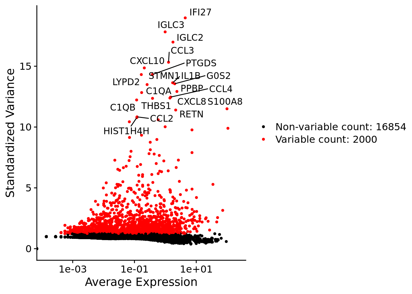
3 Z-score transformation
Now that the genes have been selected, we can proceed with PCA. Since each gene has a different expression level, it means that genes with higher expression values will naturally have higher variation that will be captured by PCA. This means that we need to somehow give each gene a similar weight when performing PCA (see below). The common practice is to center and scale each gene before performing PCA. This exact scaling called Z-score normalization is very useful for PCA, clustering and plotting heatmaps. Additionally, we can use regression to remove any unwanted sources of variation from the dataset, such as cell cycle, sequencing depth, percent mitochondria etc. This is achieved by doing a generalized linear regression using these parameters as co-variates in the model. Then the residuals of the model are taken as the regressed data. Although perhaps not in the best way, batch effect regression can also be done here.
alldata <- ScaleData(alldata, vars.to.regress = c("percent_mito", "nFeature_RNA"), assay = "RNA")4 PCA
Performing PCA has many useful applications and interpretations depending on the data used. In the case of single-cell data, we want to segregate samples based on gene expression patterns in the data.
To run PCA, you can use the function RunPCA().
alldata <- RunPCA(alldata, npcs = 50, verbose = F)We then plot the first principal components.
wrap_plots(
    DimPlot(alldata, reduction = "pca", group.by = "orig.ident", dims = 1:2, shuffle = TRUE),
    DimPlot(alldata, reduction = "pca", group.by = "orig.ident", dims = 3:4, shuffle = TRUE),
    DimPlot(alldata, reduction = "pca", group.by = "orig.ident", dims = 5:6, shuffle = TRUE),
    ncol = 3
) + plot_layout(guides = "collect")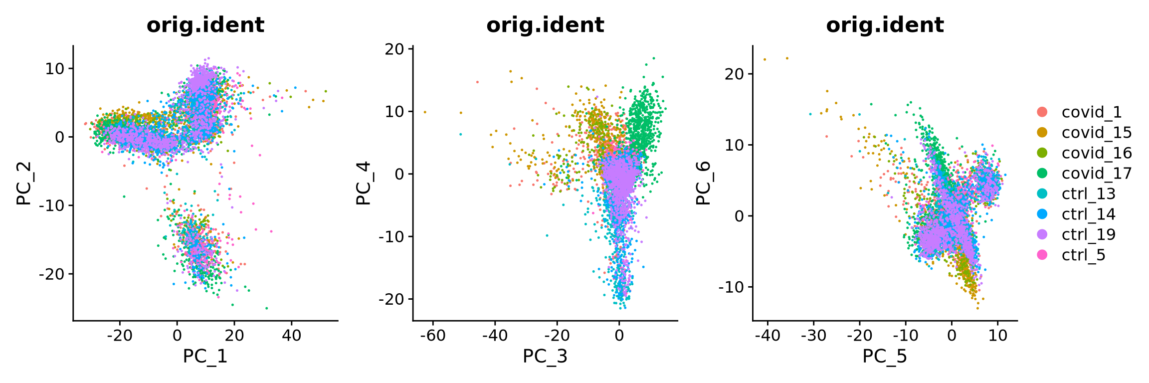
To identify which genes contribute the most to each PC, one can retrieve the loading matrix information.
VizDimLoadings(alldata, dims = 1:5, reduction = "pca", ncol = 5, balanced = T)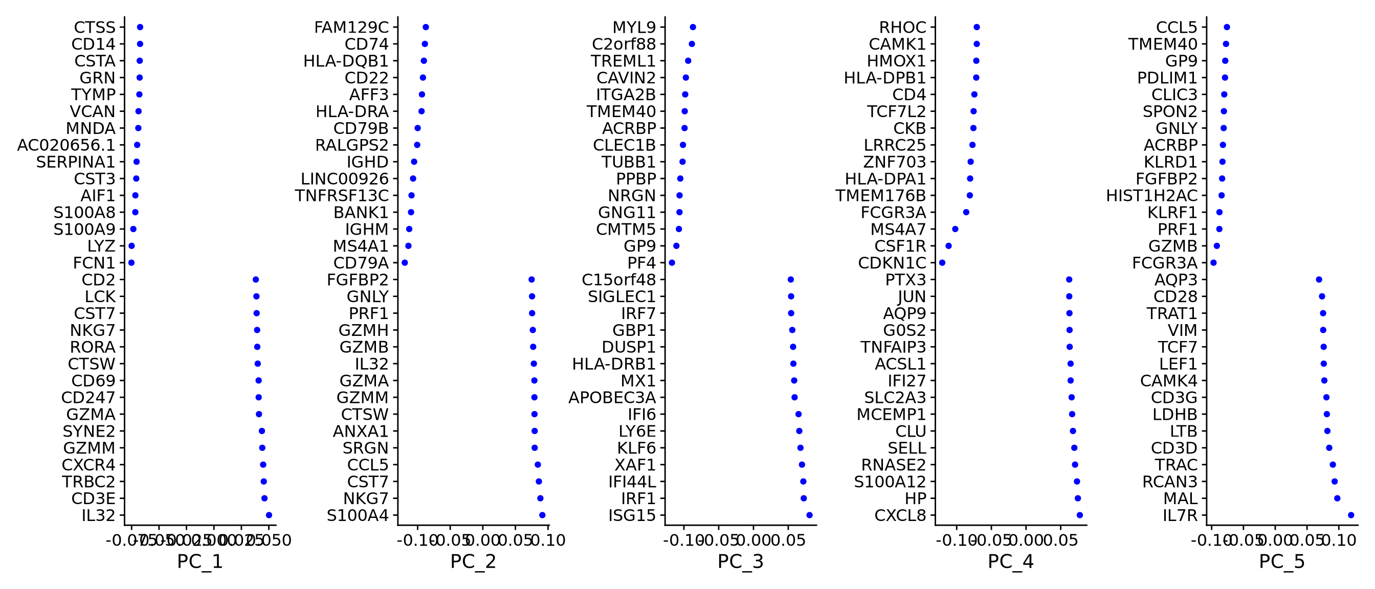
We can also plot the amount of variance explained by each PC.
ElbowPlot(alldata, reduction = "pca", ndims = 50)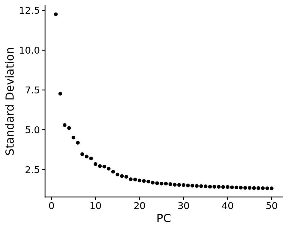
Based on this plot, we can see that the top 8 PCs retain a lot of information, while other PCs contain progressively less. However, it is still advisable to use more PCs since they might contain information about rare cell types (such as platelets and DCs in this dataset)
With the scater package we can check how different metadata variables contribute to each PCs. This can be important to look at to understand different biases you may have in your data.
scater::plotExplanatoryPCs(as.SingleCellExperiment(alldata), nvars_to_plot = 15, npcs_to_plot = 20)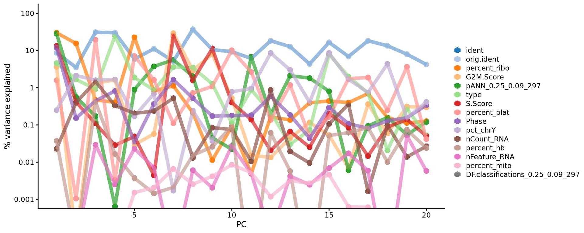
Discuss
Have a look at the plot from plotExplanatoryPCs and the gene loadings plots. Do you think the top components are biologically relevant or more driven by technical noise?
5 tSNE
We will now run BH-tSNE.
alldata <- RunTSNE(
    alldata,
    reduction = "pca", dims = 1:30,
    perplexity = 30,
    max_iter = 1000,
    theta = 0.5,
    eta = 200,
    num_threads = 0
)
# see ?Rtsne and ?RunTSNE for more info
We plot the tSNE scatterplot colored by dataset. We can clearly see the effect of batches present in the dataset.
DimPlot(alldata, reduction = "tsne", group.by = "orig.ident")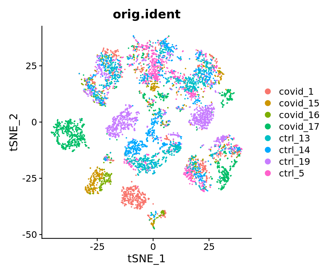
6 UMAP
We can now run UMAP for cell embeddings.
alldata <- RunUMAP(
    alldata,
    reduction = "pca",
    dims = 1:30,
    n.components = 2,
    n.neighbors = 30,
    n.epochs = 200,
    min.dist = 0.3,
    learning.rate = 1,
    spread = 1
)
# see ?RunUMAP for more info
A feature of UMAP is that it is not limited by the number of dimensions the data cen be reduced into (unlike tSNE). We can simply reduce the dimentions altering the n.components parameter. So here we will create a UMAP with 10 dimensions.
In Seurat, we can add in additional reductions, by default they are named “pca”, “umap”, “tsne” etc. depending on the function you run. Here we will specify an alternative name for the umap with the reduction.name parameter.
alldata <- RunUMAP(
    alldata,
    reduction.name = "UMAP10_on_PCA",
    reduction = "pca",
    dims = 1:30,
    n.components = 10,
    n.neighbors = 30,
    n.epochs = 200,
    min.dist = 0.3,
    learning.rate = 1,
    spread = 1
)
# see ?RunUMAP for more info
UMAP is plotted colored per dataset. Although less distinct as in the tSNE, we still see quite an effect of the different batches in the data.
wrap_plots(
    DimPlot(alldata, reduction = "umap", group.by = "orig.ident",
            shuffle = TRUE) + ggplot2::ggtitle(label = "UMAP_on_PCA"),
    DimPlot(alldata, reduction = "UMAP10_on_PCA", group.by = "orig.ident",
            dims = 1:2, shuffle = TRUE) + ggplot2::ggtitle(label = "UMAP10_on_PCA"),
    DimPlot(alldata, reduction = "UMAP10_on_PCA", group.by = "orig.ident",
            dims = 3:4, shuffle = TRUE) + ggplot2::ggtitle(label = "UMAP10_on_PCA"),
    ncol = 3
) + plot_layout(guides = "collect")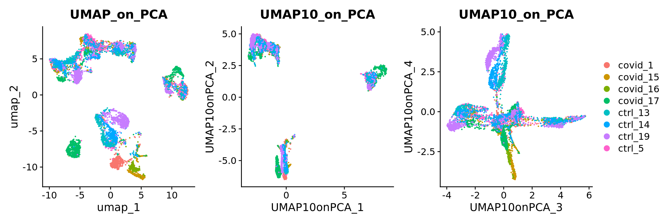
We can now plot PCA, UMAP and tSNE side by side for comparison. Have a look at the UMAP and tSNE. What similarities/differences do you see? Can you explain the differences based on what you learned during the lecture? Also, we can conclude from the dimensionality reductions that our dataset contains a batch effect that needs to be corrected before proceeding to clustering and differential gene expression analysis.
wrap_plots(
    DimPlot(alldata, reduction = "pca", group.by = "orig.ident", shuffle = TRUE),
    DimPlot(alldata, reduction = "tsne", group.by = "orig.ident", shuffle = TRUE),
    DimPlot(alldata, reduction = "umap", group.by = "orig.ident", shuffle = TRUE),
    ncol = 3
) + plot_layout(guides = "collect")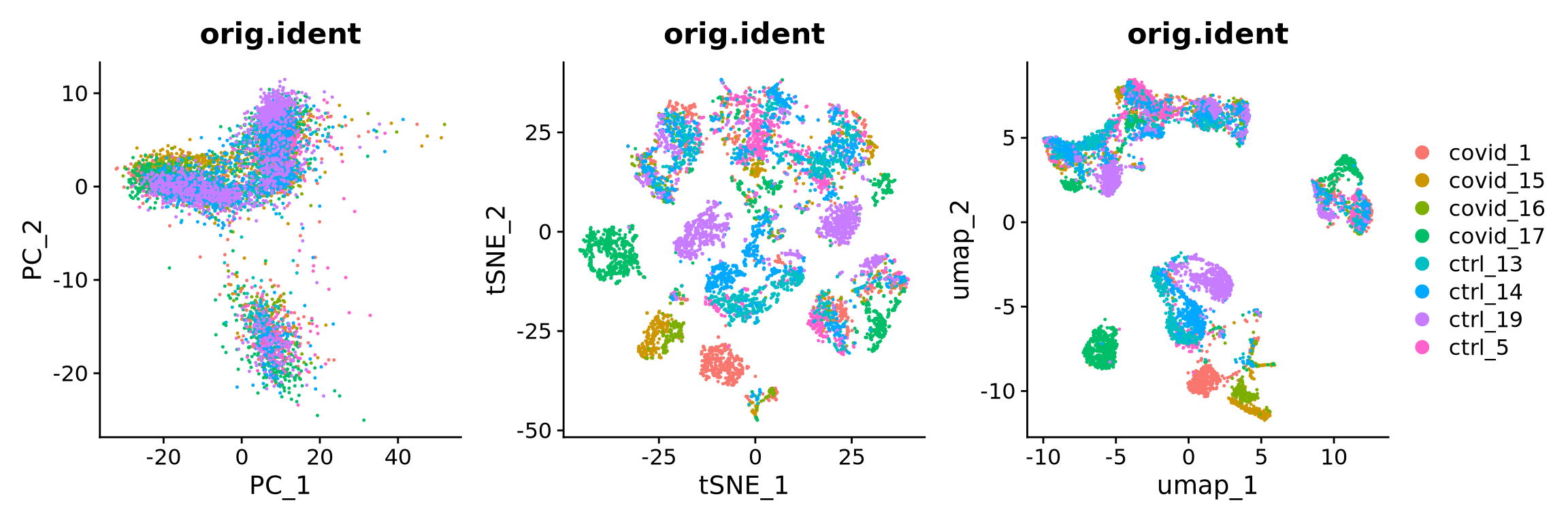
Discuss
We have now done Variable gene selection, PCA and UMAP with the settings we selected for you. Test a few different ways of selecting variable genes, number of PCs for UMAP and check how it influences your embedding.
7 Z-scores & DR graphs
Although running a second dimensionality reduction (i.e tSNE or UMAP) on PCA would be a standard approach (because it allows higher computation efficiency), the options are actually limitless. Below we will show a couple of other common options such as running directly on the scaled data (z-scores) (which was used for PCA) or on a graph built from scaled data. We will only work with UMAPs, but the same applies for tSNE.
7.1 UMAP from z-scores
To run tSNE or UMAP on the scaled data, one first needs to select the number of variables to use. This is because including dimensions that do contribute to the separation of your cell types will in the end mask those differences. Another reason for it is because running with all genes/features also will take longer or might be computationally unfeasible. Therefore we will use the scaled data of the highly variable genes.
alldata <- RunUMAP(
    alldata,
    reduction.name = "UMAP_on_ScaleData",
    features = VariableFeatures(alldata),
    assay = "RNA",
    n.components = 2,
    n.neighbors = 30,
    n.epochs = 200,
    min.dist = 0.3,
    learning.rate = 1,
    spread = 1
)
7.2 UMAP from graph
To run tSNE or UMAP on the a graph, we first need to build a graph from the data. In fact, both tSNE and UMAP first build a graph from the data using a specified distance matrix and then optimize the embedding. Since a graph is just a matrix containing distances from cell to cell and as such, you can run either UMAP or tSNE using any other distance metric desired. Euclidean and Correlation are usually the most commonly used.
#OBS! Skip for now, known issue with later version of umap-learn in Seurat5
# have 0.5.7 now, tested downgrading to 0.5.4 or 0.5.3 but still have same error.
# Seurat 5.2.0 has a fix for this, but not the version we have now.

# Build Graph
alldata <- FindNeighbors(alldata,
    reduction = "pca",
    assay = "RNA",
    k.param = 20,
    features = VariableFeatures(alldata)
)

alldata <- RunUMAP(alldata,
    reduction.name = "UMAP_on_Graph",
    umap.method = "umap-learn",
    graph = "RNA_snn",
    n.epochs = 200,
    assay = "RNA"
)
We can now plot the UMAP comparing both on PCA vs ScaledSata vs Graph.
p1 <- DimPlot(alldata, reduction = "umap", group.by = "orig.ident") + ggplot2::ggtitle(label = "UMAP_on_PCA")
p2 <- DimPlot(alldata, reduction = "UMAP_on_ScaleData", group.by = "orig.ident") + ggplot2::ggtitle(label = "UMAP_on_ScaleData")
#p3 <- DimPlot(alldata, reduction = "UMAP_on_Graph", group.by = "orig.ident") + ggplot2::ggtitle(label = "UMAP_on_Graph")
#wrap_plots(p1, p2, p3, ncol = 3) + plot_layout(guides = "collect")
wrap_plots(p1, p2, ncol = 2) + plot_layout(guides = "collect")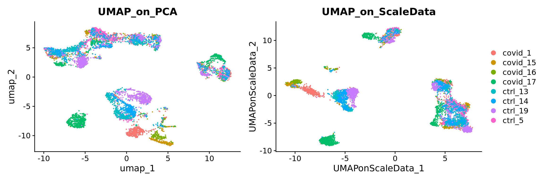
8 Genes of interest
Let’s plot some marker genes for different cell types onto the embedding.
| Markers | Cell Type |
|---|---|
| CD3E | T cells |
| CD3E CD4 | CD4+ T cells |
| CD3E CD8A | CD8+ T cells |
| GNLY, NKG7 | NK cells |
| MS4A1 | B cells |
| CD14, LYZ, CST3, MS4A7 | CD14+ Monocytes |
| FCGR3A, LYZ, CST3, MS4A7 | FCGR3A+ Monocytes |
| FCER1A, CST3 | DCs |
myfeatures <- c("CD3E", "CD4", "CD8A", "NKG7", "GNLY", "MS4A1", "CD14", "LYZ", "MS4A7", "FCGR3A", "CST3", "FCER1A")
FeaturePlot(alldata, reduction = "umap", dims = 1:2, features = myfeatures, ncol = 4, order = T)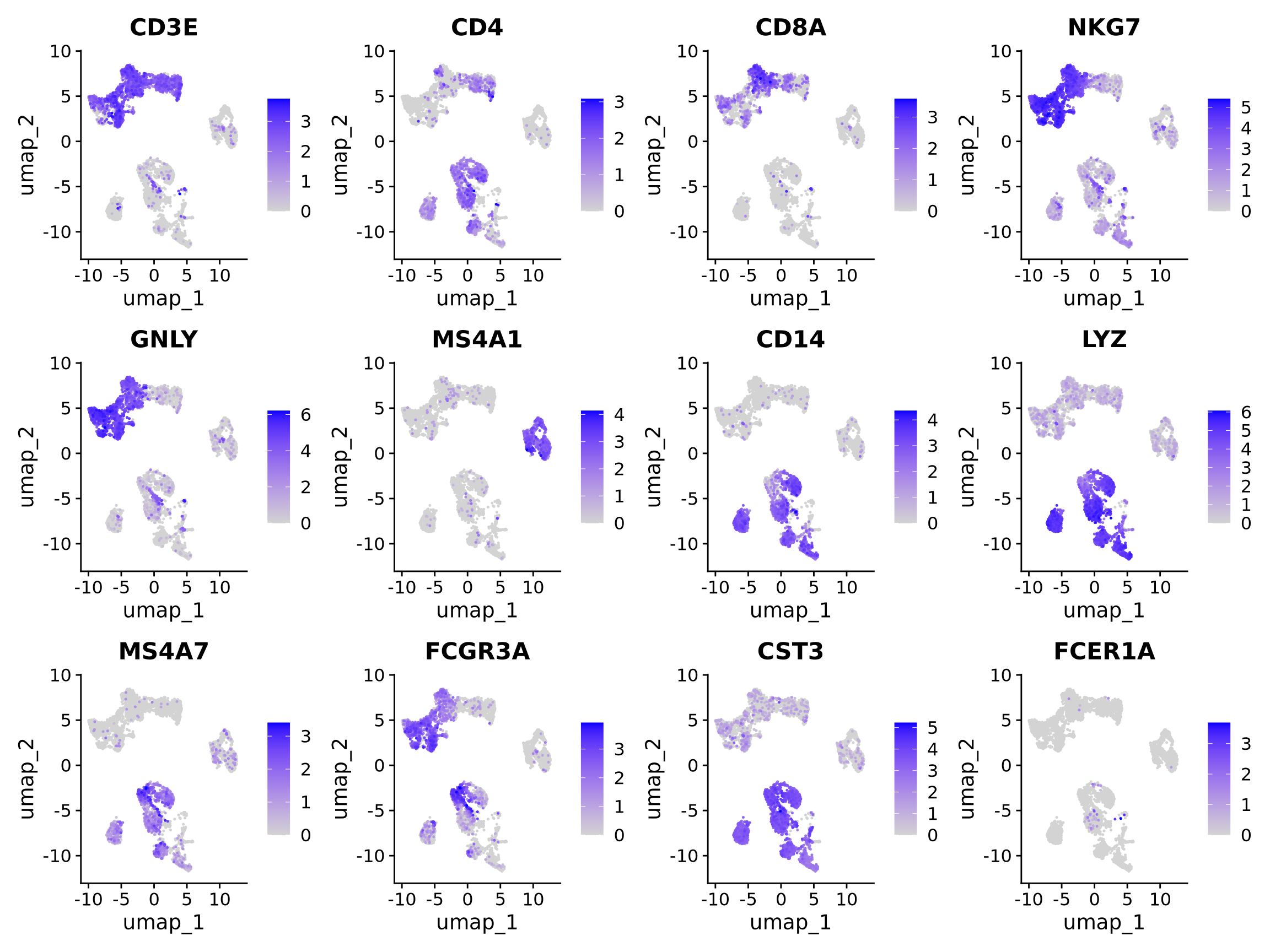
Discuss
Select some of your dimensionality reductions and plot some of the QC stats that were calculated in the previous lab. Can you see if some of the separation in your data is driven by quality of the cells?
myfeatures <- c("nCount_RNA","nFeature_RNA", "percent_mito","percent_ribo","percent_hb","percent_plat")
FeaturePlot(alldata, reduction = "umap", dims = 1:2, features = myfeatures, ncol = 3, order = T) 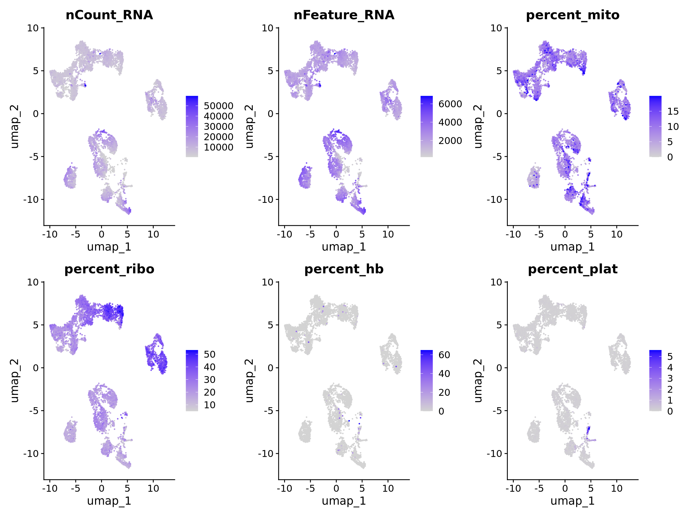
9 Save data
We can finally save the object for use in future steps.
saveRDS(alldata, "data/covid/results/seurat_covid_qc_dr.rds")10 Session info
Click here
sessionInfo()R version 4.3.3 (2024-02-29)
Platform: x86_64-conda-linux-gnu (64-bit)
Running under: Ubuntu 20.04.6 LTS
Matrix products: default
BLAS/LAPACK: /usr/local/conda/envs/seurat/lib/libopenblasp-r0.3.28.so; LAPACK version 3.12.0
locale:
[1] LC_CTYPE=en_US.UTF-8 LC_NUMERIC=C
[3] LC_TIME=en_US.UTF-8 LC_COLLATE=en_US.UTF-8
[5] LC_MONETARY=en_US.UTF-8 LC_MESSAGES=en_US.UTF-8
[7] LC_PAPER=en_US.UTF-8 LC_NAME=C
[9] LC_ADDRESS=C LC_TELEPHONE=C
[11] LC_MEASUREMENT=en_US.UTF-8 LC_IDENTIFICATION=C
time zone: Etc/UTC
tzcode source: system (glibc)
attached base packages:
[1] stats4 stats graphics grDevices utils datasets methods
[8] base
other attached packages:
[1] scran_1.30.0 scuttle_1.12.0
[3] SingleCellExperiment_1.24.0 SummarizedExperiment_1.32.0
[5] Biobase_2.62.0 GenomicRanges_1.54.1
[7] GenomeInfoDb_1.38.1 IRanges_2.36.0
[9] S4Vectors_0.40.2 BiocGenerics_0.48.1
[11] MatrixGenerics_1.14.0 matrixStats_1.5.0
[13] patchwork_1.3.0 ggplot2_3.5.1
[15] Seurat_5.1.0 SeuratObject_5.0.2
[17] sp_2.2-0
loaded via a namespace (and not attached):
[1] RcppAnnoy_0.0.22 splines_4.3.3
[3] later_1.4.1 bitops_1.0-9
[5] tibble_3.2.1 polyclip_1.10-7
[7] fastDummies_1.7.5 lifecycle_1.0.4
[9] edgeR_4.0.16 globals_0.16.3
[11] lattice_0.22-6 MASS_7.3-60.0.1
[13] magrittr_2.0.3 limma_3.58.1
[15] plotly_4.10.4 rmarkdown_2.29
[17] yaml_2.3.10 metapod_1.10.0
[19] httpuv_1.6.15 sctransform_0.4.1
[21] spam_2.11-1 spatstat.sparse_3.1-0
[23] reticulate_1.40.0 cowplot_1.1.3
[25] pbapply_1.7-2 RColorBrewer_1.1-3
[27] abind_1.4-5 zlibbioc_1.48.0
[29] Rtsne_0.17 purrr_1.0.2
[31] RCurl_1.98-1.16 GenomeInfoDbData_1.2.11
[33] ggrepel_0.9.6 irlba_2.3.5.1
[35] listenv_0.9.1 spatstat.utils_3.1-2
[37] goftest_1.2-3 RSpectra_0.16-2
[39] spatstat.random_3.3-2 dqrng_0.3.2
[41] fitdistrplus_1.2-2 parallelly_1.42.0
[43] DelayedMatrixStats_1.24.0 leiden_0.4.3.1
[45] codetools_0.2-20 DelayedArray_0.28.0
[47] tidyselect_1.2.1 farver_2.1.2
[49] viridis_0.6.5 ScaledMatrix_1.10.0
[51] spatstat.explore_3.3-4 jsonlite_1.8.9
[53] BiocNeighbors_1.20.0 progressr_0.15.1
[55] ggridges_0.5.6 survival_3.8-3
[57] scater_1.30.1 tools_4.3.3
[59] ica_1.0-3 Rcpp_1.0.14
[61] glue_1.8.0 gridExtra_2.3
[63] SparseArray_1.2.2 xfun_0.50
[65] dplyr_1.1.4 withr_3.0.2
[67] fastmap_1.2.0 bluster_1.12.0
[69] digest_0.6.37 rsvd_1.0.5
[71] R6_2.6.1 mime_0.12
[73] colorspace_2.1-1 scattermore_1.2
[75] tensor_1.5 spatstat.data_3.1-4
[77] tidyr_1.3.1 generics_0.1.3
[79] data.table_1.16.4 httr_1.4.7
[81] htmlwidgets_1.6.4 S4Arrays_1.2.0
[83] uwot_0.2.2 pkgconfig_2.0.3
[85] gtable_0.3.6 lmtest_0.9-40
[87] XVector_0.42.0 htmltools_0.5.8.1
[89] dotCall64_1.2 scales_1.3.0
[91] png_0.1-8 spatstat.univar_3.1-1
[93] knitr_1.49 reshape2_1.4.4
[95] nlme_3.1-167 zoo_1.8-12
[97] stringr_1.5.1 KernSmooth_2.23-26
[99] parallel_4.3.3 miniUI_0.1.1.1
[101] vipor_0.4.7 pillar_1.10.1
[103] grid_4.3.3 vctrs_0.6.5
[105] RANN_2.6.2 promises_1.3.2
[107] BiocSingular_1.18.0 beachmat_2.18.0
[109] xtable_1.8-4 cluster_2.1.8
[111] beeswarm_0.4.0 evaluate_1.0.3
[113] cli_3.6.4 locfit_1.5-9.11
[115] compiler_4.3.3 rlang_1.1.5
[117] crayon_1.5.3 future.apply_1.11.3
[119] labeling_0.4.3 plyr_1.8.9
[121] ggbeeswarm_0.7.2 stringi_1.8.4
[123] viridisLite_0.4.2 deldir_2.0-4
[125] BiocParallel_1.36.0 munsell_0.5.1
[127] lazyeval_0.2.2 spatstat.geom_3.3-5
[129] Matrix_1.6-5 RcppHNSW_0.6.0
[131] sparseMatrixStats_1.14.0 future_1.34.0
[133] statmod_1.5.0 shiny_1.10.0
[135] ROCR_1.0-11 igraph_2.0.3