import numpy as np
import pandas as pd
import matplotlib.pyplot as pl
from matplotlib import rcParams
import scanpy as sc

import scipy
import numpy as np
import matplotlib.pyplot as plt
import warnings

warnings.simplefilter(action="ignore", category=Warning)

# verbosity: errors (0), warnings (1), info (2), hints (3)
sc.settings.verbosity = 3
sc.settings.set_figure_params(dpi=100, frameon=False, figsize=(5, 5), facecolor='white', color_map = 'viridis_r')
Note
Code chunks run Python commands unless it starts with %%bash, in which case, those chunks run shell commands.
Partly following this PAGA tutorial with some modifications.
1 Loading libraries
2 Preparing data
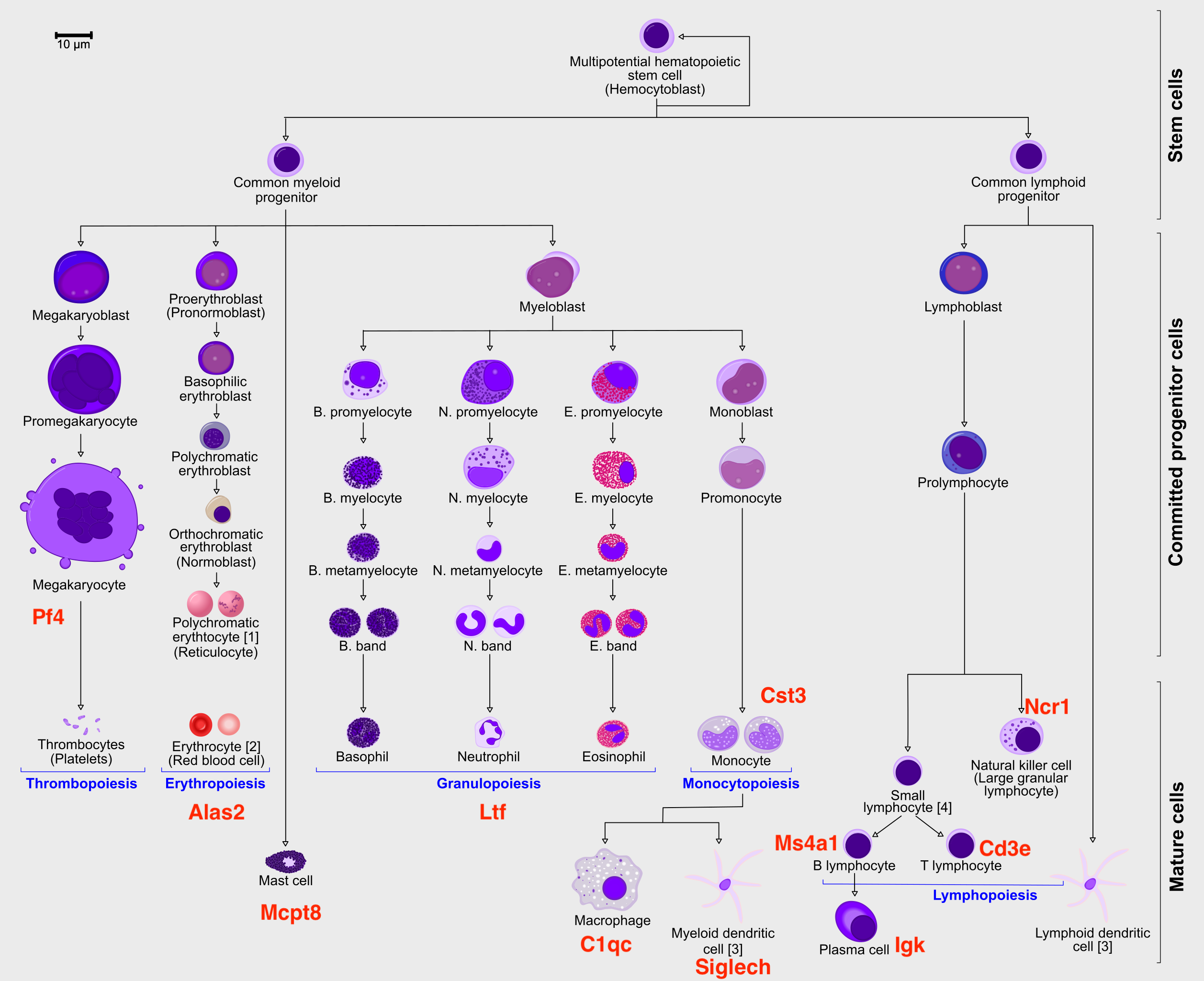
In order to speed up the computations during the exercises, we will be using a subset of a bone marrow dataset (originally containing about 100K cells). The bone marrow is the source of adult immune cells, and contains virtually all differentiation stages of cell from the immune system which later circulate in the blood to all other organs.
If you have been using the Seurat, Bioconductor or Scanpy toolkits with your own data, you need to reach to the point where can find get:
- A dimensionality reduction where to perform the trajectory (for example: PCA, ICA, MNN, harmony, Diffusion Maps, UMAP)
- The cell clustering information (for example: from Louvain, k-means)
- A KNN/SNN graph (this is useful to inspect and sanity-check your trajectories)
In this case, all the data has been preprocessed with Seurat with standard pipelines. In addition there was some manual filtering done to remove clusters that are disconnected and cells that are hard to cluster, which can be seen in this script
The file trajectory_scanpy_filtered.h5ad was converted from the Seurat object using the SeuratDisk package. For more information on how it was done, have a look at the script: convert_to_h5ad.R in the github repo.
You can download the data with the commands:
import os
import subprocess

# download pre-computed data if missing or long compute
fetch_data = True

# url for source and intermediate data
path_data = "https://nextcloud.dc.scilifelab.se/public.php/webdav"
curl_upass = "zbC5fr2LbEZ9rSE:scRNAseq2025"

path_results = "data/trajectory"
if not os.path.exists(path_results):
    os.makedirs(path_results, exist_ok=True)

path_file = "data/trajectory/trajectory_seurat_filtered.h5ad"
if not os.path.exists(path_file):
    file_url = os.path.join(path_data, "trajectory/trajectory_seurat_filtered.h5ad")
    subprocess.call(["curl", "-u", curl_upass, "-o", path_file, file_url ])
3 Reading data
We already have pre-computed and subsetted the dataset (with 6688 cells and 3585 genes) following the analysis steps in this course. We then saved the objects, so you can use common tools to open and start to work with them (either in R or Python).
adata = sc.read_h5ad("data/trajectory/trajectory_seurat_filtered.h5ad")
adata.var| features | |
|---|---|
| 0610040J01Rik | 0610040J01Rik |
| 1190007I07Rik | 1190007I07Rik |
| 1500009L16Rik | 1500009L16Rik |
| 1700012B09Rik | 1700012B09Rik |
| 1700020L24Rik | 1700020L24Rik |
| ... | ... |
| Sqor | Sqor |
| Sting1 | Sting1 |
| Tent5a | Tent5a |
| Tlcd4 | Tlcd4 |
| Znrd2 | Znrd2 |
3585 rows × 1 columns
# check what you have in the X matrix, should be lognormalized counts.
print(adata.X[:10,:10])
<Compressed Sparse Row sparse matrix of dtype 'float64'
with 25 stored elements and shape (10, 10)>
Coords Values
(0, 4) 0.11622072805743532
(0, 8) 0.4800893970571722
(1, 8) 0.2478910541698065
(1, 9) 0.17188973970230348
(2, 1) 0.09413397843954842
(2, 7) 0.18016412971724202
(3, 1) 0.08438841021254412
(3, 4) 0.08438841021254412
(3, 7) 0.08438841021254412
(3, 8) 0.3648216463668793
(4, 1) 0.14198147850903975
(4, 8) 0.14198147850903975
(5, 1) 0.17953169693896723
(5, 8) 0.17953169693896723
(5, 9) 0.17953169693896723
(6, 4) 0.2319546390006887
(6, 8) 0.42010741700351195
(7, 1) 0.1775659421407816
(7, 8) 0.39593115482156394
(7, 9) 0.09271901219711086
(8, 1) 0.12089079757716388
(8, 8) 0.22873058755480363
(9, 1) 0.08915380247493314
(9, 4) 0.08915380247493314
(9, 8) 0.382703987185901044 Explore the data
There is a umap and clusters provided with the object, first plot some information from the previous analysis onto the umap.
sc.pl.umap(adata, color = ['clusters','dataset','batches','Phase'],legend_loc = 'on data', legend_fontsize = 'xx-small', ncols = 2)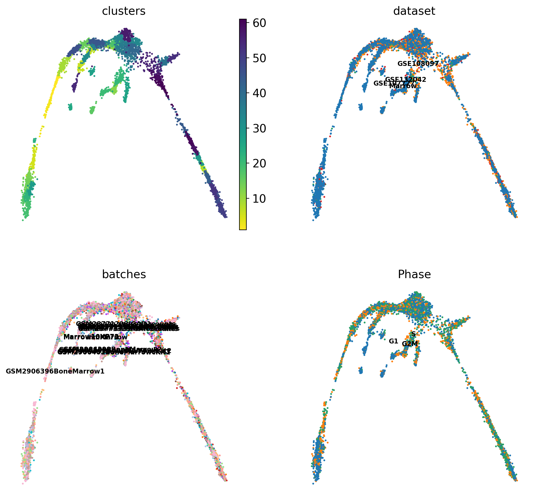
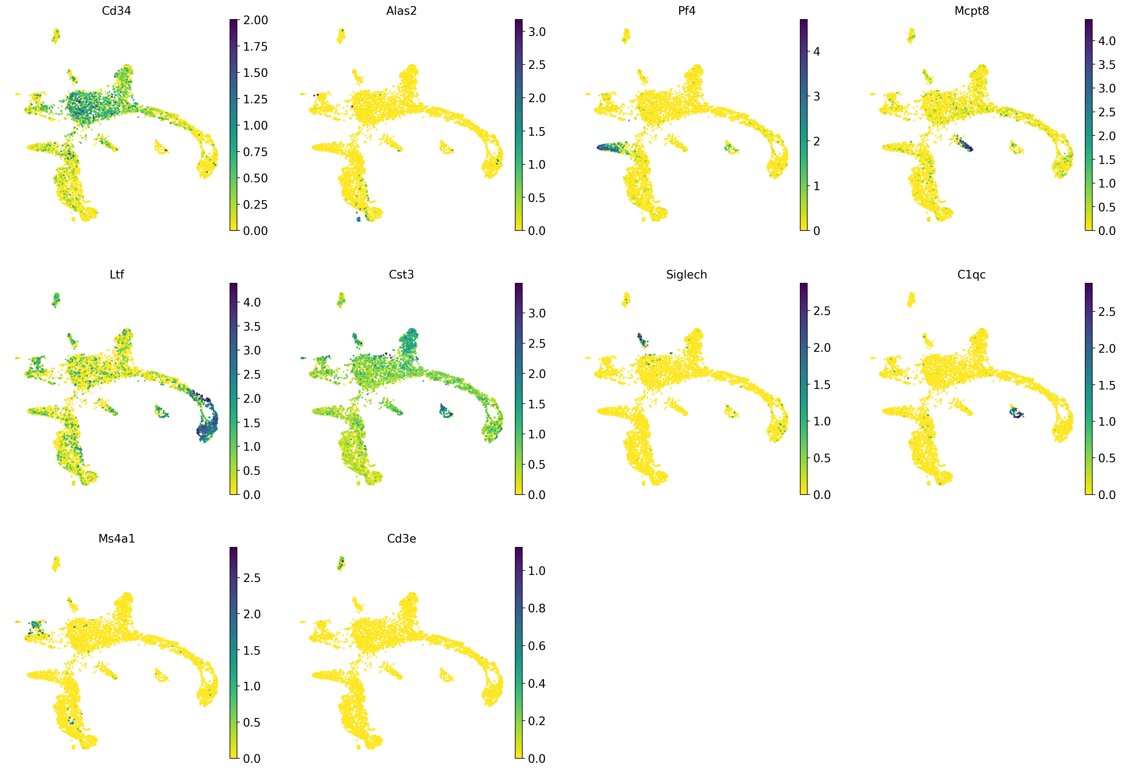
It is crucial that you performing analysis of a dataset understands what is going on, what are the clusters you see in your data and most importantly How are the clusters related to each other?. Well, let’s explore the data a bit. With the help of this table, write down which cluster numbers in your dataset express these key markers.
| Marker | Cell Type |
|---|---|
| Cd34 | HSC progenitor |
| Ms4a1 | B cell lineage |
| Cd3e | T cell lineage |
| Ltf | Granulocyte lineage |
| Cst3 | Monocyte lineage |
| Mcpt8 | Mast Cell lineage |
| Alas2 | RBC lineage |
| Siglech | Dendritic cell lineage |
| C1qc | Macrophage cell lineage |
| Pf4 | Megakaryocyte cell lineage |
markers = ["Cd34","Alas2","Pf4","Mcpt8","Ltf","Cst3", "Siglech", "C1qc", "Ms4a1", "Cd3e", ]
sc.pl.umap(adata, color = markers, use_raw = False, ncols = 4)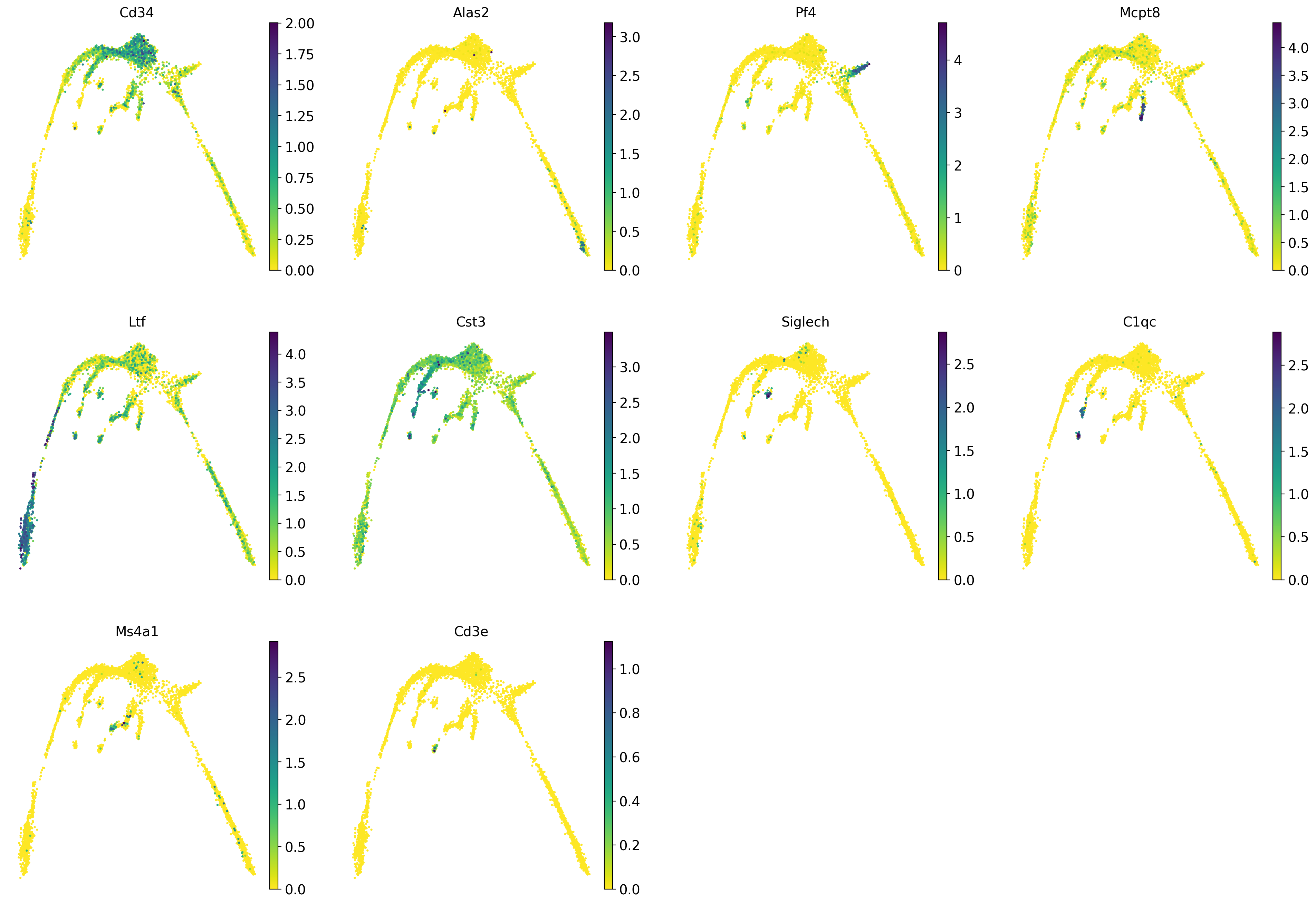
5 Rerun analysis in Scanpy
Redo clustering and umap using the basic Scanpy pipeline. Use the provided “X_harmony_Phase” dimensionality reduction as the staring point.
# first, store the old umap with a new name so it is not overwritten
adata.obsm['X_umap_old'] = adata.obsm['X_umap']

sc.pp.neighbors(adata, n_pcs = 30, n_neighbors = 20, use_rep="X_harmony_Phase")
sc.tl.umap(adata, min_dist=0.4, spread=3)
computing neighbors
finished: added to `.uns['neighbors']`
`.obsp['distances']`, distances for each pair of neighbors
`.obsp['connectivities']`, weighted adjacency matrix (0:00:10)
computing UMAP
finished: added
'X_umap', UMAP coordinates (adata.obsm)
'umap', UMAP parameters (adata.uns) (0:00:10)sc.pl.umap(adata, color = ['clusters'],legend_loc = 'on data', legend_fontsize = 'xx-small', edges = True)
sc.pl.umap(adata, color = markers, use_raw = False, ncols = 4)
# Redo clustering as well
sc.tl.leiden(adata, key_added = "leiden_1.0", resolution = 1.0) # default resolution in 1.0
sc.tl.leiden(adata, key_added = "leiden_1.2", resolution = 1.2) # default resolution in 1.0
sc.tl.leiden(adata, key_added = "leiden_1.4", resolution = 1.4) # default resolution in 1.0
#sc.tl.louvain(adata, key_added = "leiden_1.0") # default resolution in 1.0
sc.pl.umap(adata, color = ['leiden_1.0', 'leiden_1.2', 'leiden_1.4','clusters'],legend_loc = 'on data', legend_fontsize = 'xx-small', ncols =2)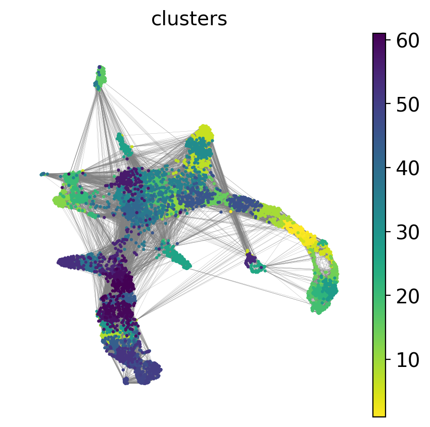
running Leiden clustering
    finished: found 16 clusters and added
    'leiden_1.0', the cluster labels (adata.obs, categorical) (0:00:00)
running Leiden clustering
    finished: found 17 clusters and added
    'leiden_1.2', the cluster labels (adata.obs, categorical) (0:00:00)
running Leiden clustering
    finished: found 19 clusters and added
    'leiden_1.4', the cluster labels (adata.obs, categorical) (0:00:00)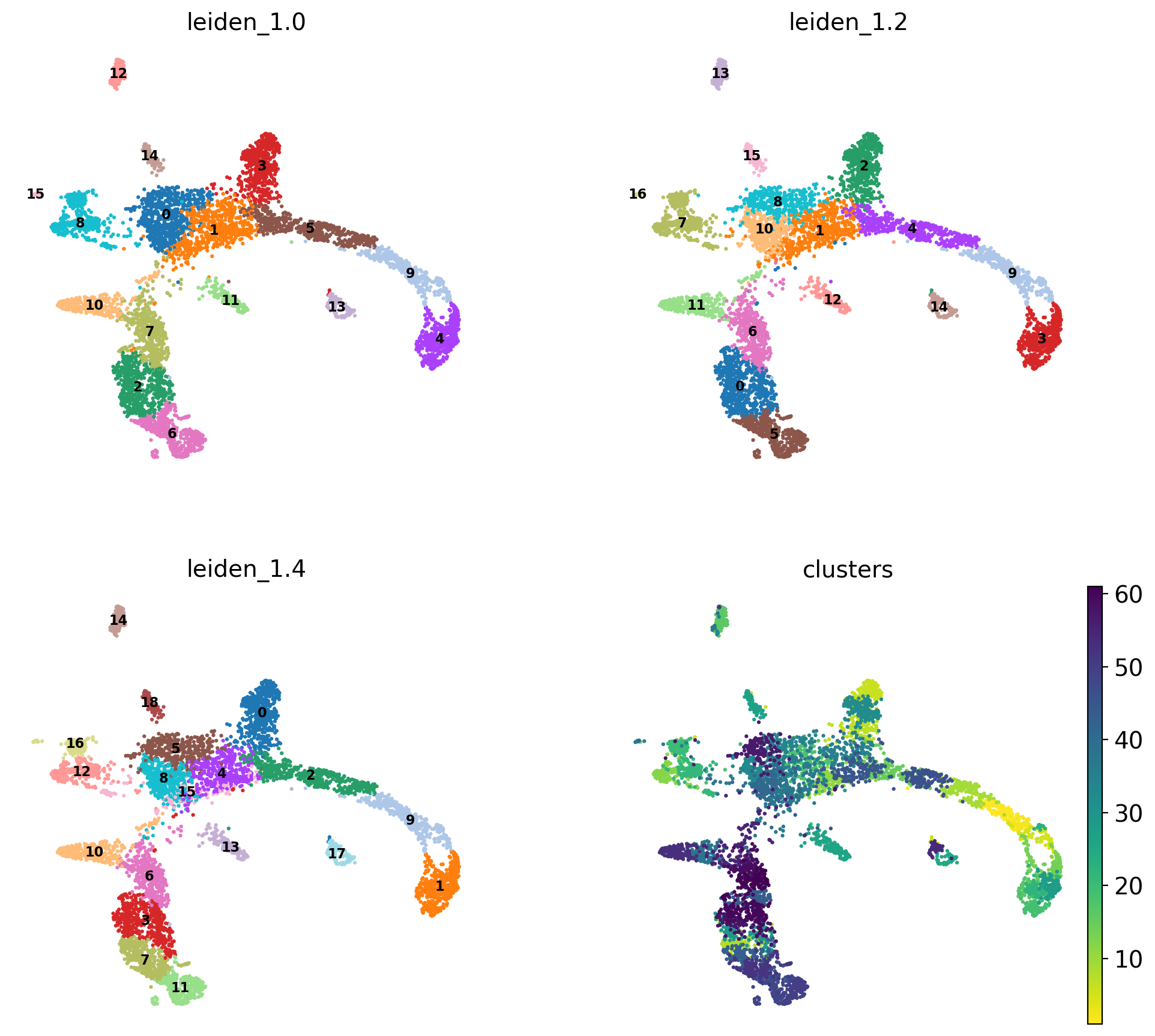
#Rename clusters with really clear markers, the rest are left unlabelled.

annot = pd.DataFrame(adata.obs['leiden_1.4'].astype('string'))
annot[annot['leiden_1.4'] == '10'] = '10_megakaryo' #Pf4
annot[annot['leiden_1.4'] == '17'] = '17_macro'  #C1qc
annot[annot['leiden_1.4'] == '11'] = '11_eryth' #Alas2
annot[annot['leiden_1.4'] == '18'] = '18_dend' #Siglech
annot[annot['leiden_1.4'] == '13'] = '13_mast' #Mcpt8
annot[annot['leiden_1.4'] == '0'] = '0_mono' #Cts3
annot[annot['leiden_1.4'] == '1'] = '1_gran' #Ltf
annot[annot['leiden_1.4'] == '9'] = '9_gran'
annot[annot['leiden_1.4'] == '14'] = '14_TC' #Cd3e
annot[annot['leiden_1.4'] == '16'] = '16_BC' #Ms4a1
annot[annot['leiden_1.4'] == '8'] = '8_progen'  # Cd34
annot[annot['leiden_1.4'] == '4'] = '4_progen'
annot[annot['leiden_1.4'] == '5'] = '5_progen'

adata.obs['annot']=annot['leiden_1.4'].astype('category')

sc.pl.umap(adata, color = 'annot',legend_loc = 'on data', legend_fontsize = 'xx-small', ncols =2)

annot.value_counts()
#type(annot)

# astype('category')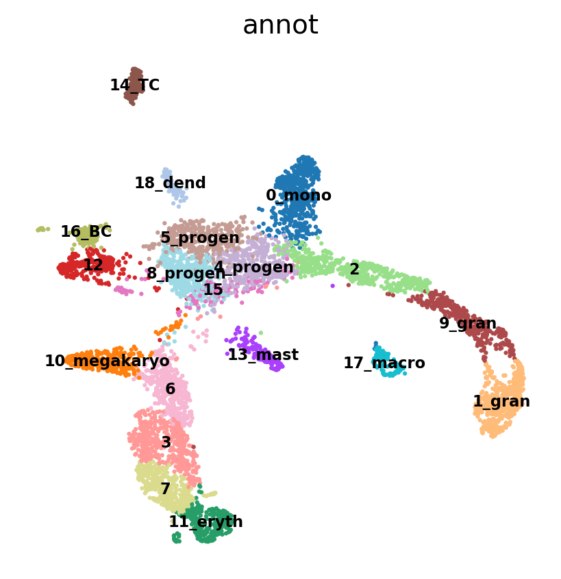
leiden_1.4
0_mono          509
1_gran          487
2               479
3               463
4_progen        387
5_progen        384
7               368
6               368
8_progen        367
9_gran          366
10_megakaryo    301
11_eryth        294
12              276
13_mast         159
14_TC           151
15              128
16_BC           124
17_macro        116
18_dend         101
dtype: int64
# plot onto the Seurat embedding:
sc.pl.embedding(adata, basis='X_umap_old', color = 'annot',legend_loc = 'on data', legend_fontsize = 'xx-small', ncols =2)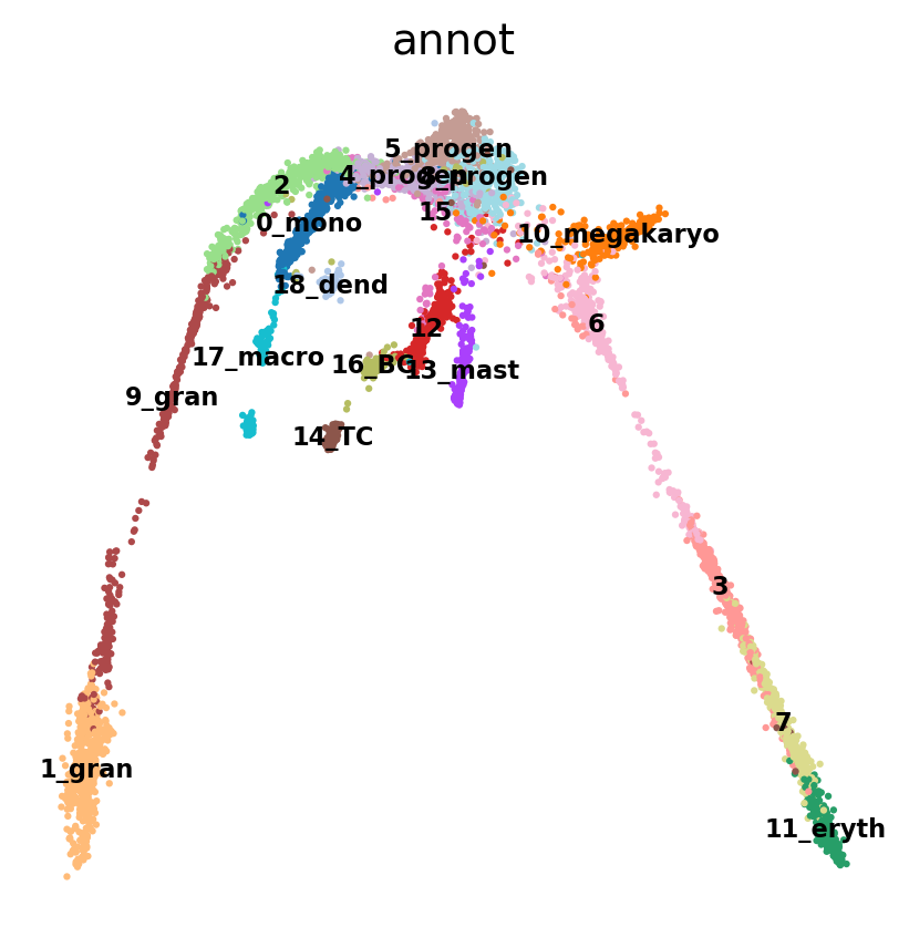
6 Run PAGA
Use the clusters from leiden clustering with leiden_1.4 and run PAGA. First we create the graph and initialize the positions using the umap.
# use the umap to initialize the graph layout.
sc.tl.draw_graph(adata, init_pos='X_umap')
sc.pl.draw_graph(adata, color='annot', legend_loc='on data', legend_fontsize = 'xx-small')
sc.tl.paga(adata, groups='annot')
sc.pl.paga(adata, color='annot', edge_width_scale = 0.3)
drawing single-cell graph using layout 'fa'
WARNING: Package 'fa2-modified' is not installed, falling back to layout 'fr'.To use the faster and better ForceAtlas2 layout, install package 'fa2-modified' (`pip install fa2-modified`).
finished: added
'X_draw_graph_fr', graph_drawing coordinates (adata.obsm) (0:00:03)
running PAGA
finished: added
'paga/connectivities', connectivities adjacency (adata.uns)
'paga/connectivities_tree', connectivities subtree (adata.uns) (0:00:00)
--> added 'pos', the PAGA positions (adata.uns['paga'])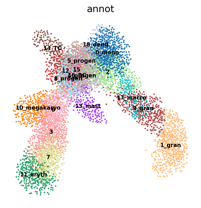
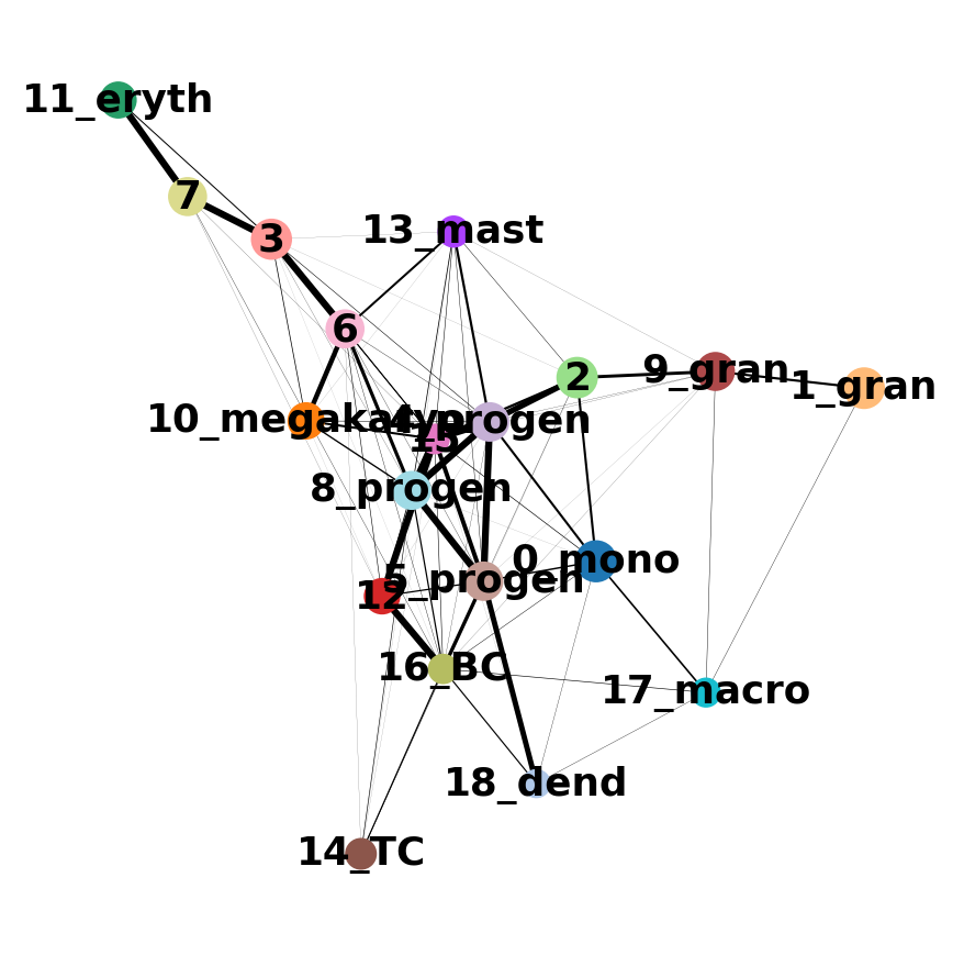
As you can see, we have edges between many clusters that we know are are unrelated, so we may need to clean up the data a bit more.
7 Filtering graph edges
First, lets explore the graph a bit. So we plot the umap with the graph connections on top.
sc.pl.umap(adata, edges=True, color = 'annot', legend_loc= 'on data', legend_fontsize= 'xx-small')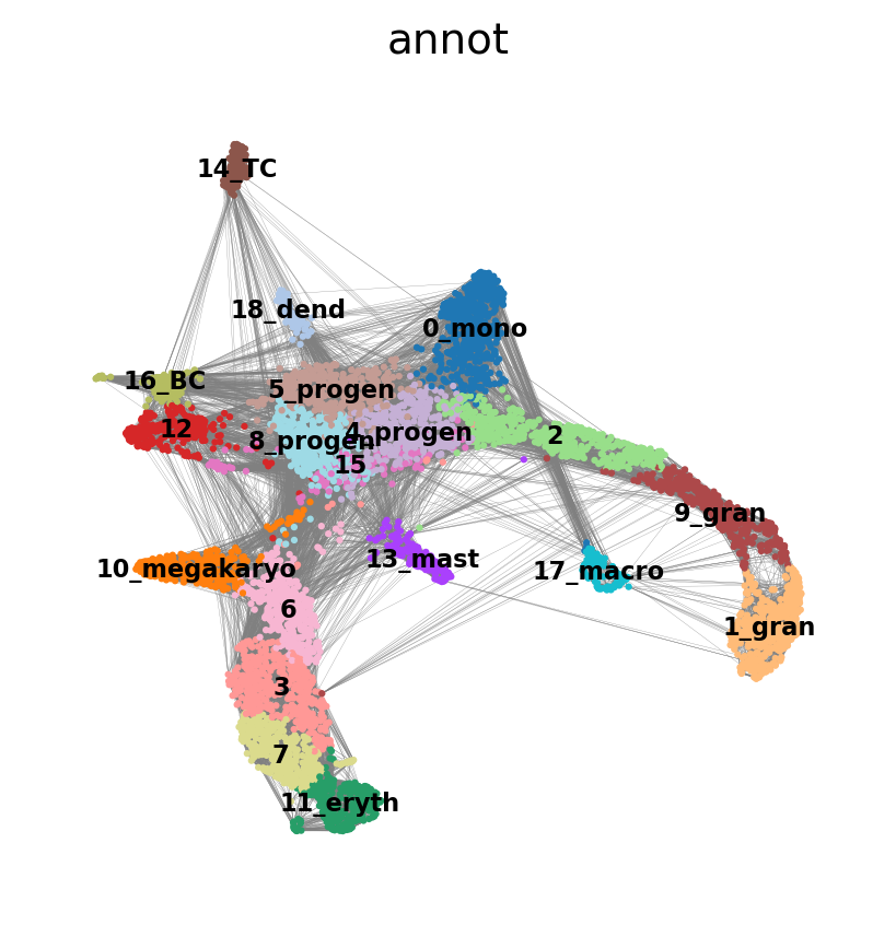
We have many edges in the graph between unrelated clusters, so lets try with fewer neighbors.
sc.pp.neighbors(adata, n_neighbors=5,  use_rep = 'X_harmony_Phase', n_pcs = 30)
sc.pl.umap(adata, edges=True, color = 'annot', legend_loc= 'on data', legend_fontsize= 'xx-small')
computing neighbors
finished: added to `.uns['neighbors']`
`.obsp['distances']`, distances for each pair of neighbors
`.obsp['connectivities']`, weighted adjacency matrix (0:00:00)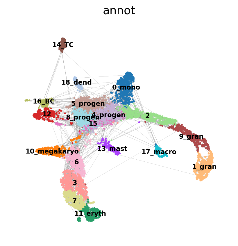
7.1 Rerun PAGA again on the data
sc.tl.draw_graph(adata, init_pos='X_umap')
sc.pl.draw_graph(adata, color='annot', legend_loc='on data', legend_fontsize = 'xx-small')
drawing single-cell graph using layout 'fa'
WARNING: Package 'fa2-modified' is not installed, falling back to layout 'fr'.To use the faster and better ForceAtlas2 layout, install package 'fa2-modified' (`pip install fa2-modified`).
finished: added
'X_draw_graph_fr', graph_drawing coordinates (adata.obsm) (0:00:02)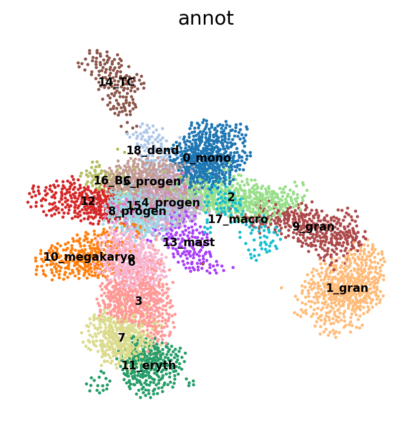
sc.tl.paga(adata, groups='annot')
sc.pl.paga(adata, color='annot', edge_width_scale = 0.3)
running PAGA
finished: added
'paga/connectivities', connectivities adjacency (adata.uns)
'paga/connectivities_tree', connectivities subtree (adata.uns) (0:00:00)
--> added 'pos', the PAGA positions (adata.uns['paga'])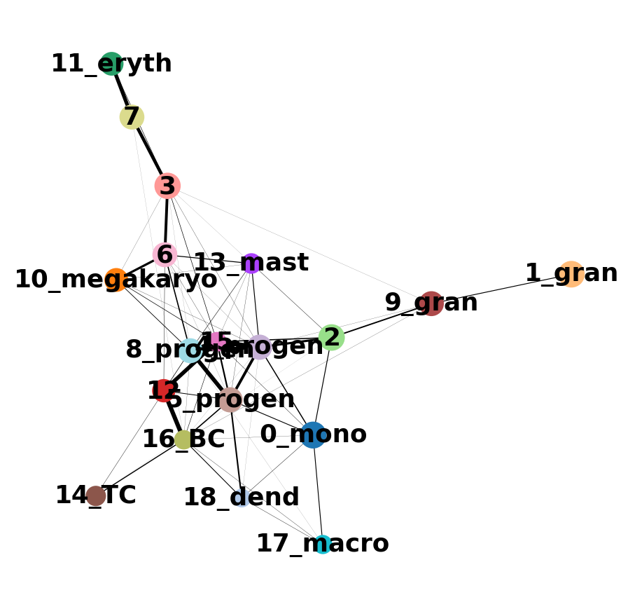
8 Embedding using PAGA-initialization
We can now redraw the graph using another starting position from the paga layout. The following is just as well possible for a UMAP.
sc.tl.draw_graph(adata, init_pos='paga')drawing single-cell graph using layout 'fa'
WARNING: Package 'fa2-modified' is not installed, falling back to layout 'fr'.To use the faster and better ForceAtlas2 layout, install package 'fa2-modified' (`pip install fa2-modified`).
finished: added
'X_draw_graph_fr', graph_drawing coordinates (adata.obsm) (0:00:14)Now we can see all marker genes also at single-cell resolution in a meaningful layout.
sc.pl.draw_graph(adata, color=['annot'], legend_loc='on data', legend_fontsize= 'xx-small')
Compare the 2 graphs
sc.pl.paga_compare(
    adata, threshold=0.03, title='', right_margin=0.2, size=10, edge_width_scale=0.5,
    legend_fontsize=12, fontsize=12, frameon=False, edges=True)
--> added 'pos', the PAGA positions (adata.uns['paga'])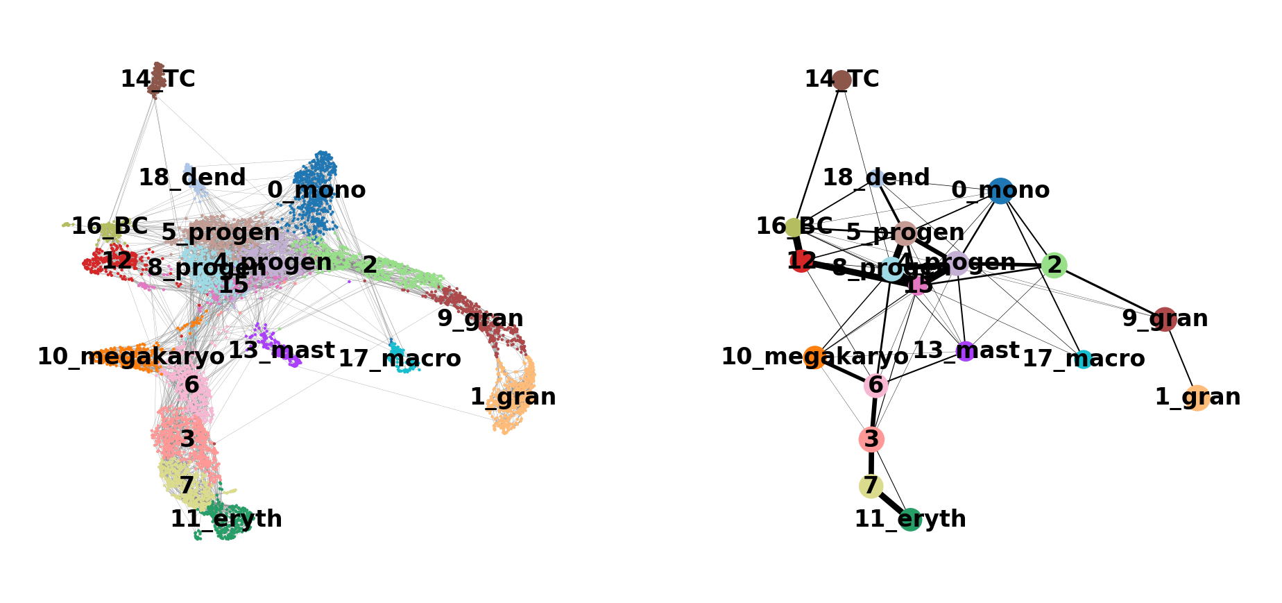
[<Axes: xlabel='UMAP1', ylabel='UMAP2'>, <Axes: >]
Discuss
Does this graph fit the biological expectations given what you know of hematopoesis. Please have a look at the figure in Section 2 and compare to the paths you now have.
9 Gene changes
We can reconstruct gene changes along PAGA paths for a given set of genes
Choose a root cell for diffusion pseudotime. We have 3 progenitor clusters, but cluster 5 seems the most clear.
adata.uns['iroot'] = np.flatnonzero(adata.obs['annot']  == '5_progen')[0]

sc.tl.dpt(adata)
WARNING: Trying to run `tl.dpt` without prior call of `tl.diffmap`. Falling back to `tl.diffmap` with default parameters.
computing Diffusion Maps using n_comps=15(=n_dcs)
computing transitions
finished (0:00:00)
eigenvalues of transition matrix
[1. 0.9989591 0.997628 0.9970365 0.9956704 0.99334306
0.9918951 0.9915921 0.99013233 0.98801893 0.9870309 0.9861044
0.9851118 0.9845008 0.9839531 ]
finished: added
'X_diffmap', diffmap coordinates (adata.obsm)
'diffmap_evals', eigenvalues of transition matrix (adata.uns) (0:00:00)
computing Diffusion Pseudotime using n_dcs=10
finished: added
'dpt_pseudotime', the pseudotime (adata.obs) (0:00:00)Use the full raw data for visualization.
sc.pl.draw_graph(adata, color=['annot', 'dpt_pseudotime'], legend_loc='on data', legend_fontsize= 'x-small')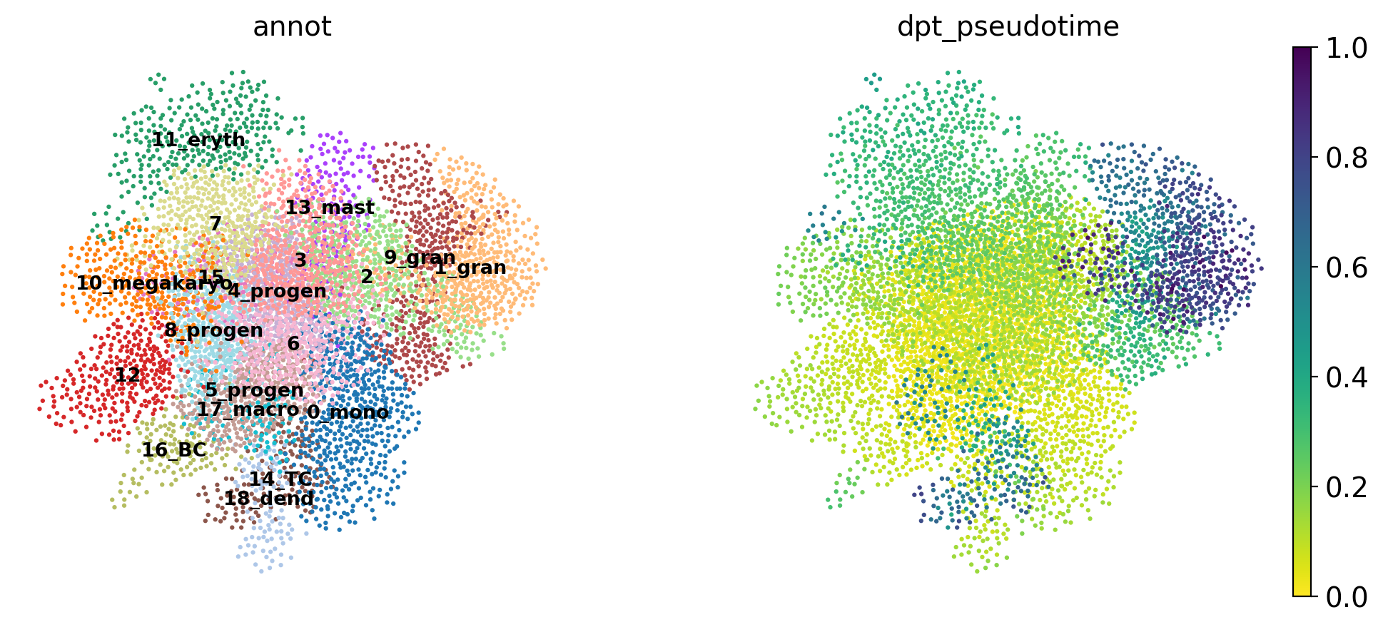
Discuss
The pseudotime represents the distance of every cell to the starting cluster. Have a look at the pseudotime plot, how well do you think it represents actual developmental time? What does it represent?
By looking at the different know lineages and the layout of the graph we define manually some paths to the graph that corresponds to specific lineages.
# Define paths

paths = [('erythrocytes', ['5_progen', '8_progen', '6', '3', '7', '11_eryth']),
         ('lympoid', ['5_progen', '12', '16_BC', '14_TC']),
         ('granulo', ['5_progen', '4_progen', '2', '9_gran', '1_gran']),
         ('mono', ['5_progen', '4_progen', '0_mono', '18_dend', '17_macro'])
         ]

adata.obs['distance'] = adata.obs['dpt_pseudotime']
Then we select some genes that can vary in the lineages and plot onto the paths.
gene_names = ['Gata2', 'Gata1', 'Klf1', 'Epor', 'Hba-a2',  # erythroid
              'Elane', 'Cebpe', 'Gfi1',                    # neutrophil
              'Irf8', 'Csf1r', 'Ctsg',                     # monocyte
              'Itga2b','Prss34','Cma1','Procr',            # Megakaryo,Basophil,Mast,HPC
              'C1qc','Siglech','Ms4a1','Cd3e','Cd34']
_, axs = pl.subplots(ncols=4, figsize=(10, 4), gridspec_kw={
'wspace': 0.05, 'left': 0.12})
pl.subplots_adjust(left=0.05, right=0.98, top=0.82, bottom=0.2)
for ipath, (descr, path) in enumerate(paths):
sc.pl.paga_path(
adata=adata,
nodes=path,
keys=gene_names,
show_node_names=False,
ax=axs[ipath],
ytick_fontsize=12,
left_margin=0.15,
n_avg=50,
annotations=['distance'],
show_yticks=True if ipath == 0 else False,
show_colorbar=False,
color_map='Greys',
groups_key='annot',
color_maps_annotations={'distance': 'viridis'},
title='{} path'.format(descr),
return_data=True,
use_raw=False,
show=False)
pl.show()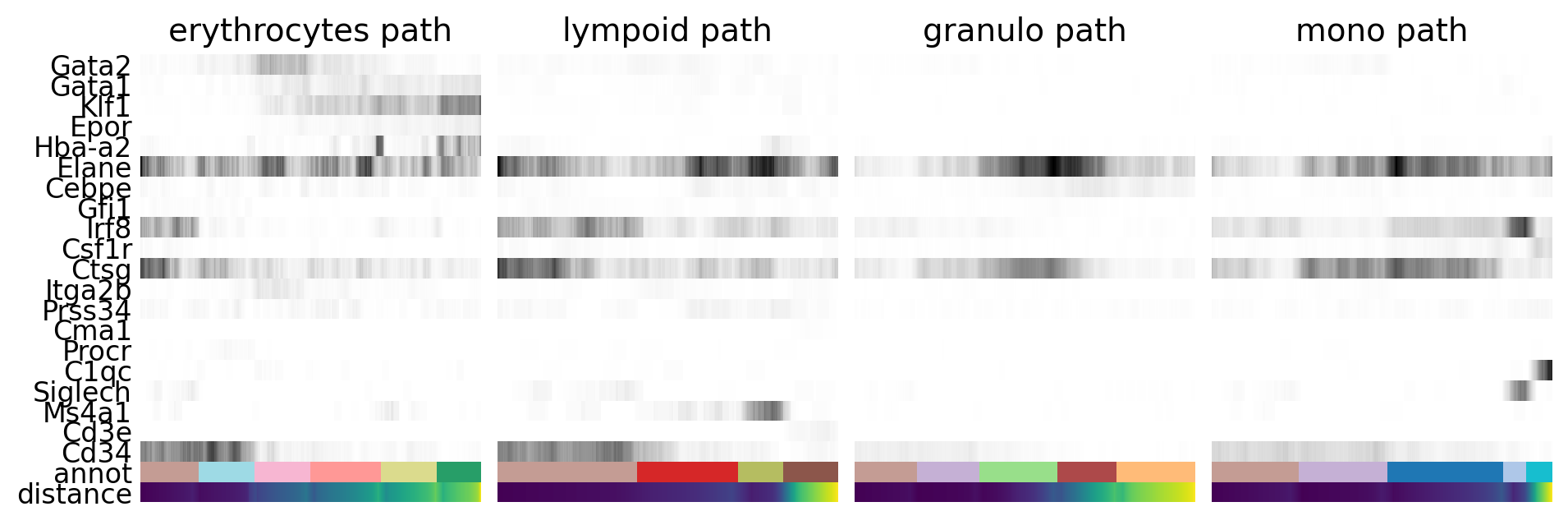
Discuss
As you can see, we can manipulate the trajectory quite a bit by selecting different number of neighbors, components etc. to fit with our assumptions on the development of these celltypes.
Please explore further how you can tweak the trajectory. For instance, can you create a PAGA trajectory using the orignial umap from Seurat instead? Hint, you first need to compute the neighbors on the umap.
10 Session info
Click here
sc.logging.print_versions()-----
anndata 0.10.8
scanpy 1.10.3
-----
PIL 11.1.0
asttokens NA
cffi 1.17.1
colorama 0.4.6
comm 0.2.2
cycler 0.12.1
cython_runtime NA
dateutil 2.9.0.post0
debugpy 1.8.12
decorator 5.1.1
exceptiongroup 1.2.2
executing 2.1.0
h5py 3.12.1
igraph 0.11.6
ipykernel 6.29.5
jedi 0.19.2
joblib 1.4.2
kiwisolver 1.4.7
legacy_api_wrap NA
leidenalg 0.10.2
llvmlite 0.43.0
matplotlib 3.9.2
matplotlib_inline 0.1.7
mpl_toolkits NA
natsort 8.4.0
networkx 3.4
numba 0.60.0
numpy 1.26.4
packaging 24.2
pandas 1.5.3
parso 0.8.4
pickleshare 0.7.5
platformdirs 4.3.6
prompt_toolkit 3.0.50
psutil 6.1.1
pure_eval 0.2.3
pycparser 2.22
pydev_ipython NA
pydevconsole NA
pydevd 3.2.3
pydevd_file_utils NA
pydevd_plugins NA
pydevd_tracing NA
pygments 2.19.1
pynndescent 0.5.13
pyparsing 3.2.1
pytz 2024.2
scipy 1.14.1
session_info 1.0.0
six 1.17.0
sklearn 1.6.1
sparse 0.15.5
stack_data 0.6.3
texttable 1.7.0
threadpoolctl 3.5.0
torch 2.5.1.post207
torchgen NA
tornado 6.4.2
tqdm 4.67.1
traitlets 5.14.3
typing_extensions NA
umap 0.5.7
wcwidth 0.2.13
yaml 6.0.2
zmq 26.2.0
zoneinfo NA
-----
IPython 8.31.0
jupyter_client 8.6.3
jupyter_core 5.7.2
-----
Python 3.10.16 | packaged by conda-forge | (main, Dec 5 2024, 14:16:10) [GCC 13.3.0]
Linux-6.10.14-linuxkit-x86_64-with-glibc2.35
-----
Session information updated at 2025-02-27 15:26