suppressPackageStartupMessages({
    library(scater)
    library(scran)
    library(patchwork)
    library(ggplot2)
    library(pheatmap)
    library(igraph)
    library(clustree)
    library(bluster)
})
Note
Code chunks run R commands unless otherwise specified.
In this tutorial, we will continue the analysis of the integrated dataset. We will use the integrated PCA or CCA to perform the clustering. First, we will construct a \(k\)-nearest neighbor graph in order to perform a clustering on the graph. We will also show how to perform hierarchical clustering and k-means clustering on the selected space.
Let’s first load all necessary libraries and also the integrated dataset from the previous step.
# download pre-computed data if missing or long compute
fetch_data <- TRUE

# url for source and intermediate data
path_data <- "https://nextcloud.dc.scilifelab.se/public.php/webdav"
curl_upass <- "-u zbC5fr2LbEZ9rSE:scRNAseq2025"

path_file <- "data/covid/results/bioc_covid_qc_dr_int.rds"
if (!dir.exists(dirname(path_file))) dir.create(dirname(path_file), recursive = TRUE)
if (fetch_data && !file.exists(path_file)) download.file(url = file.path(path_data, "covid/results_bioc/bioc_covid_qc_dr_int.rds"), destfile = path_file, method = "curl", extra = curl_upass)

sce <- readRDS(path_file)
print(reducedDims(sce))
List of length 15
names(15): PCA UMAP tSNE_on_PCA ... UMAP_on_Harmony Scanorama UMAP_on_Scanorama1 Graph clustering
The procedure of clustering on a Graph can be generalized as 3 main steps:
- Build a kNN graph from the data.
- Prune spurious connections from kNN graph (optional step). This is a SNN graph.
- Find groups of cells that maximizes the connections within the group compared other groups.
1.1 Building kNN / SNN graph
The first step into graph clustering is to construct a k-nn graph, in case you don’t have one. For this, we will use the PCA space. Thus, as done for dimensionality reduction, we will use ony the top N PCA dimensions for this purpose (the same used for computing UMAP / tSNE).
# These 2 lines are for demonstration purposes only
g <- buildKNNGraph(sce, k = 30, use.dimred = "harmony")
reducedDim(sce, "KNN") <- igraph::as_adjacency_matrix(g)

# These 2 lines are the most recommended, it first run the KNN graph construction and then creates the SNN graph.
g <- buildSNNGraph(sce, k = 30, use.dimred = "harmony")
reducedDim(sce, "SNN") <- as_adjacency_matrix(g, attr = "weight")
We can take a look at the kNN and SNN graphs. The kNN graph is a matrix where every connection between cells is represented as \(1\)s. This is called a unweighted graph (default in Seurat). In the SNN graph on the other hand, some cell connections have more importance than others, and the graph scales from \(0\) to a maximum distance (in this case \(1\)). Usually, the smaller the distance, the closer two points are, and stronger is their connection. This is called a weighted graph. Both weighted and unweighted graphs are suitable for clustering, but clustering on unweighted graphs is faster for large datasets (> 100k cells).
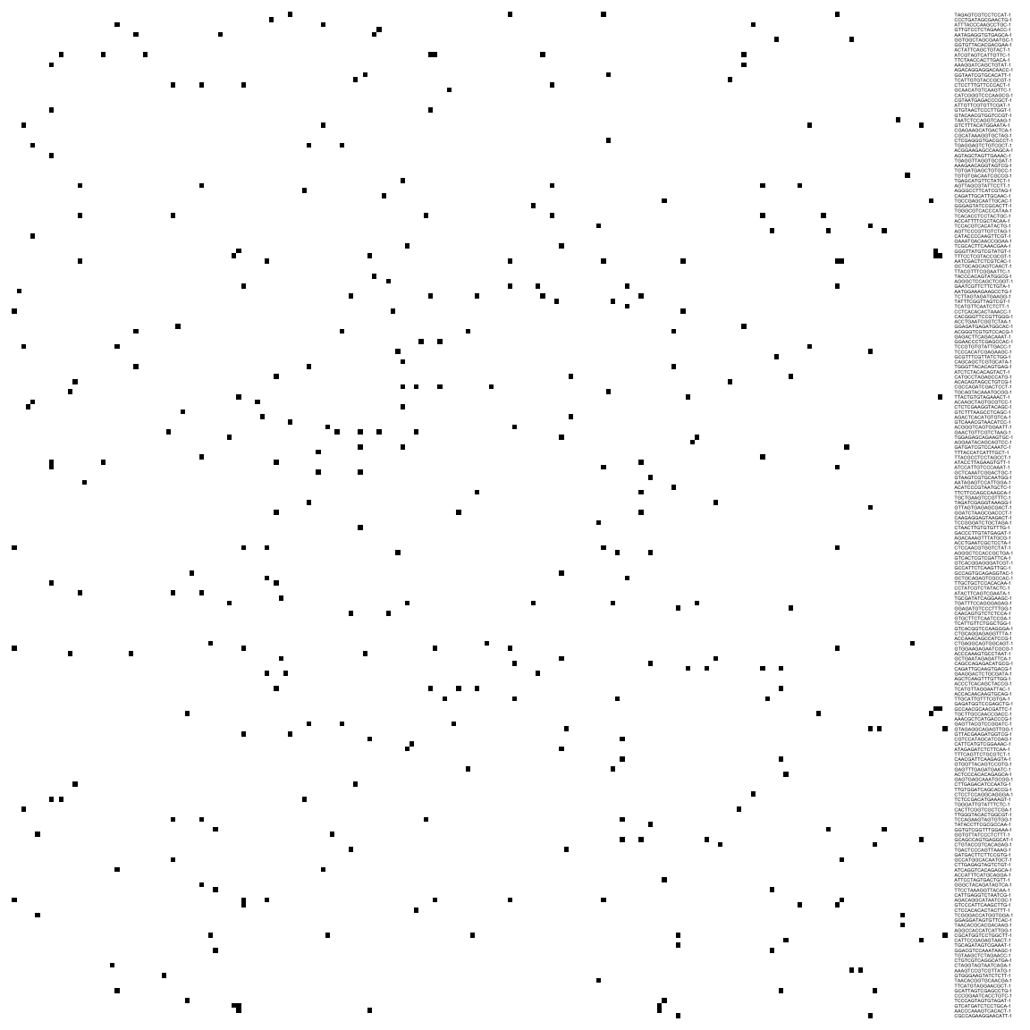
# plot the KNN graph
pheatmap(reducedDim(sce, "KNN")[1:200, 1:200],
    col = c("white", "black"), border_color = "grey90",
    legend = F, cluster_rows = F, cluster_cols = F, fontsize = 2
)
# or the SNN graph
pheatmap(reducedDim(sce, "SNN")[1:200, 1:200],
    col = colorRampPalette(c("white", "yellow", "red", "black"))(20),
    border_color = "grey90",
    legend = T, cluster_rows = F, cluster_cols = F, fontsize = 2
)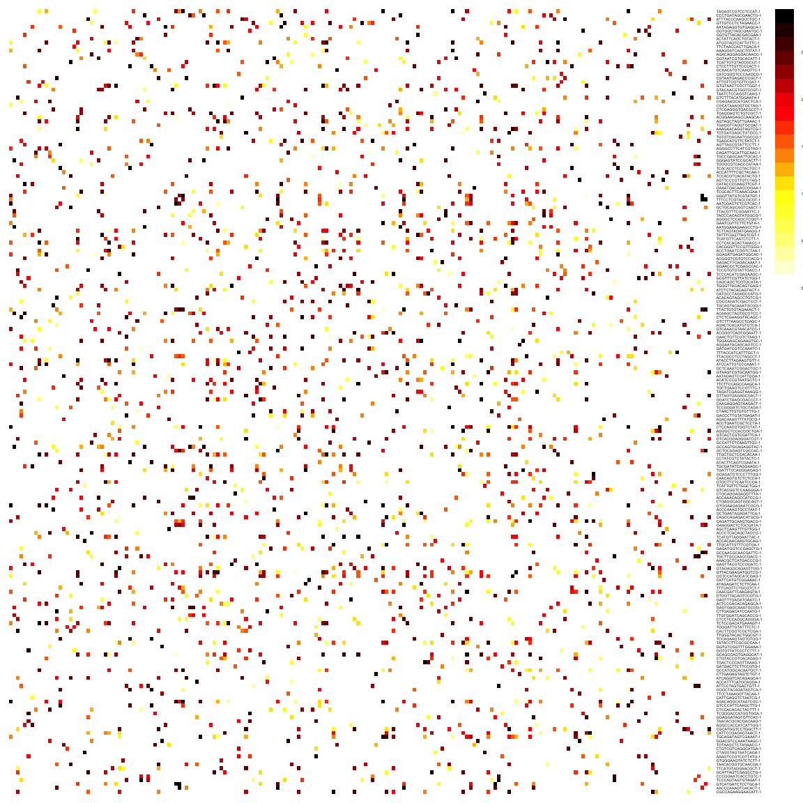
As you can see, the way Scran computes the SNN graph is different to Seurat. It gives edges to all cells that shares a neighbor, but weights the edges by how similar the neighbors are. Hence, the SNN graph has more edges than the KNN graph.
There are 3 different options how to define the SNN these are:
rank- scoring based on shared close neighbors, i.e. ranking the neighbors of two cells and comparing the ranks.number- number of shared neighborsjaccard- calculate Jaccard similarity, same as in Seurat.
1.2 Clustering on a graph
Once the graph is built, we can now perform graph clustering. The clustering is done respective to a resolution which can be interpreted as how coarse you want your cluster to be. Higher resolution means higher number of clusters.
For clustering we can use the function clusterCells() which actually runs the steps of building the KNN and SNN graph for us, and also does the graph partition. All the clustering builds on the bluster package and we specify the different options using the NNGraphParam() class.
Some parameters to consider are:
shared, can be TRUE/FALSE - construct SNN graph (TRUE) or cluster on the KNN graph (FALSE)type- for SNN graph method, can berank,numberorjaccardk- number of neighbors in the KNN construction. Can be any function implemented in ighraphcluster.fun- which community detection method.cluster.args- paramters to the different clustering functions
So to find out what the different options are for the different methods you would have to check the documentation in the igraph package, e.g. ?igraph::cluster_leiden.
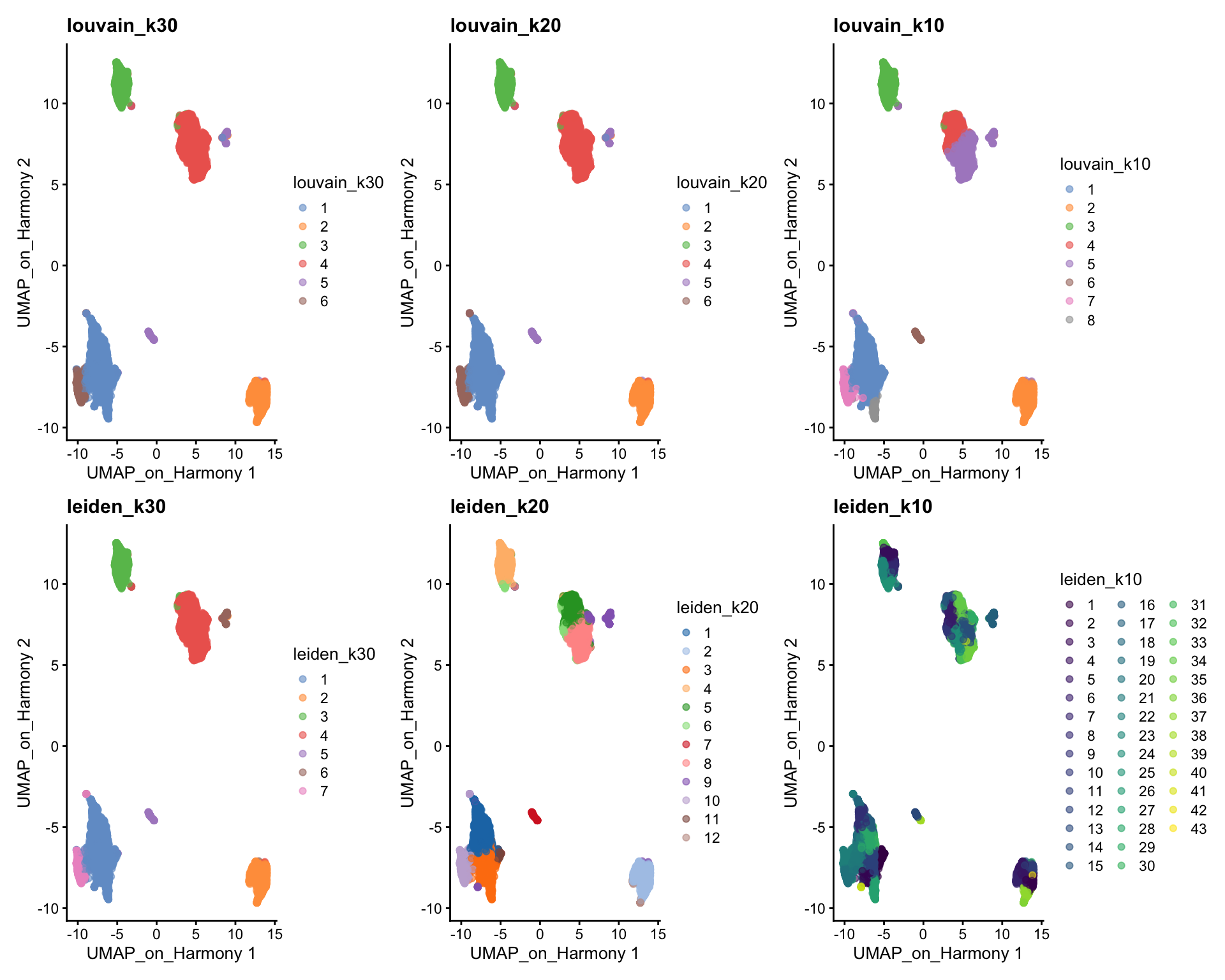
Here we will use the integration with Harmony to build the graph, and the umap built on Harmony for visualization.
OBS! There is no method to select fewer than the total 50 components in the embedding for creating the graph, so here we create a new reducedDim instance with only 20 components.
reducedDims(sce)$harmony2 = reducedDims(sce)$harmony[,1:20]

sce$louvain_k30 <- clusterCells(sce, use.dimred = "harmony2", BLUSPARAM=SNNGraphParam(k=30, cluster.fun="louvain",  cluster.args = list(resolution=0.5)))
sce$louvain_k20 <- clusterCells(sce, use.dimred = "harmony2", BLUSPARAM=SNNGraphParam(k=20, cluster.fun="louvain",  cluster.args = list(resolution=0.5)))
sce$louvain_k10 <- clusterCells(sce, use.dimred = "harmony2", BLUSPARAM=SNNGraphParam(k=10, cluster.fun="louvain",  cluster.args = list(resolution=0.5)))

sce$leiden_k30 <- clusterCells(sce, use.dimred = "harmony2", BLUSPARAM=SNNGraphParam(k=30, cluster.fun="leiden",  cluster.args = list(resolution_parameter=0.3)))
sce$leiden_k20 <- clusterCells(sce, use.dimred = "harmony2", BLUSPARAM=SNNGraphParam(k=20, cluster.fun="leiden",  cluster.args = list(resolution_parameter=0.3)))
sce$leiden_k10 <- clusterCells(sce, use.dimred = "harmony2", BLUSPARAM=SNNGraphParam(k=10, cluster.fun="leiden",  cluster.args = list(resolution_parameter=0.3)))


wrap_plots(
    plotReducedDim(sce, dimred = "UMAP_on_Harmony", colour_by = "louvain_k30") +
        ggplot2::ggtitle(label = "louvain_k30"),
    plotReducedDim(sce, dimred = "UMAP_on_Harmony", colour_by = "louvain_k20") +
        ggplot2::ggtitle(label = "louvain_k20"),
    plotReducedDim(sce, dimred = "UMAP_on_Harmony", colour_by = "louvain_k10") +
        ggplot2::ggtitle(label = "louvain_k10"),
    plotReducedDim(sce, dimred = "UMAP_on_Harmony", colour_by = "leiden_k30") +
        ggplot2::ggtitle(label = "leiden_k30"),
    plotReducedDim(sce, dimred = "UMAP_on_Harmony", colour_by = "leiden_k20") +
        ggplot2::ggtitle(label = "leiden_k20"),
    plotReducedDim(sce, dimred = "UMAP_on_Harmony", colour_by = "leiden_k10") +
        ggplot2::ggtitle(label = "leiden_k10"),
    ncol = 3
)
We can now use the clustree package to visualize how cells are distributed between clusters depending on resolution.
suppressPackageStartupMessages(library(clustree))
clustree(sce, prefix = "louvain_k")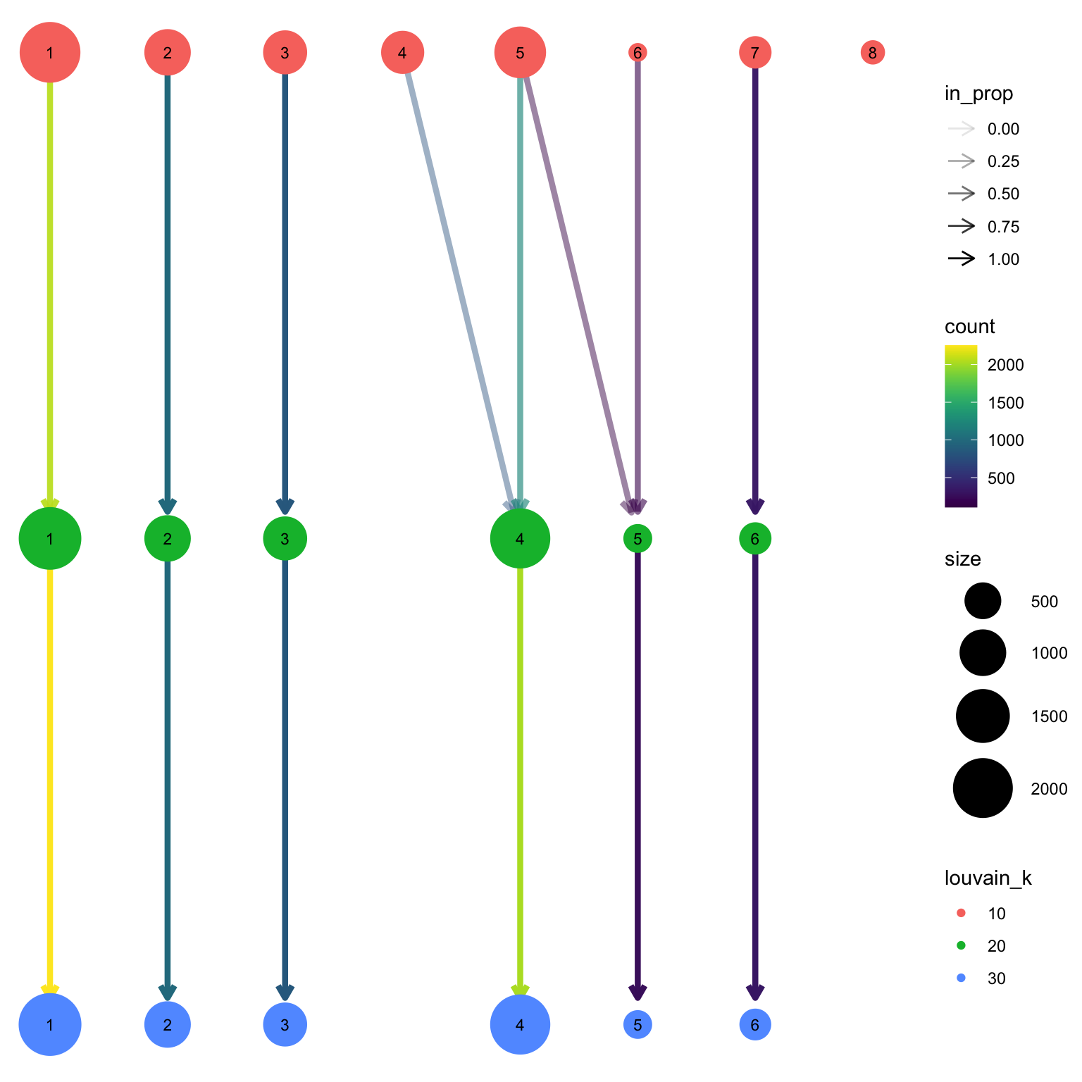
2 K-means clustering
K-means is a generic clustering algorithm that has been used in many application areas. In R, it can be applied via the kmeans() function. Typically, it is applied to a reduced dimension representation of the expression data (most often PCA, because of the interpretability of the low-dimensional distances). We need to define the number of clusters in advance. Since the results depend on the initialization of the cluster centers, it is typically recommended to run K-means with multiple starting configurations (via the nstart argument).
#| fig-height: 8
#| fig-width: 10

sce$kmeans_5 <- clusterCells(sce, use.dimred = "harmony2", BLUSPARAM=KmeansParam(centers=5))
sce$kmeans_10 <- clusterCells(sce, use.dimred = "harmony2", BLUSPARAM=KmeansParam(centers=10))
sce$kmeans_15 <- clusterCells(sce, use.dimred = "harmony2", BLUSPARAM=KmeansParam(centers=15))
sce$kmeans_20 <- clusterCells(sce, use.dimred = "harmony2", BLUSPARAM=KmeansParam(centers=20))


wrap_plots(
    plotReducedDim(sce, dimred = "UMAP_on_Harmony", colour_by = "kmeans_5") +
        ggplot2::ggtitle(label = "KMeans5"),
    plotReducedDim(sce, dimred = "UMAP_on_Harmony", colour_by = "kmeans_10") +
        ggplot2::ggtitle(label = "KMeans10"),
    plotReducedDim(sce, dimred = "UMAP_on_Harmony", colour_by = "kmeans_15") +
        ggplot2::ggtitle(label = "KMeans15"),
    plotReducedDim(sce, dimred = "UMAP_on_Harmony", colour_by = "kmeans_15") +
        ggplot2::ggtitle(label = "KMeans20"),
    ncol = 2
)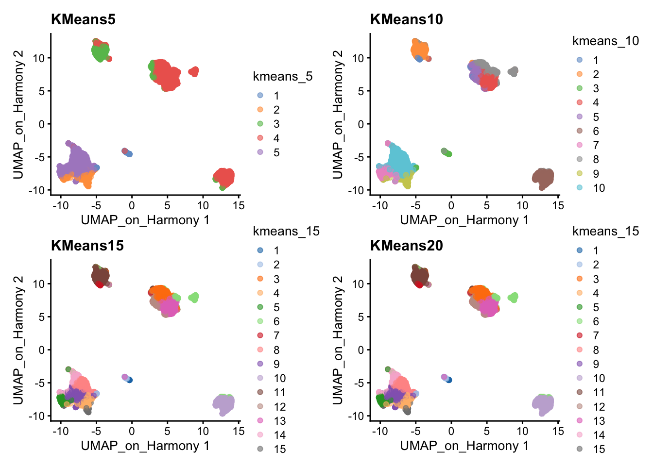
clustree(sce, prefix = "kmeans_")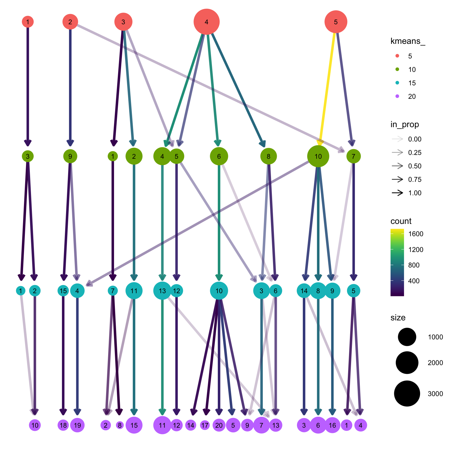
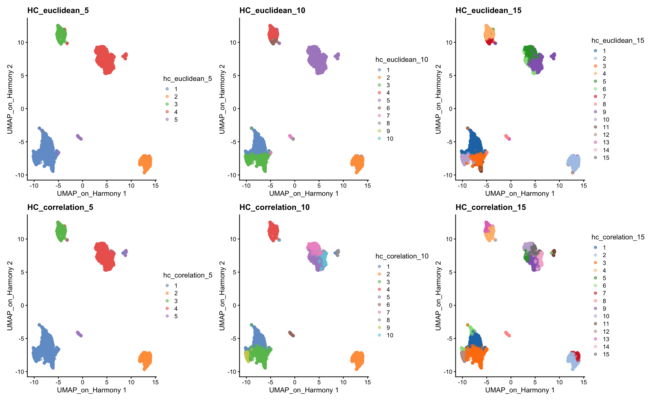
3 Hierarchical clustering
There is the optioni to run hierarchical clustering in the clusterCells function using HclustParam, but there are limited options to specify distances such as correlations that we show below, so we will run the clustering with our own implementation.
3.1 Defining distance between cells
The base R stats package already contains a function dist that calculates distances between all pairs of samples. Since we want to compute distances between samples, rather than among genes, we need to transpose the data before applying it to the dist function. This can be done by simply adding the transpose function t() to the data. The distance methods available in dist are: ‘euclidean’, ‘maximum’, ‘manhattan’, ‘canberra’, ‘binary’ or ‘minkowski’.
d <- dist(reducedDim(sce, "harmony2"), method = "euclidean")As you might have realized, correlation is not a method implemented in the dist() function. However, we can create our own distances and transform them to a distance object. We can first compute sample correlations using the cor function.
As you already know, correlation range from -1 to 1, where 1 indicates that two samples are closest, -1 indicates that two samples are the furthest and 0 is somewhat in between. This, however, creates a problem in defining distances because a distance of 0 indicates that two samples are closest, 1 indicates that two samples are the furthest and distance of -1 is not meaningful. We thus need to transform the correlations to a positive scale (a.k.a. adjacency):
\[adj = \frac{1- cor}{2}\]
Once we transformed the correlations to a 0-1 scale, we can simply convert it to a distance object using as.dist() function. The transformation does not need to have a maximum of 1, but it is more intuitive to have it at 1, rather than at any other number.
# Compute sample correlations
sample_cor <- cor(Matrix::t(reducedDim(sce, "harmony2")))

# Transform the scale from correlations
sample_cor <- (1 - sample_cor) / 2

# Convert it to a distance object
d2 <- as.dist(sample_cor)
3.2 Clustering cells
After having calculated the distances between samples, we can now proceed with the hierarchical clustering per-se. We will use the function hclust() for this purpose, in which we can simply run it with the distance objects created above. The methods available are: ‘ward.D’, ‘ward.D2’, ‘single’, ‘complete’, ‘average’, ‘mcquitty’, ‘median’ or ‘centroid’. It is possible to plot the dendrogram for all cells, but this is very time consuming and we will omit for this tutorial.
# euclidean
h_euclidean <- hclust(d, method = "ward.D2")

# correlation
h_correlation <- hclust(d2, method = "ward.D2")
Once your dendrogram is created, the next step is to define which samples belong to a particular cluster. After identifying the dendrogram, we can now literally cut the tree at a fixed threshold (with cutree) at different levels to define the clusters. We can either define the number of clusters or decide on a height. We can simply try different clustering levels.
# euclidean distance
sce$hc_euclidean_5 <- factor(cutree(h_euclidean, k = 5))
sce$hc_euclidean_10 <- factor(cutree(h_euclidean, k = 10))
sce$hc_euclidean_15 <- factor(cutree(h_euclidean, k = 15))

# correlation distance
sce$hc_corelation_5 <- factor(cutree(h_correlation, k = 5))
sce$hc_corelation_10 <- factor(cutree(h_correlation, k = 10))
sce$hc_corelation_15 <- factor(cutree(h_correlation, k = 15))

wrap_plots(
    plotReducedDim(sce, dimred = "UMAP_on_Harmony", colour_by = "hc_euclidean_5") +
        ggplot2::ggtitle(label = "HC_euclidean_5"),
    plotReducedDim(sce, dimred = "UMAP_on_Harmony", colour_by = "hc_euclidean_10") +
        ggplot2::ggtitle(label = "HC_euclidean_10"),
    plotReducedDim(sce, dimred = "UMAP_on_Harmony", colour_by = "hc_euclidean_15") +
        ggplot2::ggtitle(label = "HC_euclidean_15"),
    plotReducedDim(sce, dimred = "UMAP_on_Harmony", colour_by = "hc_corelation_5") +
        ggplot2::ggtitle(label = "HC_correlation_5"),
    plotReducedDim(sce, dimred = "UMAP_on_Harmony", colour_by = "hc_corelation_10") +
        ggplot2::ggtitle(label = "HC_correlation_10"),
    plotReducedDim(sce, dimred = "UMAP_on_Harmony", colour_by = "hc_corelation_15") +
        ggplot2::ggtitle(label = "HC_correlation_15"),
    ncol = 3
)
Finally, lets save the clustered data for further analysis.
saveRDS(sce, "data/covid/results/bioc_covid_qc_dr_int_cl.rds")4 Distribution of clusters
Now, we can select one of our clustering methods and compare the proportion of samples across the clusters.
p1 <- ggplot(as.data.frame(colData(sce)), aes(x = leiden_k20, fill = sample)) +
    geom_bar(position = "fill")
p2 <- ggplot(as.data.frame(colData(sce)), aes(x = leiden_k20, fill = type)) +
    geom_bar(position = "fill")

p1 + p2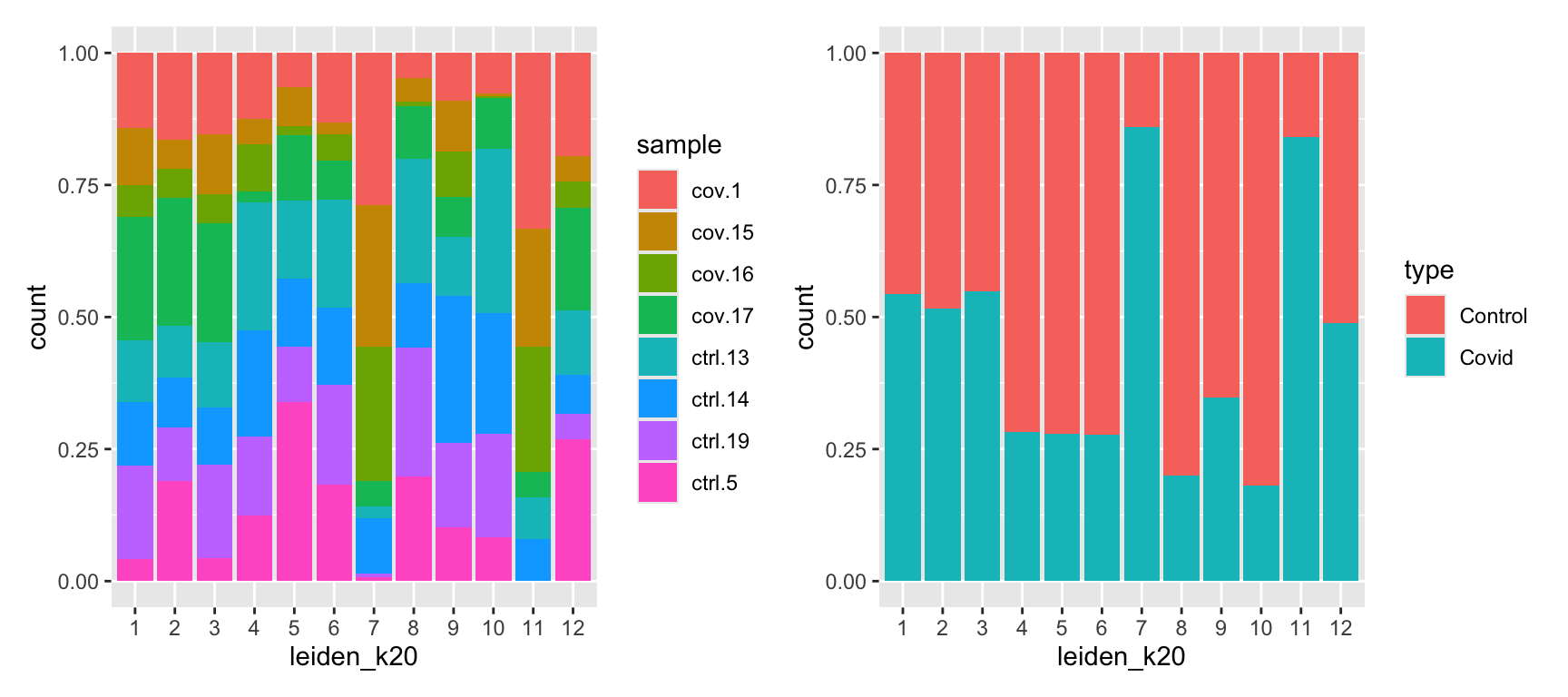
In this case we have quite good representation of each sample in each cluster. But there are clearly some biases with more cells from one sample in some clusters and also more covid cells in some of the clusters.
We can also plot it in the other direction, the proportion of each cluster per sample.
ggplot(as.data.frame(colData(sce)), aes(x = sample, fill = leiden_k20)) +
    geom_bar(position = "fill")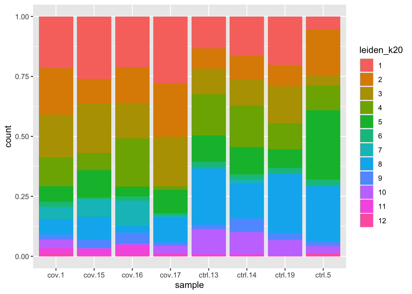
Discuss
By now you should know how to plot different features onto your data. Take the QC metrics that were calculated in the first exercise, that should be stored in your data object, and plot it as violin plots per cluster using the clustering method of your choice. For example, plot number of UMIS, detected genes, percent mitochondrial reads. Then, check carefully if there is any bias in how your data is separated by quality metrics. Could it be explained biologically, or could there be a technical bias there?
wrap_plots(
    plotColData(sce, y = "detected", x = "leiden_k20", colour_by = "leiden_k20"),
    plotColData(sce, y = "total", x = "leiden_k20", colour_by = "leiden_k20"),
    plotColData(sce, y = "subsets_mt_percent", x = "leiden_k20", colour_by = "leiden_k20"),
    plotColData(sce, y = "subsets_ribo_percent", x = "leiden_k20", colour_by = "leiden_k20"),
    plotColData(sce, y = "subsets_hb_percent", x = "leiden_k20", colour_by = "leiden_k20"),
    ncol = 3
) + plot_layout(guides = "collect")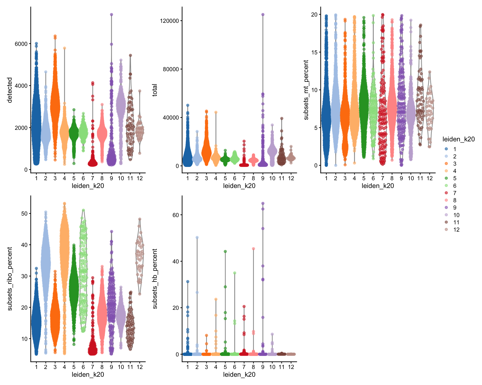
Some clusters that are clearly defined by higher number of genes and counts. These are either doublets or a larger celltype. And some clusters with low values on these metrics that are either low quality cells or a smaller celltype. You will have to explore these clusters in more detail to judge what you believe them to be.
5 Subclustering of T and NK-cells
It is common that the subtypes of cells within a cluster is not so well separated when you have a heterogeneous dataset. In such a case it could be a good idea to run subclustering of individual celltypes. The main reason for subclustering is that the variable genes and the first principal components in the full analysis are mainly driven by differences between celltypes, while with subclustering we may detect smaller differences between subtypes within celltypes.
So first, lets find out where our T-cell and NK-cell clusters are. We know that T-cells express CD3E, and the main subtypes are CD4 and CD8, while NK-cells express GNLY.
wrap_plots(
    plotReducedDim(sce, dimred = "UMAP_on_Harmony", colour_by = "leiden_k30"),
    plotReducedDim(sce, dimred = "UMAP_on_Harmony", colour_by = "CD3E"),
    plotReducedDim(sce, dimred = "UMAP_on_Harmony", colour_by = "CD4"),
    plotReducedDim(sce, dimred = "UMAP_on_Harmony", colour_by = "CD8A"),
    plotReducedDim(sce, dimred = "UMAP_on_Harmony", colour_by = "GNLY"),
    ncol = 3
)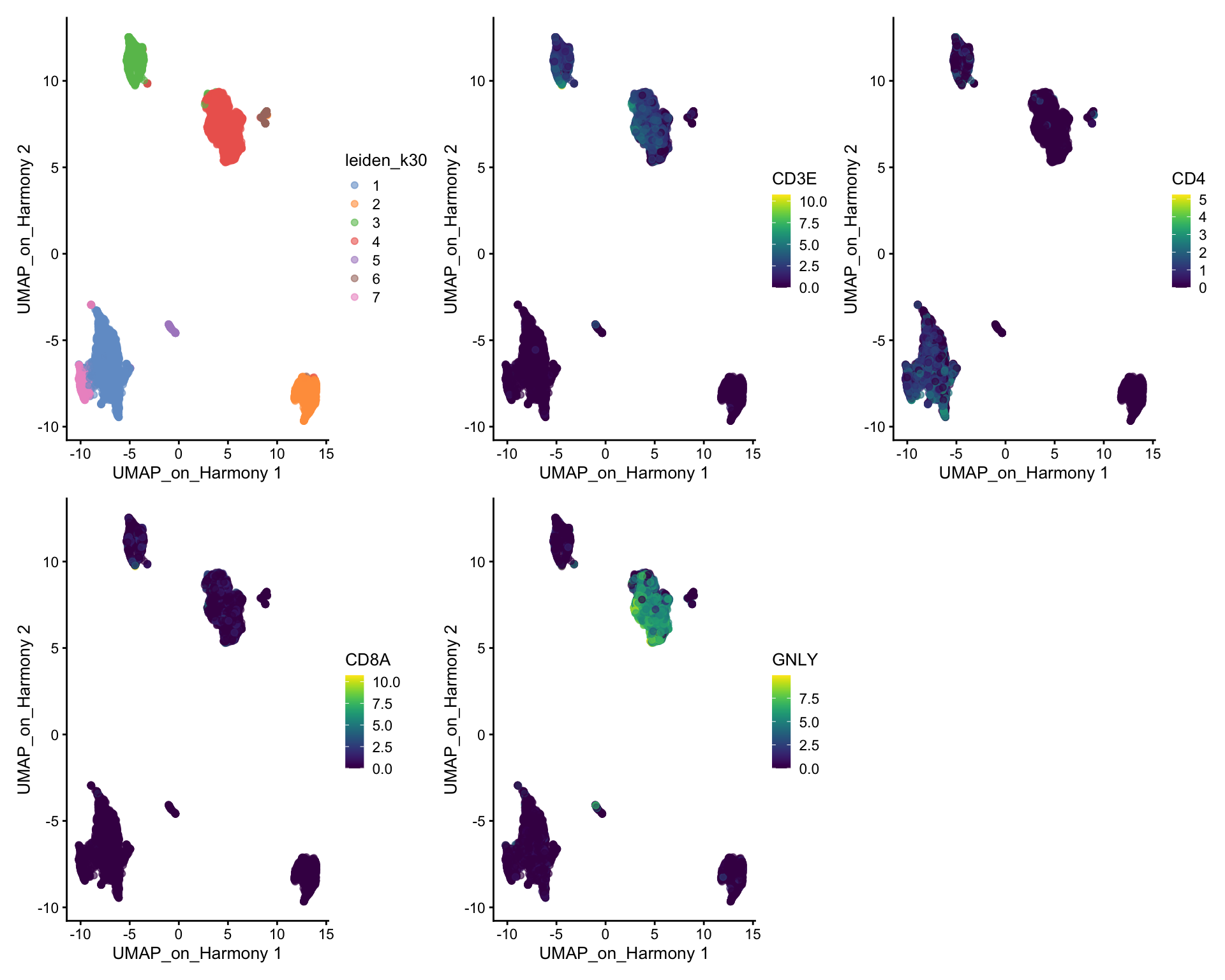
We can clearly see what clusters are T-cell clusters, so lets subset the data for those cells
tcells = sce[,sce$leiden_k30 %in% c(3,4)]

table(tcells$sample)
  cov.1  cov.15  cov.16  cov.17 ctrl.13 ctrl.14 ctrl.19  ctrl.5
    221     160     106     234     608     432     505     632
Ideally we should rerun all steps of integration with that subset of cells instead of just taking the joint embedding. If you have too few cells per sample in the celltype that you want to cluster it may not be possible. We will start with selecting a new set of genes that better reflecs the variability within this celltype
var.out <- modelGeneVar(tcells, block = tcells$sample)
hvgs.tcell <- getTopHVGs(var.out, n = 2000)

# check overlap with the variable genes using all the data
length(intersect(metadata(sce)$hvgs, hvgs.tcell))
[1] 921We clearly have a very different geneset now, so hopefully it should better capture the variability within T-cells.
Now we have to run the full pipeline with scaling, pca, integration and clustering on this subset of cells, using the new set of variable genes
tcells = runPCA(tcells, exprs_values = "logcounts", ncomponents = 30, subset_row = hvgs.tcell, scale = TRUE)


library(harmony)
tcells <- RunHarmony(
    tcells,
    group.by.vars = "sample",
    reduction.save = "harmony",
    reduction = "PCA"
)

# Here we use all PCs computed from Harmony for UMAP calculation
tcells <- runUMAP(tcells, dimred = "harmony", n_dimred = 30, ncomponents = 2, name = "UMAP_tcell")
tcells$leiden_tcell_k20 <- clusterCells(tcells, use.dimred = "harmony", BLUSPARAM=SNNGraphParam(k=20, cluster.fun="leiden", cluster.args = list(resolution_parameter=0.3)))wrap_plots(
plotReducedDim(tcells, dimred = "UMAP_on_Harmony", colour_by = "sample") +ggtitle("Full umap"),
plotReducedDim(tcells, dimred = "UMAP_on_Harmony", colour_by = "leiden_k20") +ggtitle("Full umap, full clust"),
plotReducedDim(tcells, dimred = "UMAP_on_Harmony", colour_by = "leiden_tcell_k20") +ggtitle("Full umap, T-cell clust"),
plotReducedDim(tcells, dimred = "UMAP_tcell", colour_by = "sample") +ggtitle("T-cell umap"),
plotReducedDim(tcells, dimred = "UMAP_tcell", colour_by = "leiden_k20") +ggtitle("T-cell umap, full clust"),
plotReducedDim(tcells, dimred = "UMAP_tcell", colour_by = "leiden_tcell_k20") +ggtitle("T-cell umap, T-cell clust"),
ncol = 3
)+ plot_layout(guides = "collect")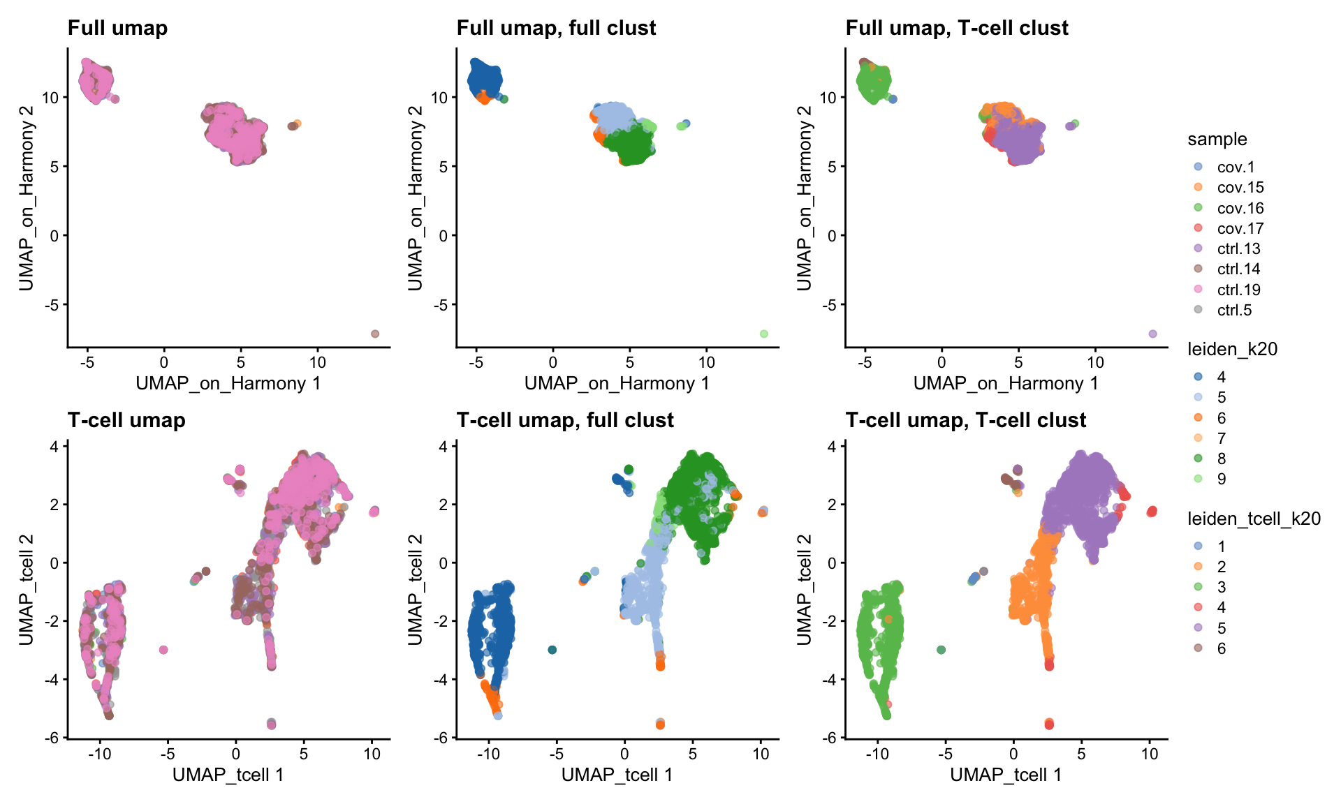
As you can see, we do have some new clusters that did not stand out before. But in general the separation looks very similar.
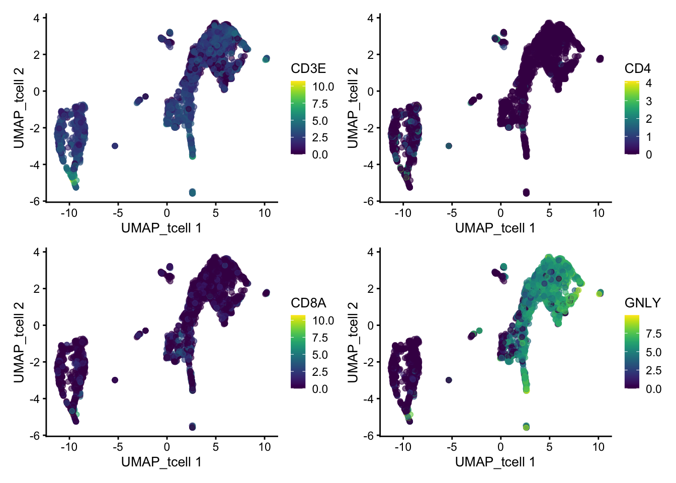
Lets also have a look at the same genes in the new umap:
wrap_plots(
    plotReducedDim(tcells, dimred = "UMAP_tcell", colour_by = "CD3E"),
    plotReducedDim(tcells, dimred = "UMAP_tcell", colour_by = "CD4"),
    plotReducedDim(tcells, dimred = "UMAP_tcell", colour_by = "CD8A"),
    plotReducedDim(tcells, dimred = "UMAP_tcell", colour_by = "GNLY"),
    ncol = 2
)
Discuss
Have a look at the T-cells in the umaps with all cells or only T/NK cells. What are the main differences? Do you think it improved with subclustering? Also, there are some cells in these clusters that fall far away from the rest in the UMAPs, why do you think that is?
6 Session info
Click here
sessionInfo()R version 4.3.3 (2024-02-29)
Platform: x86_64-conda-linux-gnu (64-bit)
Running under: Ubuntu 20.04.6 LTS
Matrix products: default
BLAS/LAPACK: /usr/local/conda/envs/seurat/lib/libopenblasp-r0.3.28.so; LAPACK version 3.12.0
locale:
[1] LC_CTYPE=en_US.UTF-8 LC_NUMERIC=C
[3] LC_TIME=en_US.UTF-8 LC_COLLATE=en_US.UTF-8
[5] LC_MONETARY=en_US.UTF-8 LC_MESSAGES=en_US.UTF-8
[7] LC_PAPER=en_US.UTF-8 LC_NAME=C
[9] LC_ADDRESS=C LC_TELEPHONE=C
[11] LC_MEASUREMENT=en_US.UTF-8 LC_IDENTIFICATION=C
time zone: Etc/UTC
tzcode source: system (glibc)
attached base packages:
[1] stats4 stats graphics grDevices utils datasets methods
[8] base
other attached packages:
[1] harmony_1.2.1 Rcpp_1.0.14
[3] bluster_1.12.0 clustree_0.5.1
[5] ggraph_2.2.1 igraph_2.0.3
[7] pheatmap_1.0.12 patchwork_1.3.0
[9] scran_1.30.0 scater_1.30.1
[11] ggplot2_3.5.1 scuttle_1.12.0
[13] SingleCellExperiment_1.24.0 SummarizedExperiment_1.32.0
[15] Biobase_2.62.0 GenomicRanges_1.54.1
[17] GenomeInfoDb_1.38.1 IRanges_2.36.0
[19] S4Vectors_0.40.2 BiocGenerics_0.48.1
[21] MatrixGenerics_1.14.0 matrixStats_1.5.0
loaded via a namespace (and not attached):
[1] bitops_1.0-9 gridExtra_2.3
[3] rlang_1.1.5 magrittr_2.0.3
[5] compiler_4.3.3 DelayedMatrixStats_1.24.0
[7] vctrs_0.6.5 pkgconfig_2.0.3
[9] crayon_1.5.3 fastmap_1.2.0
[11] backports_1.5.0 XVector_0.42.0
[13] labeling_0.4.3 rmarkdown_2.29
[15] ggbeeswarm_0.7.2 purrr_1.0.2
[17] xfun_0.50 zlibbioc_1.48.0
[19] cachem_1.1.0 beachmat_2.18.0
[21] jsonlite_1.8.9 DelayedArray_0.28.0
[23] BiocParallel_1.36.0 tweenr_2.0.3
[25] irlba_2.3.5.1 parallel_4.3.3
[27] cluster_2.1.8 R6_2.6.1
[29] RColorBrewer_1.1-3 limma_3.58.1
[31] knitr_1.49 FNN_1.1.4.1
[33] Matrix_1.6-5 tidyselect_1.2.1
[35] abind_1.4-5 yaml_2.3.10
[37] viridis_0.6.5 codetools_0.2-20
[39] lattice_0.22-6 tibble_3.2.1
[41] withr_3.0.2 evaluate_1.0.3
[43] polyclip_1.10-7 pillar_1.10.1
[45] checkmate_2.3.2 generics_0.1.3
[47] RCurl_1.98-1.16 sparseMatrixStats_1.14.0
[49] munsell_0.5.1 scales_1.3.0
[51] RhpcBLASctl_0.23-42 glue_1.8.0
[53] metapod_1.10.0 tools_4.3.3
[55] BiocNeighbors_1.20.0 ScaledMatrix_1.10.0
[57] locfit_1.5-9.11 graphlayouts_1.2.2
[59] cowplot_1.1.3 tidygraph_1.3.0
[61] grid_4.3.3 tidyr_1.3.1
[63] edgeR_4.0.16 colorspace_2.1-1
[65] GenomeInfoDbData_1.2.11 beeswarm_0.4.0
[67] BiocSingular_1.18.0 ggforce_0.4.2
[69] vipor_0.4.7 cli_3.6.4
[71] rsvd_1.0.5 S4Arrays_1.2.0
[73] viridisLite_0.4.2 dplyr_1.1.4
[75] uwot_0.2.2 gtable_0.3.6
[77] digest_0.6.37 SparseArray_1.2.2
[79] ggrepel_0.9.6 dqrng_0.3.2
[81] htmlwidgets_1.6.4 farver_2.1.2
[83] memoise_2.0.1 htmltools_0.5.8.1
[85] lifecycle_1.0.4 statmod_1.5.0
[87] MASS_7.3-60.0.1