class: center, middle, inverse, title-slide .title[ # Base R graphics ] .subtitle[ ## R Foundations for Data Analysis ] .author[ ### Marcin Kierczak, Nima Rafati ] --- exclude: true count: false <link href="https://fonts.googleapis.com/css?family=Roboto|Source+Sans+Pro:300,400,600|Ubuntu+Mono&subset=latin-ext" rel="stylesheet"> <link rel="stylesheet" href="https://use.fontawesome.com/releases/v5.3.1/css/all.css" integrity="sha384-mzrmE5qonljUremFsqc01SB46JvROS7bZs3IO2EmfFsd15uHvIt+Y8vEf7N7fWAU" crossorigin="anonymous"> <!-- ------------ Only edit title, subtitle & author above this ------------ --> --- name: ex1_graphics # Example graphics 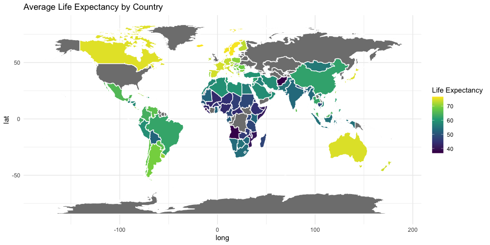 Life expectancy. --- name: ex2_graphics # Exampel graphics .pull-left-70[ 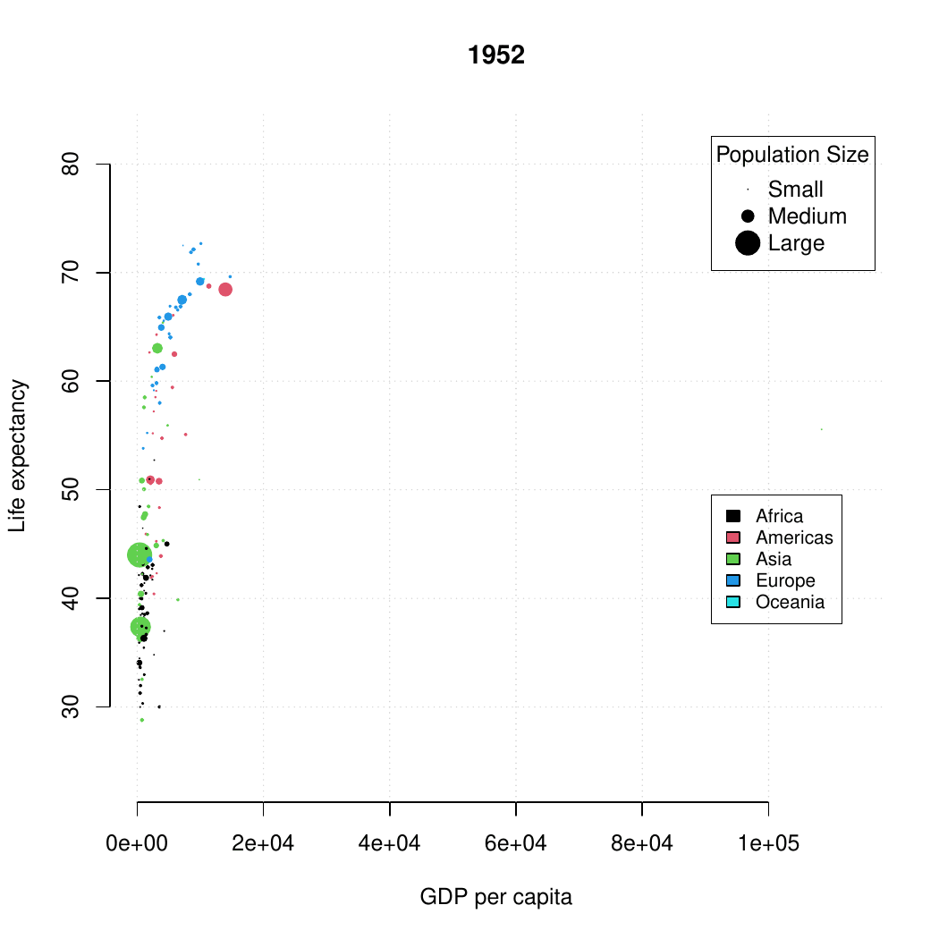 ] --- name: grapgical_devices class: spaced # Graphical devices The concept of a **graphical device** is crucial for understanding R graphics. -- A device can be a screen (default) or a file. -- Creating a plot entails: * opening a graphical device (not necessary for plotting on screen), -- * plotting to the graphical device, -- * closing the graphical device (very important!) -- # Common graphical devices <table> <thead> <tr> <th style="text-align:left;"> Device.Type </th> <th style="text-align:left;"> Functions </th> <th style="text-align:left;"> Notes </th> </tr> </thead> <tbody> <tr> <td style="text-align:left;"> Screen </td> <td style="text-align:left;"> default device </td> <td style="text-align:left;"> Displays plot on screen </td> </tr> <tr> <td style="text-align:left;"> Bitmap/Raster </td> <td style="text-align:left;"> png(), bmp(), tiff(), jpeg() </td> <td style="text-align:left;"> Use for images with pixel data </td> </tr> <tr> <td style="text-align:left;"> Vector </td> <td style="text-align:left;"> svg(), pdf() </td> <td style="text-align:left;"> High-quality, scalable graphics </td> </tr> <tr> <td style="text-align:left;"> Cairo </td> <td style="text-align:left;"> cairo_pdf(), cairo_ps() </td> <td style="text-align:left;"> Enhanced quality, especially on Windows </td> </tr> </tbody> </table> For more information visit [this link](http://stat.ethz.ch/R-manual/R-devel/library/grDevices/html/Devices.html). --- name: working_with_graphical_devs class: spaced # Working with graphical devices ``` r png(filename = 'myplot.png', width = 320, height = 320, antialias = T) # anti-aliasing, a technique that smooths the edges of shapes and text in the plot, making them appear less pixelated or jagged. plot(x=c(1,2,7), y=c(2,3,5)) dev.off() ``` -- What we did was, in sequence: * open a graphical device, here `png()` with some parameters, * do the actual plotting to the device using `plot()` and * close the graphical device using `dev.off()`. -- > It is of paramount importance to remember to close graphical devices. Otherwise, our plots may end up in some random weird files or on screens. --- name: std_viewport # Standard graphical device viewport .pull-left-50[ .size-80[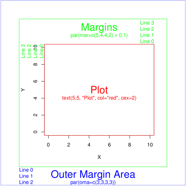] .small[source: rgraphics.limnology.wisc.edu] ] -- .pull-right-50[ `c(bottom, left, top, righ)` ] --- name: plot_basics # `base::plot()` basics `base::plot()` is a basic command that lets you visualize your data and results. It is very powerful yet takes some effort to fully master it. Let's begin with plotting three points: * A(1,2); * B(2,3); * C(7,5); .size-40[ ``` r plot(x=c(1,2,7), y=c(2,3,5)) ``` <img src="slide_base_graphics_files/figure-html/plot1-1.png" width="504" style="display: block; margin: auto;" /> ] --- name: plot_data_frame # Anatomy of a plot — episode 1 For convenience, we will create a data frame with our points: .pull-left-50[ ``` ## x y ## A 1 2 ## B 2 3 ## C 7 5 ``` ] .pull-right-50[ ``` r plot(df) ``` <img src="slide_base_graphics_files/figure-html/unnamed-chunk-3-1.png" width="504" style="display: block; margin: auto;" /> ] --- name: plot_anatomy_2 # Anatomy of a plot — episode 2 .pull-left-50[ There is many parameters one can set in `plot()`. Let's have a closer look at some of them: * pch – type of the plotting symbol * col – color of the points * cex – scale for points * main – main title of the plot * sub – subtitle of the plot * xlab – X-axis label * ylab – Y-axis label * las – axis labels orientation * cex.axis – axis lables scale * xlim – X-axis limits or range * ylim – Y-axis limits or range ] .pull-right-50[ Let's make our plot a bit fancier... ``` r # recycling rule in action! plot(df, pch = c(15, 17, 19), col = c("tomato", "slateblue"), main = "Three points", sub = "Stage 1") ``` <img src="slide_base_graphics_files/figure-html/plot2-1.png" width="504" style="display: block; margin: auto;" /> ] --- name: gr_param # Graphical parameters Graphical parameters can be set in two different ways: * as plotting function arguments, e.g. `plot(dat, cex = 0.5)` * using `par()` to set parameters globally ``` r # read current graphical parameters par() # first, save the current parameters so that you # can set them back if needed old_par <- par() # should work in theory, practise varies :-( # now, modify what you want par(cex.axis = 0.8, bg='grey') # do your plotting plot(................) # restore the old parameters if you want par(old_par) ``` --- name: pch_plot # The `pch` parameter .size-80[ <img src="slide_base_graphics_files/figure-html/par.pch-1.png" width="504" style="display: block; margin: auto;" /> ] --- name: pch_cheatsheet_code # How to make the `pch` cheatsheet ``` r # create a grid of coordinates coords <- expand.grid(1:6,1:6) # make a vector of numerical pch symbols pch.num <- c(0:25) # and a vector of character pch symbols pch.symb <- c('*', '.', 'o', 'O', '0', '-', '+', '|', '%', '#') # plot numerical pch plot(coords[1:26,1], coords[1:26,2], pch=pch.num, bty='n', xaxt='n', yaxt='n', bg='red', xlab='', ylab='') # and character pch's points(coords[27:36,1], coords[27:36,2], pch=pch.symb) # label them text(coords[,1], coords[,2], c(1:26, pch.symb), pos = 1, col='slateblue', cex=.8) ``` > Now, make your own cheatsheet for the **lty** parameter! --- name: layers_1 # Layers Elements are added to a plot in the same order you plot them. It is like layers in a graphical program. Think about it! For instance the auxiliary grid lines should be plotted before the actual data points. .pull-left-50[ ``` r # make an empty plot plot(1:5, type = "n", las = 1, bty = "n") grid(col = "grey", lty = 3) points(1:5, pch = 19, cex = 3) abline(h = 3, col = "red") ``` ] .pull-right-50[ <img src="slide_base_graphics_files/figure-html/gr.layers.ex-1.png" width="504" style="display: block; margin: auto;" /> ] The line overlaps one data point. It is better to plot it before plotting `points()` --- name: general_thoughts class: spaced # Some thoughts about plotting There is a few points you should have in mind when working with plots: -- * raster or vector graphics, -- * colors, e.g. color-blind people, warm vs. cool colors and optical illusions (check [colorbrewer2.org](https://colorbrewer2.org/#type=sequential&scheme=BuGn&n=3)), -- * avoid complications, e.g. 3D plots, pie charts etc., -- * use black and shades of grey for things you do not need to emphasize, i.e. basically everything except your main result, -- * avoid 3 axes on one figure. --- name: many_plots_on_one_fig # Many plots on one figure .pull-left-40[ ``` r par(mfrow=c(2,3)) plot(1:5) plot(1:5, pch=19, col='red') plot(1:5, pch=15, col='blue') hist(rnorm(100, mean = 0, sd=1)) hist(rnorm(100, mean = 7, sd=3)) hist(rnorm(100, mean = 1, sd=0.5)) par(mfrow=c(1,1)) ``` Alternative: use `par(mfcol=c(3,2))`. ] -- .pull-right-60[ <img src="slide_base_graphics_files/figure-html/mfrow.ex-1.png" width="504" style="display: block; margin: auto;" /> ] --- name: layout # Using `graphics::layout()` .pull-left-50[ ``` r M <- matrix(c(1,2,2,2,3,2,2,2), nrow = 2, ncol = 4, byrow = T) M layout(mat = M) layout.show(n = 3) #It shows the layout setup without plots ``` ``` ## [,1] [,2] [,3] [,4] ## [1,] 1 2 2 2 ## [2,] 3 2 2 2 ``` ] -- .pull-right-50[ ``` r M <- matrix(c(1,2,2,2,3,2,2,2), nrow = 2, ncol = 4, byrow = T) layout(mat = M) plot(1:5, pch=15, col='blue') hist(rnorm(100, mean = 0, sd=1)) plot(1:5, pch=15, col='red') ``` <img src="slide_base_graphics_files/figure-html/layout_ex-1.png" width="504" style="display: block; margin: auto;" /> ] --- name: colors # Defining colors ``` r mycol <- c(rgb(0, 0, 1), "olivedrab", "#FF0000") plot(1:3, c(1, 1, 1), col = mycol, pch = 19, cex = 3) points(2, 1, col = rgb(0, 0, 1, 0.5), pch = 15, cex = 5) ``` -- <img src="slide_base_graphics_files/figure-html/color_ex-1.png" width="360" style="display: block; margin: auto;" /> --- name: palettes # Color palettes There some built-in palettes: default, hsv, gray, rainbow, terrain.colors, topo.colors, cm.colors, heat.colors ``` r mypal <- heat.colors(10) mypal pie(x = rep(1, times = 10), col = mypal) ``` ``` ## [1] "#FF0000" "#FF2400" "#FF4900" "#FF6D00" "#FF9200" "#FFB600" "#FFDB00" ## [8] "#FFFF00" "#FFFF40" "#FFFFBF" ``` <img src="slide_base_graphics_files/figure-html/color.pal-1.png" width="360" style="display: block; margin: auto;" /> --- name: custom_palettes # Custom color palettes .pull-left-50[ You can easily create custom palettes: ``` r mypal <- colorRampPalette(c("red", "green", "blue")) pie(x = rep(1, times = 12), col = mypal(12)) class(mypal) ``` ``` ## [1] "function" ``` <img src="slide_base_graphics_files/figure-html/color.pal.custom-1.png" width="504" style="display: block; margin: auto;" /> ] -- .pull-right-50[ > **Note:**`grDevices::colorRampPalette()` returns a function for generating colors based on the defined custom palette! > There is an excellent package `RColorBrewer` that offers a number of pre-made palettes, e.g. color-blind safe palette. > Package `wesanderson` offers palettes based on Wes Anderson's movies :-) ] --- name: boxplot_theory # Box-and-whiskers plot — theory There are also more specialized R functions used for creating specific types of plots. One commonly used is `graphics::boxplot()` .size-40[.center[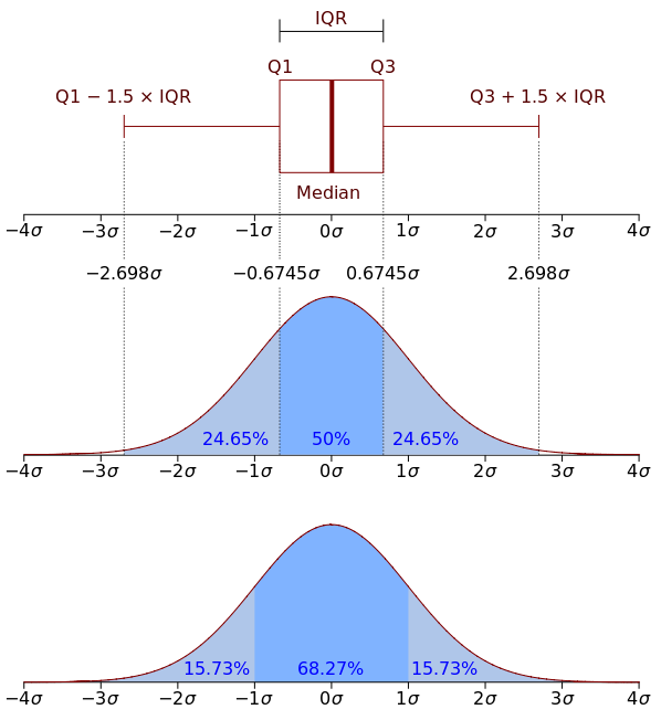]] > **Rule of thumb.** If median of one boxplot is outside the box of another, the median difference is likely to be significant `\(\alpha = 5\%\)`. --- name: boxplot # Box-and-whiskers plot .pull-left-50[ ``` r boxplot(decrease ~ treatment, data = OrchardSprays, log = "y", col = "bisque", varwidth=TRUE) ``` <img src="slide_base_graphics_files/figure-html/boxplot-1.png" width="504" style="display: block; margin: auto;" /> ] -- .pull-right-50[ The `add=TRUE` parameter in plots allows you to compose plots using previously plotted stuff! ``` r attach(InsectSprays) boxplot(count~spray, data=InsectSprays[spray %in% c("C","F"),], col="lightgray") boxplot(count~spray, data=InsectSprays[spray %in% c("A","B"),], col="tomato", add=TRUE) boxplot(count~spray, data=InsectSprays[spray %in% c("D","E"),], col="slateblue", add=TRUE) detach(InsectSprays) ``` <img src="slide_base_graphics_files/figure-html/boxplot2-1.png" width="288" style="display: block; margin: auto;" /> ] --- name: vcd # Plotting categorical data ``` r data(Titanic) # Load the data vcd::mosaic(Titanic, labeling = vcd::labeling_border(rot_labels = c(0,0,0,0))) ``` <img src="slide_base_graphics_files/figure-html/vcd.titanic-1.png" width="432" style="display: block; margin: auto;" /> > Package `vcd` provides a lot of ways of visualizing categorical data. --- name: heatmaps # Plotting simple heatmaps ``` r heatmap(matrix(rnorm(100, mean = 0, sd = 1), nrow = 10), col=terrain.colors(10)) ``` <img src="slide_base_graphics_files/figure-html/heatmap-1.png" width="360" style="display: block; margin: auto;" /> --- name: graph_gallery # Graph gallery For more awesome examples visit: [http://www.r-graph-gallery.com](http://www.r-graph-gallery.com)  <!-- --------------------- Do not edit this and below --------------------- --> --- name: end_slide class: end-slide, middle count: false # Thank you! Questions? .end-text[ <p class="smaller"> <span class="small" style="line-height: 1.2;">Graphics from </span><img src="./assets/freepik.jpg" style="max-height:20px; vertical-align:middle;"><br> Created: 23-Oct-2025 • <a href="https://www.scilifelab.se/">SciLifeLab</a> • <a href="https://nbis.se/">NBIS</a> </p> ]