flowchart LR
  A(Data types) --> B(Categorical)
  A --> C(Numerical)
Descriptive statistics
Introduction
Two main types of statistics
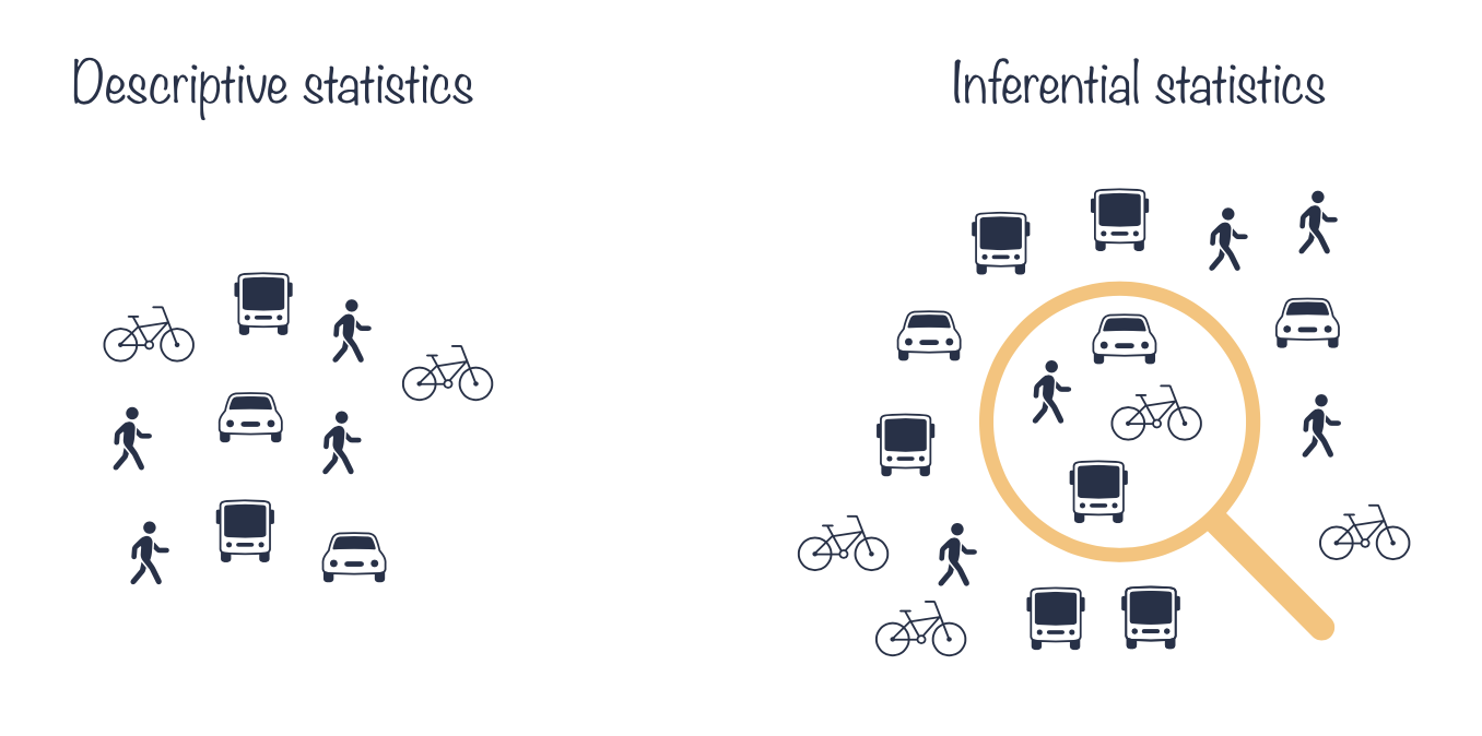
- Descriptive statistics describes and summarizes the data.
- It can be contrasted with inferential statistics that uses a sample of data to make inferences about the population that the sample of data is drawn from.
Categorical data
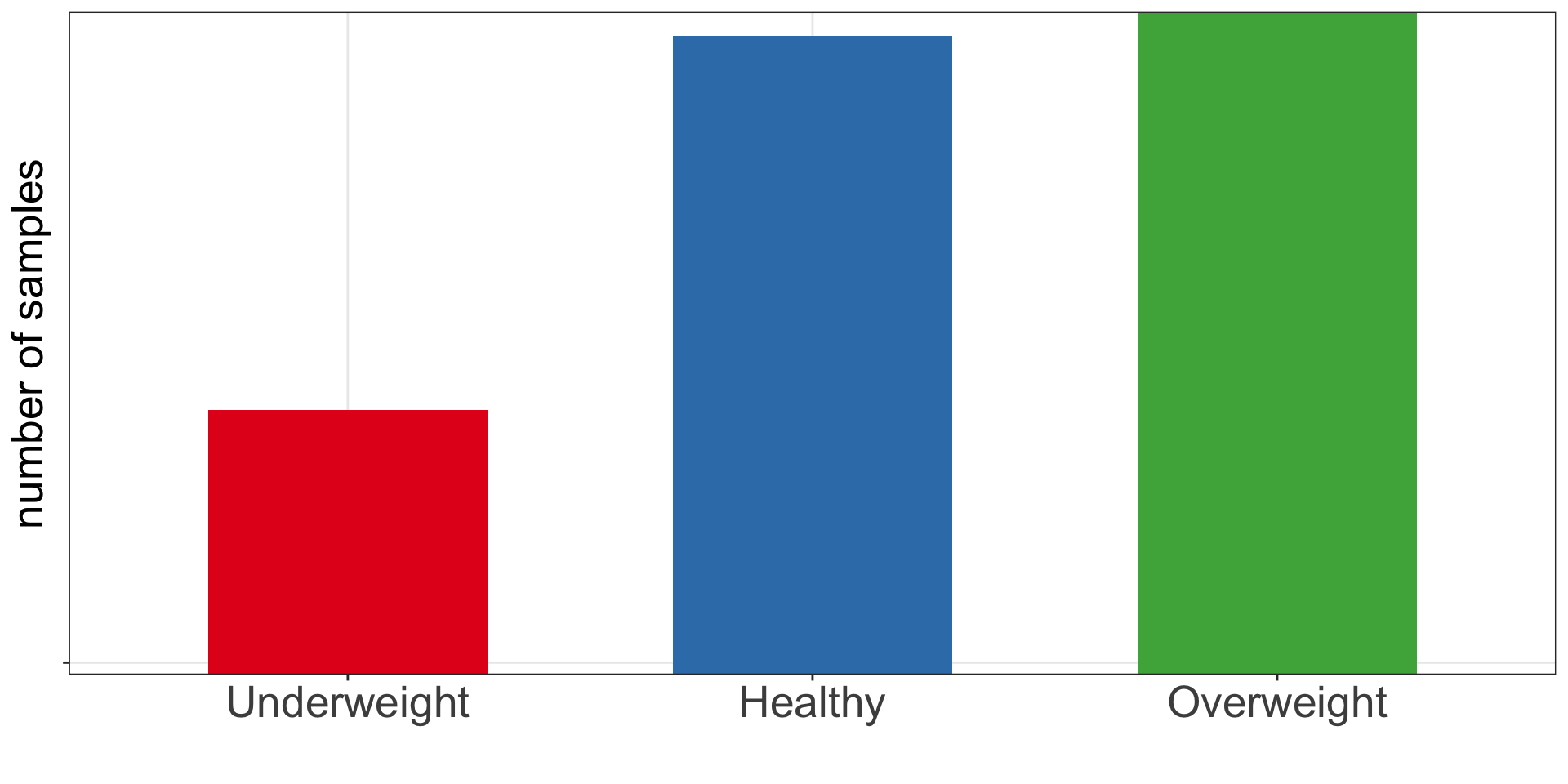
Frequency table. Bar and pie charts.
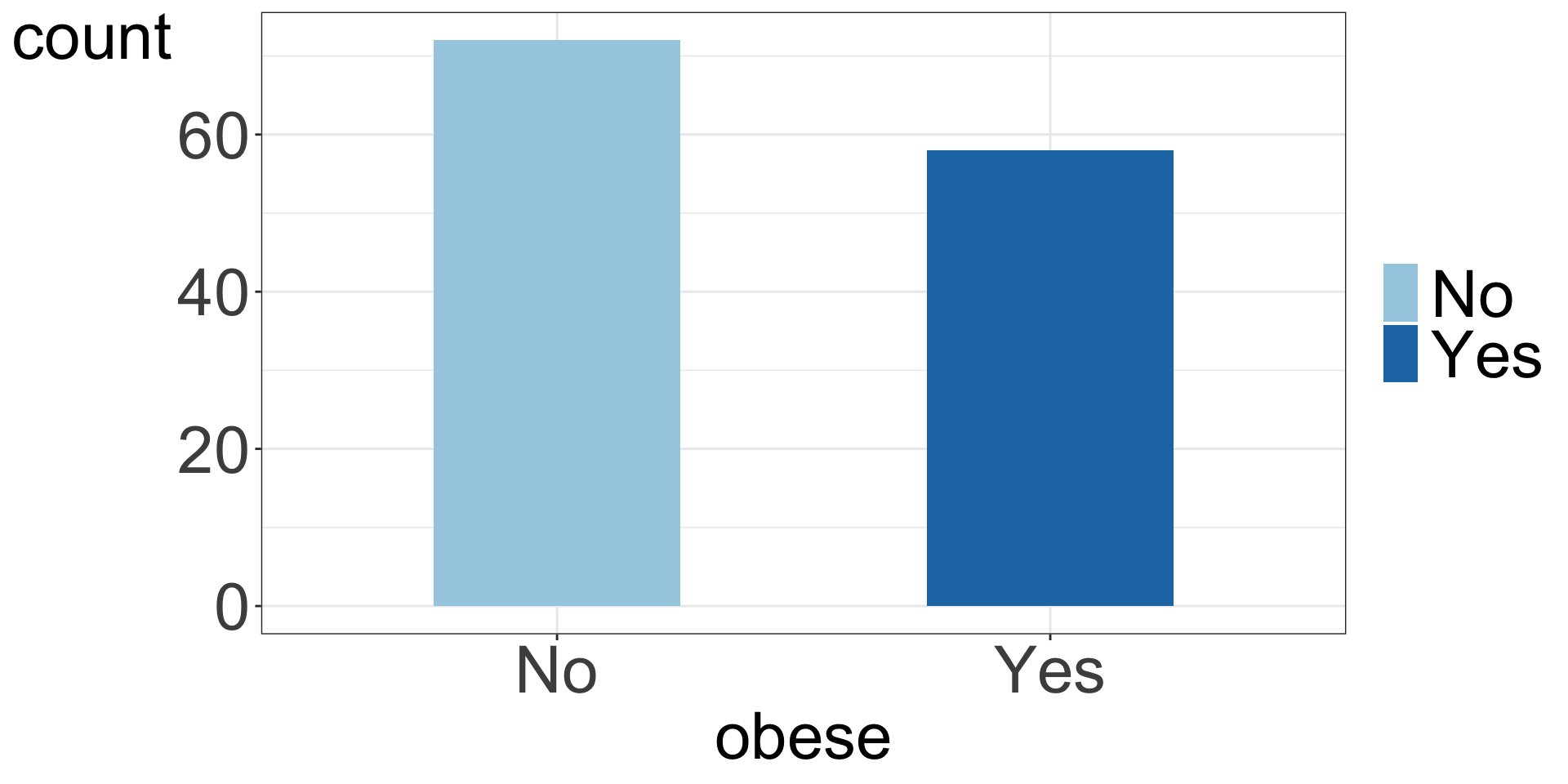
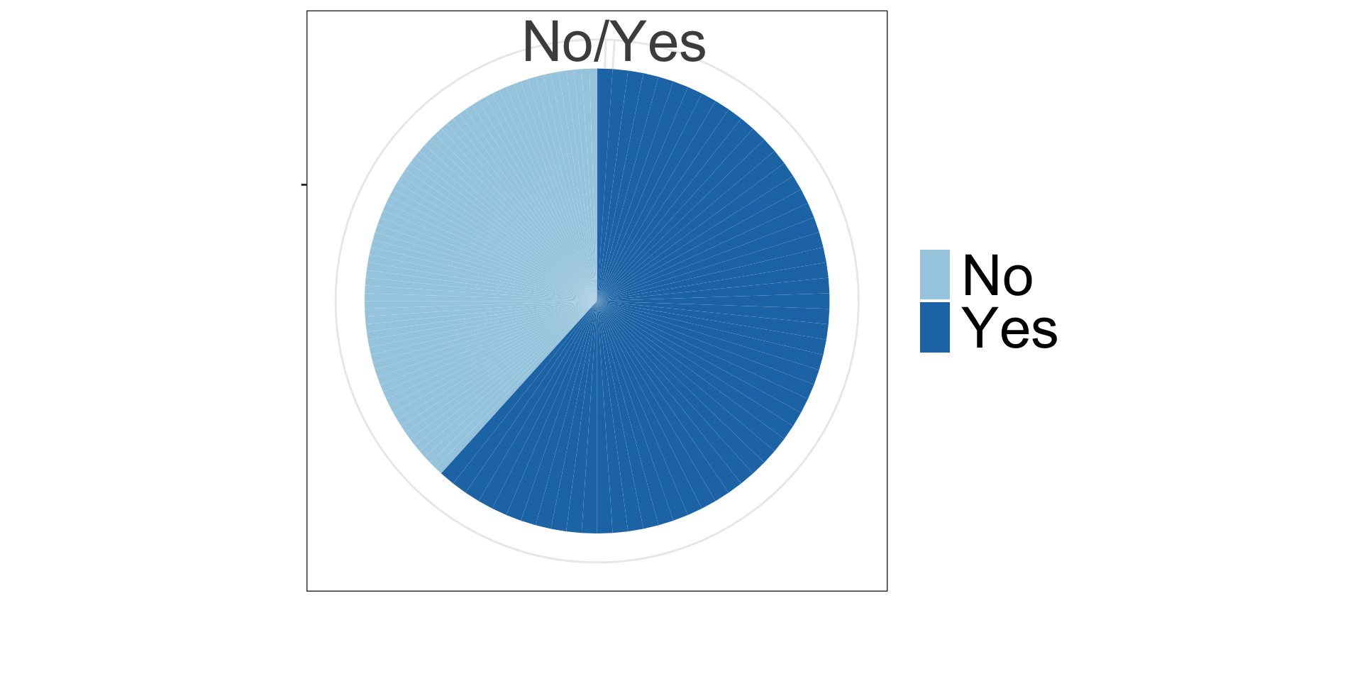
Frequency table shows the number, percentages and proportions of study participants with BMI \(\ge\) 30 and with BMI < 30.
| obese | n | percent (%) | proportion |
|---|---|---|---|
| No | 72 | 55.4 | 0.6 |
| Yes | 58 | 44.6 | 0.4 |
Bar chart
Pie chart
Categorical data
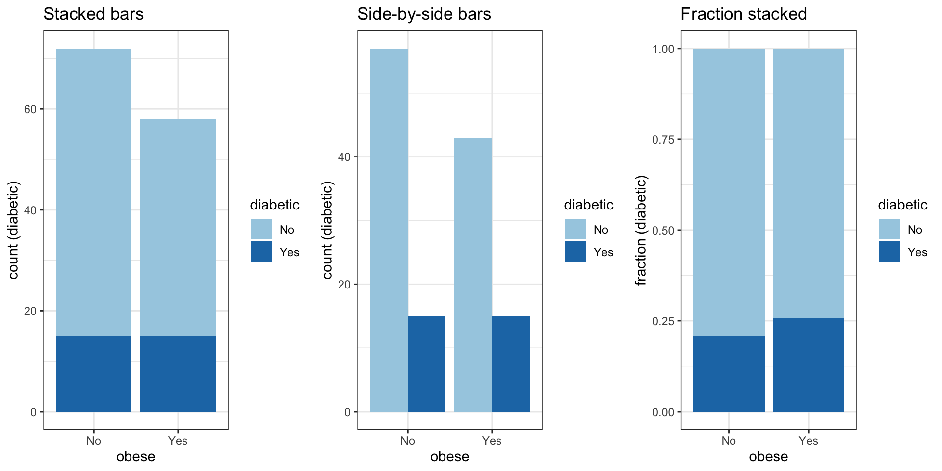
Bar charts: 2 categorical variables
Bar charts can be used to visualize two and more categorical variables, e.g. by using stacking, side-by-side bars or colors.
Categorical data
Mosaic plot
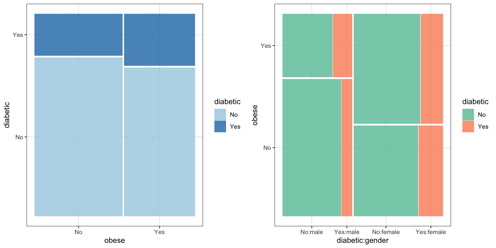
Figure 3: Mosaic plots display contigency tables, here of obesity and diabetic status among study pariticipants (left) and colour-coded by gender (right).
Numerical data
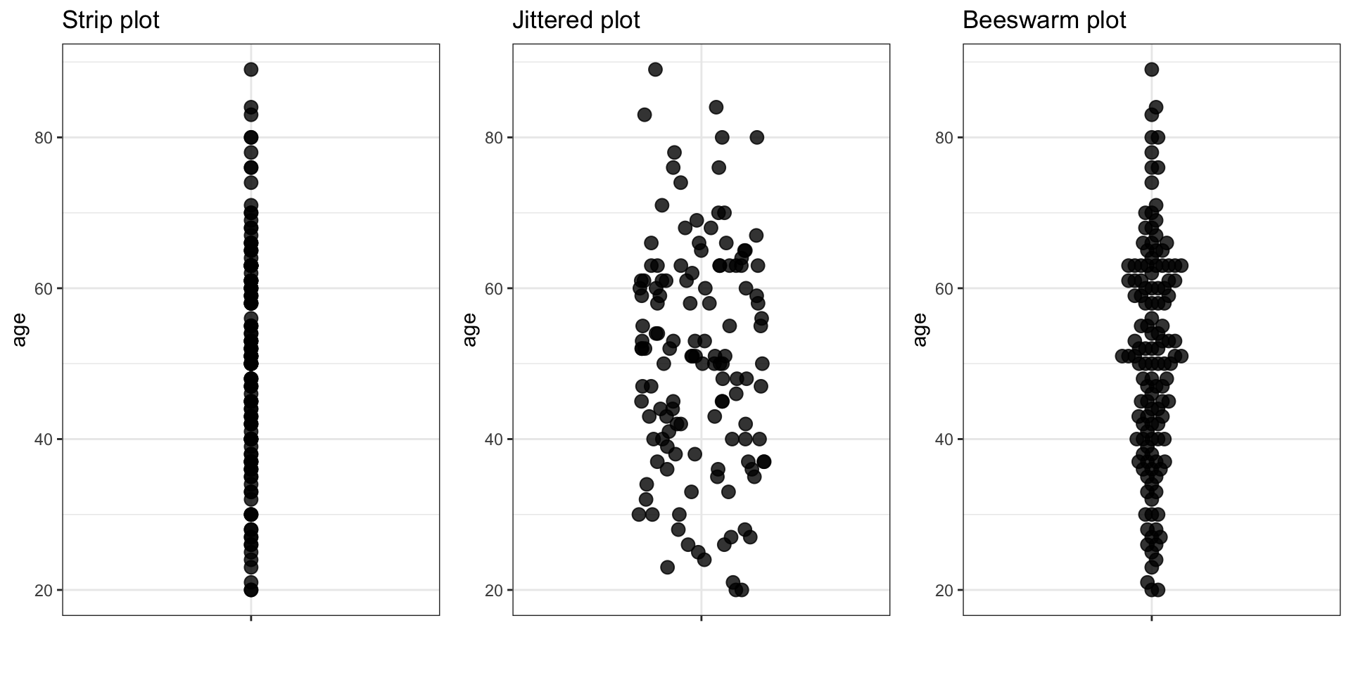
Strip plot, Jittered strip plot & Beeswarm plot
If it is technically feasible, it is recommended to visually assess all measurements on a plot.
Numerical data
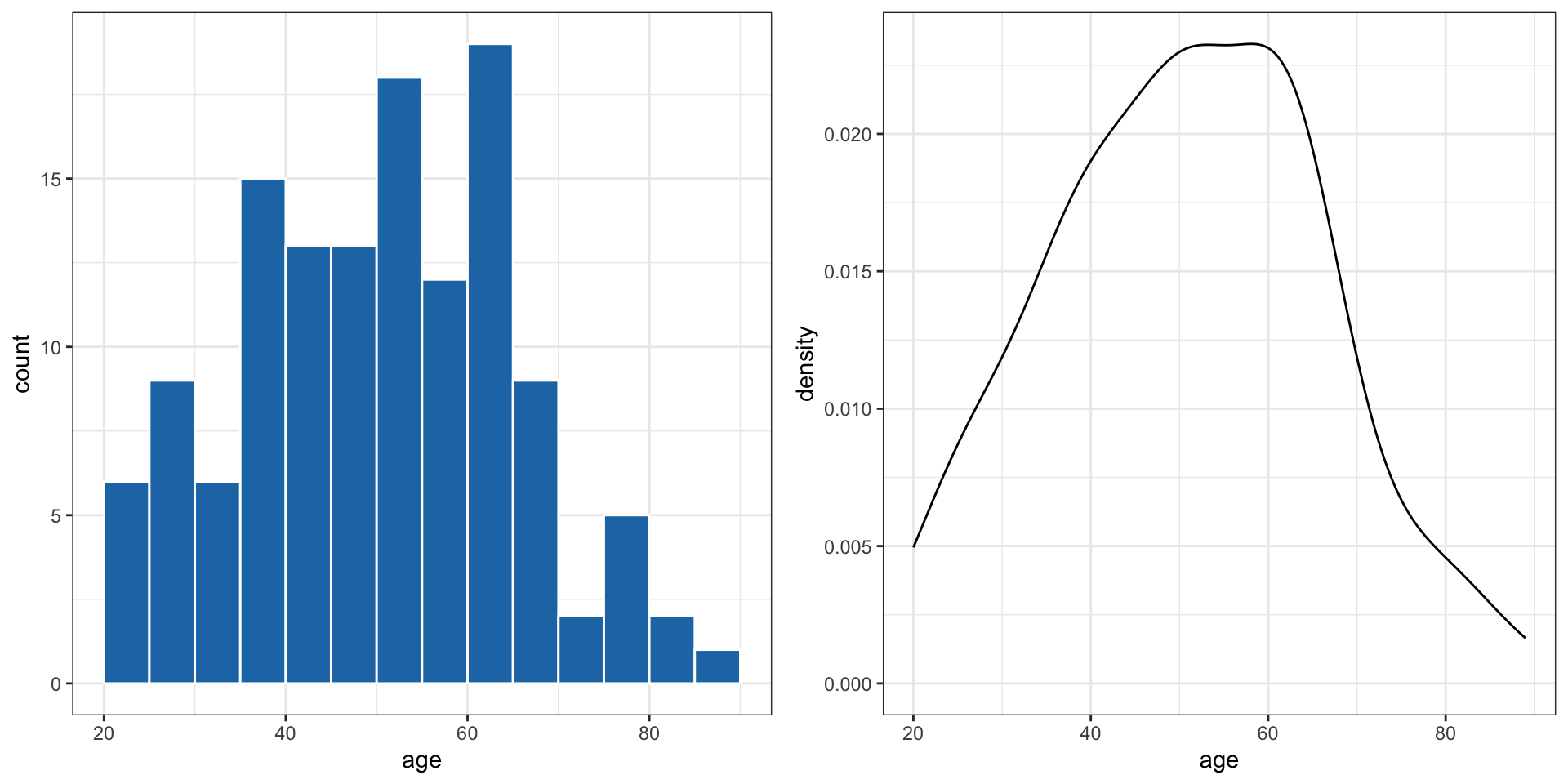
Histogram & density plot
A histogram bins the data and counts the number of observations that fall into each bin. A density plot is like a smoothed histogram where the total area under the curve is set to 1. A density plot is an approximation of a distribution.
Numerical data
Scatter plot: 2 numerical variables
Scatter plots are useful when studying a relationship (association) between two numerical variables.
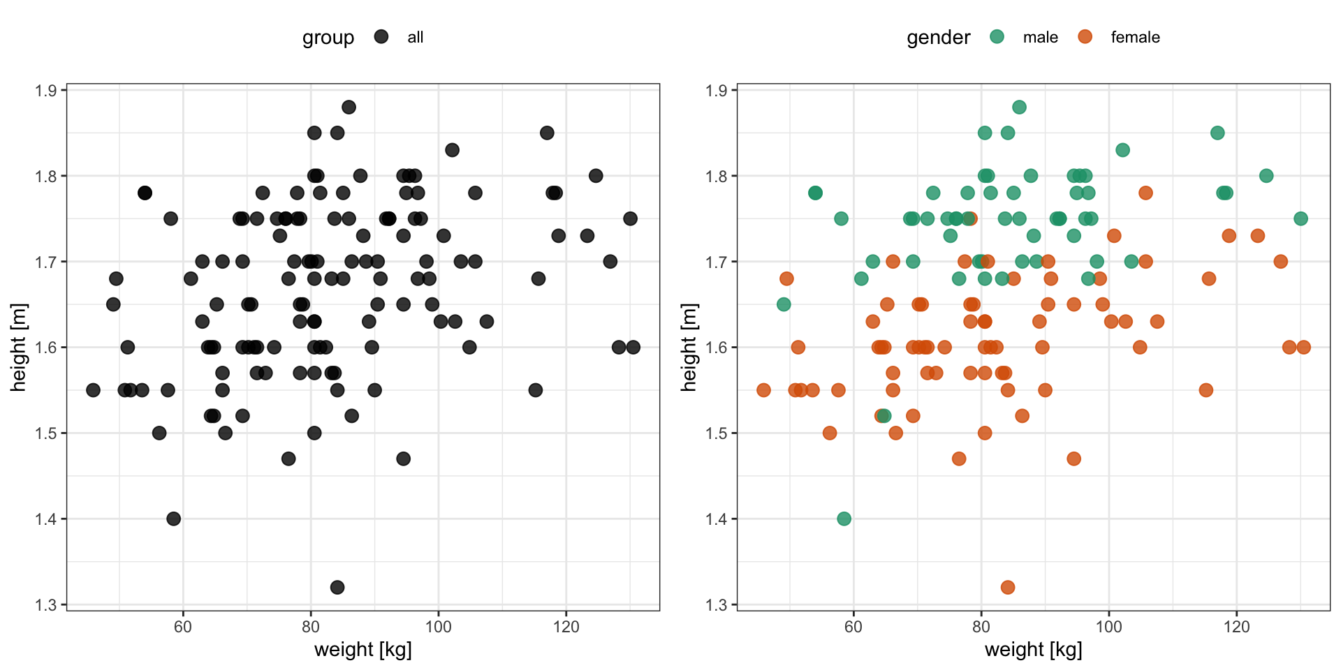
Numerical data
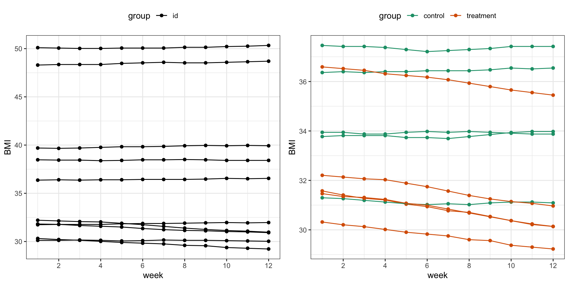
Scatter plot: 2 numerical variables cont.
Sometimes, it is useful to connect the observations in the order in which they appear, e.g. when analyzing time series data. The diabetes data set does not contain any measurements over time but we can simulate some BMI values over time for demonstration purposes.
Measures of location
Mean, median & outliers
In addition, it is good to remember that several very different distributions can still have the same mean value.
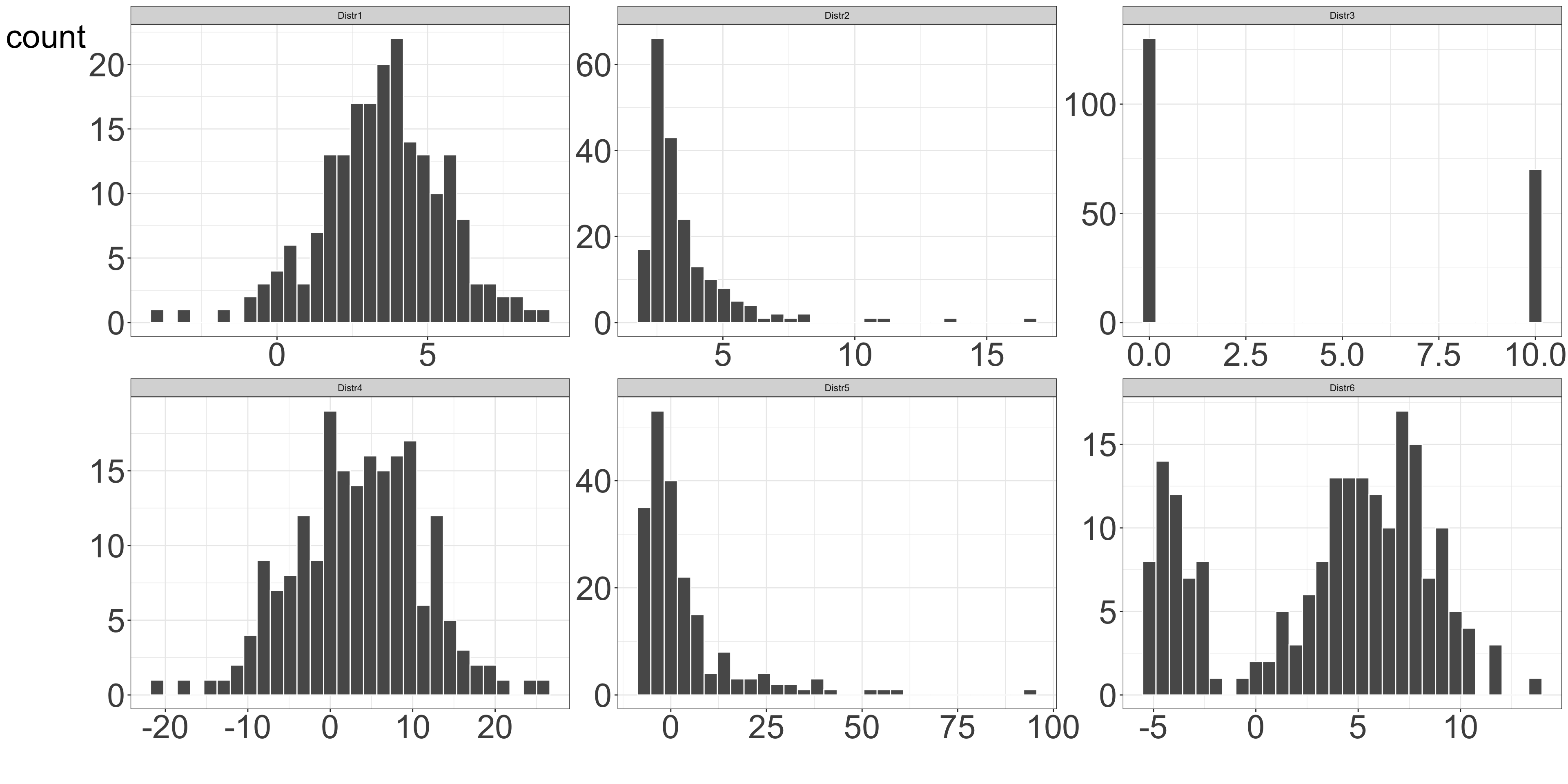
Figure 8: Examples of various distributions having the same mean value of 3.5
Measures of spread
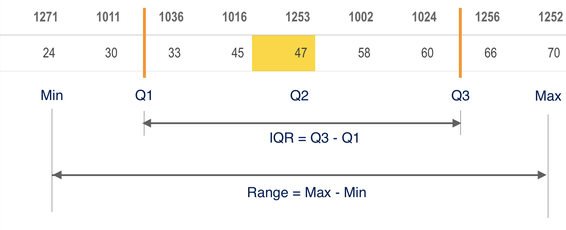
Range, quartiles and IQR
- The range is the difference between the largest and the smallest observations in the data set.
- Quartiles are the three values that divide the data values into four equally sized groups.
- The interquartile range, IQR, is the difference between the 1st (Q1) and the 3rd (Q3) quartiles, i.e. between the 25th and 75th percentiles.
 {width = 80%}
Measures of spread
Variance and standard deviation
The variance of a set of observations is their mean squared distance from the mean value:
\[\sigma^2 = \frac{1}{n} \sum_{i=1}^n (x_i - \bar x)^2 \qquad(3)\]
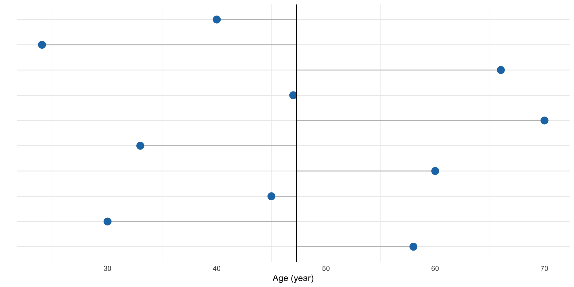
Figure 9: First ten age measurements for the study participants. Grey lines show the distance to the mean age value.
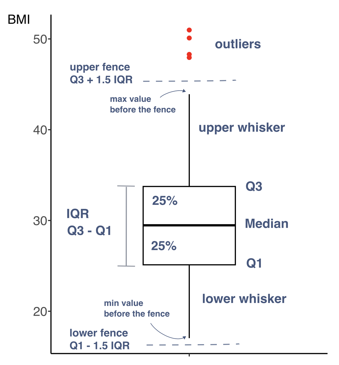
A box-and-whisker plot
Boxplot
- A box-and-whisker plot is a diagram summarizing numerical data through quartiles.
- It is shown as a vertical or horizontal rectangle box, with the ends of rectangle corresponding to the upper (Q3) and lower (Q1) quartiles of the data values. A line drawn through the rectangle corresponds to the median value (Q2).
- There can be also lines called whiskers extending from the rectangle indicating variability outside the upper and lower quartiles. These can be defined in few ways1.
- Data beyond the end of the whiskers are called “outlying” points and are plotted individually.
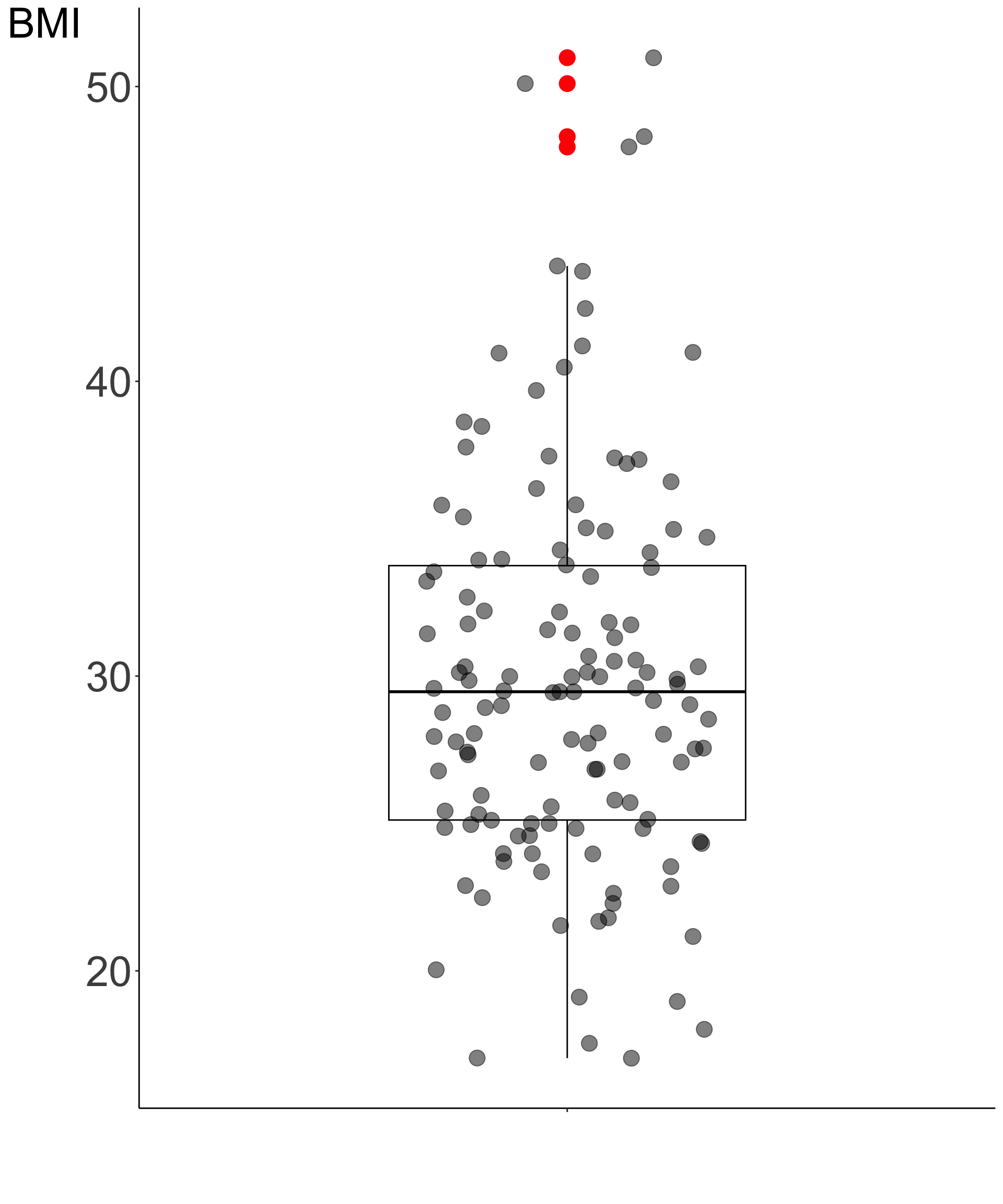
A box-and-whisker plot
Boxplot
- We have recommended to visually assess all the observations.
- We can overlay jitter plot on the box plot to get a complete picture of both the data and the quartiles summary statistics.
- On the right we see a box-and-whisker plot overlayed on the jitter plot for the BMI values based on the measurements for the 130 study participants
Feature engineering
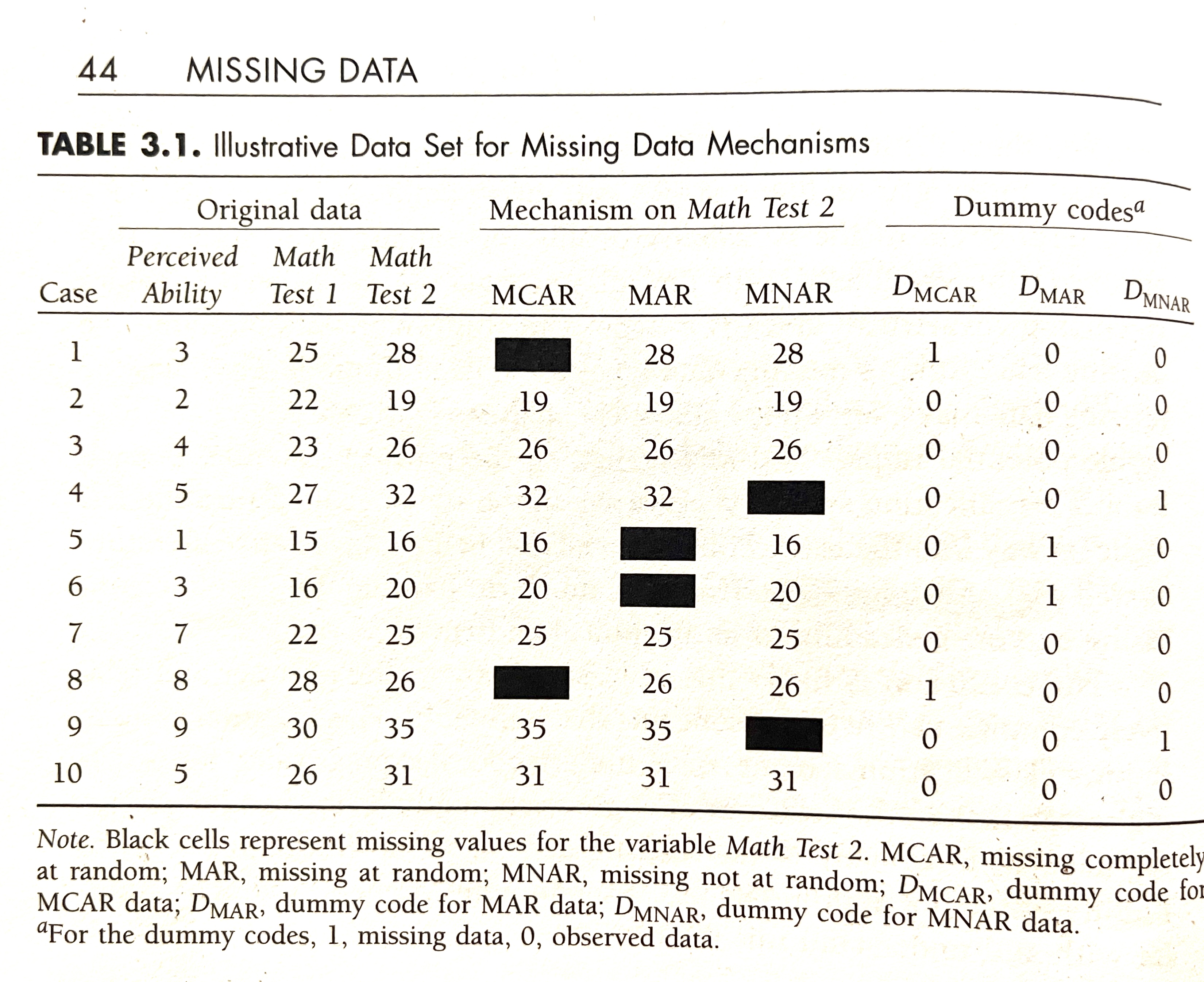
Rubin’s (1976) missing data classification system
MCAR
- missing completely at random
MAR
- missing at random
- two observations for Test 2 deleted where Test 1 \(<17\)
- missing data on a variable is related to some other measured variable in the model, but not to the value of the variable with missing values itself
MNAR
- missing not at random
- omitting two highest values for Test 2
- when the missing values on a variable are related to the values of that variable itself
 “Missing Data: A Gentle Introduction by Patrick E. McKnight, Katherine M. McKnight, Souraya Sidani, and Aurelio Jose Figueredo” (2008)
Feature engineering
handling imbalanced data
- handling imbalanced data
- down-sampling
- up-sampling
- generating synthetic instances
- e.g. with SMOTE (Fernández et al. 2018)
- or ADASYN (He et al. 2008)