suppressPackageStartupMessages({
  library(GenomicRanges)
  library(limma)
  library(dplyr)
  library(tidyr)
  library(tibble)
  library(ggplot2)
  library(patchwork)
  library(Rtsne)
})1 Overview
This tutorial covers more advanced analyses pertaining to ChIP-seq data. We will examine histone modifications over time and look into how we can jointly visualize the epigenome and changes in chromatin that occur on a global level.
1.1 The data set
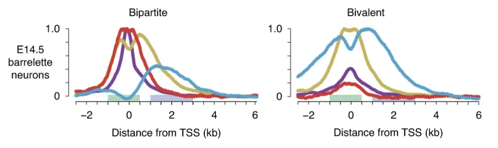
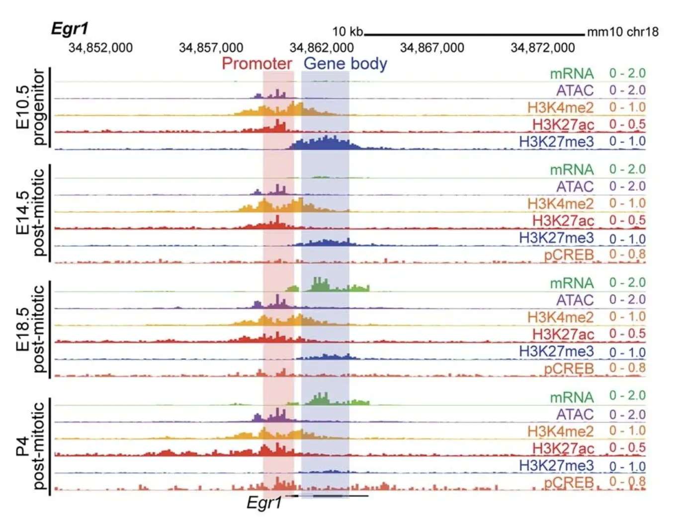
As mentioned, we will be looking at histone marks as well as accessibility from several time points across development. For this we will be using the data generated in this study by Kitazawa et al. (2021) where the authors look at barrelette neurons in mice, which receive sensory input from the whiskers on the face of the mouse. The authors describe genes with a new epigenetic signature characterized by open and H3K27-acetylated promoters (active mark) and H3K27-methylated gene bodies (repressive mark), called bipartite genes. These genes are not expressed but can be within minutes as soon as the repressive H3K27me3 mark is removed from the gene body upon exposure to the right stimulus. They tend to be transcription factors (TFs) and play key developmental roles. Figure 1 below depicts how the chromatin marks present themselves on bipartite and the previously described bivalent genes.
2 Read in the data
Our starting point for this tutorial is two raw count matrices: one on promoters and another on gene bodies. Promoters were defined as 1kb upstream and 500 bases downstream the transcription start site (TSS) and gene bodies as regions from 1kb to 3kb downstream the TSS. The rows in these count matrices correspond to genes and the columns correspond to the different modalities quantified on the promoter and gene body level and at three different developmental time points, namely E14, E18 and P4, where E14 means day 14 at the embryonic stage, E18 is embryonic stage at day 18 and this is actually when birth happens, and P4 means 4 days post-natally or after birth. The marks that were quantified are ATAC-seq, H3K27me3, H3K27Ac and H3K4me2.
2.1 Downlading the data
NoteSetting up and downloading the data
Open a terminal and navigate to your working directory (this is important) and follow these instructions:
## Go to your working directory and make a data folder
mkdir dataObjects

## Download the files from Pelle. Replace 'username' with your actual username
rsync username@pelle.uppmax.uu.se:'/proj/uppmax2026-1-197/ChIP/advancedChIP/*' dataObjects/
2.2 Reading in the data
Let’s begin by reading in the data.
## promoters
promoters <- readRDS("dataObjects/promotersGRanges.rds")
pCnt <- readRDS("dataObjects/promotersCnt.rds")
Let’s have a look at the objects.
head(promoters)GRanges object with 6 ranges and 5 metadata columns:
seqnames ranges strand | GENEID TXNAME
<Rle> <IRanges> <Rle> | <character> <character>
100009664 chr11 45807083-45808583 + | 100009664 uc007inp.2
100033459 chr1 173672680-173674180 + | 100033459 uc007drs.1
100037258 chr14 118936932-118938432 + | 100037258 uc007uzd.2
100037278 chr8 71601099-71602599 + | 100037278 uc009med.2
100038347 chr7 73739307-73740807 + | 100038347 uc009hrf.2
100038358 chr2 6131869-6133369 + | 100038358 uc008igh.2
percGC oeCpG Gene_Symbol
<numeric> <numeric> <character>
100009664 46.7022 0.331664 F630206G17Rik
100033459 43.7042 0.231901 Ifi208
100037258 64.2905 0.841210 Dnajc3
100037278 55.5630 0.612880 Fam129c
100038347 55.8961 0.718914 Fam174b
100038358 52.2318 0.315631 Gm10857
-------
seqinfo: 66 sequences (1 circular) from mm10 genomehead(pCnt) width P4_vPrV_K27Ac_1 P4_vPrV_K27Ac_2 E18_vPrV_K27Ac_1
100009664 1501 56 71 25
100033459 1501 26 26 5
100037258 1501 150 240 156
100037278 1501 27 17 22
100038347 1501 58 73 105
100038358 1501 25 25 25
E18_vPrV_K27Ac_2 E14_vPrV_K27Ac_1 E14_vPrV_K27Ac_2 P4_vPrV_K27Me3_1
100009664 37 31 34 25
100033459 24 22 25 19
100037258 138 110 148 9
100037278 18 32 35 277
100038347 49 134 157 228
100038358 15 24 36 87
P4_vPrV_K27Me3_2 E18_vPrV_K27Me3_1 E18_vPrV_K27Me3_2
100009664 27 31 27
100033459 13 35 22
100037258 5 23 22
100037278 169 689 555
100038347 121 164 142
100038358 56 107 80
E14_vPrV_K27Me3_1 E14_vPrV_K27Me3_2 P4_vPrV_K4Me2_1 P4_vPrV_K4Me2_2
100009664 30 36 236 34
100033459 20 43 39 22
100037258 17 16 697 340
100037278 379 207 125 131
100038347 50 37 655 378
100038358 46 44 15 29
E18_vPrV_K4Me2_1 E18_vPrV_K4Me2_2 E14_vPrV_K4Me2_1 E14_vPrV_K4Me2_2
100009664 29 38 7 30
100033459 8 10 16 27
100037258 428 224 179 215
100037278 107 69 56 83
100038347 571 295 257 380
100038358 10 17 12 28
P4_vPrV_ATAC_1 P4_vPrV_ATAC_2 E18_vPrV_ATAC_1 E18_vPrV_ATAC_2
100009664 131 131 89 94
100033459 152 134 62 55
100037258 2443 2351 2066 3623
100037278 267 230 80 73
100038347 446 484 364 604
100038358 166 163 57 41
E14_vPrV_ATAC_1 E14_vPrV_ATAC_2
100009664 72 44
100033459 78 56
100037258 918 1251
100037278 138 66
100038347 231 235
100038358 93 62## gene bodies
geneBodies <- readRDS("dataObjects/geneBodiesGRanges.rds")
gbCnt <- readRDS("dataObjects/geneBodiesCnt.rds")
TipExercise
- Examine the gene body regions and counts.
- Pick either one of the two count matrices (promoter or gene body level) and summarize how many time points there are, how many marks are measured, and how many replicates each mark has per time point. You can make use of the
tablefunction to do this.
3 Examining the promoter H3K4Me2 count matrix
We will focus on the promoter H3K4Me2 count matrix as an example, to illustrate how to get a global picture of our data. We want to know if there are any non-linearitites or problems with the counts. Do we expect global shifts across time? Do the replicates agree?
# cnt <- pCnt[, grep("K4Me2", colnames(pCnt))]
#
# pairs(cnt, panel = function(...){smoothScatter(..., nrpoints = 0, colramp = jet.colors, add=TRUE);abline(a=0,b=1,col="white")},
#       main = paste0("Original log2(RPKM) - ", conditions[i]))
#

cnt <- pCnt[, grep("K4Me2", colnames(pCnt))]
cpm <- sweep(x = cnt, MARGIN = 2,
             STATS = colSums(cnt), FUN = "/")*1e6
log2cpm <- log2(cpm + 1)

jet.colors <- colorRampPalette(c("#00007F", "blue", "#007FFF", "cyan",
                                 "#7FFF7F", "yellow", "#FF7F00", "red", "#7F0000"))
pairs(log2cpm, panel = function(...){smoothScatter(..., nrpoints = 0, colramp = jet.colors, add=TRUE);
  abline(a=0,b=1,col="white")}, main = "Promoter log2(CPM+1)")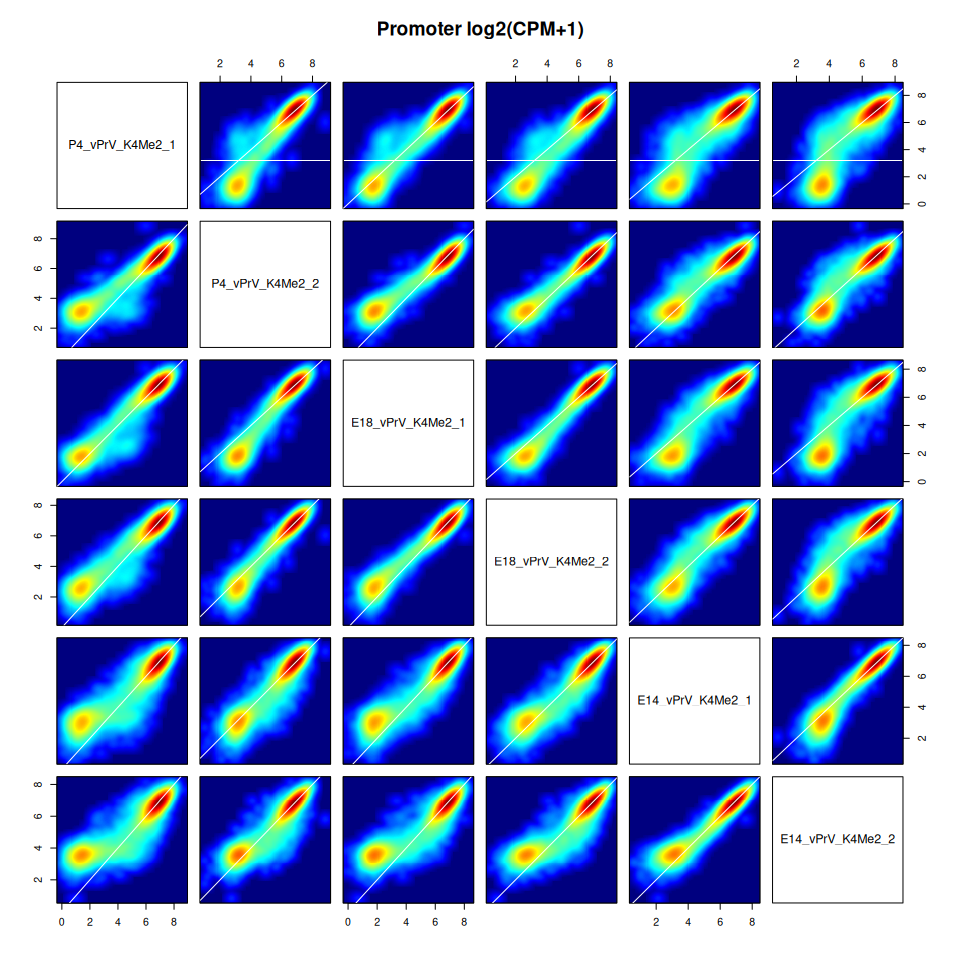
TipExercise
Comment on the pairs scatter plot above. Do you notice the non-linearities between samples? Examine the count vs GC content trends per sample to see if they explain these differences. Use the promoters object to get the GC percent of promoters and plot the log2(cnt+1) vs percGC for each sample on the promoter level for the H3K4Me2 mark depicted above. You may refer to the other ChIP-seq tutorial if needed.
4 Correcting for non-linearities
Before doing any normalization or correction it is important to understand why you are doing this, as well as how. In our case, we have discovered that the non-linearities in the scatter plots above can be explained by the differences in GC trends between samples. These technically-caused differences in counts will drive the differences we see if we don’t account for them in some way.
We will continue with the promoter H3K4Me2 count matrix from above to illustrate the normalization procedure. We will use the normalizeCyclicLoess function from the limma package to do this. An important assumption we are making here is that we do not expect genome-wide difference between the samples we are comparing, the time points in our case, meaning that most promoters don’t change over time.
So what does the function do? Briefly, the mean count across samples is calculated for all promoters. Then, for each sample, the difference from this mean is calculated and a loess fit is done for this difference vs the mean. The fitted values are used and subtracted from the original sample counts. This is done over a few iterations, hence the name cyclic loess. See the help page as well as the code in the function for more details. We can think of it as correcting the reads towards the same count vs GC trend since this is what’s driving the non-linearities in our counts. The linear relationship between count and GC content is not removed, but the counts are moved towards the same trend. This makes the samples comparable across the same region. This is a softer approach than completely removing the linear relationship between count and GC content.
Let’s aply this on our count matirx.
## Normalize with cyclic loess
log2cpmNorm <- normalizeCyclicLoess(log2cpm)

## Plot the corrected counts
pairs(log2cpmNorm, panel = function(...){smoothScatter(..., nrpoints = 0, colramp = jet.colors, add=TRUE);
  abline(a=0,b=1,col="white")}, main = "Promoter Norm log2(CPM+1)")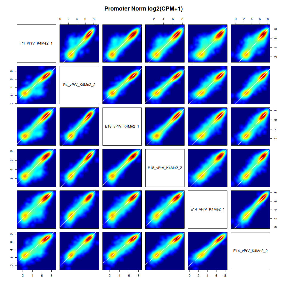
TipExercise
Take these corrected counts, which are corrected log2 CPM counts, and plot them against the percent GC for promoters for each sample. Do you see a change in the trends? Are they more similar between samples than before?
TipExercise
Make an MA plot showing the log2 fold change vs log2 average expression for P4 vs E14. Do this using the log2cpm matrix, and using the log2cpmNorm matrix. Compare the two MA plots and what can you notice? You may refer to the first tutorial to see how we did MA plots.
5 RPKMs on promoters and gene bodies
Now that we have illustrated how to correct for non-linearities coming from differences in count vs GC content trends, let’s create one matrix from the promoter and gene body counts. The purpose will be become apparent in the next section. The matrix we want to construct should have genes from the three developmental time points as rows, and the promoter and gene body ATAC, H3K27Me2, H3K27Ac and H3K27Me3 as columns. In essence, we want to have genes as rows and the different chromatin measurements on promoter and gene body as columns for those genes, and we want to do this for each time point.
The promoters and gene bodies we defined here have different widths, so the counts will have to be corrected for both library size difference between samples, as well as width differences between promoters and gene bodies. We will calculate reads per kilobase per million reads (RPKM) to accomplish this.
## Calculate RPKMs
all(colnames(pCnt) == colnames(gbCnt))
[1] TRUEall(rownames(pCnt) == rownames(gbCnt))[1] TRUElibSizes <- colSums(pCnt[,-1]) + colSums(gbCnt[,-1])
pRPKM <- t(t(pCnt[,-1] / pCnt[,1] * 1000) / libSizes * 1e6)
gbRPKM <- t(t(gbCnt[,-1] / gbCnt[,1] * 1000) / libSizes * 1e6)Let’s calculate the average RPKM per condition (average the replicates).
## Group by condition and calculate average rpkm per condition for each time pt.
conditions <- gsub('.{2}$', '', colnames(pRPKM))
spl <- split(colnames(pRPKM), conditions)
lengths(spl)
E14_vPrV_ATAC E14_vPrV_K27Ac E14_vPrV_K27Me3 E14_vPrV_K4Me2 E18_vPrV_ATAC
2 2 2 2 2
E18_vPrV_K27Ac E18_vPrV_K27Me3 E18_vPrV_K4Me2 P4_vPrV_ATAC P4_vPrV_K27Ac
2 2 2 2 2
P4_vPrV_K27Me3 P4_vPrV_K4Me2
2 2 ## Average replicates per sample
pRPKMavr <- do.call(cbind, lapply(spl, function(i){rowMeans(pRPKM[, i])}))
gbRPKMavr <- do.call(cbind, lapply(spl, function(i){rowMeans(gbRPKM[, i])}))
## log2(RPKM+0.1)
log2pRPKM <- log2(pRPKMavr+0.1)
log2gbRPKM <- log2(gbRPKMavr+0.1)5.1 Normalization
Next we will use normalizeCyclicLoess per chromatin mark across the time points, separately for promoters and gene bodies.
## Create groupings on which to use normalizeCyclicLoess
all(colnames(log2pRPKM) == colnames(log2gbRPKM))
[1] TRUEconditions <- limma::strsplit2(colnames(log2pRPKM), "_")[, 3]
spl <- split(colnames(log2pRPKM), conditions)
lengths(spl) ATAC K27Ac K27Me3 K4Me2
3 3 3 3 ## Apply normalization per chromatin mark across conditions per P and GB
pNormL <- lapply(spl, function(timePts){
normalizeCyclicLoess(log2pRPKM[, timePts])
})
gbNormL <- lapply(spl, function(timePts){
normalizeCyclicLoess(log2gbRPKM[, timePts])
})
head(pNormL$K27Ac) E14_vPrV_K27Ac E18_vPrV_K27Ac P4_vPrV_K27Ac
100009664 3.120708 3.251253 3.978973
100033459 2.522338 2.333243 2.710857
100037258 5.180954 5.273012 5.530245
100037278 3.042171 2.559821 2.513233
100038347 5.459113 4.235493 4.016066
100038358 2.856345 2.509648 2.661333
TipExercise
Take a few marks of your choice on either promoter or gene body level (after normalization), and look at the pairs scatter plots. Does everything seem in order?
Next, we will construct a count matrix where the columns display normalized log2 RPKMs for each mark, and the rows the genes at a specific developmental time point. We do this again for P and GB separately.
## For each mark, haev the time points per gene as rows
pNormExpandedL <- lapply(names(pNormL), function(mark){
  normMat <- pNormL[[mark]]
  normMat %>%
    as.data.frame() %>%
    rownames_to_column("geneID") %>%
    pivot_longer(cols = -geneID, names_to = "timePt", values_to = "log2rpkm") %>%
    mutate(geneIDtimePt = paste0(geneID, "_", limma::strsplit2(timePt, "_")[, 1])) %>%
    select(geneIDtimePt, log2rpkm) %>%
    column_to_rownames("geneIDtimePt") %>%
    rename(!!mark := log2rpkm)  %>%
    as.matrix()
})
gbNormExpandedL <- lapply(names(gbNormL), function(mark){
  normMat <- gbNormL[[mark]]
  normMat %>%
    as.data.frame() %>%
    rownames_to_column("geneID") %>%
    pivot_longer(cols = -geneID, names_to = "timePt", values_to = "log2rpkm") %>%
    mutate(geneIDtimePt = paste0(geneID, "_", limma::strsplit2(timePt, "_")[, 1])) %>%
    select(geneIDtimePt, log2rpkm) %>%
    column_to_rownames("geneIDtimePt") %>%
    rename(!!mark := log2rpkm)  %>%
    as.matrix()
})

## Check the row names are identical
sapply(pNormExpandedL, function(mat){
  all(rownames(mat)==rownames(pNormExpandedL[[1]]))
})
[1] TRUE TRUE TRUE TRUEsapply(gbNormExpandedL, function(mat){
all(rownames(mat)==rownames(gbNormExpandedL[[1]]))
})[1] TRUE TRUE TRUE TRUE## Combine marks
promoterlog2RPKM <- do.call(cbind, pNormExpandedL)
geneBodylog2RPKM <- do.call(cbind, gbNormExpandedL)
head(promoterlog2RPKM) ATAC K27Ac K27Me3 K4Me2
100009664_E14 2.589528 3.120708 3.405074 1.4614586
100009664_E18 3.342408 3.251253 2.976335 2.1073839
100009664_P4 2.414835 3.978973 3.045081 3.0751355
100033459_E14 2.782488 2.522338 3.308939 1.2442062
100033459_E18 2.757692 2.333243 2.984537 0.5933288
100033459_P4 2.528426 2.710857 2.306148 1.3027107Now we can combine the promoter and gene body matrices.
## Prepare to combine
all(rownames(promoterlog2RPKM) == rownames(geneBodylog2RPKM))
[1] TRUEcolnames(promoterlog2RPKM) <- paste0(colnames(promoterlog2RPKM), "_P")
colnames(geneBodylog2RPKM) <- paste0(colnames(geneBodylog2RPKM), "_GB")
## Combine
combinedLog2RPKM <- cbind(promoterlog2RPKM, geneBodylog2RPKM)
## Fix colnames
g <- grep("^K", colnames(combinedLog2RPKM))
colnames(combinedLog2RPKM)[g] <- paste0("H3", colnames(combinedLog2RPKM)[g])
head(combinedLog2RPKM) ATAC_P H3K27Ac_P H3K27Me3_P H3K4Me2_P ATAC_GB H3K27Ac_GB
100009664_E14 2.589528 3.120708 3.405074 1.4614586 2.084640 2.947568
100009664_E18 3.342408 3.251253 2.976335 2.1073839 2.569249 3.458712
100009664_P4 2.414835 3.978973 3.045081 3.0751355 2.202145 3.356313
100033459_E14 2.782488 2.522338 3.308939 1.2442062 2.175142 2.517316
100033459_E18 2.757692 2.333243 2.984537 0.5933288 2.415524 2.819339
100033459_P4 2.528426 2.710857 2.306148 1.3027107 2.051002 3.162050
H3K27Me3_GB H3K4Me2_GB
100009664_E14 3.353498 1.6349220
100009664_E18 3.092520 1.6182870
100009664_P4 3.061138 2.3249161
100033459_E14 2.451159 1.1627894
100033459_E18 2.688176 0.7656530
100033459_P4 1.943775 0.7645045Why did we do all this? Now we have the chromatin marks of interest on the gene level, capturing quantitatively comparable promoter and gene body levels per mark over all genes. In a way we are already thinking of these different columns as dimensions in the chromatin landscape of these genes. Furthermore, the rows are showing these values for each of the three time points. This will make it possible to see how the chromatin landscape changes over time, when we compare the different time points.
6 PCA
So how can we visualize this chromatin landscape? Since we have 8 columns or dimensions which together represent the chromatin landscape we are interested in, we need to reduce this to 2 (or 3) dimensions to visualize this space. Principle component analysis (PCA) which we have already seen in the previous tutorial could be used to look at the top principle components and see if they capture most of this landscape.
Let’s try this.
## PCA
pca <- prcomp(x = combinedLog2RPKM, scale. = FALSE)
summary(pca)
Importance of components:
PC1 PC2 PC3 PC4 PC5 PC6 PC7
Standard deviation 3.1285 2.0429 1.121 0.63775 0.54606 0.53411 0.44583
Proportion of Variance 0.5924 0.2526 0.076 0.02462 0.01805 0.01727 0.01203
Cumulative Proportion 0.5924 0.8450 0.921 0.94558 0.96363 0.98090 0.99293
PC8
Standard deviation 0.34183
Proportion of Variance 0.00707
Cumulative Proportion 1.00000s <- summary(pca)
pc1var <- round(s$importance["Proportion of Variance", "PC1"]*100, digits = 2)
pc2var <- round(s$importance["Proportion of Variance", "PC2"]*100, digits = 2)
pc3var <- round(s$importance["Proportion of Variance", "PC3"]*100, digits = 2)
jet.colors <- colorRampPalette(c(
"#00007F", "blue", "#007FFF", "cyan",
"#7FFF7F", "yellow", "#FF7F00", "red", "#7F0000"
))
df <- cbind(data.frame(pca$x), combinedLog2RPKM) %>%
rownames_to_column("rowName") %>%
mutate(geneID = limma::strsplit2(rowName, "_")[, 1]) %>%
mutate(timePt = limma::strsplit2(rowName, "_")[, 2])
df %>%
pivot_longer(cols = starts_with(c("ATAC", "H3")),
names_to = "chromatinMark", values_to = "log2RPKM") %>%
ggplot(aes(x = PC1, y = PC2)) +
geom_point(aes(color = log2RPKM)) +
scale_color_gradientn(colors = jet.colors(100)) +
#coord_fixed(ratio = pc2var/pc1var) +
labs(x = paste0("PC1 (", pc1var, "%)"), y = paste0("PC2 (", pc2var, "%)")) +
theme_classic() +
facet_wrap(~chromatinMark, ncol = 4)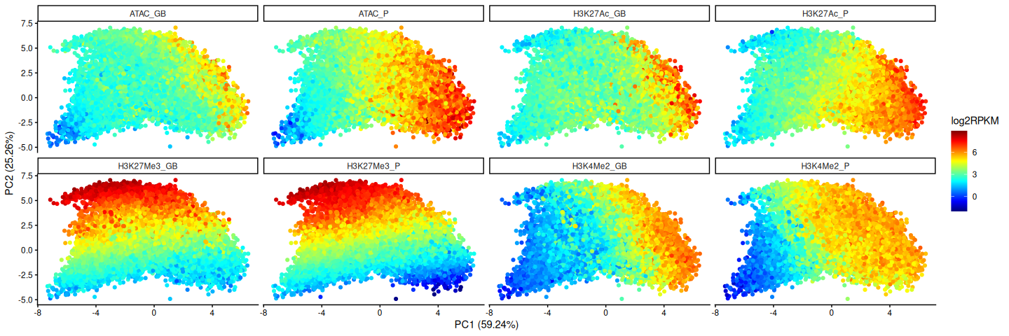
PC1 seems to capture more accessible and active genes going to the right of the plot, where H3K27Ac gets higher. PC2 seems to capture the repressive H3K27me3 mark with more of this mark being present on genes grouped with increasing PC2. But can we get a bit of a more fine-tuned visualization of the chromatin landscape? We will next input our gene (per time point) vs PC matrix into the Rtsne function to produce a t-SNE plot.
7 t-SNE
Let’s use the matrix from the PCA (PCs as columns) to apply the t-distributed stochastic neighbor embedding, or t-SNE for short, from Maaten and Hinton (2008). In contrast to the PCA, this is a stochastic and non-linear dimensionality reduction technique. The method tries to produce a lower dimensional representation of the data, maintaining as much as possible the distances between the points from the higher dimensions. What this means is that points that are close to each other in the original high dimensional space should remain close to each other in the lower dimensional representation (2 dimensions in our case). t-SNE is commonly used in single cell RNA-seq data analysis, and it is a great way to visualize the data especially in this case where we expect a rather continuous chromatin landscape and varying degrees of the mark depositions or accessibility.
## t-SNE
set.seed(6740)
tsne <- Rtsne(X = pca$x, pca = FALSE)
str(tsne)
List of 14
$ N : int 39834
$ Y : num [1:39834, 1:2] -26.32 -14.91 -9.19 -19.27 -22.02 ...
$ costs : num [1:39834] 9.39e-05 8.57e-05 1.03e-04 7.31e-05 7.65e-05 ...
$ itercosts : num [1:20] 114.1 114.1 106.9 98.8 96.5 ...
$ origD : int 8
$ perplexity : num 30
$ theta : num 0.5
$ max_iter : num 1000
$ stop_lying_iter : int 250
$ mom_switch_iter : int 250
$ momentum : num 0.5
$ final_momentum : num 0.8
$ eta : num 200
$ exaggeration_factor: num 12
- attr(*, "class")= chr [1:2] "Rtsne" "list"Let’s plot the t-SNE coloring by all the chromatin marks, to try and make sense of the chromatin landscape we are seeing and if there’s any structure and order to it. Note that each chromatin mark lives in its own space, meaning a count of 1 in the ATAC modality does not translate to or compare to a count of 1 in the H3K27me3 modality. They are different data types, and even amongst the ChIP-seq samples, different antibodies have different pull-down efficiencies or degrees of how well they capture the mark of interest. However within one mark, say H3K27Ac, we can indeed compare the promoter and gene body counts since we have log2 RPKM values. We will take this into account when plotting, so that the colors are directly comparable between promoter and gene body levels of a particular mark. We will also be setting lower and upper level limits so that the extreme values don’t dominate the color space and we can appreciate the global differences in the marks in a more fine grained way.
## Prepare to plot
tsneMat <- as.data.frame(tsne$Y)
colnames(tsneMat) <- c("TSNE1", "TSNE2")
df <- cbind(tsneMat, combinedLog2RPKM) %>%
  rownames_to_column("rowName") %>%
  mutate(geneID = limma::strsplit2(rowName, "_")[, 1]) %>%
  mutate(timePt = limma::strsplit2(rowName, "_")[, 2])

## Plot
marks <- sort(colnames(df)[grep("^ATAC|H3", colnames(df))])
plotList <- lapply(marks, function(mark){

  # get P and GB log2 RPKMs for the mark and set a lower and upper limit
  # ... limit for the colors corresponding to the bottom and top 5%
  modality <- limma::strsplit2(mark, "_")[, 1]
  values <- c(df[, paste0(modality, "_P")], df[, paste0(modality, "_GB")])
  lowerLim <- quantile(values, 0.05)
  upperLim <- quantile(values, 0.95)

  # plot
  ggplot(df, aes(x = TSNE1, y = TSNE2)) +
    geom_point(aes(color = .data[[mark]])) +
    scale_color_gradientn(colors = jet.colors(100),
                          limits = c(lowerLim, upperLim),
                          oob = scales::squish) +
    labs(title = mark) +
    theme_classic()

})
wrap_plots(plotList, ncol = 2)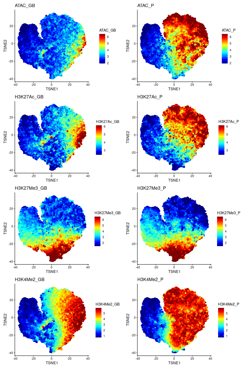
We can see certain patterns emerging here. The right-hand side of the t-SNE plot seems to depict genes that are more active or expressed. They are high in accessibility as well as H3K27Ac. The genes on the left-hand side are almost completely inaccessible, lack the active H3K27Ac mark, and are also lacking the repressive H3K27Me3 mark. These are likely genes in the heterochromatin which is not actively used and so tightly packed that it’s both inaccessible and lacking the repressive histone mark. The region in the middle, at the bottom of the t-SNE looks interesting. There is a more plastic world in between, where we see signs of both active and repressive marks co-existing to varying degrees. We will come to see later that this is where we find bipartite and bivalent genes.
TipExercise
Pick a mark of your choosing, for example ATAC_P, and plot the t-SNE coloring by this mark. Do this with and without setting any value limits in the coloring the way we have done above, and compare the two plots. Do you notice a difference in contrast? Which do you prefer and why? It is generally nice to try both variations to understand the full range of your values, and also how to best visualize the data depending on what you want to emphasize, so long as you are transparent with reporting this.
TipExercise
Have a look at the df object we made to generate the plots. You will notice that we have a column showing the time point. Plot the t-SNE coloring by the time point. Do you see an even mixing of the time points or is there a space in the t-SNE more dominated by one time point than another. What do each of those scenarios mean?
Let’s next color by the GC content to see if there are emerging patterns there or if this is more or less random.
## Get promoter and gene body GC content
all(promoters$GENEID == geneBodies$GENEID)
[1] TRUEm <- match(df$geneID, promoters$GENEID)
df$percGC_P <- promoters$percGC[m]
df$percGC_GB <- geneBodies$percGC[m]
df$oeCpG_P <- promoters$oeCpG[m]
df$oeCpG_GB <- geneBodies$oeCpG[m]
## Plot
feature <- c("percGC_P", "percGC_GB", "oeCpG_P", "oeCpG_GB")
plotL <- lapply(feature, function(f){
ggplot(df, aes(x = TSNE1, y = TSNE2)) +
geom_point(aes(color = .data[[f]])) +
scale_color_gradientn(colors = jet.colors(100)) +
ggtitle(f) +
theme_classic()
})
wrap_plots(plotL, ncol = 2)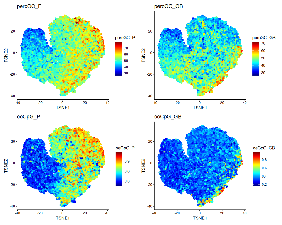
We can notice some patterns, with promoter GC content and CpG occurrences being enriched in the right-hand side which is also the genes which were more accessible.
7.1 t-SNE is stochastic
Did you notice that we had to set the seed in order to obtain this exact plot. If you do not do this, you will generate a different t-SNE everytime. So it is important to set the seed in order to be able to reproduce the plot you want.
TipExercise
Play with different seed values (any random number of your choosing) and generate the t-SNE and plots from above. Do you have a new favorite? Feel free to continue this tutorial with the t-SNE plot of your choice.
Please have a look at the arguments of the Rtsne function and its help page. You will notice that by default, the function will perform a PCA before a t-SNE. That is why we set pca=FALSE. You will also notice that there are additional arguments for the t-SNE that can affect the plot we get. This includes the perplexity argument which controls how many nearest neighbors are taken when constructing the embedding in the lower dimensional space. See more in the Details section.
TipExercise
- Use the
Rtsnefunction directly on thecombinedLog2RPKMmatrix. Do you get the same t-SNE as above? Keep in mind that you need to set the same seed. - Read a little more about the perplexity parameter and vary it. What do your plots look like?
7.2 Gene expression
What about gene expression? This is not information that went into the t-SNE. If we color the genes by their expression here, does this fit our interpretation of the marks and the landscape we have seen so far? We have gene expression data on the same samples and we will be reading in the log2 RPKM values below.
## Read in RNA data
RNAlog2RPKM <- readRDS("dataObjects/RNAlog2RPKM.rds")
head(RNAlog2RPKM)
100009664_E14 100033459_E14 100037258_E14 100037278_E14 100038347_E14
-3.215057 -3.321928 3.624810 2.132474 5.238235
100038358_E14
-1.697797 ## Add to df
m <- match(df$rowName, names(RNAlog2RPKM))
df$RNAlog2RPKM <- RNAlog2RPKM[m]
## Plot
ggplot(df, aes(x = TSNE1, y = TSNE2)) +
geom_point(aes(color = RNAlog2RPKM)) +
scale_color_gradientn(colors = jet.colors(100)) +
theme_classic()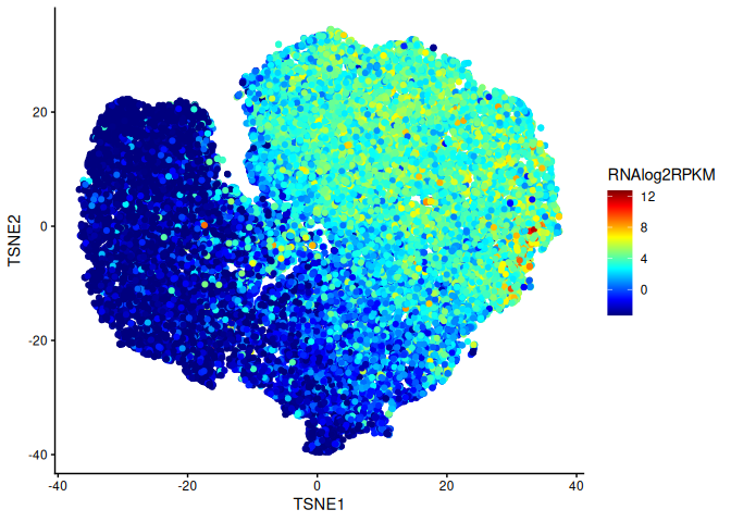
We can nicely see the gene expression pattern agreeing with what we know about the chromatin data so far. The highly expressed genes are also those with higher promoter H3K27Ac.
8 Global changes in chromatin over time
Now that we have our so called chromatin landscape and some degree of understanding on which parts of the t-SNE represent more or less active genes purely based on the chromatin, the question we really want to ask is how does this change over time? If you have certain genes of interest, you could plot which chromatin space they move into over time. At the moment, we want to know which genes change the most out of all other genes, purely based on changes in chromatin, going through the different time points.
How can we measure such changes quantitatively? We will use the Euclidean distance to do this, calculating it in the original high dimensional space. The Euclidean distance between two points in space is the length of the line connecting them. In a two dimensional space, you can calculate this distance using the Pythagoras theorem as shown in Figure 2 for the two points \(p\) and \(q\), so \(d(p,q)=\sqrt{(p_1-q_1)^2+(p_2-q_2)^2}\). This is generalizable for more than two dimensions. Taking vectors \(p\) and \(q\) with \(n\) dimensions, \(d(p,q)=\sqrt{(p-q)^2}\)

Let’s calculate the Euclidean distance between E14 and E18 for each gene.
## Create time-specific matrices
E14 <- combinedLog2RPKM[grep("E14", rownames(combinedLog2RPKM)), ]
E18 <- combinedLog2RPKM[grep("E18", rownames(combinedLog2RPKM)), ]
rownames(E14) <- limma::strsplit2(rownames(E14), "_")[, 1]
rownames(E18) <- limma::strsplit2(rownames(E18), "_")[, 1]

## Check gene IDs are ordered the same way
all(rownames(E14) == rownames(E18))
[1] TRUE## Calculate Euclidean distance in the high dimensional space
dist <- sqrt(rowSums((E18 - E14)^2))
summary(dist) Min. 1st Qu. Median Mean 3rd Qu. Max.
0.2923 0.9312 1.2018 1.3471 1.5707 6.1828 Let’s next color the genes belonging to the E14 time point by the distance we calculated. Which genes are changing the most in chromatin by the E18 time point?
## Color the E14 t-SNE by the distance
distCols <- c("cornsilk", "darkmagenta", "firebrick4")
df %>%
  filter(timePt == "E14") %>%
  mutate(euclDist = dist[geneID]) %>%
  ggplot(aes(x = TSNE1, y = TSNE2)) +
  geom_point(aes(color = euclDist)) +
  scale_color_gradientn(colors = distCols) +
  theme_classic()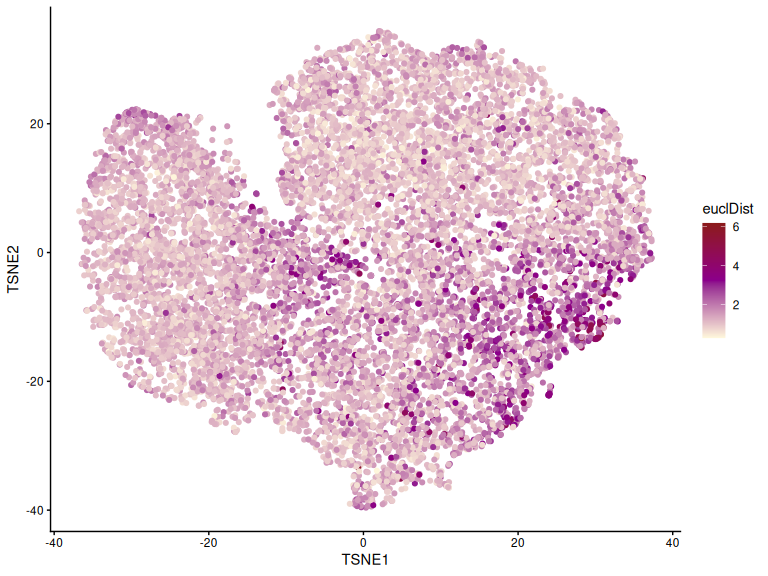
We can notice certain regions of the t-SNE are changing the most in chromatin going from E14 to E18, and that these genes which change the most are not randomly spread out in the entire t-SNE. The regions that are never used or which are highly expressed and constantly used, like housekeeping genes, change the least over time. A closer inspection of genes which change the most in the t-SNE actually reveals that these are the bipartite genes and they play key dynamic roles during development. Their promoters are open and carry active marks, even H3K27Ac which is normally a mark expressed genes carry, but these genes are not expressed due to the presence of the repressive H3K27Me3 mark at the gene body. These genes can be quickly induced when the right stimulus comes during development and the H3K27Me3 mark is removed thus causing these genes to be expressed.
TipExercise
Choose another pair of time points to compare, and plot the the t-SNE coloring by the Euclidean distance. Do you see something similar and is it in the same part of the t-SNE?
9 Genes over time
Let’s select a few genes and follow how they move over time in the chromatin space using the t-SNE we have made. We will focus on the bipartite genes of which we have selected some example genes below from the study. Kitazawa et al. (2021) have calculated bivalent and bipartite scores for genes to identify the genes of either categories. Without going into the details of these score calculations, which are based on expected chromatin marks on these genes, we will be using these identified genes here to define the regions in the t-SNE which are the bivalent and bipartite gene containing regions.
## Read in bipartite and bivalent genes
bipGenes <- readRDS("dataObjects/bipartiteGenes.rds")
m <- match(bipGenes, df$rowName)
df$bipartite<- FALSE
df$bipartite[m] <- TRUE
bivGenes <- readRDS("dataObjects/bivalentGenes.rds")
m <- match(bivGenes, df$rowName)
df$bivalent<- FALSE
df$bivalent[m] <- TRUE

## Plot them on the t-SNE
p1 <- ggplot(df, aes(x = TSNE1, y = TSNE2)) +
  geom_point(color = "grey", size = 0.5) +
  geom_point(data = subset(df, bivalent), aes(color = bivalent)) +
  theme_classic()
p2 <- ggplot(df, aes(x = TSNE1, y = TSNE2)) +
  geom_point(color = "grey", size = 0.5) +
  geom_point(data = subset(df, bipartite), aes(color = bipartite)) +
  theme_classic()
p1 + p2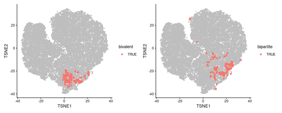
Let’s visualize these regions as contours on the t-SNE.
contourDf <- df %>%
  pivot_longer(cols = c(bivalent, bipartite),
               names_to = "regionType",
               values_to = "belong") %>%
  filter(belong)

ggplot(df, aes(x = TSNE1, y = TSNE2)) +
  geom_point(color = "grey", size = 0.5) +
  geom_density_2d(data = contourDf, aes(color = regionType)) +
  theme_classic()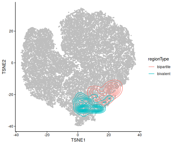
If you compare this plot to the plots where we colored the t-SNE by the different chromatin marks you will notice that the bipartite gene area has promoter H3K27Ac as well as gene body H3K27me3, whereas the bivalent region has no H3K27Ac but has the H3K27Me3 and H3K4Me2 marks coexisting on the gene, as they should by definition.
9.1 Immediate early genes (IEGs)
We will pick some IEGs mentioned by Kitazawa et al. (2021), which carry the bipartite gene signature and follow them over time going from E14 to E18 to P4. IEGs tend to be some of the first responders to the right stimulus. They tend to be transcription factors and timing is key during development, so that they are expressed at the right time when the stimulus comes. They in turn trigger the expression of other genes. In the context of the barrelette neurons which receive sensory input from the whiskers of the mice, the stimulus comes during birth at E18 when the mice start using their whiskers to sense their surroundings.
Let’s track some select IEGs.
## IEGs
iegs <- c("Fos", "Egr1", "Bcl6", "Nr3c1", "Plekhh3")

## Add gene names to df
m <- match(df$geneID, promoters$GENEID)
df$geneName <- promoters$Gene_Symbol[m]

## Add IEG column
df$isIEG <- df$geneName %in% iegs

## Plot IEGs over time
ggplot(df, aes(x = TSNE1, y = TSNE2)) +
  geom_point(color = "grey", size = 0.5) +
  geom_density_2d(data = contourDf, aes(color = regionType)) +
  geom_point(data = subset(df, isIEG), aes(fill = geneName),
             shape = 21, size = 2) +
  theme_classic() +
  facet_wrap(~timePt)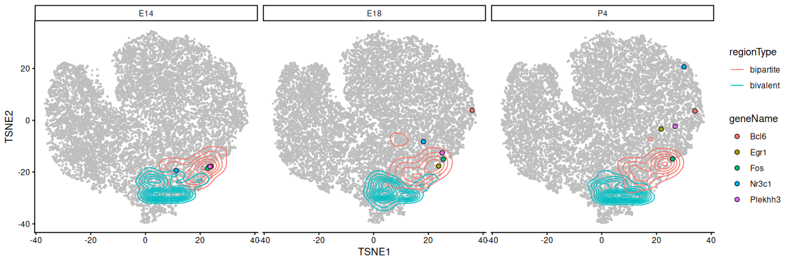
Notice how these genes start out as bipartite and gradually move up towards the part of the t-SNE where genes are more active (recall the plots coloring by all chromatin marks). The t-SNE helps us get a global picture and the genome browser tracks for the Egr1 gene below confirm what we are seeing above. We can appreciate a gradual decrease in H3K27Me3 accompanied by an increase in expression over time.
10 Final remarks
The chromatin landscapes we visualized here were done on the gene level in the context of the bipartite gene story. However one can do this on any regions of interest, like enhancers for example, and understand how the different chromatin regions group, and even visualize how they change between conditions by tracking how they move in this chromatin space.
11 Session
date()Code Output
[1] "Fri Oct 9 13:43:19 2026"sessionInfo()Code Output
R version 4.6.1 (2026-06-24)
Platform: x86_64-pc-linux-gnu
Running under: Ubuntu 24.04.5 LTS

Matrix products: default
BLAS:   /usr/lib/x86_64-linux-gnu/openblas-pthread/libblas.so.3
LAPACK: /usr/lib/x86_64-linux-gnu/openblas-pthread/libopenblasp-r0.3.26.so;  LAPACK version 3.12.0

locale:
 [1] LC_CTYPE=C.UTF-8       LC_NUMERIC=C           LC_TIME=C.UTF-8
 [4] LC_COLLATE=C.UTF-8     LC_MONETARY=C.UTF-8    LC_MESSAGES=C.UTF-8
 [7] LC_PAPER=C.UTF-8       LC_NAME=C              LC_ADDRESS=C
[10] LC_TELEPHONE=C         LC_MEASUREMENT=C.UTF-8 LC_IDENTIFICATION=C

time zone: UTC
tzcode source: system (glibc)

attached base packages:
[1] stats4    stats     graphics  grDevices datasets  utils     methods
[8] base

other attached packages:
 [1] Rtsne_0.17           patchwork_1.3.2      ggplot2_4.0.3
 [4] tibble_3.3.1         tidyr_1.3.2          dplyr_1.2.1
 [7] limma_3.68.5         GenomicRanges_1.64.0 Seqinfo_1.2.0
[10] IRanges_2.46.0       S4Vectors_0.50.2     BiocGenerics_0.58.1
[13] generics_0.1.4

loaded via a namespace (and not attached):
 [1] gtable_0.3.6        jsonlite_2.0.0      compiler_4.6.1
 [4] BiocManager_1.30.27 renv_1.2.3          Rcpp_1.1.1-1.1
 [7] tidyselect_1.2.1    dichromat_2.0-1     scales_1.4.0
[10] yaml_2.3.12         fastmap_1.2.0       statmod_1.5.2
[13] R6_2.6.1            labeling_0.4.3      isoband_0.3.0
[16] knitr_1.51          MASS_7.3-65         htmlwidgets_1.6.4
[19] RColorBrewer_1.1-3  pillar_1.11.1       rlang_1.3.0
[22] xfun_0.57           S7_0.2.2            otel_0.2.0
[25] cli_3.6.6           withr_3.0.2         magrittr_2.0.5
[28] digest_0.6.39       grid_4.6.1          lifecycle_1.0.5
[31] vctrs_0.7.3         KernSmooth_2.23-26  evaluate_1.0.5
[34] glue_1.8.1          farver_2.1.2        rmarkdown_2.31
[37] purrr_1.2.2         tools_4.6.1         pkgconfig_2.0.3
[40] htmltools_0.5.9
References
Kitazawa, Taro, Dania Machlab, Onkar Joshi, et al. 2021. “A Unique Bipartite Polycomb Signature Regulates Stimulus-Response Transcription During Development.” Nature Genetics 53: 379–91. https://doi.org/10.1038/s41588-021-00789-z.
Maaten, Laurens van der, and Geoffrey Hinton. 2008. “Visualizing Data Using t-SNE.” Journal of Machine Learning Research 9: 2579–605. https://www.cs.toronto.edu/~hinton/absps/tsne.pdf.