---
title: "Testing polars in python with seaborn"
toc: true
date: last-changed
format:
html:
code-tools: true
font-size: 10
code-annotations: hover
jupyter: python3
---
In this extra material, we will look into the use of `python` as a base programming language instead of `R` to recreate some of the plots we have create in this course. We will use `polars` as the dataframe manipulation library and `seaborn` for plotting with `numpy` and `palmerpenguins` as extra libraries to do these following exercises.
You could install these libraries using `pip`, `conda` or other means you prefer. For example, using `pip` you can run the following command in your terminal:
```{bash}
#| eval: false
pip install polars seaborn numpy palmerpenguins
```
Then you can open a `Jupyter` or `Quarto` notebook and start using these libraries to manipulate data and create plots.
# Dataframes
```{python}
#| label: polars
#| fig-cap: "First figure in python"
import polars as pl
from palmerpenguins import load_penguins

penguins = pl.from_pandas( load_penguins() )
penguins.head()
```
## From a file
```{python}
gc_raw = pl.read_csv("../data/counts_raw.txt", has_header=True, separator="\t")
gc_raw.head()
```
## Wide to Long format
```{python}
gc_raw_long = gc_raw.unpivot(index=["Gene"], variable_name="Sample_ID", value_name="counts")
gc_raw_long.head()
```
## Joining metadata
```{python}
md = pl.read_csv("../data/metadata.csv", has_header=True, separator=";")
md.head()
```
```{python}
gc_raw_all = gc_raw_long.join(md, on="Sample_ID", how="left")
gc_raw_all.head()
```
# Seaborn
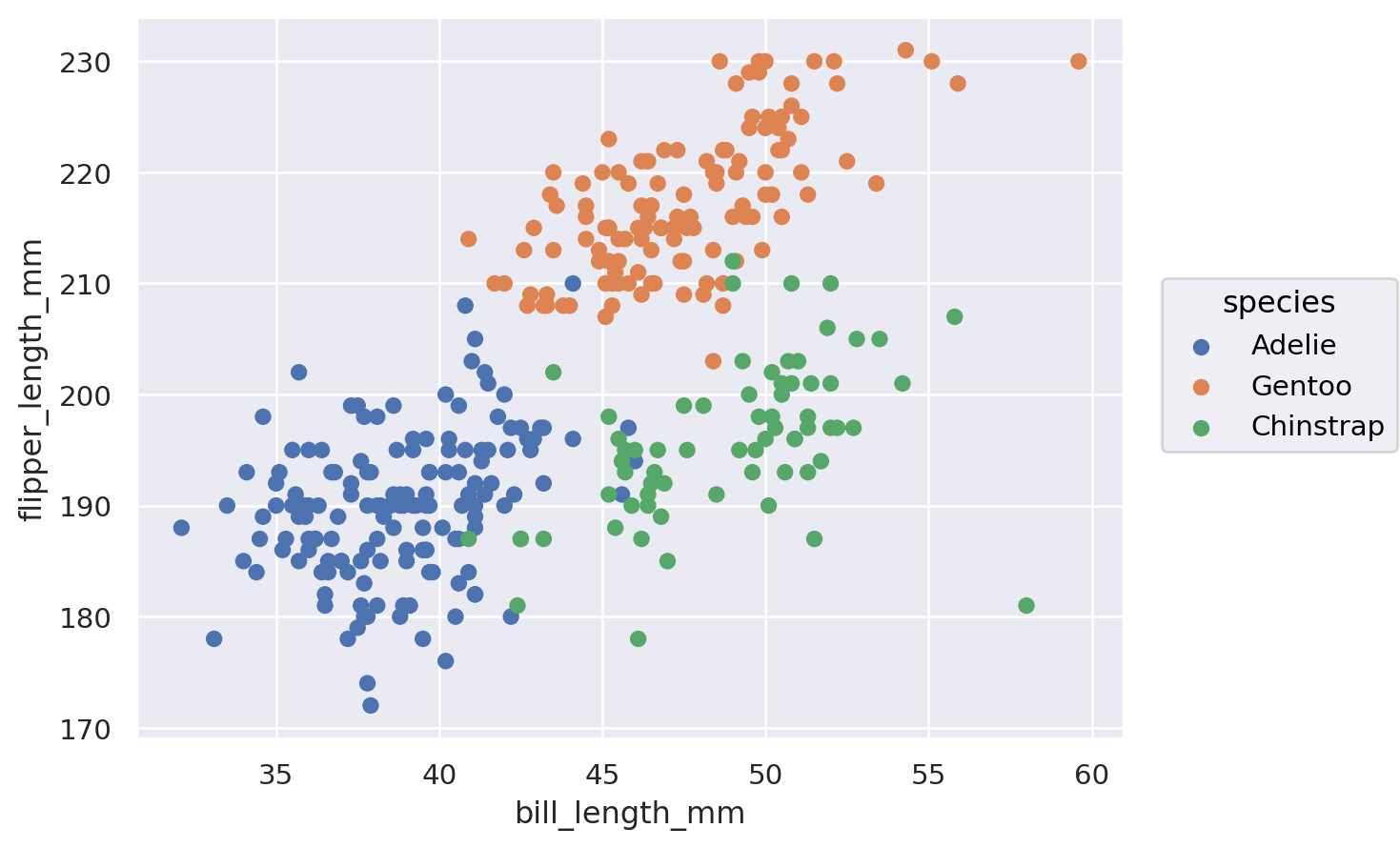
```{python}
import seaborn as sns
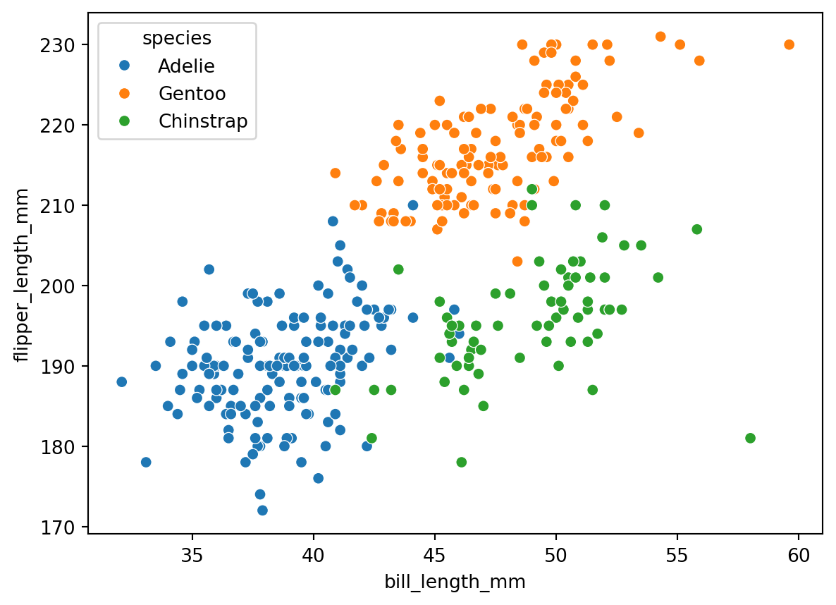
sns.scatterplot(penguins, x="bill_length_mm", y="flipper_length_mm", hue="species")
```
```{python}
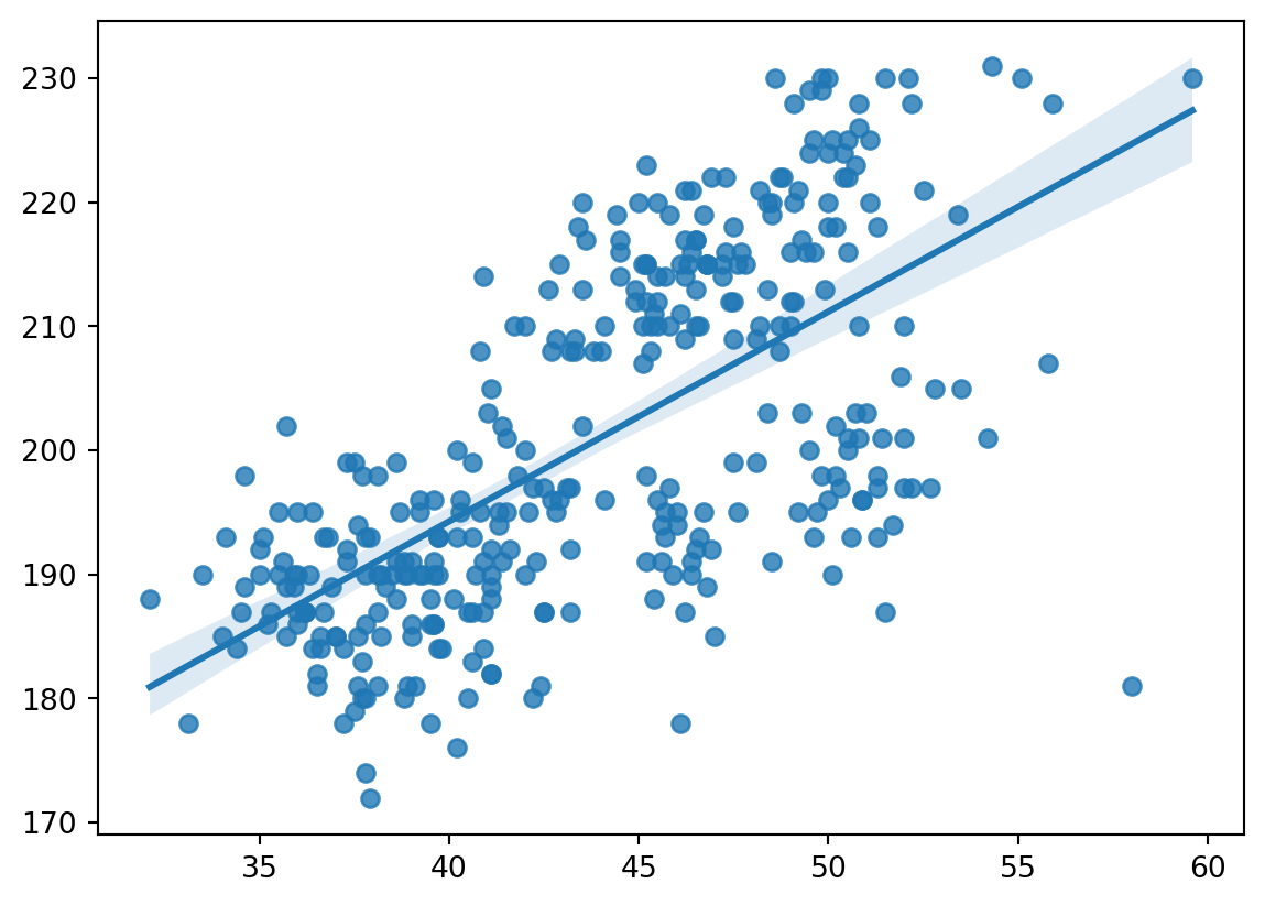
sns.regplot(penguins, x="bill_length_mm", y="flipper_length_mm")
```
```{python}
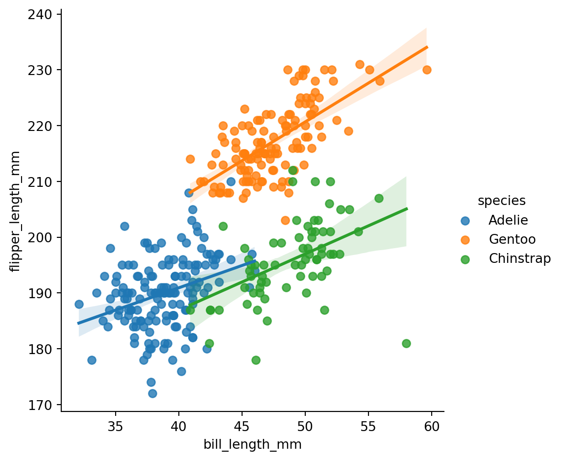
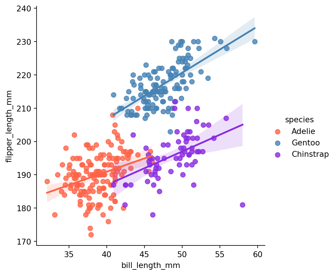
sns.lmplot(penguins, x="bill_length_mm", y="flipper_length_mm", hue="species")
```
```{python}
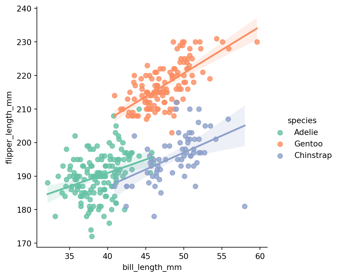
sns.lmplot(penguins, x="bill_length_mm", y="flipper_length_mm", hue="species", palette='Set2')
```
```{python}
custom_palette = ['#FF6347', '#4682B4', '#8A2BE2', '#FFD700']
sns.lmplot(penguins, x="bill_length_mm", y="flipper_length_mm", hue="species", palette=custom_palette)
```
```{python}
import numpy as np
gc_raw_log = gc_raw_all.with_columns([
( pl.col("counts").log1p() / np.log(10) ).alias("log10_counts")
])
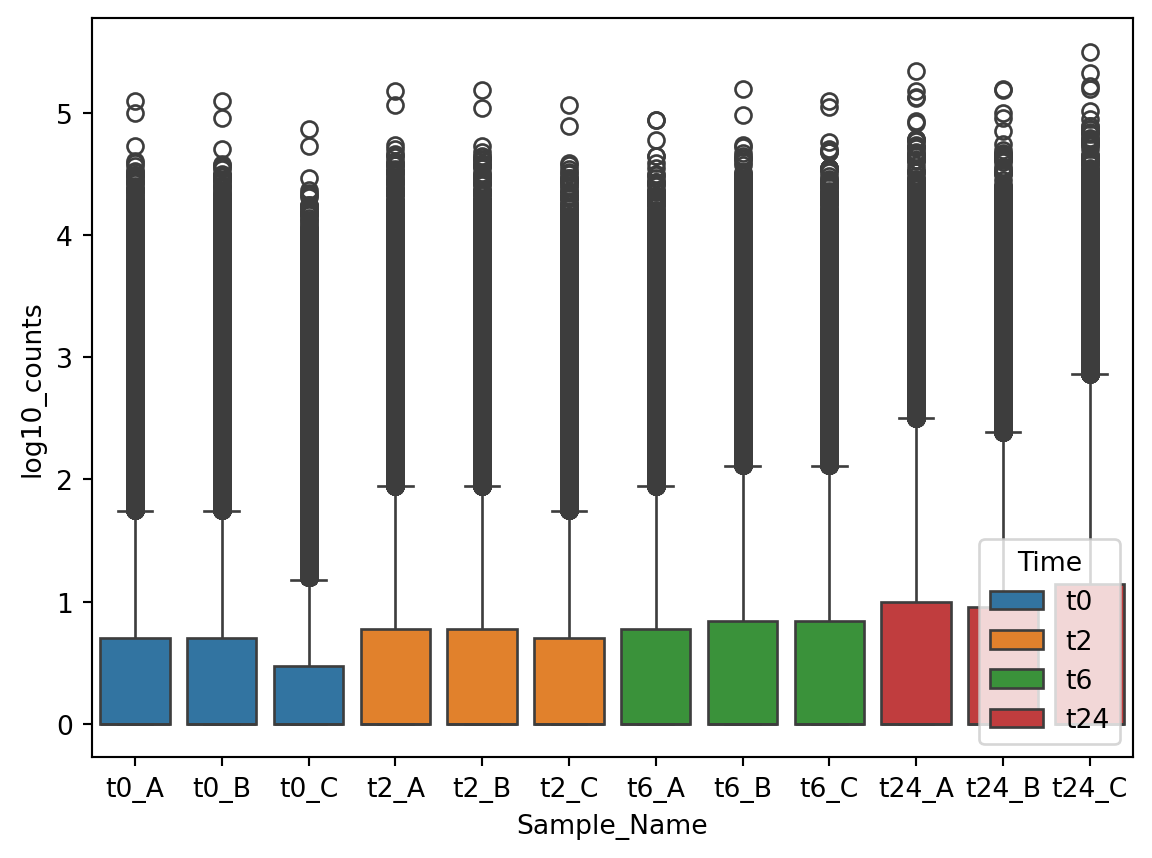
sns.boxplot(data=gc_raw_log, x="Sample_Name", y="log10_counts", hue="Time")
```
## move legend
```{python}
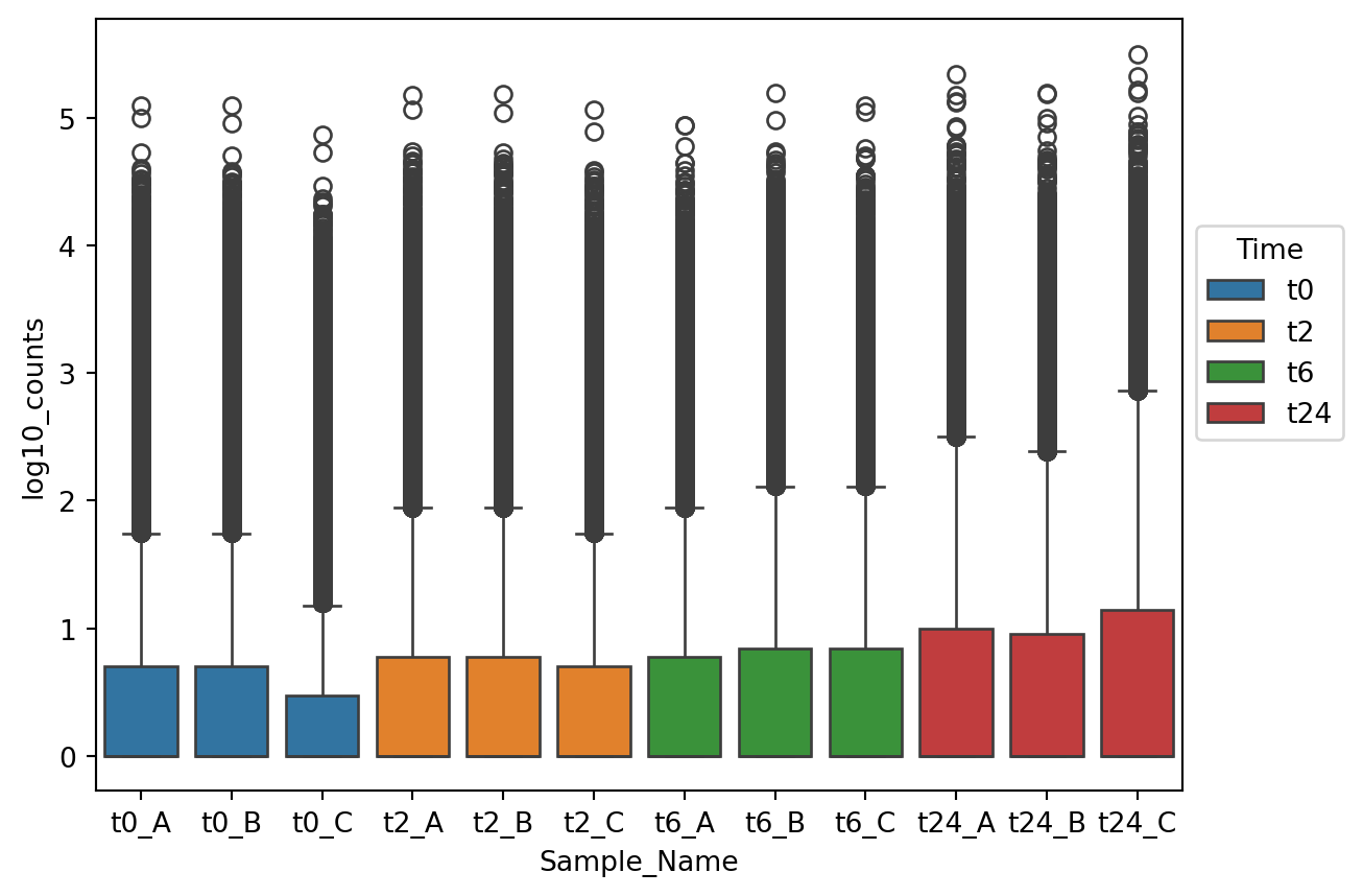
p1 = sns.boxplot(data=gc_raw_log, x="Sample_Name", y="log10_counts", hue="Time")
sns.move_legend(p1, "upper left", bbox_to_anchor=(1, 0.75))
```
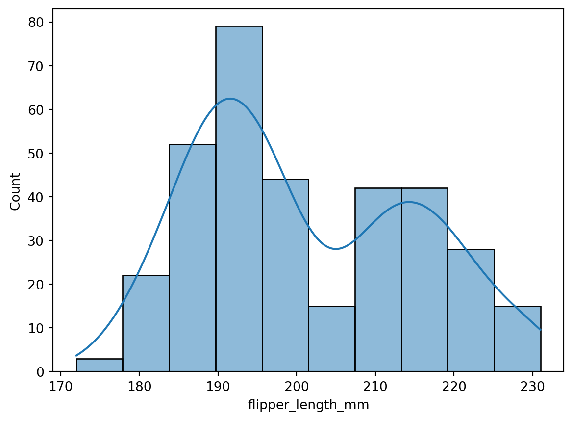
## Histogram
```{python}
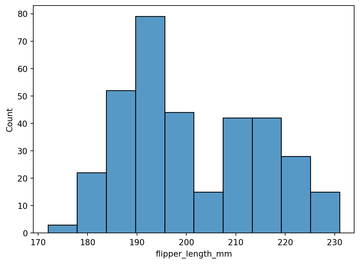
sns.histplot(data=penguins, x="flipper_length_mm")
```
```{python}
sns.histplot(data=penguins, x="flipper_length_mm", kde=True)
```
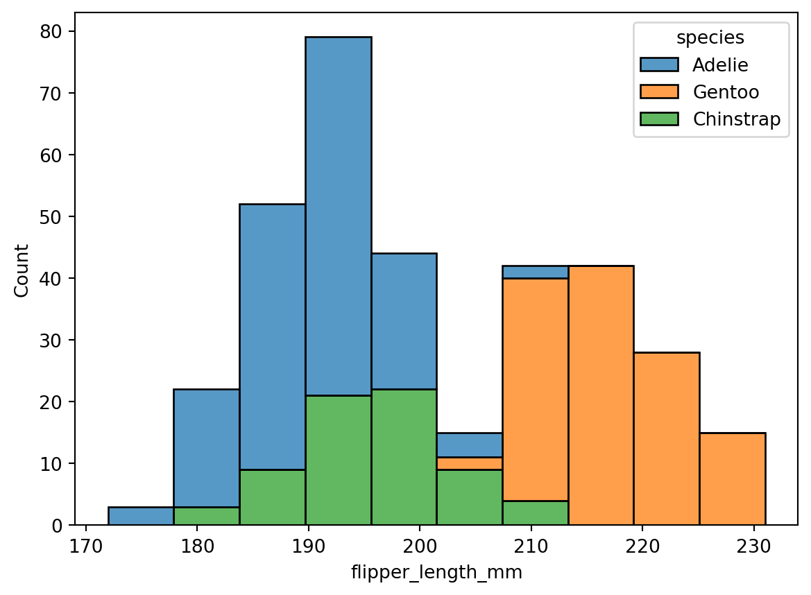
```{python}
sns.histplot(data=penguins, x="flipper_length_mm", hue="species", multiple="stack")
```
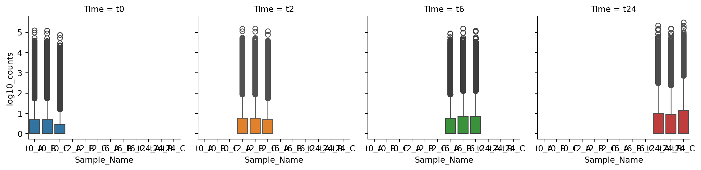
## Faceting
```{python}
g = sns.FacetGrid(gc_raw_log, col="Time", hue="Time")
g.map_dataframe(sns.boxplot, "Sample_Name", "log10_counts")
```
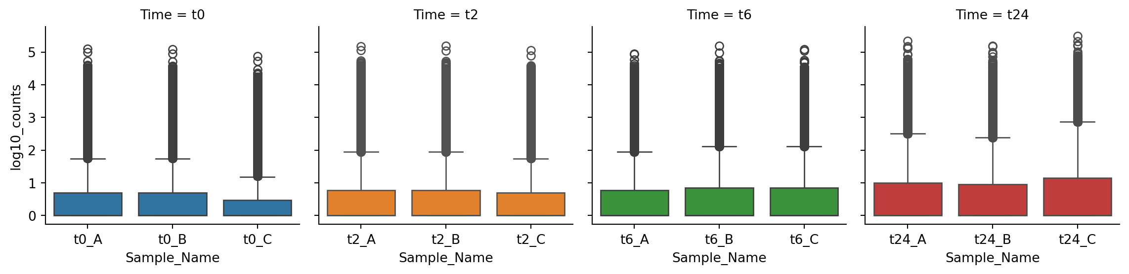
```{python}
g = sns.FacetGrid(gc_raw_log, col="Time", hue="Time", sharex=False)
g.map_dataframe(sns.boxplot, "Sample_Name", "log10_counts")
```
### 2-dimensional faceting
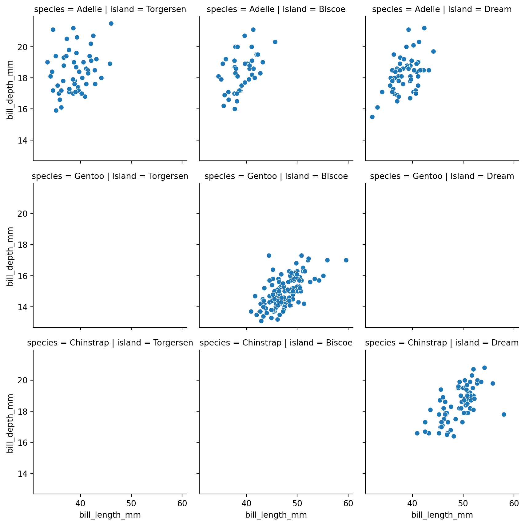
```{python}
g = sns.FacetGrid(penguins, col="island", row="species")
g.map_dataframe(sns.scatterplot, "bill_length_mm", "bill_depth_mm")
```
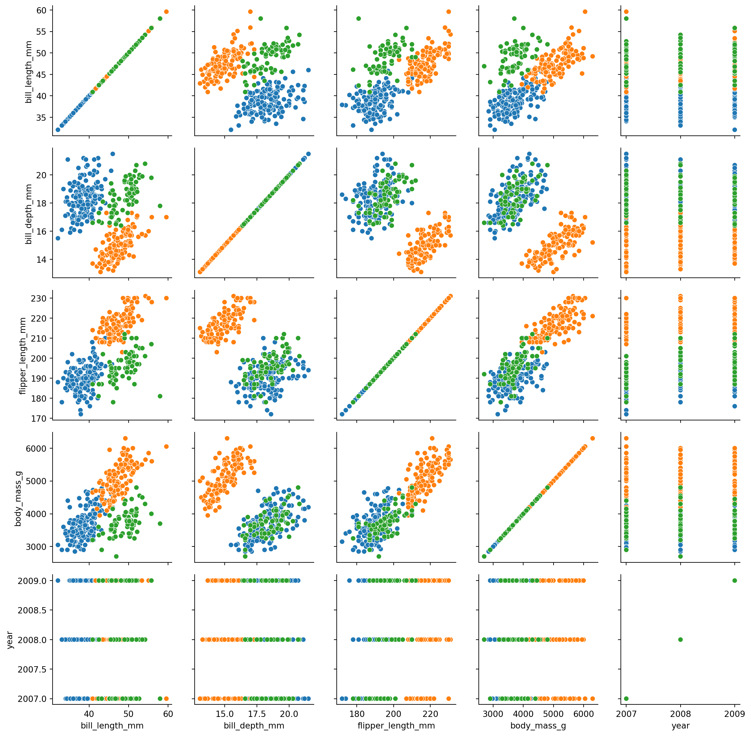
### PairGrid
```{python}
g = sns.PairGrid(penguins, hue="species")
g.map(sns.scatterplot)
```
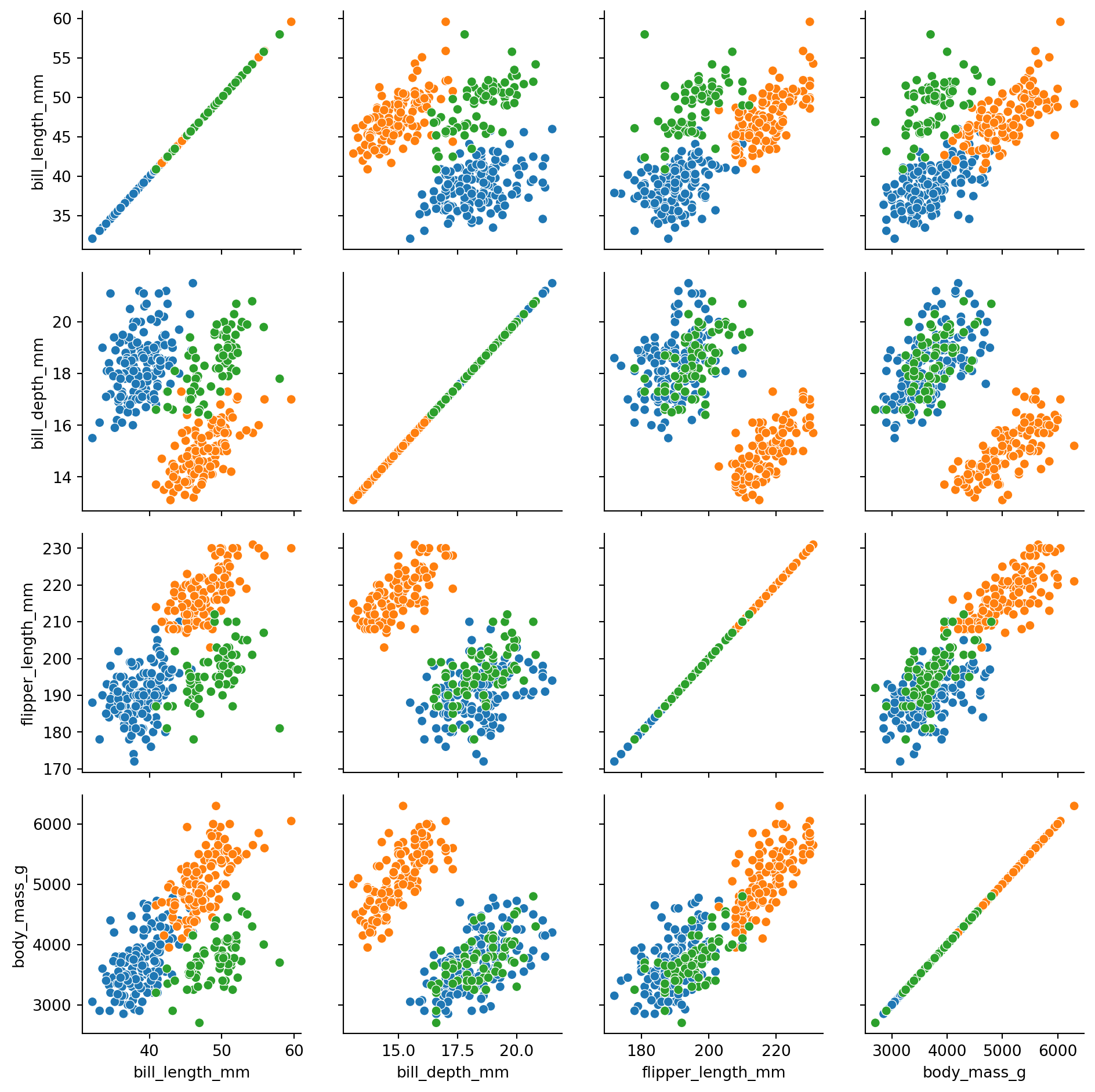
let us remove the `year` column as it is not numeric.
```{python}
penguins_no_year = penguins.drop("year")
g = sns.PairGrid(penguins_no_year, hue="species")
g.map(sns.scatterplot)
```
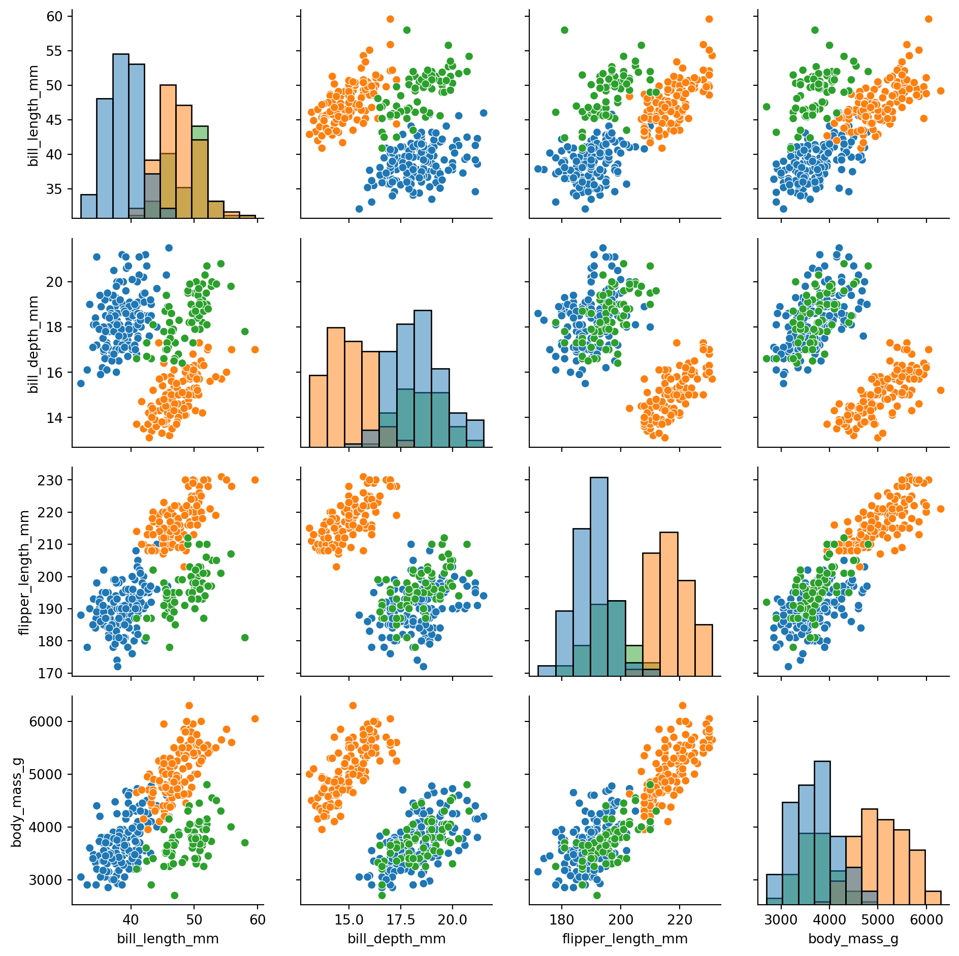
```{python}
g = sns.PairGrid(penguins_no_year, hue="species")
g.map_diag(sns.histplot)
g.map_offdiag(sns.scatterplot)
```
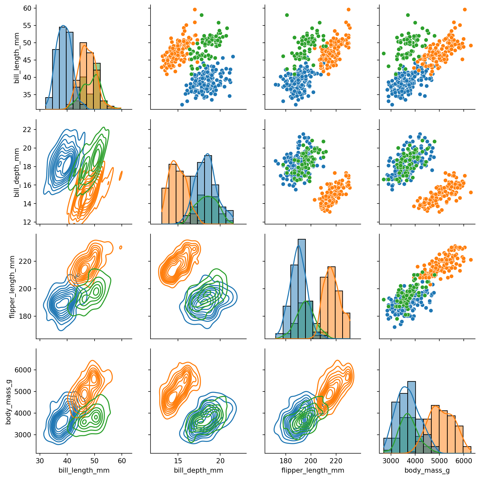
```{python}
g = sns.PairGrid(penguins_no_year, hue="species")
g.map_diag(sns.histplot, kde=True)
g.map_upper(sns.scatterplot)
g.map_lower(sns.kdeplot)
```
`PairGrid` is very flexible and allows you to use different types of plots on the diagonal, upper and lower triangle of the grid. You can also customize the appearance of the plots using the `map` method.
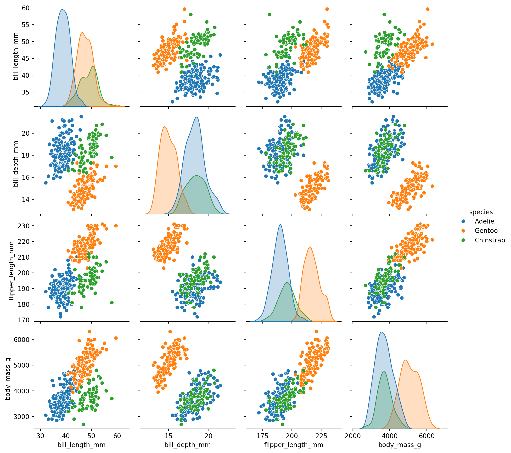
There is also a higher-level interface called `pairplot` that provides a simpler way to create pairwise plots. It is essentially a wrapper around `PairGrid` that uses scatterplots for the off-diagonal and histograms for the diagonal by default.
**However, `pairplot` needs the data to be in pandas DataFrame format**
```{python}
sns.pairplot(penguins_no_year.to_pandas(), hue="species")
```
## Text annotations
```{python}
import seaborn.objects as so
(
    so.Plot(penguins, x="bill_length_mm", y="flipper_length_mm", color="species")
    .add(so.Dot())
)
```
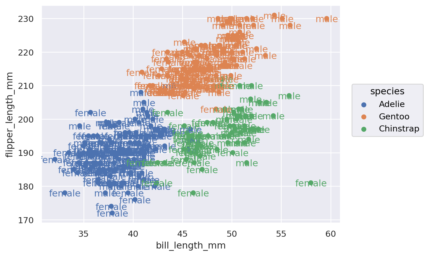
```{python}
(
    so.Plot(penguins, x="bill_length_mm", y="flipper_length_mm", color="species", text="sex")
    .add(so.Dot())
    .add(so.Text())
)
```
```{python}
def std_err(col: pl.Expr) -> pl.Expr:
    return ((col.var() / col.count()).sqrt())

gc_raw_log_1 = gc_raw_log.group_by('Time').agg(pl.col('log10_counts').mean().alias('mean'), std_err(pl.col('log10_counts')).alias('std_err'))

gc_raw_log_1
```