Dynamic applications
Katja Kozjek
NBIS, SciLifeLab
08-May-2026

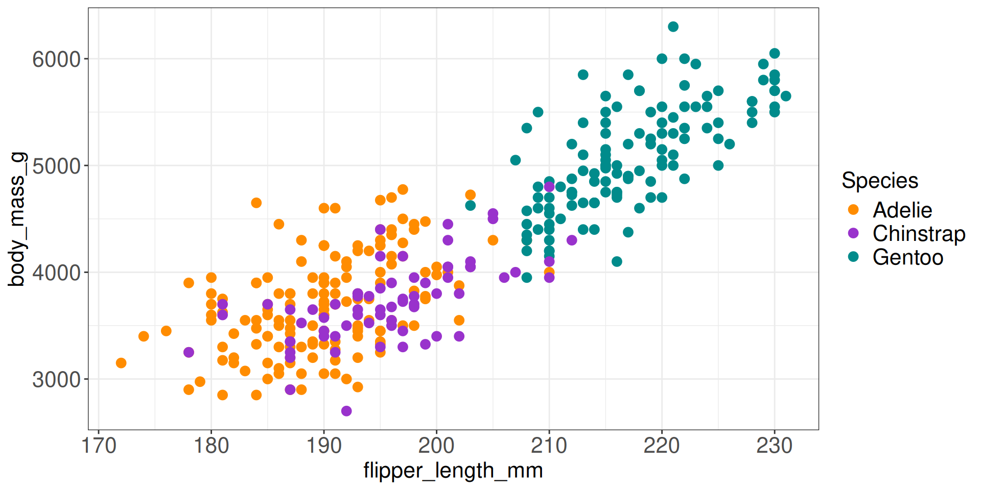
Static vs Dynamic plotting
Static plotting
Dynamic plotting
Dynamic and Interactive applications
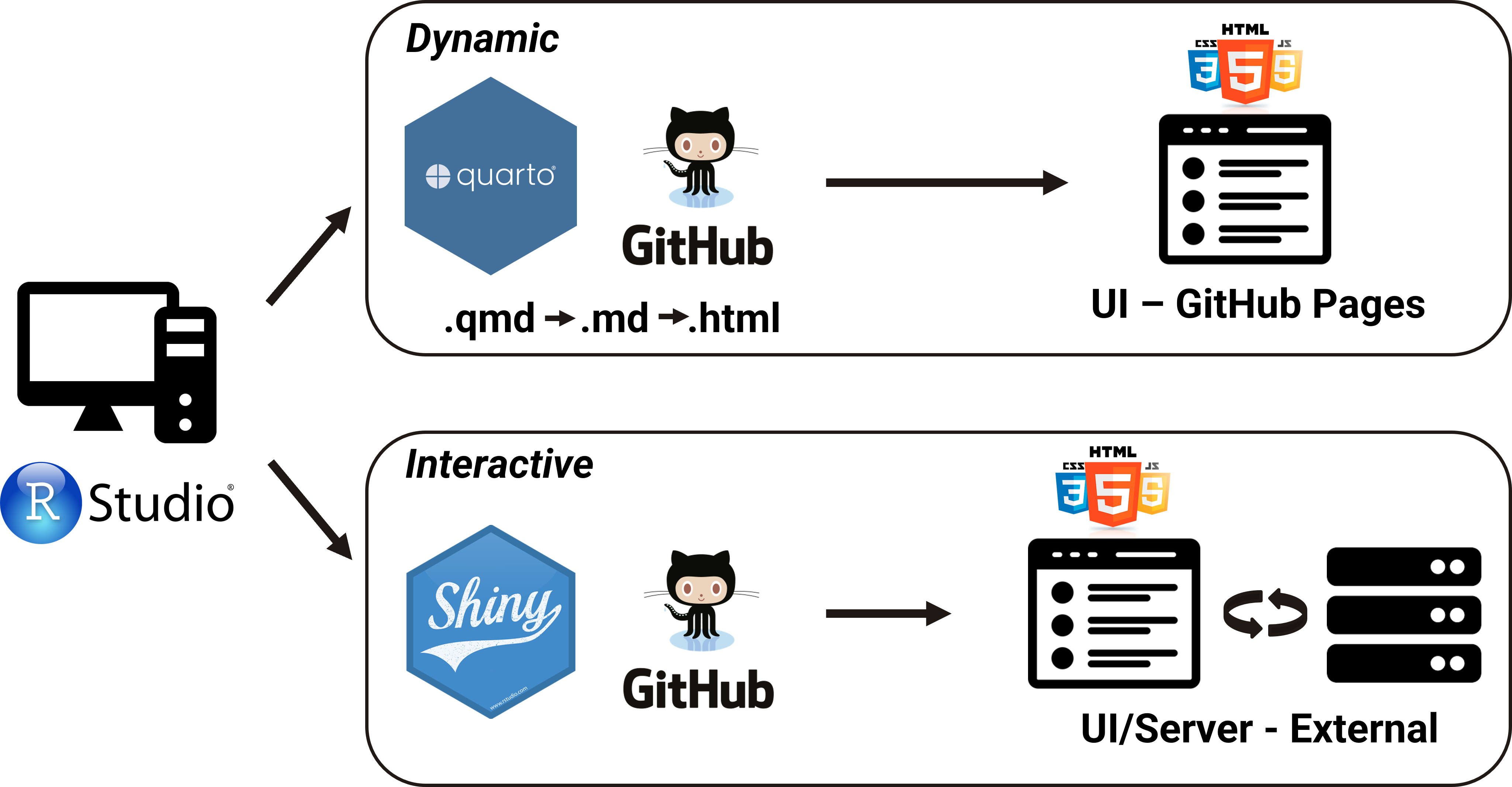
Quarto using htmlwidgets
htmlwidgetswork just like R plots except they produce dynamic/interactive web visualizationshtmlwidgetssupport adding dynamic, interactive elements directly into Quarto documents- Do not require any knowledge of JavaScript, nor use of a Shiny Server
plotly
add_markers(): This adds markers (points) to the plot. Each row in the dataset will be represented as a marker at the corresponding (x, y) coordinates.
ggiraph
- Compared to
plotlyit offers more control and customization options - Allows adding tooltips, hover effects, etc.
```{r}
#| fig-width: 12
#| fig-height: 8
library(ggiraph)
library(ggplot2)

tb_data <- read.csv("./data/bcg-immunization-coverage-for-tb-among-1-year-olds.csv", sep = ",", header = T)

tb_data_filt <- tb_data[grepl("^P", tb_data$Entity), ]

mean_tb_data <- tb_data_filt %>%
  group_by(Entity, Year) %>%
  summarise(mean_share = mean(Share_of_newborns))

p1 <- ggplot(mean_tb_data, aes(x = Year, y = mean_share, col = Entity, data_id = Entity)) +
    geom_line_interactive(aes(tooltip = Entity), linewidth = 2.5) +
    geom_point_interactive(size = 4) +
    labs(x = "Year", y = "Share of Newborns (%)") +
    scale_color_manual(values =c ("#7F3C8D","#11A579","#3969AC","#F2B701","#E73F74","#80BA5A","#E68310","#008695","#CF1C90")) +
    scale_fill_manual(values =c ("#7F3C8D","#11A579","#3969AC","#F2B701","#E73F74","#80BA5A","#E68310","#008695","#CF1C90")) +
    theme_minimal() +
    theme(axis.text = element_text(size = 20),
            axis.title = element_text(size = 20),
            legend.text = element_text(size = 20),
            legend.position = "none")

girafe(ggobj = p1,
       options = list(
    opts_hover(css = ""), ## CSS code of line we're hovering over
    opts_hover_inv(css = "opacity:0.1;") ## CSS code of all other lines
  ))
```
ggiraph
```{r}
#| fig-width: 12
#| fig-height: 8
library(ggiraph)
library(ggplot2)
library(patchwork)

p2 <- ggplot(mean_tb_data, aes(x = Entity, y = mean_share, col = Entity, data_id = Entity)) +
    geom_boxplot_interactive(aes(fill = Entity)) +
    labs(x = "Entity", y = "Share of Newborns (%)") +
    coord_flip() +
    scale_color_manual(values =c ("#7F3C8D","#11A579","#3969AC","#F2B701","#E73F74","#80BA5A","#E68310","#008695","#CF1C90")) +
    scale_fill_manual(values =c ("#7F3C8D","#11A579","#3969AC","#F2B701","#E73F74","#80BA5A","#E68310","#008695","#CF1C90")) +
    theme_minimal() +
    theme(axis.text = element_text(size = 20),
            axis.title = element_text(size = 20),
            legend.position = "none")

girafe(ggobj = p1 + p2,
       options = list(
    opts_hover(css = ""), ## CSS code of line we're hovering over
    opts_hover_inv(css = "opacity:0.1;") ## CSS code of all other lines
  ))
```leaflet
- For creating dynamic maps that support panning and zooming along with various annotations like markers, basemaps, and pop-ups
- Let’s check where NBIS has drop-ins on Wednesdays at 10.30 in Lund
```{r}
library(leaflet)

df <- data.frame(lng = c(13.20279, 13.20869, 13.21894),
                 lat = c(55.71118, 55.71414, 55.71092))

icons_list <- awesomeIcons(icon = 'briefcase',
  iconColor = 'white',
  library = 'ion',
  markerColor = "cadetblue")

leaflet(width = "100%") %>%
  addTiles() %>%
  setView(lng = 13.21014,lat = 55.71208, zoom = 12) %>%
  addAwesomeMarkers(data = df, icon = icons_list, popup = c("Forum Medicum Café", "Café Le Mani", "MV Inspira"))
```
dygraphs
- For creating dynamic time series plots
```{r}
library(dplyr)
library(tidyverse)
library(dygraphs)

tb_data <- read.csv("./data/bcg-immunization-coverage-for-tb-among-1-year-olds.csv", sep = ",", header = T)

tb_data_filt <- tb_data[grepl("^F", tb_data$Entity), ]

tb_data_select <- tb_data_filt %>% select(Entity, Year, Share_of_newborns)
tb_data_dygraph <- tb_data_select %>%
    pivot_wider(names_from = Entity, values_from = Share_of_newborns)

tb_data_dygraph$Year <- as.numeric(tb_data_dygraph$Year)

dygraph(tb_data_dygraph, main = "BCG Immunization Coverage for TB among 1-year-olds") %>%
    dySeries("Fiji", color = "#332288", strokeWidth = 2) %>%
    dySeries("Finland", color = "#AA4499", strokeWidth = 2) %>%
    dySeries("France", color = "#44AA99", strokeWidth = 2) %>%
    dyRangeSelector()
```- Data for
dygraphneeds to be in a specific format, first column should be the time variable
DT
reactable
- Offers the ability to sort and filter data
- Slightly more challenging to work with it compared to
DT, but offers more customization options reactablefmtrpackage provides additional formatting options forreactabletables
Quarto using crosstalk
Let’s expore how we can link different
htmlwidgetsWater Quality at Sydney Beaches dataset from TidyTuesday 2025, week 20
Aim: Visualize water quality at Sydney beaches
Filtering: by region (
filter_checkbox())Output visualizations:
- scatter plot: relationship between water temperature and Enterococci levels (
plotly) - map: swim site locations (
leaflet)
- scatter plot: relationship between water temperature and Enterococci levels (
```{r}
library(crosstalk)
library(plotly)
library(leaflet)

beach_data <- read.csv("./data/beach_data.csv", sep = ",", header = T)

beach_data_filt <- beach_data %>%
     filter(water_temperature_c <= 100)

beach_data_clean <- beach_data_filt %>%
    filter(date >= "2025-01-01" & date <= "2025-12-31")

data_cross <- SharedData$new(beach_data_clean)

bscols(
  list(
  filter_checkbox("region", "Region", data_cross, ~region, inline = TRUE)),
  plot_ly(data_cross, x = ~water_temperature_c, y=~enterococci_cfu_100ml, color = ~region, type = "scatter", mode = "markers"),
  leaflet(data_cross) %>% addTiles() %>% addMarkers()
)
```
Quarto using crosstalk
ObservableJS
ObservableJS OJS allows dynamic features to be included in a Quarto document.
It is an entirely separate language outside of R that uses JavaScript and allows excellent functionality similar to what is provided by a Shiny Server.
{ojs}executable code block
- Let’s look at how BCG immunization coverage for TB among 1-year-olds has changed over the years in different countries.
- Aim: Create a bar plot that dynamically updates based on specified filters for year and entity
- Filters:
- range slider to select a year (between 2000 and 2023)
- checkbox to select specific countries (entities starting with letter B)
ObservableJS
```{ojs}
// Create a checkbox input to filter data by specific entities
viewof entity = Inputs.checkbox(
  ["Bangladesh", "Belarus", "Belize", "Benin", "Bhutan", "Bolivia", "Bosnia and Herzegovina", "Botswana", "Brazil", "Brunei", "Bulgaria", "Burkina Faso", "Burundi"],
  { value: ["Belarus", "Belize", "Bolivia", "Brasil", "Bulgaria"],
    label: "Entity:"
  }
)
```ObservableJS
- Dynamic behavior
- range slider to select a year and the checkbox to select specific countries
- The bar plot updates dynamically based on the filtered data, reflecting the selected year and entities.
data = FileAttachment("./data/bcg-immunization-coverage-for-tb-among-1-year-olds.csv").csv({})

viewof year = Inputs.range([2000, 2023], {step: 1, value: 2010, label: "Year"})

viewof entity = Inputs.checkbox(
  ["Bangladesh", "Belarus", "Belize", "Benin", "Bhutan", "Bolivia", "Bosnia and Herzegovina", "Botswana", "Brazil", "Brunei", "Bulgaria", "Burkina Faso", "Burundi"],
  { value: ["Belarus", "Belize", "Bolivia", "Brasil", "Bulgaria"],
    label: "Entity:"
  }
)

filteredData = data.filter(function(d) {
  return year < d.Year && entity.includes(d.Entity);
})

Plot.plot({
  color: {legend: true},
  marks: [
    Plot.barY(filteredData, {
      x: "Year",
      y: "Share_of_newborns",
      fill: "Entity",
    }),
    Plot.ruleY([0])
  ]
})
Sources
Thank you. Questions?