These are exercises to get you started with Quarto Dashboards. Refer to the official Quarto Dashboards documentation for help.
By the end of this exercise, you will be able to:
- Create a basic Quarto dashboard.
- Become familiar with different components of a dashboard.
- Customize dashboard layout and appearance.
- Add dynamic components to your dashboard.
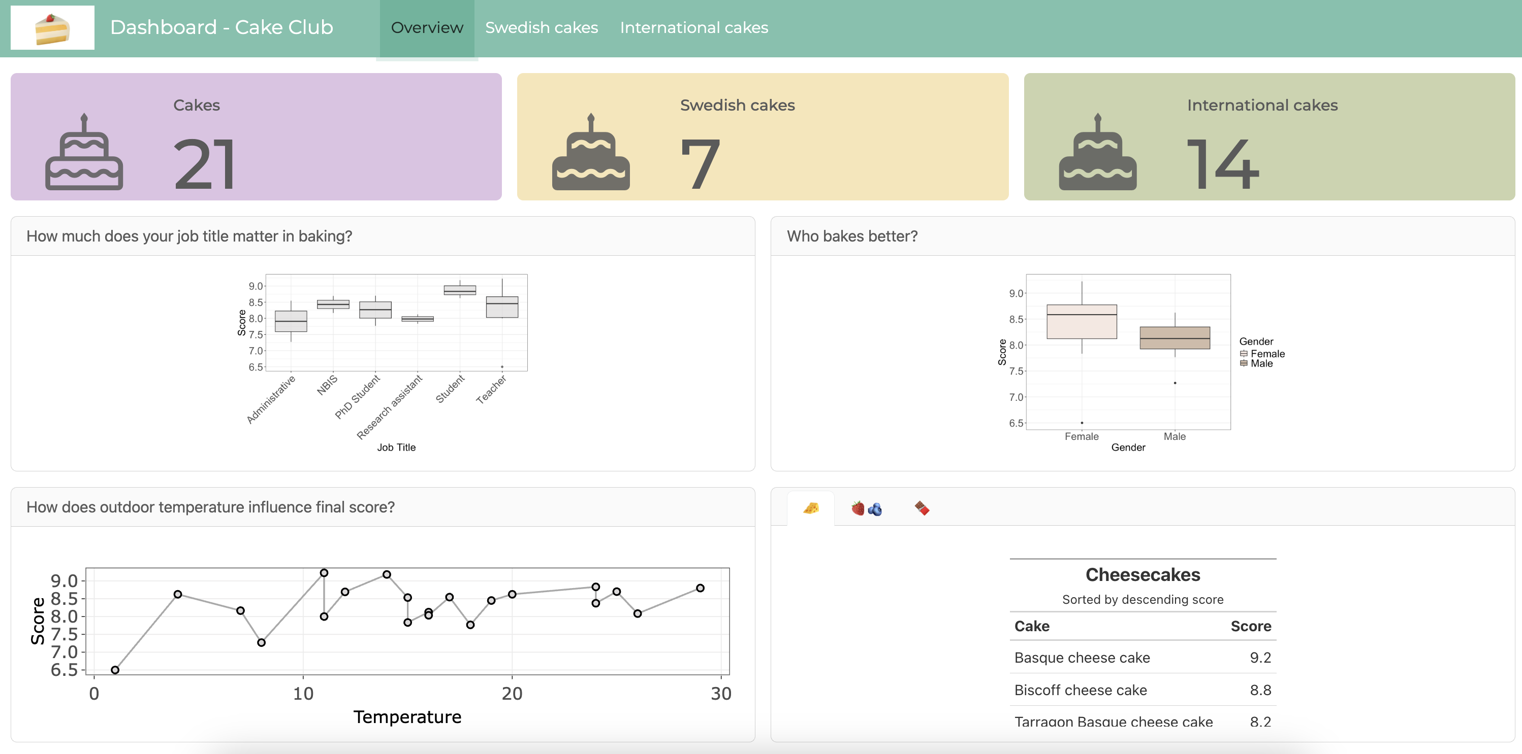
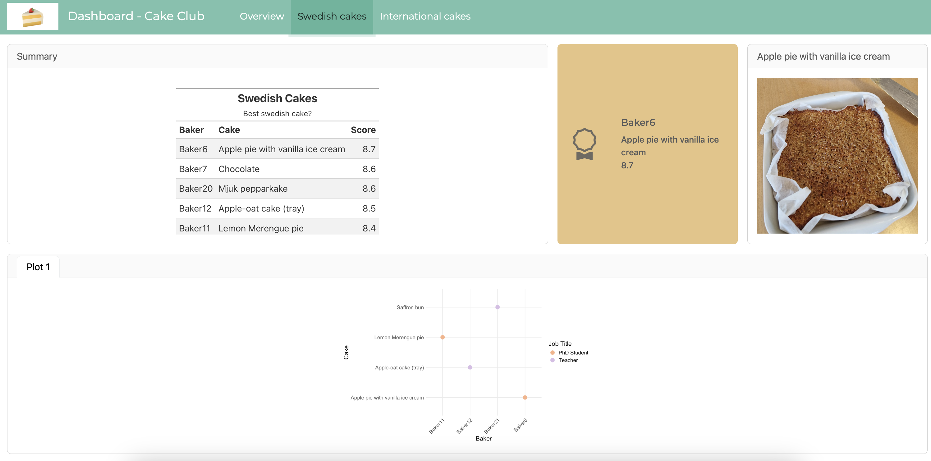
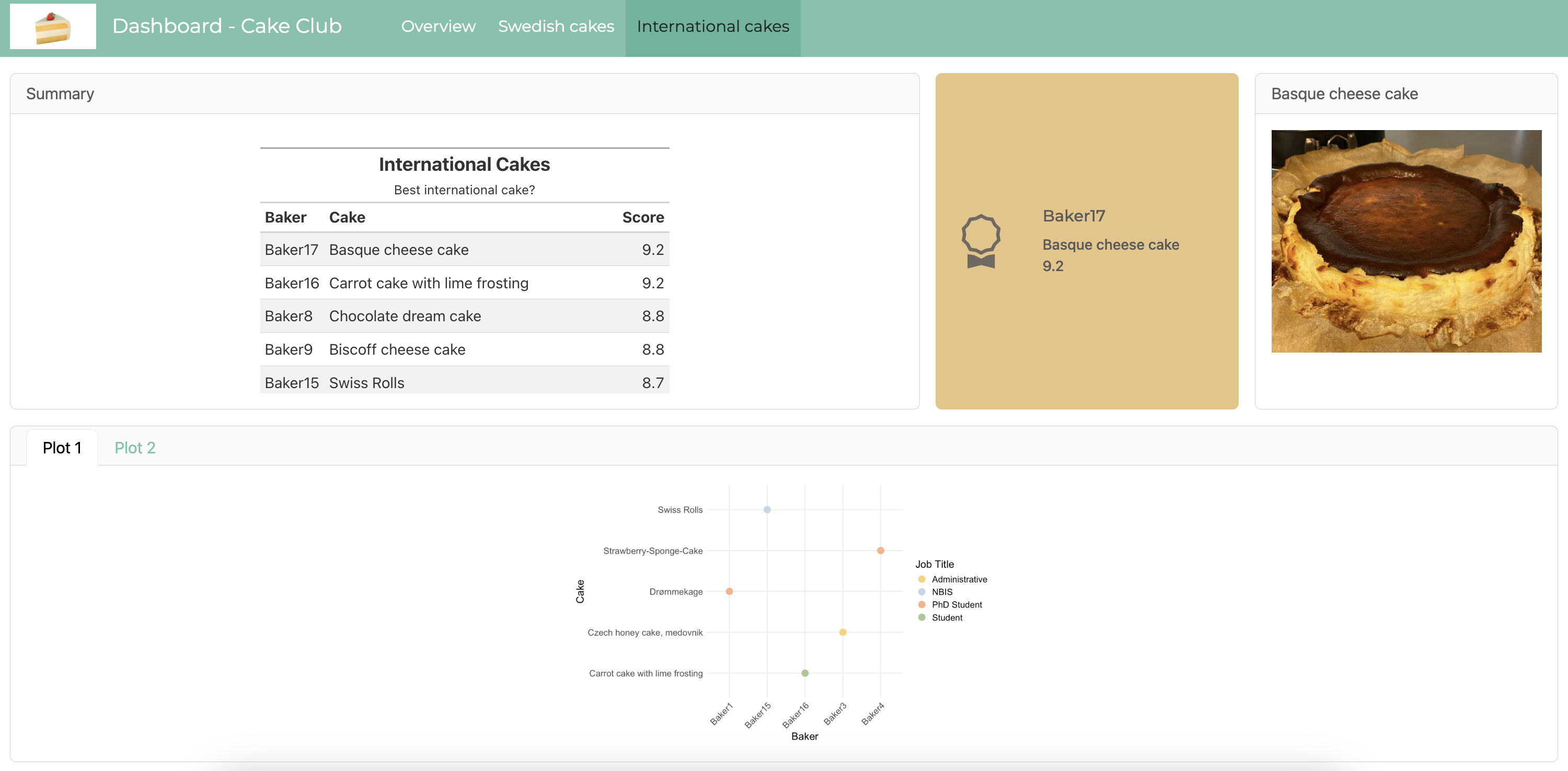
For this exercise, we will use the cake data (year 2024) provided by the Immunotechnology Cake Club in Lund. The GitHub repository also includes pictures of all the cakes.
1 Introduction
Dashboards are a powerful way to communicate data and insights in a visually appealing manner. With Quarto dashboards we can create elegant and production-ready dashboards using a variety of components such as static graphics (ggplot2, Matplotlib, Seaborn, etc.), dynamic widgets (plotly, leaflet, htmlwidgets, etc.), charts, tables, value boxes, and text annotations that are arranged in a structured layout.
The dashboard building process begins with a basic Quarto document. This document is then transformed into a dashboard by changing the format to dashboard.
2 Dashboard structure
- Dashboards are composed of cards.
- Cards are arranged into rows and columns.
- Pages, tabsets, and sidebars allow for more advanced layouts.
2.1 Dashboard layout
Navigation
All dashboards include a top-level navigation bar that provide a title and (optionally) a logo and author. Dashboards with multiple pages also contain a link to each page on the navigation bar. The title and author are specified as they are in normal Quarto documents. You can also include a logo.
---
title: "Cake Club"
author: "NBIS"
format:
  dashboard:
    logo: ./Downloads/cake-emoji.png
---
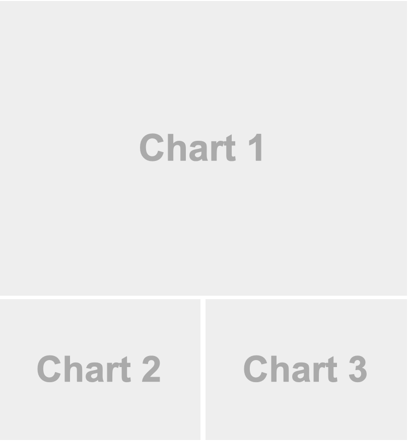
Layout - rows and columns
Rows and columns are defined using markdown headings (with optional attributes to control height, width, etc.).
Every Level 2 header (##) introduces a new row.
Every code chunk introduces a new column.
This example shows simple layout with two rows, where the second row is split into two columns. Moreover, Level 2 markdown headings (e.g. ## Row {height=70%}) define the contents of rows as well as their relative height. The {} code cells in turn automatically create cards that are laid out in columns within the row.
---
title: "Cake club"
format: dashboard
---

## Row {height=70%}


::: {.cell}

:::


## Row {height=30%}


::: {.cell}

:::


::: {.cell}

:::
The default orientation setting is by rows. You can set the orientiation to be by column in the YAML specifying the orientation: columns. If that is the case, then the Level 2 header would be a column and each code chunk a row in the column.
Quarto automatically divides the area into equally divided charts.
Pages
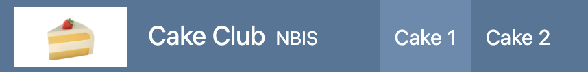
To introduce multiple pages, use Level 1 headings above the Level 2 headings used to define rows and columns. The text of the Level 1 headings will be used to link to the pages in the navigation bar.
For example, here is a dashboard that splits content across two pages.
---
title: "Cake club"
format: dashboard
---

# Cake 1

```{r}
```

# Cake 2

## Column

```{r}
```

```{r}
```

## Column

```{r}
```
Tabsets
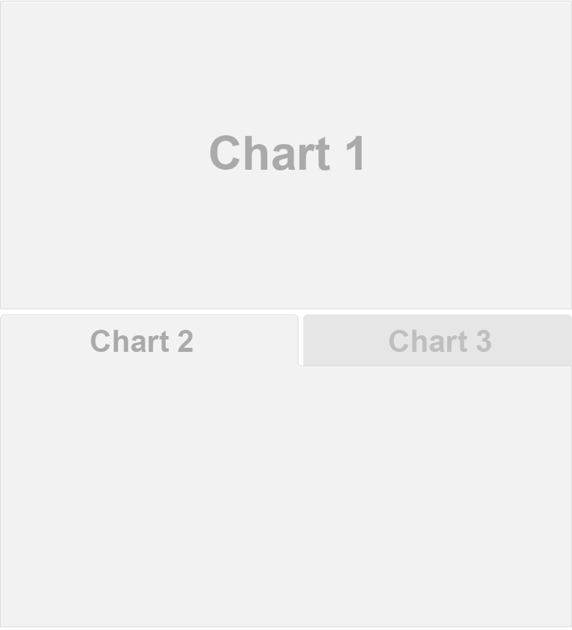
Use tabsets to include multiple views of data or to include content of secondary importance without having it crowd the main display. Tabsets are created by adding the .tabset class to a row or column.
For example, this layout displays the bottom row as a set of two tabs.
---
title: "Cake club"
format: dashboard
---

## Row

```{r}
```

## Row {.tabset}

```{r}
#| title: Chart 2
```

```{r}
#| title: Chart 3
```
Cards
Cards are the fundamental unit of display within dashboards. They are created automatically for each code chunk or explicitly using the card option.
Here each of the r cells become card.
## Column {width=40%}

```{r}
```

```{r}
```
Here .card option is used.
## Column {width=40%}

```{r}
```

::: {.card}
This text will be displayed within a card
:::

```{r}
```
To provide a title for a markdown card use the title attribute.
For example:
::: {.card title="My Title"}
This text will be displayed within a card
:::
2.2 Other features
Value boxes
Value boxes are a great way to prominently display simple values within a dashboard. For example, here is a dashboard row with three value boxes.

## Row

```{r}
#| content: valuebox
#| title: "Sunny days"
list(
  icon = "brightness-high-fill",
  color = "warning",
  value = 14
)
```

```{r}
#| content: valuebox
#| title: "Snowy days"
list(
  icon = "snow2",
  color = "info",
  value = 5
)
```

```{r}
#| content: valuebox
#| title: "Rainy days"
list(
  icon = "cloud-rain-heavy",
  color = "secondary",
  value = 12
)
```
The icon used in value boxes can be any of the 2,000 available bootstrap icons.
The color can be any CSS color value, however there are some color aliases that are tuned specifically for dashboards that you might consider using by default:
| Color Alias | Default Theme Color(s) |
|---|---|
primary |
Blue |
secondary |
Gray |
success |
Green |
info |
Bright Blue |
warning |
Yellow/Orange |
danger |
Red |
light |
Light Gray |
dark |
Black |
The value can be a variable created previously within the document, or randomly assigned value as here.
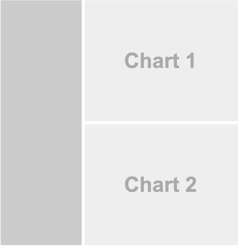
Sidebars
Sidebars are a great place to group inputs for dashboards. By adding a new Level 2 headline with a .sidebar class, you can easily add a collapsible sidebar.
---
title: "Cake club"
format: dashboard
---

# Page 1

## {.sidebar}

```{r}
```

## Column

```{r}
```

```{r}
```
Dashboard theming
Quarto Dashboards use same Bootstrap 5 based theming system as regular HTML documents (so themes you have built for HTML websites can also be used with dashboards). Use any of the 25 themes from the Bootswatch project via the theme option.
title: "Quartz theme"
format:
  dashboard:
    theme: quartz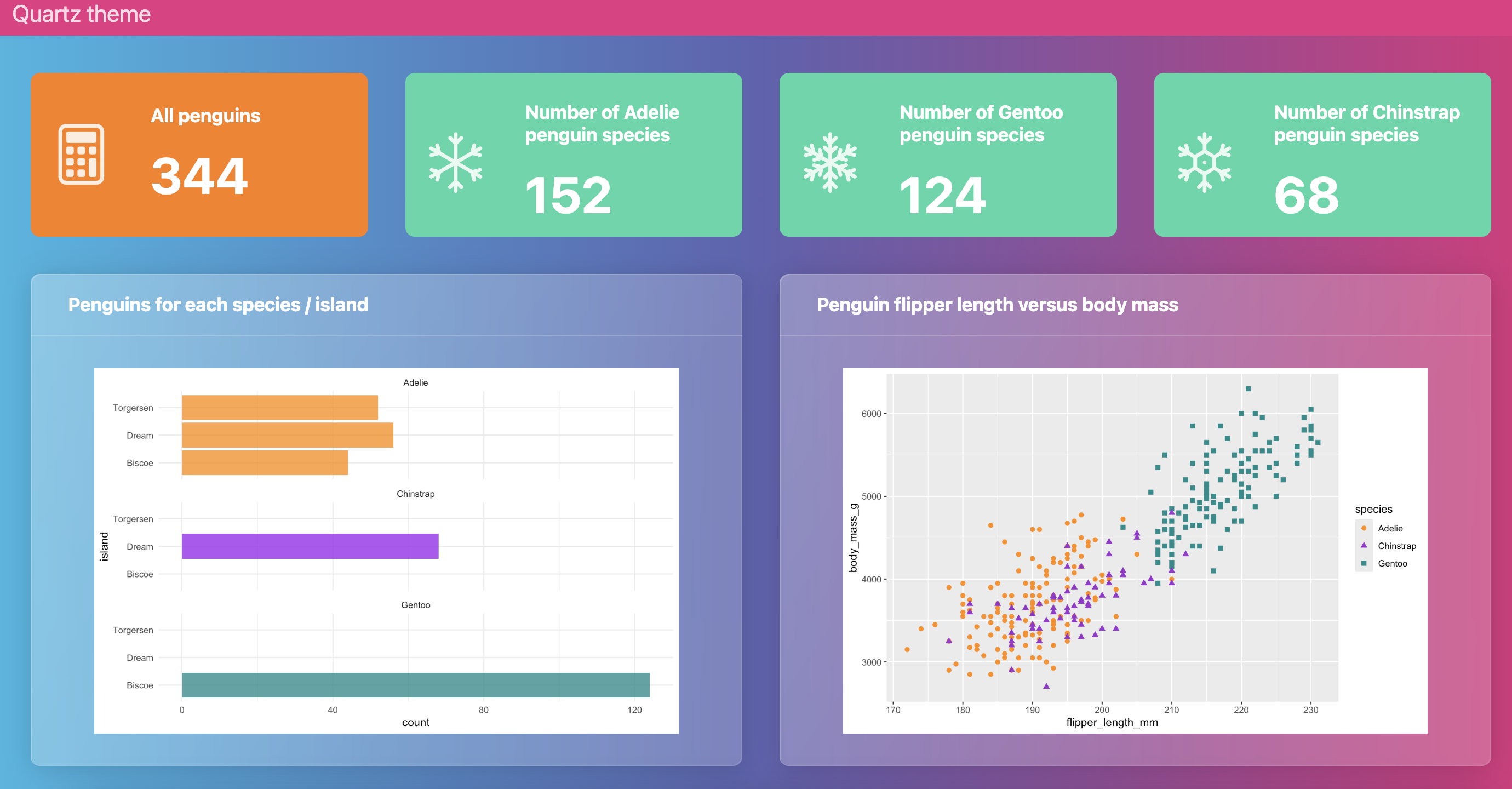
You can provide a light and dark theme and Quarto will automatically place a light or dark toggle on the navbar.
format:
  dashboard:
    theme:
      light: flatly
      dark: darkly
You can create your own custom theme and apply it to your dashboard or you can modify existing Bootswatch themes, by following the instructions in the Quarto theming documentation.
3 Dashboard deployment
There are several options to deploy your Quarto dashboard. If you are deploying a static dashboard (i.e. not using Shiny for interactivity), you can simply publish it to any web server. Among them the most common options include Posit Connect Could and GitHub Pages.
Dashboards that use Shiny for interactivity require a server for deployment. Deployment options include shinyapps.io, Shiny Server and Posit Connect.
4 Exercise
Your task is to build your own dashboard using the provided cake data. Start by creating a simple dashboard with one row and one column. Use the dashboard example below as a foundation to understand the structure. Once comfortable, expand your dashboard by adding pages, tabsets, or additional rows and columns for a more advanced layout. Explore different themes. To add logo or other images check the GitHub repository. Optionally, enhance your dashboard with dynamic components like plotly.