Fig.1: Body mass and flipper length of Palmer penguins
Dynamic applications
Katja Kozjek
NBIS, SciLifeLab
19-May-2025

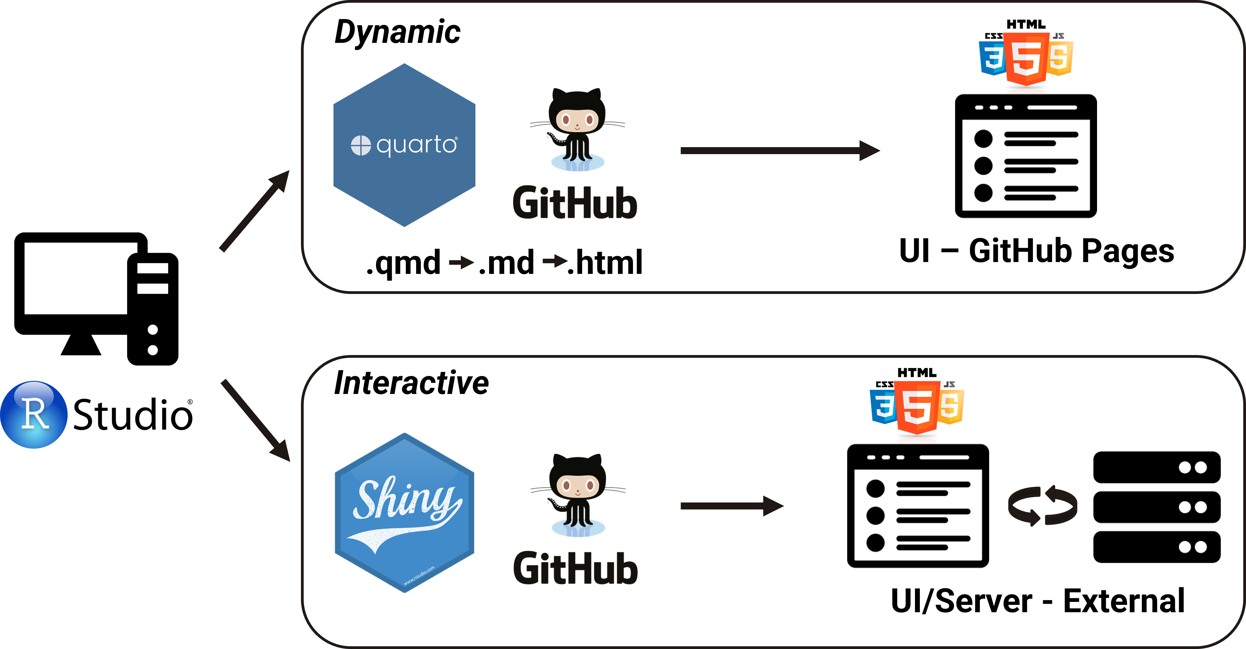
Dynamic and Interactive applications
Quarto using htmlwidgets
- HTML widgets work just like R plots except they produce dynamic/interactive web visualizations
- Do not require any knowledge of JavaScript, nor use of a Shiny Server
- There are many widgets to choose from, most known are:
plotly
```{r}
library(plotly)
library(palmerpenguins)
penguins %>%
    plot_ly(x = ~body_mass_g, y = ~flipper_length_mm,
    color = ~sex, width = 550, height = 400) %>%
    add_markers()
```
add_markers(): This adds markers (points) to the plot. Each row in the dataset will be represented as a marker at the corresponding (x, y) coordinates.
ggiraph
- Works similar to
plotly - It can connect 2 or more charts together
```{r}
#| fig-width: 14
#| fig-height: 10
library(ggiraph)
library(ggplot2)
library(patchwork)

tb_data <- read.csv("./data/bcg-immunization-coverage-for-tb-among-1-year-olds.csv", sep = ",", header = T)

tb_data_filt <- tb_data[tb_data$Year == 2020 & tb_data$Share_of_newborns < 60, ]

p1 <- ggplot(tb_data_filt, aes(x = Entity, y = Share_of_newborns)) +
    geom_col_interactive(aes(color = Entity, tooltip = Share_of_newborns, fill = Entity)) +
    theme_minimal() +
    labs(x = "Entity", y = "Share of Newborns (%)") +
    coord_flip() +
    scale_color_manual(values =c ("#88CCEE", "#44AA99", "#117733", "#332288", "#DDCC77", "#999933")) +
    scale_fill_manual(values =c ("#88CCEE", "#44AA99", "#117733", "#332288", "#DDCC77", "#999933")) +
    theme(axis.text = element_text(size = 18),
    axis.title = element_text(size = 18),
    legend.text = element_text(size = 18),
    legend.title = element_text(size = 18))

tb_data_filt1 <- tb_data[tb_data$Year == 2023 & tb_data$Share_of_newborns < 60, ]

p2 <- ggplot(tb_data_filt1, aes(x = Entity, y = Share_of_newborns)) +
    geom_col_interactive(aes(color = Entity, tooltip = Share_of_newborns, fill = Entity)) +
    theme_minimal() +
    labs(x = "Entity", y = "Share of Newborns (%)") +
    coord_flip() +
    scale_color_manual(values =c ("#117733", "#332288", "#CC6677", "#999933")) +
    scale_fill_manual(values =c ("#117733", "#332288", "#CC6677", "#999933")) +
    theme(axis.text = element_text(size = 18),
    axis.title = element_text(size = 18),
    legend.text = element_text(size = 18),
    legend.title = element_text(size = 18))

girafe(ggobj = (p1 + p2))
```leaflet
- For creating dynamic maps that support panning and zooming along with various annotations like markers, basemaps, and pop-ups
- Let’s check where NBIS has drop-ins on Wednesdays at 10.30 in Lund
```{r}
library(leaflet)

df <- data.frame(lng = c(13.20279, 13.20869, 13.21894),
                 lat = c(55.71118, 55.71414, 55.71092))

icons_list <- awesomeIcons(icon = 'briefcase',
  iconColor = 'white',
  library = 'ion',
  markerColor = "cadetblue")

leaflet(width = "100%") %>%
  addTiles() %>%
  setView(lng = 13.21014,lat = 55.71208, zoom = 12) %>%
  addAwesomeMarkers(data = df, icon = icons_list, popup = c("Forum Medicum Café", "Café Le Mani", "MV Inspira"))
```
DT
Quarto using crosstalk
```{r}
library(crosstalk)
library(DT)
library(plotly)

tb_data <- read.csv("./data/bcg-immunization-coverage-for-tb-among-1-year-olds.csv", sep = ",", header = T)
tb_data_filt <- tb_data[grepl("^N", tb_data$Entity) & tb_data$Year == 2000, ]
tb_data_cross <- SharedData$new(tb_data_filt)

bscols(
  list(filter_checkbox("Entity", "Entity", tb_data_cross, ~Entity, inline = TRUE)),
  plot_ly(tb_data_cross, x = ~Entity, y=~Share_of_newborns),
  datatable(tb_data_cross, width = "100%")
)
```ObservableJS
ObservableJS OJS is a relatively new approach that also allows dynamic features to be included in a Quarto document.
It is an entirely separate language outside of R that uses JavaScript and allows excellent functionality similar to what is provided by a Shiny Server.
{ojs}executable code block
```{ojs}
// Load the dataset from a CSV file
data = FileAttachment("./data/bcg-immunization-coverage-for-tb-among-1-year-olds.csv").csv()

// Create a range slider to select the year dynamically
viewof year = Inputs.range([2000, 2023], {step: 1, value: 2010, label: "Year"})

// Create a checkbox input to filter data by specific entities
viewof entity = Inputs.checkbox(
  ["Bangladesh", "Belarus", "Belize", "Benin", "Bhutan", "Bolivia", "Bosnia and Herzegovina", "Botswana", "Brazil", "Brunei", "Bulgaria", "Burkina Faso", "Burundi"],
  { value: ["Belarus", "Belize", "Bolivia", "Brasil", "Bulgaria"],
    label: "Entity:"
  }
)

// Filter the dataset based on the selected year and entity
filteredData = data.filter(d => d.Year == year && entity.includes(d.Entity))

// Generate a bar plot using the filtered data
Plot.plot({
    marks: [
        Plot.barY(filteredData, {x: "Entity", y: "Share_of_newborns", fill: "Entity"})
    ],
    x: {label: "Entity"}, // Label for the x-axis
    y: {label: "Share of Newborns (%)"}, // Label for the y-axis
    color: {legend: true} // enable the color legend
})
```
ObservableJS
- Dynamic behavior
- range slider to select a year and the checkbox to select specific countries
- The bar plot updates dynamically based on the filtered data, reflecting the selected year and entities.
data = FileAttachment("./data/bcg-immunization-coverage-for-tb-among-1-year-olds.csv").csv()

// Create a range slider to select the year dynamically
viewof year = Inputs.range([2000, 2023], {step: 1, value: 2010, label: "Year"})

// Create a checkbox input to filter data by specific entities
viewof entity = Inputs.checkbox(
  ["Bangladesh", "Belarus", "Belize", "Benin", "Bhutan", "Bolivia", "Bosnia and Herzegovina", "Botswana", "Brazil", "Brunei", "Bulgaria", "Burkina Faso", "Burundi"],
  { value: ["Belarus", "Belize", "Bolivia", "Brasil", "Bulgaria"],
    label: "Entity:"
  }
)

// Filter the dataset based on the selected year and entity
filteredData = data.filter(d => d.Year == year && entity.includes(d.Entity))

// Generate a bar plot using the filtered data
Plot.plot({
    marks: [
        Plot.barY(filteredData, {x: "Entity", y: "Share_of_newborns", fill: "Entity"})
    ],
    x: {label: "Entity"}, // Label for the x-axis
    y: {label: "Share of Newborns (%)"}, // Label for the y-axis
    color: {legend: true} // enable the color legend
})
Sources
Thank you. Questions?