Advanced Quarto
NBIS, SciLifeLab
19-May-2025

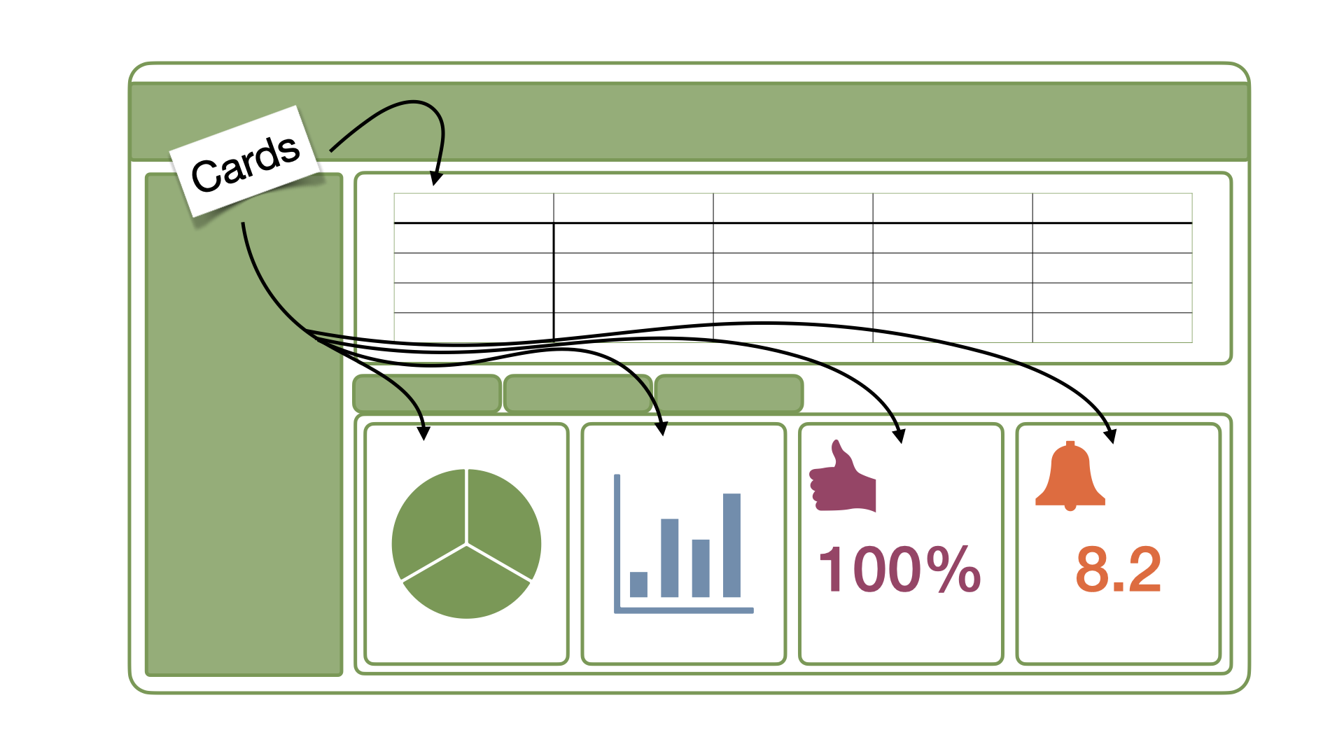
Dashboard components
- Dashboards are composed of cards
- Cards content: plots, tables, value boxes…
- Cards are arranged into rows and columns
- Pages, tabsets, and sidebars allow for more advanced layouts
Dashboard basic structure
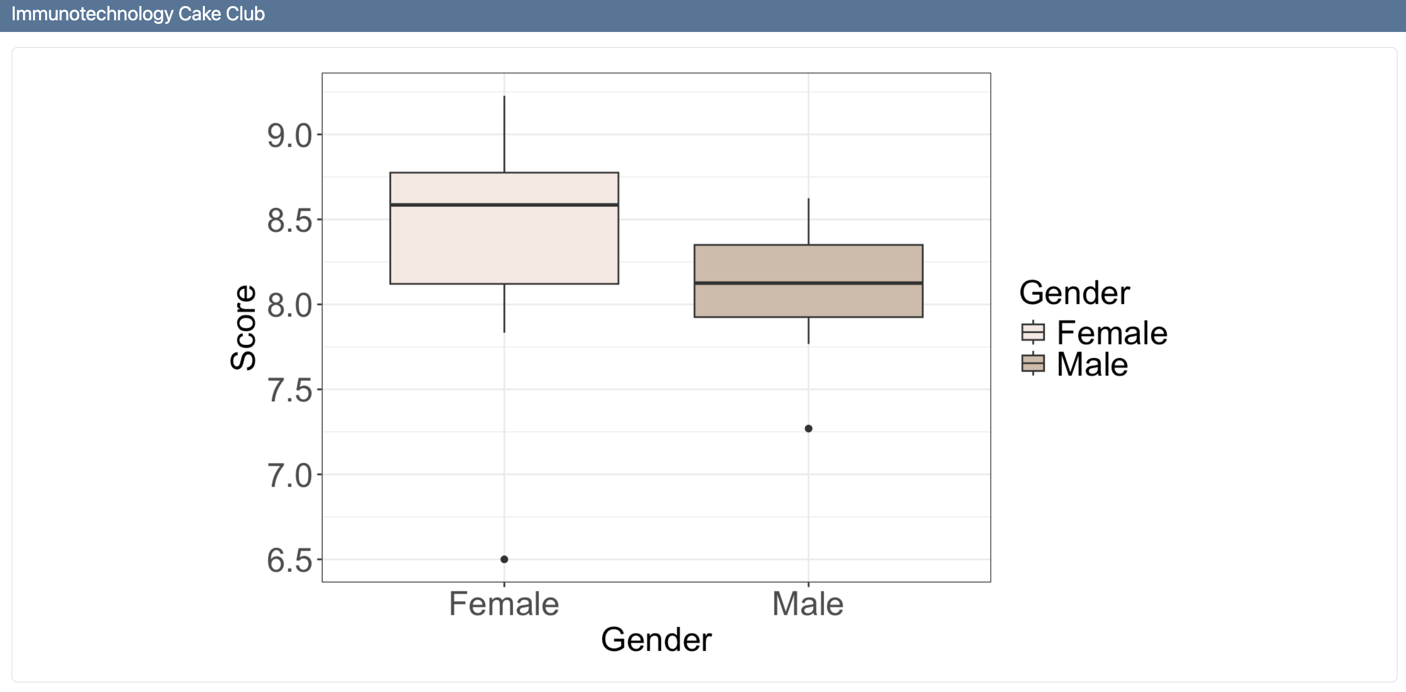
Step 2: Add a card
my-dashboard.qmd
---
title: "Immunotechnology Cake Club"
format: dashboard
---

```{r}
library(dplyr)
library(ggplot2)
library(gt)
```

```{r}
cake_data %>%
    ggplot(aes(x = Gender, y = Score, fill = Gender)) +
    geom_boxplot() +
    theme_minimal() +
    theme_bw() +
    scale_fill_manual(values = c("#F5E8E1", "#D0BBA8")) +
    labs(x = "Gender", y = "Score") +
    theme(axis.text = element_text(size = 20),
    axis.title = element_text(size = 20),
    legend.text = element_text(size = 20),
    legend.title = element_text(size = 20))
```
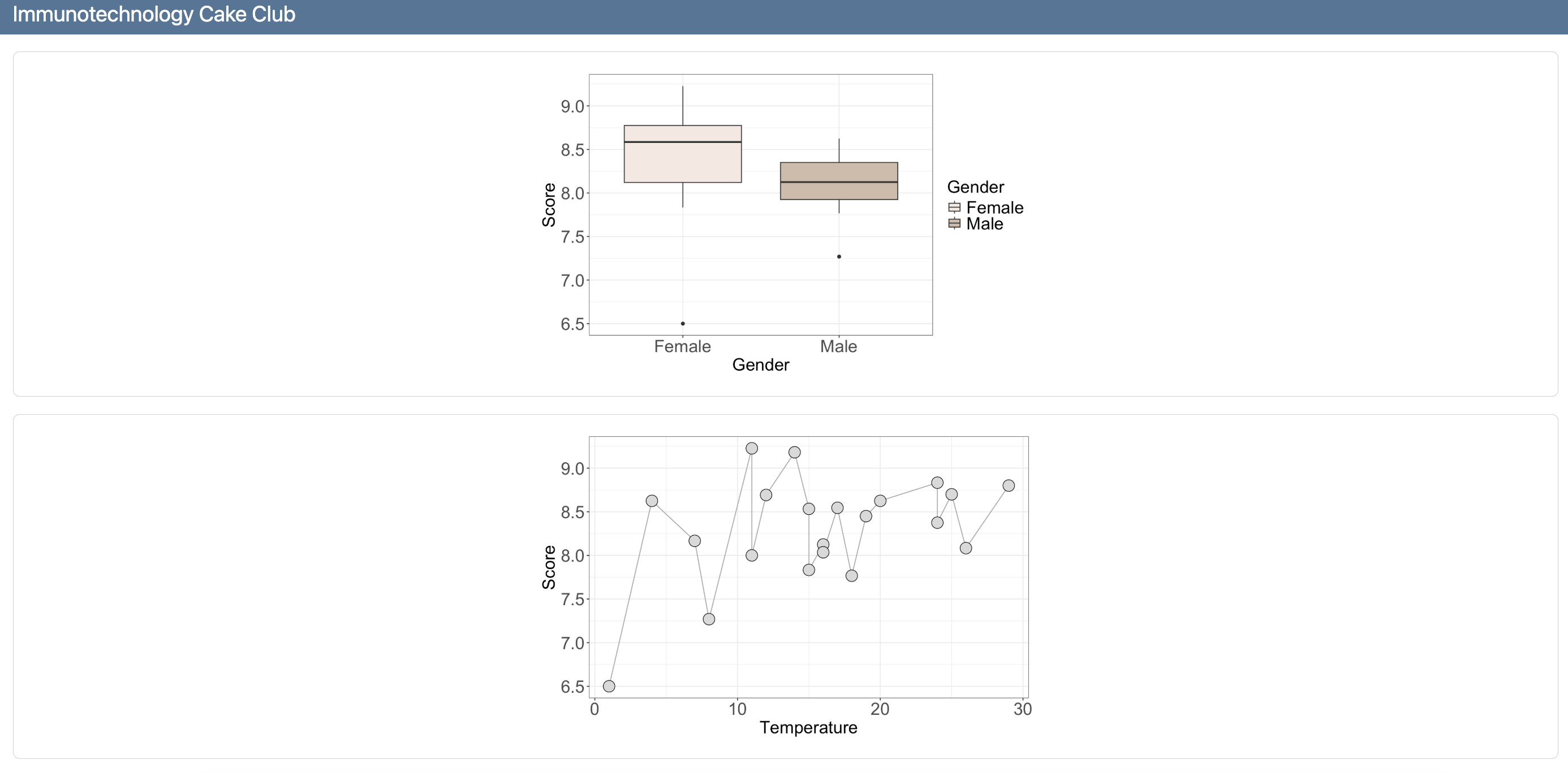
Step 3: Add another card
my-dashboard.qmd
---
title: "Immunotechnology Cake Club"
format: dashboard
---

```{r}
library(dplyr)
library(ggplot2)
library(gt)
```

```{r}
cake_data %>%
    ggplot(aes(x = Gender, y = Score, fill = Gender)) +
    geom_boxplot() +
    theme_minimal() +
    theme_bw() +
    scale_fill_manual(values = c("#F5E8E1", "#D0BBA8")) +
    labs(x = "Gender", y = "Score") +
    theme(axis.text = element_text(size = 20),
    axis.title = element_text(size = 20),
    legend.text = element_text(size = 20),
    legend.title = element_text(size = 20))
```
```{r}
cake_data %>%
ggplot(aes(x = Temperature, y = Score)) +
geom_line( color="darkgrey") +
geom_point(shape=21, color="black", fill="#DBD9DA", size=6) +
theme_bw() +
theme(axis.text = element_text(size = 20),
axis.title = element_text(size = 20),
legend.text = element_text(size = 20),
legend.title = element_text(size = 20))
```
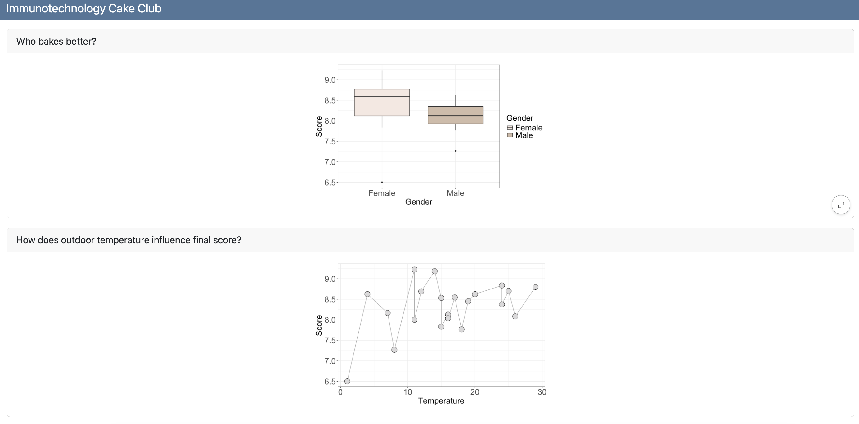
Step 4: Add titles to cards
my-dashboard.qmd
---
title: "Immunotechnology Cake Club"
format: dashboard
---

```{r}
library(dplyr)
library(ggplot2)
library(gt)
```

```{r}
#| title: Who bakes better?
cake_data %>%
    ggplot(aes(x = Gender, y = Score, fill = Gender)) +
    geom_boxplot() +
    theme_minimal() +
    theme_bw() +
    scale_fill_manual(values = c("#F5E8E1", "#D0BBA8")) +
    labs(x = "Gender", y = "Score") +
    theme(axis.text = element_text(size = 20),
    axis.title = element_text(size = 20),
    legend.text = element_text(size = 20),
    legend.title = element_text(size = 20))
```

```{r}
#| title: How does outdoor temperature influence final score?
cake_data %>%
    ggplot(aes(x = Temperature, y = Score)) +
    geom_line( color="darkgrey") +
    geom_point(shape=21, color="black", fill="#DBD9DA", size=6) +
    theme_bw() +
    theme(axis.text = element_text(size = 20),
    axis.title = element_text(size = 20),
    legend.text = element_text(size = 20),
    legend.title = element_text(size = 20))
```
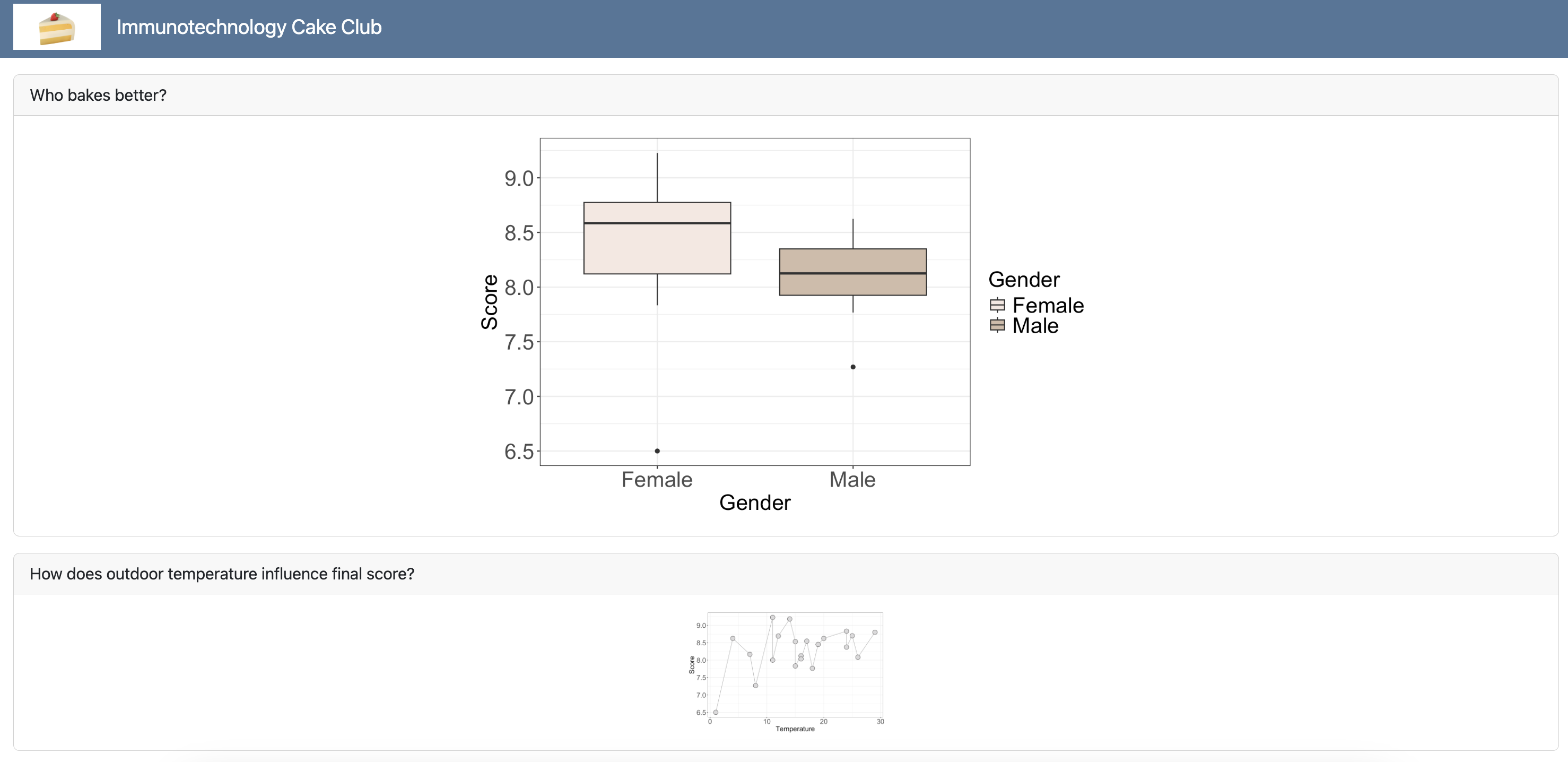
Step 5: Add a logo
my-dashboard.qmd
---
title: "Immunotechnology Cake Club"
format:
  dashboard:
    logo: ../assets/images/cake-emoji.png
---

```{r}
library(dplyr)
library(ggplot2)
library(gt)
```

```{r}
#| title: Who bakes better?
cake_data %>%
    ggplot(aes(x = Gender, y = Score, fill = Gender)) +
    geom_boxplot() +
    theme_minimal() +
    theme_bw() +
    scale_fill_manual(values = c("#F5E8E1", "#D0BBA8")) +
    labs(x = "Gender", y = "Score") +
    theme(axis.text = element_text(size = 20),
    axis.title = element_text(size = 20),
    legend.text = element_text(size = 20),
    legend.title = element_text(size = 20))
```

```{r}
#| title: How does outdoor temperature influence final score?
cake_data %>%
    ggplot(aes(x = Temperature, y = Score)) +
    geom_line( color="darkgrey") +
    geom_point(shape=21, color="black", fill="#DBD9DA", size=6) +
    theme_bw() +
    theme(axis.text = element_text(size = 20),
    axis.title = element_text(size = 20),
    legend.text = element_text(size = 20),
    legend.title = element_text(size = 20))
```![]()
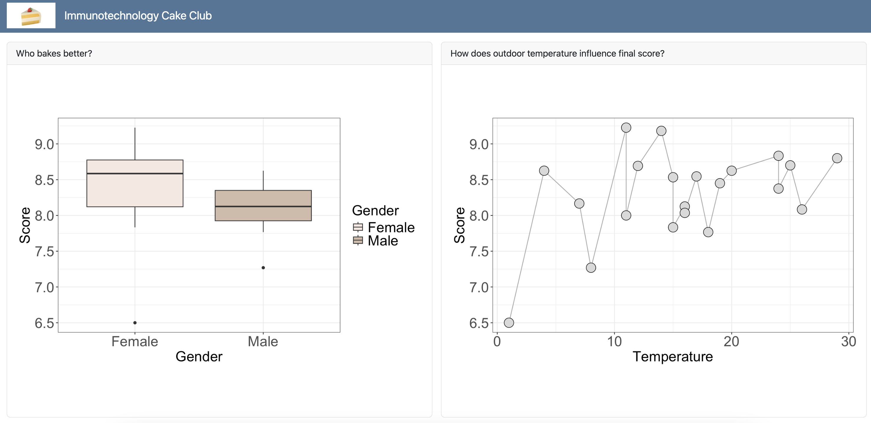
Layout - Rows
my-dashboard.qmd
---
title: "Immunotechnology Cake Club"
format:
  dashboard:
    logo: ./cake-emoji.png
---

```{r}
library(dplyr)
library(ggplot2)
```

## Row - Gender {height=70%}

```{r}
#| title: Who bakes better?
cake_data %>%
    ggplot(aes(x = Gender, y = Score, fill = Gender)) +
    geom_boxplot() +
    theme_minimal() +
    theme_bw() +
    scale_fill_manual(values = c("#F5E8E1", "#D0BBA8")) +
    labs(x = "Gender", y = "Score") +
    theme(axis.text = element_text(size = 20),
    axis.title = element_text(size = 20),
    legend.text = element_text(size = 20),
    legend.title = element_text(size = 20))
```

## Row - Temperature {height=30%}

```{r}
#| title: How does outdoor temperature influence final score?
cake_data %>%
    ggplot(aes(x = Temperature, y = Score)) +
    geom_line( color="darkgrey") +
    geom_point(shape=21, color="black", fill="#DBD9DA", size=6) +
    theme_bw() +
    theme(axis.text = element_text(size = 20),
    axis.title = element_text(size = 20),
    legend.text = element_text(size = 20),
    legend.title = element_text(size = 20))
```
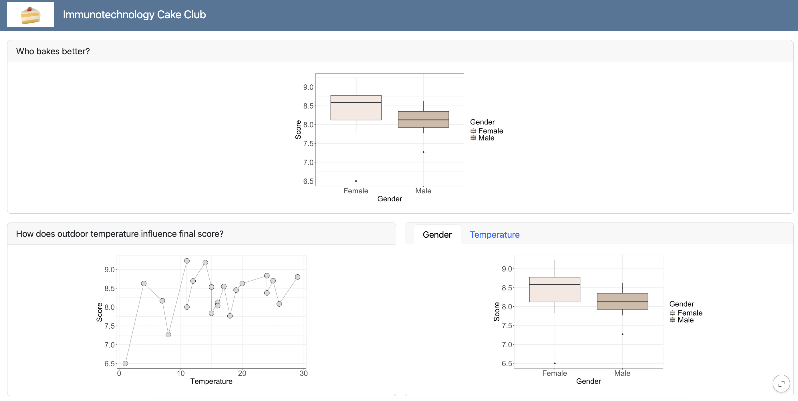
Layout - Columns
my-dashboard.qmd
---
title: "Immunotechnology Cake Club"
format:
  dashboard:
    orientation: columns
    logo: ./cake-emoji.png
---

```{r}
library(dplyr)
library(ggplot2)
```

## Column - Gender

```{r}
#| title: Who bakes better?
cake_data %>%
    ggplot(aes(x = Gender, y = Score, fill = Gender)) +
    geom_boxplot() +
    theme_minimal() +
    theme_bw() +
    scale_fill_manual(values = c("#F5E8E1", "#D0BBA8")) +
    labs(x = "Gender", y = "Score") +
    theme(axis.text = element_text(size = 20),
    axis.title = element_text(size = 20),
    legend.text = element_text(size = 20),
    legend.title = element_text(size = 20))
```

## Column - Temperature

```{r}
#| title: How does outdoor temperature influence final score?
cake_data %>%
    ggplot(aes(x = Temperature, y = Score)) +
    geom_line( color="darkgrey") +
    geom_point(shape=21, color="black", fill="#DBD9DA", size=6) +
    theme_bw() +
    theme(axis.text = element_text(size = 20),
    axis.title = element_text(size = 20),
    legend.text = element_text(size = 20),
    legend.title = element_text(size = 20))
```
Tabsets
my-dashboard.qmd
---
title: "Immunotechnology Cake Club"
format:
  dashboard:
    logo: ./cake-emoji.png
---

```{r}
library(dplyr)
library(ggplot2)
```

## Row - Gender

```{r}
#| title: Who bakes better?
cake_data %>%
    ggplot(aes(x = Gender, y = Score, fill = Gender)) +
    geom_boxplot() +
    theme_minimal() +
    theme_bw() +
    scale_fill_manual(values = c("#F5E8E1", "#D0BBA8")) +
    labs(x = "Gender", y = "Score") +
    theme(axis.text = element_text(size = 20),
    axis.title = element_text(size = 20),
    legend.text = element_text(size = 20),
    legend.title = element_text(size = 20))
```

## Row - Temperature

```{r}
#| title: How does outdoor temperature influence final score?
cake_data %>%
    ggplot(aes(x = Temperature, y = Score)) +
    geom_line( color="darkgrey") +
    geom_point(shape=21, color="black", fill="#DBD9DA", size=6) +
    theme_bw() +
    theme(axis.text = element_text(size = 20),
    axis.title = element_text(size = 20),
    legend.text = element_text(size = 20),
    legend.title = element_text(size = 20))
```

### Tabsets of plots {.tabset}
```{r}
#| title: Gender
cake_data %>%
    ggplot(aes(x = Gender, y = Score, fill = Gender)) +
    geom_boxplot() +
    theme_minimal() +
    theme_bw() +
    scale_fill_manual(values = c("#F5E8E1", "#D0BBA8")) +
    labs(x = "Gender", y = "Score") +
    theme(axis.text = element_text(size = 20),
    axis.title = element_text(size = 20),
    legend.text = element_text(size = 20),
    legend.title = element_text(size = 20))
```

```{r}
#| title: Temperature
cake_data %>%
    ggplot(aes(x = Temperature, y = Score)) +
    geom_line( color="darkgrey") +
    geom_point(shape=21, color="black", fill="#DBD9DA", size=6) +
    theme_bw() +
    theme(axis.text = element_text(size = 20),
    axis.title = element_text(size = 20),
    legend.text = element_text(size = 20),
    legend.title = element_text(size = 20))
```
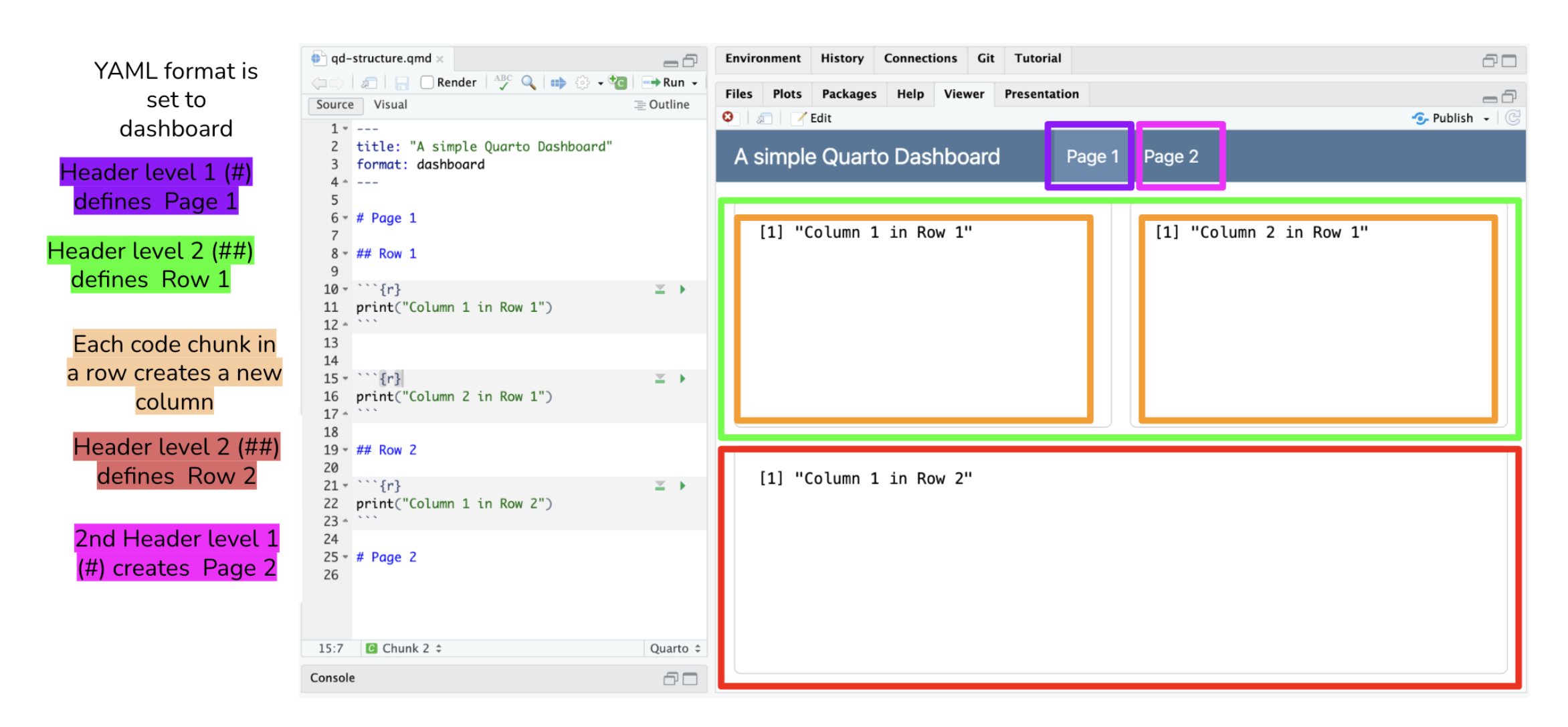
Pages
my-dashboard.qmd
---
title: "Immunotechnology Cake Club"
format:
dashboard:
logo: ./cake-emoji.png
---
```{r}
library(dplyr)
library(ggplot2)
```
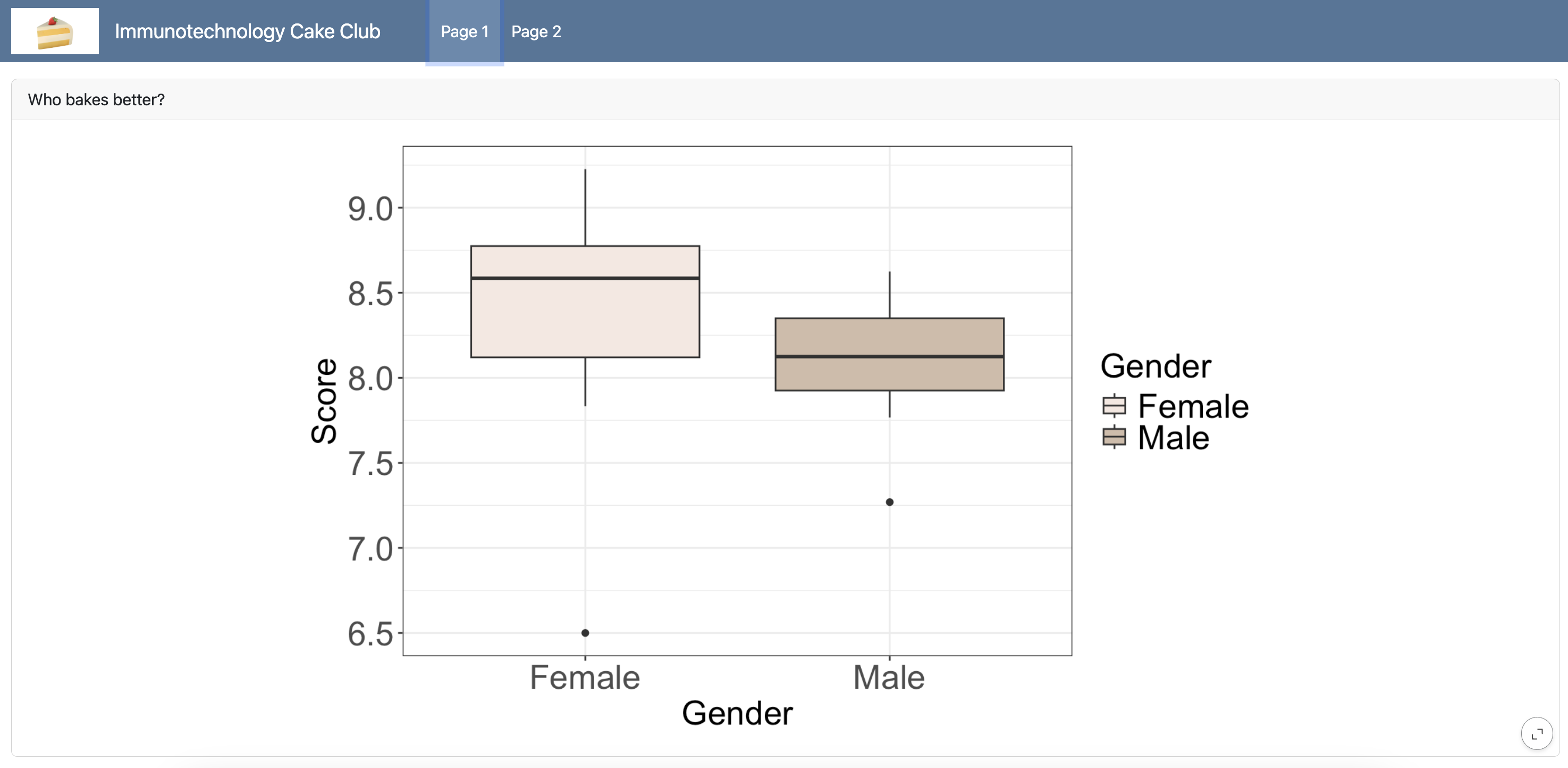
# Page 1
## Row - Gender
```{r}
#| title: Who bakes better?
cake_data %>%
ggplot(aes(x = Gender, y = Score, fill = Gender)) +
geom_boxplot() +
theme_minimal() +
theme_bw() +
scale_fill_manual(values = c("#F5E8E1", "#D0BBA8")) +
labs(x = "Gender", y = "Score") +
theme(axis.text = element_text(size = 20),
axis.title = element_text(size = 20),
legend.text = element_text(size = 20),
legend.title = element_text(size = 20))
```
# Page 2
## Row - Temperature
```{r}
#| title: How does outdoor temperature influence final score?
cake_data %>%
ggplot(aes(x = Temperature, y = Score)) +
geom_line( color="darkgrey") +
geom_point(shape=21, color="black", fill="#DBD9DA", size=6) +
theme_bw() +
theme(axis.text = element_text(size = 20),
axis.title = element_text(size = 20),
legend.text = element_text(size = 20),
legend.title = element_text(size = 20))
```
Thank you. Questions?