Scanpy: Clustering
In this tutorial we will continue the analysis of the integrated dataset. We will use the integrated PCA to perform the clustering using graph community detection algorithms.
Let's first load all necessary libraries and also the integrated dataset from the previous step.
import numpy as np
import pandas as pd
import scanpy as sc
import matplotlib.pyplot as plt

sc.settings.verbosity = 3             # verbosity: errors (0), warnings (1), info (2), hints (3)
sc.logging.print_versions()
sc.settings.set_figure_params(dpi=80)
save_file = './data/scanpy_mnn_corrected_3pbmc.h5ad'
adata = sc.read_h5ad(save_file)
adata
Graph clustering
The procedure of clustering on a Graph can be generalized as 3 main steps:
1) Build a kNN graph from the data
2) Prune spurious connections from kNN graph (optional step). This is a SNN graph.
3) Find groups of cells that maximizes the connections within the group compared other groups.
If you recall from the dimensionality reductionction tutorial, we already constructed a knn graph before running UMAP. Hence we do not need to do it again, and can run the community detection right away.
The modularity optimization algoritm in Scanpy are Leiden and Louvain. Lets test both and see how they compare.
Leiden
sc.tl.leiden(adata, key_added = "leiden_1.0") # default resolution in 1.0
sc.tl.leiden(adata, resolution = 0.6, key_added = "leiden_0.6")
sc.tl.leiden(adata, resolution = 0.4, key_added = "leiden_0.4")
sc.tl.leiden(adata, resolution = 1.4, key_added = "leiden_1.4")
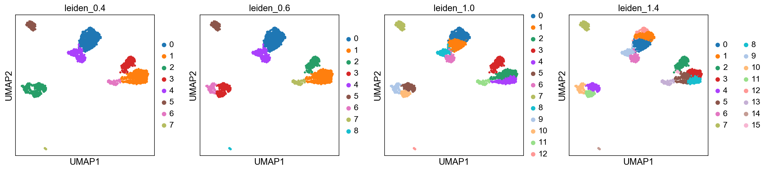
Plot the clusters, as you can see, with increased resolution, we get higher granularity in the clustering.
sc.pl.umap(adata, color=['leiden_0.4', 'leiden_0.6', 'leiden_1.0','leiden_1.4'])
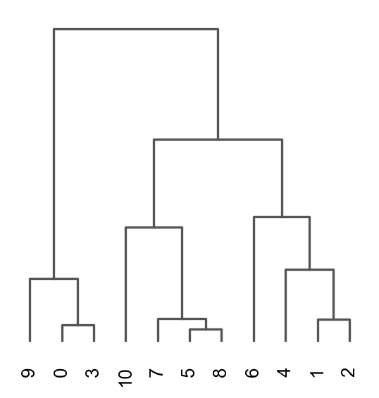
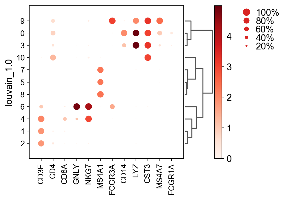
Once we have done clustering, the relationships between clusters can be calculated as correlation in PCA space and we also visualize some of the marker genes that we used in the Dim Reduction lab onto the clusters.
sc.tl.dendrogram(adata, groupby = "leiden_1.0")
sc.pl.dendrogram(adata, groupby = "leiden_1.0")

genes  = ["CD3E", "CD4", "CD8A", "GNLY","NKG7", "MS4A1","FCGR3A","CD14","LYZ","CST3","MS4A7","FCGR1A"]
sc.pl.dotplot(adata, genes, groupby='leiden_1.0', dendrogram=True)


Louvain
sc.tl.louvain(adata, key_added = "louvain_1.0") # default resolution in 1.0
sc.tl.louvain(adata, resolution = 0.6, key_added = "louvain_0.6")
sc.tl.louvain(adata, resolution = 0.4, key_added = "louvain_0.4")
sc.tl.louvain(adata, resolution = 1.4, key_added = "louvain_1.4")

sc.pl.umap(adata, color=['louvain_0.4', 'louvain_0.6', 'louvain_1.0','louvain_1.4'])

sc.tl.dendrogram(adata, groupby = "louvain_1.0")
sc.pl.dendrogram(adata, groupby = "louvain_1.0")

genes  = ["CD3E", "CD4", "CD8A", "GNLY","NKG7", "MS4A1","FCGR3A","CD14","LYZ","CST3","MS4A7","FCGR1A"]

sc.pl.dotplot(adata, genes, groupby='louvain_1.0', dendrogram=True)
K-means clustering
K-means is a generic clustering algorithm that has been used in many application areas. In R, it can be applied via the kmeans function. Typically, it is applied to a reduced dimension representation of the expression data (most often PCA, because of the interpretability of the low-dimensional distances). We need to define the number of clusters in advance. Since the results depend on the initialization of the cluster centers, it is typically recommended to run K-means with multiple starting configurations (via the nstart argument).
from sklearn.cluster import KMeans
from sklearn.metrics import adjusted_rand_score

# extract pca coordinates
X_pca = adata.obsm['X_pca']

# kmeans with k=5
kmeans = KMeans(n_clusters=5, random_state=0).fit(X_pca)
adata.obs['kmeans5'] = kmeans.labels_.astype(str)

# kmeans with k=10
kmeans = KMeans(n_clusters=10, random_state=0).fit(X_pca)
adata.obs['kmeans10'] = kmeans.labels_.astype(str)

# kmeans with k=15
kmeans = KMeans(n_clusters=15, random_state=0).fit(X_pca)
adata.obs['kmeans15'] = kmeans.labels_.astype(str)

sc.pl.umap(adata, color=['kmeans5', 'kmeans10', 'kmeans15'])

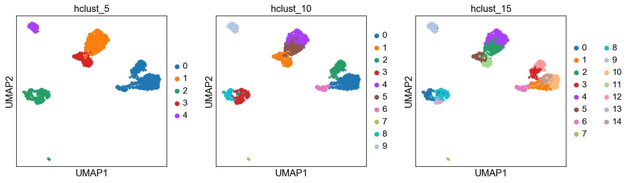
Hierarchical clustering
Hierarchical clustering is another generic form of clustering that can be applied also to scRNA-seq data. As K-means, it is typically applied to a reduced dimension representation of the data. Hierarchical clustering returns an entire hierarchy of partitionings (a dendrogram) that can be cut at different levels. Hierarchical clustering is done in two steps:
- Step1: Define the distances between samples. The most common are Euclidean distance (a.k.a. straight line between two points) or correlation coefficients.
- Step2: Define a measure of distances between clusters, called linkage criteria. It can for example be average distances between clusters. Commonly used methods are
single,complete,average,median,centroidandward. Step3: Define the deprogram among all samples using Bottom-up or Top-down approach. Bottom-up is where samples start with their own cluster which end up merged pair-by-pair until only one cluster is left. Top-down is where samples start all in the same cluster that end up being split by 2 until each sample has its own cluster.
The function
AgglomerativeClusteringhas the option of running with disntance metrics “euclidean”, “l1”, “l2”, “manhattan”, “cosine”, or “precomputed". However, with ward linkage only euklidean distances works. Here we will try out euclidean distance and ward linkage calculated in PCA space.
from sklearn.cluster import AgglomerativeClustering

cluster = AgglomerativeClustering(n_clusters=5, affinity='euclidean', linkage='ward')
adata.obs['hclust_5'] = cluster.fit_predict(X_pca).astype(str)

cluster = AgglomerativeClustering(n_clusters=10, affinity='euclidean', linkage='ward')
adata.obs['hclust_10'] = cluster.fit_predict(X_pca).astype(str)

cluster = AgglomerativeClustering(n_clusters=15, affinity='euclidean', linkage='ward')
adata.obs['hclust_15'] = cluster.fit_predict(X_pca).astype(str)


sc.pl.umap(adata, color=['hclust_5', 'hclust_10', 'hclust_15'])
Finally, lets save the integrated data for further analysis.
adata.write_h5ad('./data/scanpy_clustered_3pbmc.h5ad')
Check QC-stats
By now you should know how to plot different features onto your data. Take the QC metrics that were calculated in the first exercise, that should be stored in your data object, and plot it onto your UMAP and as violin plots per cluster using the clustering method of your choice. For example, plot number of UMIS, detected genes, percent mitochondrial reads. Then, check carefully if there is any bias in how your data is separated due to quality metrics. Could it be explained biologically, or could you have technical bias there?