library(dplyr)
library(tidyr)
library(stringr)

library(ggplot2)
library(ggrepel)
# library(showtext)
Note
These are a series of exercises to help you get started and familiarize yourself with ggplot2 syntax, plot building logic and fine modification of plots. Practice using the Basics section and then move on to slightly more complex plots: a scatterplot and a heatmap.
1 Basics
First step is to make sure that the necessary packages are installed and loaded.
We use the iris data to get started. This dataset has four continuous variables and one categorical variable. It is important to remember about the data type when plotting graphs.
data("iris")
head(iris)| Sepal.Length | Sepal.Width | Petal.Length | Petal.Width | Species |
|---|---|---|---|---|
| 5.1 | 3.5 | 1.4 | 0.2 | setosa |
| 4.9 | 3.0 | 1.4 | 0.2 | setosa |
| 4.7 | 3.2 | 1.3 | 0.2 | setosa |
| 4.6 | 3.1 | 1.5 | 0.2 | setosa |
| 5.0 | 3.6 | 1.4 | 0.2 | setosa |
| 5.4 | 3.9 | 1.7 | 0.4 | setosa |
1.1 Building a plot
ggplot2 plots are initialized by specifying the dataset. This can be saved to a variable or it draws a blank plot.
ggplot(data = iris)
Now we can specify what we want on the x and y axes using aesthetic mapping. And we specify the geometric using geoms. Note that the variable names do not have double quotes "" like in base plots.
ggplot(data = iris) +
  geom_point(mapping = aes(x = Petal.Length, y = Petal.Width))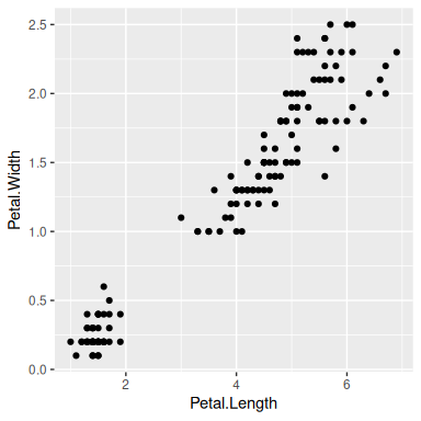
1.2 Multiple geoms
Further geoms can be added. For example let’s add a regression line. When multiple geoms with the same aesthetics are used, they can be specified as a common mapping. Note that the order in which geoms are plotted depends on the order in which the geoms are supplied in the code. In the code below, the points are plotted first and then the regression line.
ggplot(data = iris, mapping = aes(x = Petal.Length, y = Petal.Width)) +
  geom_point() +
  geom_smooth(method = "lm")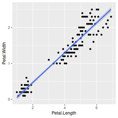
1.3 Using colors
We can use the categorical column Species to color the points. The color aesthetic is used by geom_point and geom_smooth. Three different regression lines are now drawn. Notice that a legend is automatically created.
ggplot(data = iris, mapping = aes(x = Petal.Length, y = Petal.Width, color = Species)) +
  geom_point() +
  geom_smooth(method = "lm")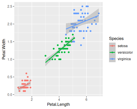
If we wanted to keep a common regression line while keeping the colors for the points, we could specify color aesthetic only for geom_point.
ggplot(data = iris, mapping = aes(x = Petal.Length, y = Petal.Width)) +
  geom_point(aes(color = Species)) +
  geom_smooth(method = "lm")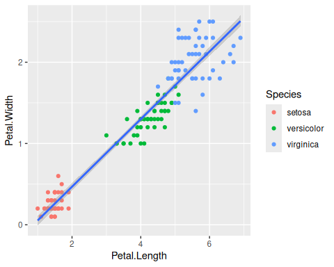
1.4 Aesthetic parameter
We can change the size of all points by a fixed amount by specifying size outside the aesthetic parameter.
ggplot(data = iris, mapping = aes(x = Petal.Length, y = Petal.Width)) +
  geom_point(aes(color = Species), size = 3) +
  geom_smooth(method = "lm")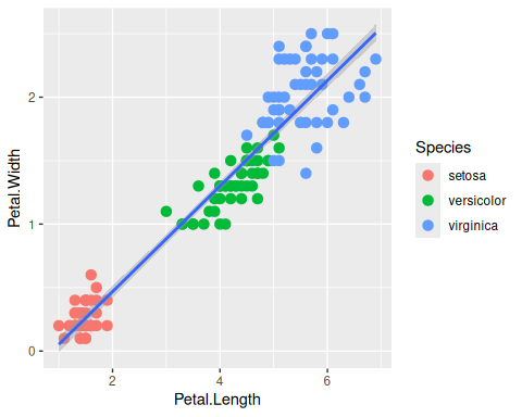
1.5 Aesthetic mapping
We can map another variable as size of the points. This is done by specifying size inside the aesthetic mapping. Now the size of the points denote Sepal.Width. A new legend group is created to show this new aesthetic.
ggplot(data = iris, mapping = aes(x = Petal.Length, y = Petal.Width)) +
  geom_point(aes(color = Species, size = Sepal.Width)) +
  geom_smooth(method = "lm")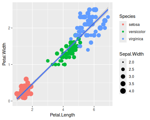
1.6 Discrete colors
We can change the default colors by specifying new values inside a scale.
ggplot(data = iris, mapping = aes(x = Petal.Length, y = Petal.Width)) +
  geom_point(aes(color = Species, size = Sepal.Width)) +
  geom_smooth(method = "lm") +
  scale_color_manual(values = c("red", "blue", "green"))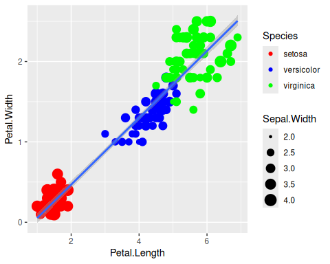
1.7 Continuous colors
We can also map the colors to a continuous variable. This creates a color bar legend item.
ggplot(data = iris, mapping = aes(x = Petal.Length, y = Petal.Width)) +
  geom_point(aes(color = Sepal.Width)) +
  geom_smooth(method = "lm")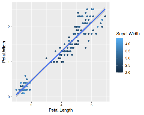
1.8 Titles
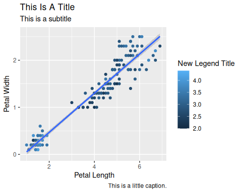
Now let’s rename the axis labels, change the legend title and add a title, a subtitle and a caption. We change the legend title using scale_color_continuous(). All other labels are changed using labs().
ggplot(data = iris, mapping = aes(x = Petal.Length, y = Petal.Width)) +
  geom_point(aes(color = Sepal.Width)) +
  geom_smooth(method = "lm") +
  scale_color_continuous(name = "New Legend Title") +
  labs(
    title = "This Is A Title", subtitle = "This is a subtitle", x = " Petal Length",
    y = "Petal Width", caption = "This is a little caption."
  )
1.9 Axes modification
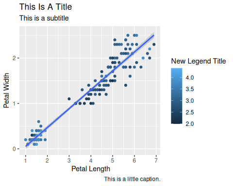
Let’s say we are not happy with the x-axis breaks 2,4,6 etc. We would like to have 1,2,3… We change this using scale_x_continuous().
ggplot(data = iris, mapping = aes(x = Petal.Length, y = Petal.Width)) +
  geom_point(aes(color = Sepal.Width)) +
  geom_smooth(method = "lm") +
  scale_color_continuous(name = "New Legend Title") +
  scale_x_continuous(breaks = 1:8) +
  labs(
    title = "This Is A Title", subtitle = "This is a subtitle", x = " Petal Length",
    y = "Petal Width", caption = "This is a little caption."
  )
1.10 Faceting
We can create subplots using the faceting functionality. Let’s create three subplots for the three levels of Species.
ggplot(data = iris, mapping = aes(x = Petal.Length, y = Petal.Width)) +
  geom_point(aes(color = Sepal.Width)) +
  geom_smooth(method = "lm") +
  scale_color_continuous(name = "New Legend Title") +
  scale_x_continuous(breaks = 1:8) +
  labs(
    title = "This Is A Title", subtitle = "This is a subtitle", x = " Petal Length",
    y = "Petal Width", caption = "This is a little caption."
  ) +
  facet_wrap(~Species)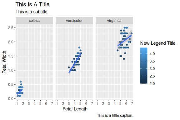
1.11 Themes
The look of the plot can be changed using themes. Let’s can the default theme_grey() to theme_bw().
ggplot(data = iris, mapping = aes(x = Petal.Length, y = Petal.Width)) +
  geom_point(aes(color = Sepal.Width)) +
  geom_smooth(method = "lm") +
  scale_color_continuous(name = "New Legend Title") +
  scale_x_continuous(breaks = 1:8) +
  labs(
    title = "This Is A Title", subtitle = "This is a subtitle", x = " Petal Length",
    y = "Petal Width", caption = "This is a little caption."
  ) +
  facet_wrap(~Species) +
  theme_bw()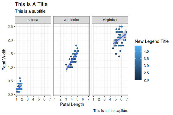
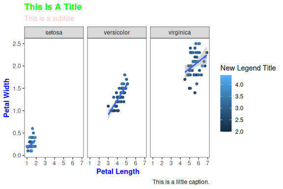
All non-data related aspects of the plot can be modified through themes. Let’s modify the colors of the title labels and turn off the gridlines. The various parameters for theme can be found using ?theme.
ggplot(data = iris, mapping = aes(x = Petal.Length, y = Petal.Width)) +
  geom_point(aes(color = Sepal.Width)) +
  geom_smooth(method = "lm") +
  scale_color_continuous(name = "New Legend Title") +
  scale_x_continuous(breaks = 1:8) +
  labs(
    title = "This Is A Title", subtitle = "This is a subtitle", x = " Petal Length",
    y = "Petal Width", caption = "This is a little caption."
  ) +
  facet_wrap(~Species) +
  theme_bw() +
  theme(
    axis.title = element_text(color = "Blue", face = "bold"),
    plot.title = element_text(color = "Green", face = "bold"),
    plot.subtitle = element_text(color = "Pink"),
    panel.grid = element_blank()
  )
Themes can be saved and reused.
newtheme <- theme(
  axis.title = element_text(color = "Blue", face = "bold"),
  plot.title = element_text(color = "Green", face = "bold"),
  plot.subtitle = element_text(color = "Pink"),
  panel.grid = element_blank()
)

ggplot(data = iris, mapping = aes(x = Petal.Length, y = Petal.Width)) +
  geom_point(aes(color = Sepal.Width)) +
  geom_smooth(method = "lm") +
  scale_color_continuous(name = "New Legend Title") +
  scale_x_continuous(breaks = 1:8) +
  labs(
    title = "This Is A Title", subtitle = "This is a subtitle", x = " Petal Length",
    y = "Petal Width", caption = "This is a little caption."
  ) +
  facet_wrap(~Species) +
  theme_bw() +
  newtheme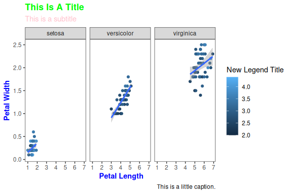
1.12 Controlling legends
Here we see two legends based on the two aesthetic mappings.
ggplot(data = iris, mapping = aes(x = Petal.Length, y = Petal.Width)) +
  geom_point(aes(color = Species, size = Sepal.Width))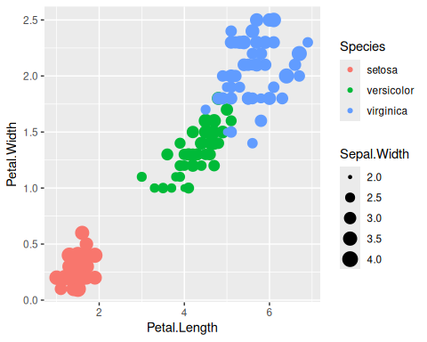
If we don’t want to have the extra legend, we can turn off legends individually by aesthetic.
ggplot(data = iris, mapping = aes(x = Petal.Length, y = Petal.Width)) +
  geom_point(aes(color = Species, size = Sepal.Width)) +
  guides(size = "none")
We can also turn off legends by geom.
ggplot(data = iris, mapping = aes(x = Petal.Length, y = Petal.Width)) +
  geom_point(aes(color = Species, size = Sepal.Width), show.legend = FALSE)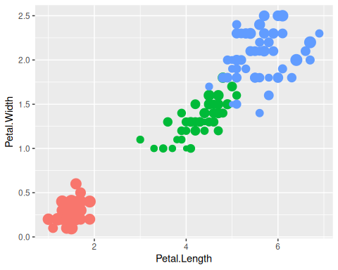
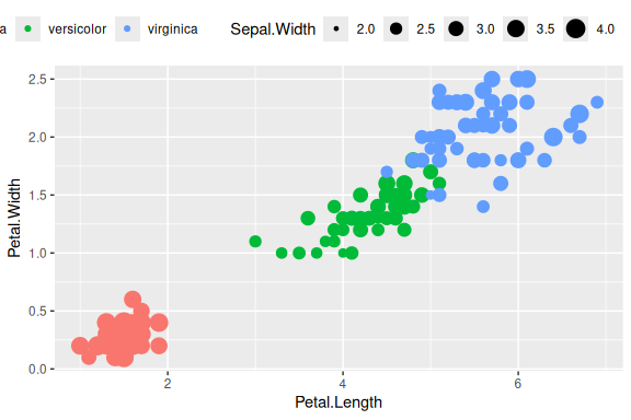
Legends can be moved around using theme.
ggplot(data = iris, mapping = aes(x = Petal.Length, y = Petal.Width)) +
  geom_point(aes(color = Species, size = Sepal.Width)) +
  theme(
    legend.position = "top",
    legend.justification = "right"
  )
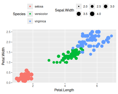
Legend rows can be controlled in a finer manner.
ggplot(data = iris, mapping = aes(x = Petal.Length, y = Petal.Width)) +
  geom_point(aes(color = Species, size = Sepal.Width)) +
  guides(
    size = guide_legend(nrow = 2, byrow = TRUE),
    color = guide_legend(nrow = 3, byrow = TRUE)
  ) +
  theme(
    legend.position = "top",
    legend.justification = "right"
  )
1.13 Labelling
Items on the plot can be labelled using the geom_text or geom_label geoms.
ggplot(data = iris, mapping = aes(x = Petal.Length, y = Petal.Width)) +
  geom_point(aes(color = Species)) +
  geom_text(aes(label = Species, hjust = 0), nudge_x = 0.5, size = 3)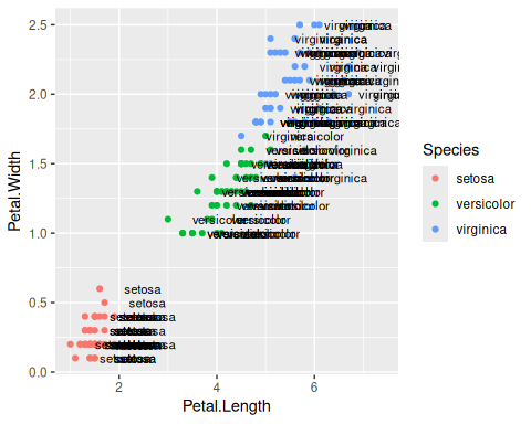
ggplot(data = iris, mapping = aes(x = Petal.Length, y = Petal.Width)) +
  geom_point(aes(color = Species)) +
  geom_label(aes(label = Species, hjust = 0), nudge_x = 0.5, size = 3)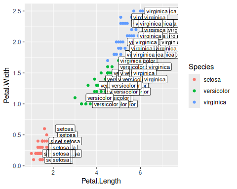
The R package ggrepel allows for non-overlapping labels.
library(ggrepel)
ggplot(data = iris, mapping = aes(x = Petal.Length, y = Petal.Width)) +
  geom_point(aes(color = Species)) +
  geom_text_repel(aes(label = Species), size = 3)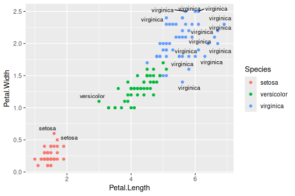
1.14 Annotations
Custom annotations of any geom can be added arbitrarily anywhere on the plot.
ggplot(data = iris, mapping = aes(x = Petal.Length, y = Petal.Width)) +
  geom_point(aes(color = Species)) +
  annotate("text", x = 2.5, y = 2.1, label = "There is a random line here") +
  annotate("segment", x = 2, xend = 4, y = 1.5, yend = 2)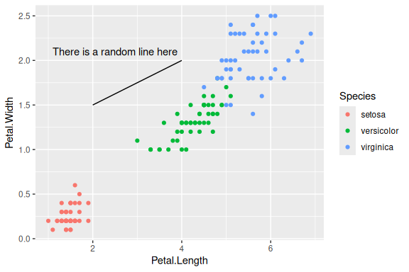
1.15 Barplots
ggplot(data = iris, mapping = aes(x = Species, y = Petal.Width)) +
  geom_col()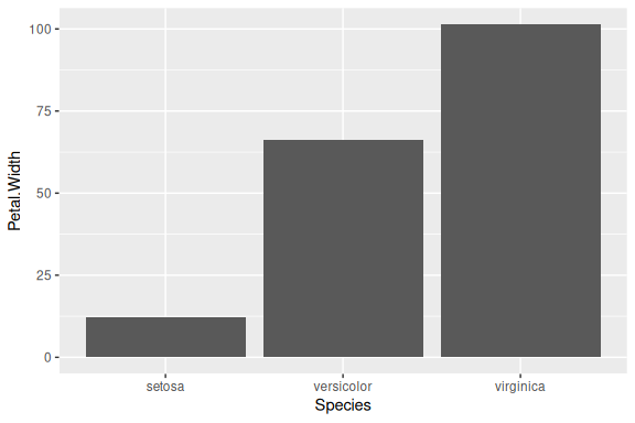
1.16 Flip axes
x and y axes can be flipped using coord_flip.
ggplot(data = iris, mapping = aes(x = Species, y = Petal.Width)) +
  geom_col() +
  coord_flip()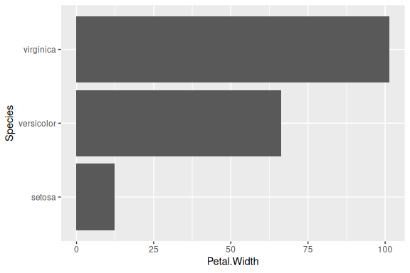
1.17 Error Bars
An example of using error bars with points. The mean and standard deviation is computed. This is used to create upper and lower bounds for the error bars.
dfr <- iris |>
  group_by(Species) |>
  summarise(mean = mean(Sepal.Length), sd = sd(Sepal.Length)) |>
  mutate(high = mean + sd, low = mean - sd)

ggplot(data = dfr, mapping = aes(x = Species, y = mean, color = Species)) +
  geom_point(size = 4) +
  geom_errorbar(aes(ymax = high, ymin = low), width = 0.2)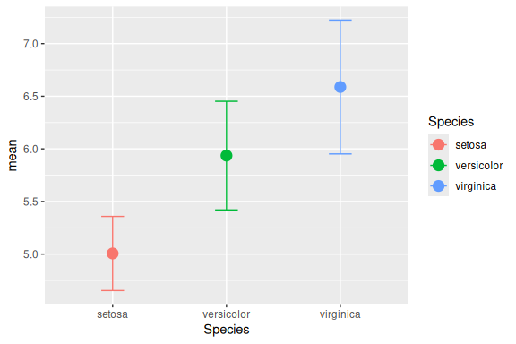
2 Economist Scatterplot
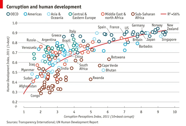
The aim of this challenge is to recreate the plot below originally published in The Economist. The graph is a scatterplot showing the relationship between Corruption Index and Human Development Index for various countries.
2.1 Data
Download the data csv file.
Then read in the data. Adjust the path as needed.
ec <- read.csv("assets/data_economist.csv", header = TRUE)
head(ec)| X | Country | HDI.Rank | HDI | CPI | Region |
|---|---|---|---|---|---|
| 1 | Afghanistan | 172 | 0.398 | 1.5 | Asia Pacific |
| 2 | Albania | 70 | 0.739 | 3.1 | East EU Cemt Asia |
| 3 | Algeria | 96 | 0.698 | 2.9 | MENA |
| 4 | Angola | 148 | 0.486 | 2.0 | SSA |
| 5 | Argentina | 45 | 0.797 | 3.0 | Americas |
| 6 | Armenia | 86 | 0.716 | 2.6 | East EU Cemt Asia |
Make sure that the fields are of the correct type. The x-axis field ‘CPI’ and the y-axis field ‘HDI’ must be of numeric type. The field ‘Region’ must be of Factor type.
str(ec)'data.frame': 173 obs. of 6 variables:
$ X : int 1 2 3 4 5 6 7 8 9 10 ...
$ Country : chr "Afghanistan" "Albania" "Algeria" "Angola" ...
$ HDI.Rank: int 172 70 96 148 45 86 2 19 91 53 ...
$ HDI : num 0.398 0.739 0.698 0.486 0.797 0.716 0.929 0.885 0.7 0.771 ...
$ CPI : num 1.5 3.1 2.9 2 3 2.6 8.8 7.8 2.4 7.3 ...
$ Region : chr "Asia Pacific" "East EU Cemt Asia" "MENA" "SSA" ...We need to first modify the ‘Region’ column. The current levels in the ‘Region’ field are:
ec$Region <- factor(ec$Region)
levels(ec$Region)
[1] "Americas" "Asia Pacific" "East EU Cemt Asia"
[4] "EU W. Europe" "MENA" "SSA" But, the categories on the plot are different and need to be changed as follows:
From                  To
EU W. Europe          OECD
Americas              Americas
Asia Pacific          Asia & Oceania
East EU Cemt Asia     Central & Eastern Europe
MENA                  Middle East & North Africa
SSA                   Sub-Saharan Africa
Since the ‘To’ strings are a bit too long to be in one line on the legend, use \n to break a line into two lines.
Tip
\n is the newline character in R.
From                  To
EU W. Europe          OECD
Americas              Americas
Asia Pacific          Asia &\nOceania
East EU Cemt Asia     Central &\nEastern Europe
MENA                  Middle East &\nNorth Africa
SSA                   Sub-Saharan\nAfrica
The strings can be renamed using string replacement or substitution. But a easier way to do it is to use factor(). The arguments levels and labels in function factor() can be used to rename factors.
ec$Region <- factor(ec$Region,
  levels = c(
    "EU W. Europe",
    "Americas",
    "Asia Pacific",
    "East EU Cemt Asia",
    "MENA",
    "SSA"
  ),
  labels = c(
    "OECD",
    "Americas",
    "Asia &\nOceania",
    "Central &\nEastern Europe",
    "Middle East &\nNorth Africa",
    "Sub-Saharan\nAfrica"
  )
)
Our new Regions should look like:
levels(ec$Region)[1] "OECD" "Americas"
[3] "Asia &\nOceania" "Central &\nEastern Europe"
[5] "Middle East &\nNorth Africa" "Sub-Saharan\nAfrica" 2.2 Points
Start building up the basic plot.
Tip
Provide data.frame ‘ec’ as the data and map field ‘CPI’ to the x-axis and ‘HDI’ to the y-axis. Use geom_point() to draw point geometry. To select shapes, see here. Circular shape can be drawn using 1, 16, 19, 20 and 21. Using shape ‘21’ allows us to control stroke color, fill color and stroke thickness for the points. Check out ?geom_point and look under ‘Aesthetics’ for the various possible aesthetic options. Set shape to 21, size to 3, stroke to 0.8 and fill to white.
ggplot(ec, aes(x = CPI, y = HDI, color = Region)) +
  geom_point(shape = 21, size = 3, stroke = 0.8, fill = "white")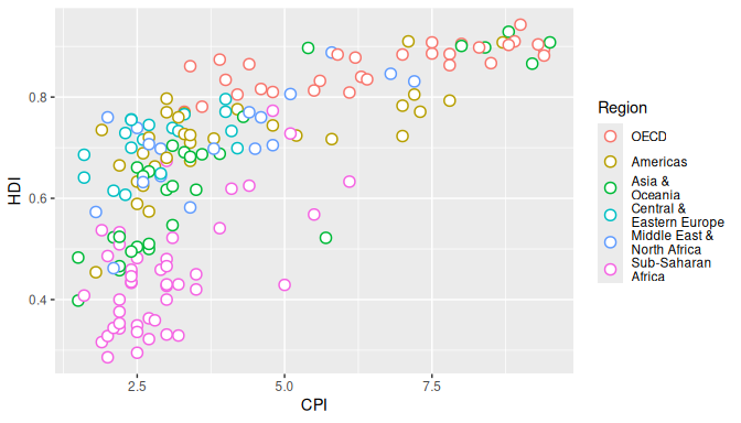
Notice how ‘’ has created newlines in the Legend.
2.3 Trendline
Now, we add the trend line using geom_smooth. Check out ?geom_smooth and look under ‘Arguments’ for argument options and ‘Aesthetics’ for the aesthetic options.
- Use method ‘lm’ and use a custom formula of
y~poly(x,2)to approximate the curve seen on the plot. Turn off confidence interval shading. Set line thickness to 0.6 and line color to red.
ggplot(ec, aes(x = CPI, y = HDI, color = Region)) +
  geom_point(shape = 21, size = 3, stroke = 0.8, fill = "white") +
  geom_smooth(method = "lm", formula = y ~ poly(x, 2), se = FALSE, linewidth = 0.6, color = "red")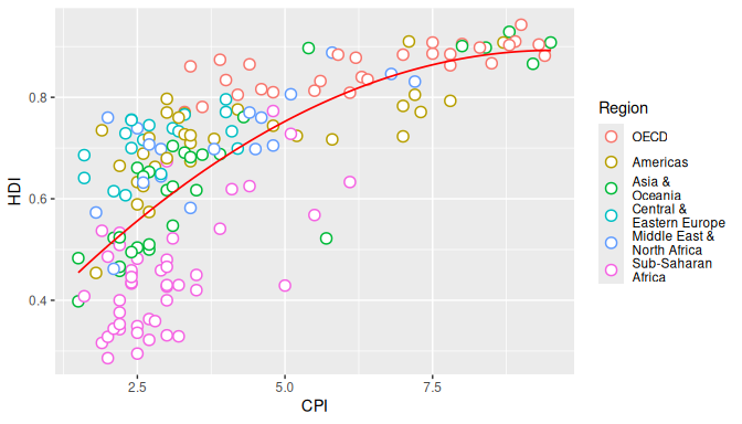
Notice that the line is drawn over the points due to the plotting order. We want the points to be over the line. So reorder the geoms. Since we provided no aesthetic mappings to geom_smooth, there is no legend entry for the trendline. We can fake a legend entry by providing an aesthetic, for example; aes(fill="red"). We do not use the color aesthetic because it is already in use and would give us reduced control later on to modify this legend entry.
p <- ggplot(ec, aes(x = CPI, y = HDI, color = Region)) +
  geom_smooth(aes(fill = "red"), method = "lm", formula = y ~ poly(x, 2), se = FALSE, color = "red", linewidth = 0.6) +
  geom_point(shape = 21, size = 3, stroke = 0.8, fill = "white")

trend_model <- lm(HDI ~ poly(CPI, 2), data = ec)
r_squared <- summary(trend_model)$r.squared
r_label <- as.expression(bquote(R^2 == .(round(r_squared, 2))))

p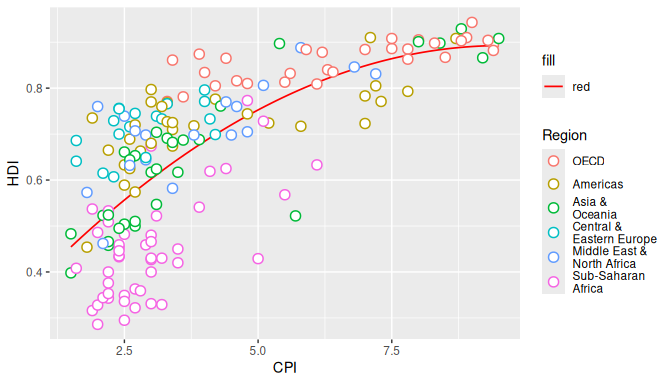
2.4 Text Labels
Now we add the text labels. Only a subset of countries are plotted. The list of countries to label is shown below.
"Congo","Afghanistan","Sudan","Myanmar","Iraq","Venezuela","Russia","Argentina","Brazil","Italy","South Africa","Cape Verde","Bhutan","Botswana","Britain","New Zealand","Greece","China","India","Rwanda","Spain","France","United States","Japan","Norway","Singapore","Barbados","Germany"- Use
geom_textto subset the original data.frame to the reduced set above and plot the labels as text. See?geom_text.
labels <- c("Congo", "Afghanistan", "Sudan", "Myanmar", "Iraq", "Venezuela", "Russia", "Argentina", "Brazil", "Italy", "South Africa", "Cape Verde", "Bhutan", "Botswana", "Britain", "New Zealand", "Greece", "China", "India", "Rwanda", "Spain", "France", "United States", "Japan", "Norway", "Singapore", "Barbados", "Germany")

p + geom_text(data = subset(ec, Country %in% labels), aes(label = Country), color = "black")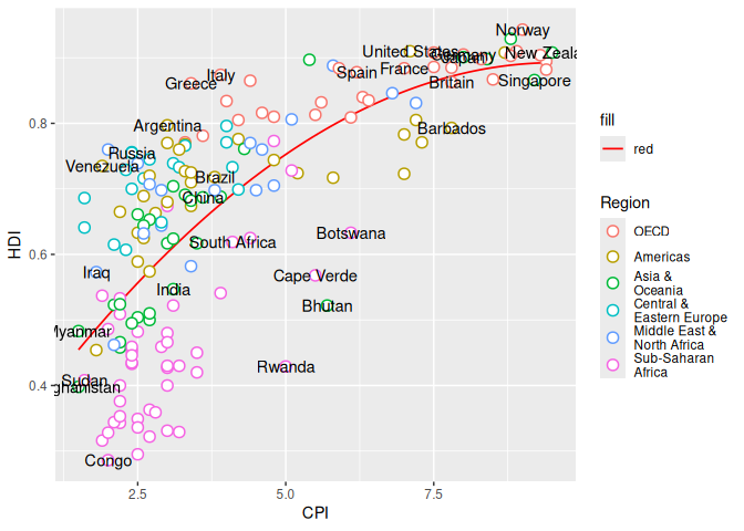
2.5 Custom Font
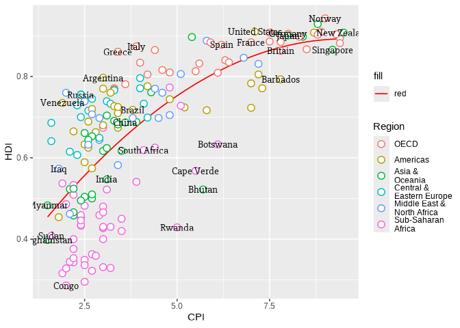
Custom font can be used for the labels by providing the font name to argument family like so geom_text(family="fontname"). If you do not want to bother with fonts, just avoid the family argument in geom_text and skip this part.
Using custom fonts can be tricky business. A convenient way to use fonts in plots is the showtext package. It can register fonts from Google Fonts or from a local font file, and then make them available to ggplot2 through the family argument.
library(showtext)
sysfonts::font_add_google(name = "Slabo 27px", family = "Slabo 27px")
showtext_auto()
The actual font used on the Economist graph is something close to ITC Officina Sans. Since this is not a free font, I am using a free font called Slabo 27px. After the font is registered with showtext, it can be used in ggplot2 by setting family = "Slabo 27px".
p + geom_text(
  data = subset(ec, Country %in% labels), aes(label = Country),
  color = "black", family = "Slabo 27px"
)
2.6 Label Overlap
To avoid overlapping of labels, we can use a ggplot2 extension package ggrepel. We can use function geom_text_repel() from the ggrepel package. geom_text_repel() has the same arguments/aesthetics as geom_text and a few more. Skip the family="Slabo 27px" part if you do not want to change the font.
library(ggrepel)
p <- p + geom_text_repel(
  data = subset(ec, Country %in% labels), aes(label = Country),
  color = "black", box.padding = unit(1, "lines"), segment.size = 0.25,
  size = 3, family = "Slabo 27px"
)
p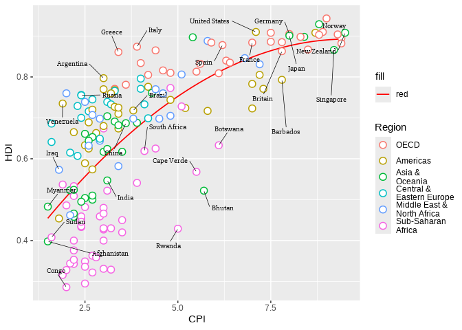
2.7 Axes
Next step is to adjust the axes breaks, axes labels, point colors and relabeling the trendline legend text.
- Change axes labels to ‘Corruption Perceptions Index, 2011 (10=least corrupt)’ on the x-axis and ‘Human Development Index, 2011 (1=best)’ on the y-axis. Set breaks on the x-axis from 1 to 10 by 1 increment and y-axis from 0.2 to 1.0 by 0.1 increments.
p <- p + scale_x_continuous(
  name = "Corruption Perceptions Index, 2011 (10=least corrupt)",
  breaks = 1:10, limits = c(1, 10)
) +
  scale_y_continuous(
    name = "Human Development Index, 2011 (1=best)",
    breaks = seq(from = 0.2, to = 1, by = 0.1), limits = c(0.2, 1)
  )
p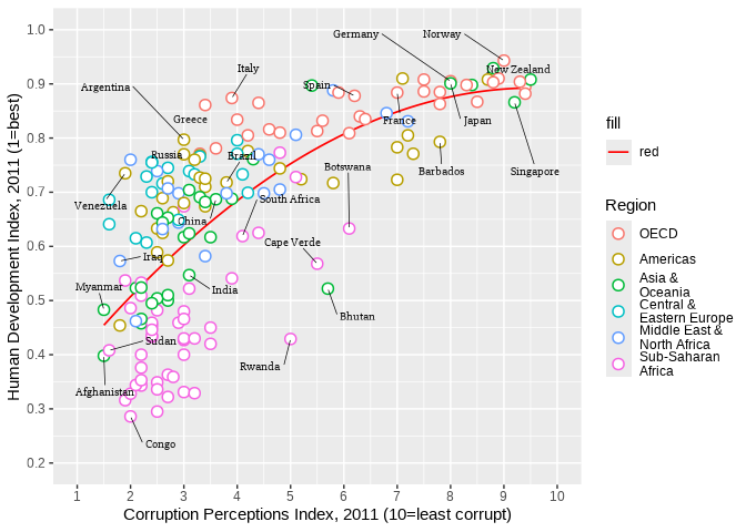
2.8 Scale Colors
Now we want to change the color palette for the points and modify the legend text for the trendline.
- Use
scale_color_manual()to provide custom colors. These are the colors to use for the points:"#23576E","#099FDB","#29B00E", "#208F84","#F55840","#924F3E". - Use
scale_fill_manualto change the trendline label since it’s a fill scale. Compute the model fit first, then use the resulting value to create the legend entry asR².
p <- p + scale_color_manual(values = c("#23576E", "#099FDB", "#29B00E", "#208F84", "#F55840", "#924F3E")) +
  scale_fill_manual(name = "trend", values = "red", labels = r_label)
p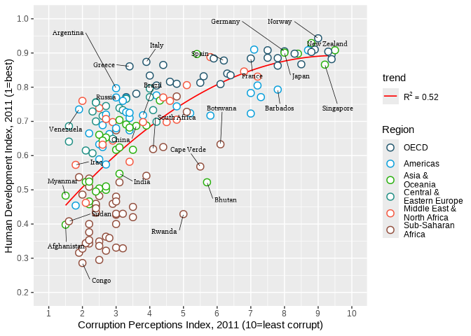
2.9 Title
Title and caption can be added with labs.
- Set the title to ‘Corruption and human development’.
- Set the caption to ‘Sources: Transparency International; UN Human Development Report’.
p <- p + labs(
  title = "Corruption and human development",
  caption = "Sources: Transparency International; UN Human Development Report"
)
p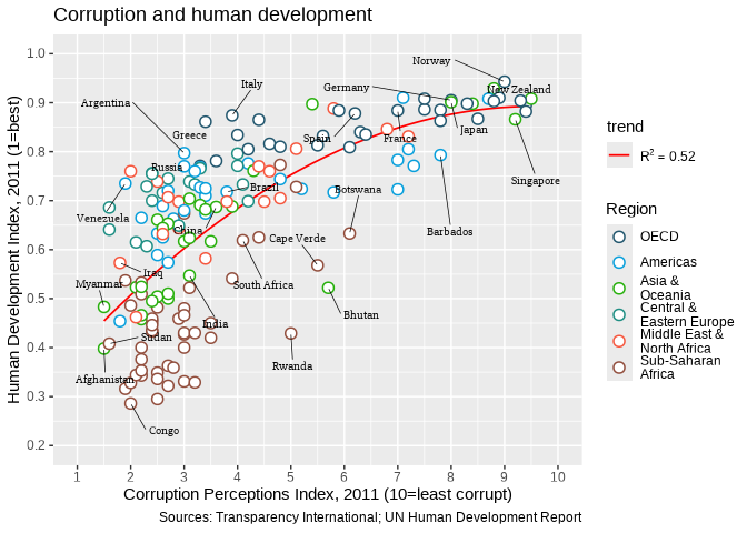
2.10 Theme
We want to move the legend to the top and as a single row. This can be done using theme() option legend.position. See ?theme. guides() is used to set the number of rows to 1. We also set a custom font for all text elements using base_family="Slabo 27px". This can be skipped if a font change is not required.
p <- p + guides(color = guide_legend(nrow = 1)) +
  theme_bw(base_family = "Slabo 27px") +
  theme(legend.position = "top")
p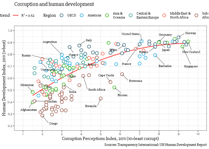
Now we do some careful refining with themes.
- Turn off minor gridlines
- Turn off major gridlines on x-axis
- Remove the gray background
- Remove panel border
- Remove legend titles
- Make axes titles italic
- Turn off y-axis ticks
- Change x-axis ticks to color grey60
- Make plot title bold
- Decrease size of caption to size 8
p + theme(
  panel.grid.minor = element_blank(),
  panel.grid.major.x = element_blank(),
  panel.background = element_blank(),
  panel.border = element_blank(),
  legend.title = element_blank(),
  axis.title = element_text(face = "italic"),
  axis.ticks.y = element_blank(),
  axis.ticks.x = element_line(color = "grey60"),
  plot.title = element_text(face = "bold"),
  plot.caption = element_text(hjust = 0, size = 8)
)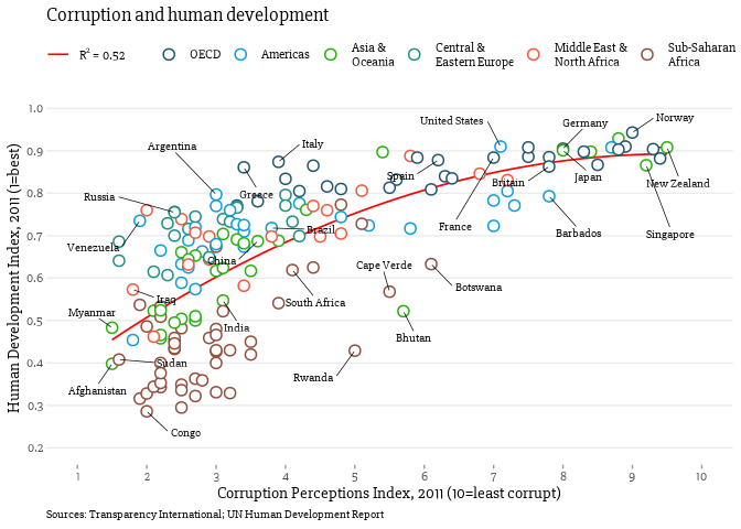
And now our plot is ready and we can compare with the original. Close? Close enough?
The full script for this challenge is summarized here:
# read data
ec <- read.csv("assets/data_economist.csv", header = TRUE)
# refactor
ec$Region <- factor(ec$Region,
  levels = c(
    "EU W. Europe", "Americas", "Asia Pacific",
    "East EU Cemt Asia", "MENA", "SSA"
  ),
  labels = c(
    "OECD", "Americas", "Asia &\nOceania",
    "Central &\nEastern Europe",
    "Middle East &\nNorth Africa",
    "Sub-Saharan\nAfrica"
  )
)

# labels
labels <- c("Congo", "Afghanistan", "Sudan", "Myanmar", "Iraq", "Venezuela", "Russia", "Argentina", "Brazil", "Italy", "South Africa", "Cape Verde", "Bhutan", "Botswana", "Britain", "New Zealand", "Greece", "China", "India", "Rwanda", "Spain", "France", "United States", "Japan", "Norway", "Singapore", "Barbados", "Germany")

# trendline label
trend_model <- lm(HDI ~ poly(CPI, 2), data = ec)
r_squared <- summary(trend_model)$r.squared
r_label <- as.expression(bquote(R^2 == .(round(r_squared, 2))))

# plotting
p1 <- ggplot(ec, aes(x = CPI, y = HDI, color = Region)) +
  geom_smooth(aes(fill = "red"), method = "lm", formula = y ~ poly(x, 2), se = FALSE, color = "red", linewidth = 0.6) +
  geom_point(shape = 21, size = 3, stroke = 0.8, fill = "white") +
  geom_text_repel(
    data = subset(ec, Country %in% labels), aes(label = Country),
    color = "black", box.padding = unit(1, "lines"), segment.size = 0.25,
    size = 3, family = "Slabo 27px"
  ) +
  scale_x_continuous(
    name = "Corruption Perceptions Index, 2011 (10=least corrupt)",
    breaks = 1:10, limits = c(1, 10)
  ) +
  scale_y_continuous(
    name = "Human Development Index, 2011 (1=best)",
    breaks = seq(from = 0.2, to = 1, by = 0.1), limits = c(0.2, 1)
  ) +
  scale_color_manual(values = c("#23576E", "#099FDB", "#29B00E", "#208F84", "#F55840", "#924F3E")) +
  scale_fill_manual(name = "trend", values = "red", labels = r_label) +
  labs(
    title = "Corruption and human development",
    caption = "Sources: Transparency International; UN Human Development Report"
  ) +
  guides(color = guide_legend(nrow = 1)) +
  theme_bw(base_family = "Slabo 27px") +
  theme(
    legend.position = "top",
    panel.grid.minor = element_blank(),
    panel.grid.major.x = element_blank(),
    panel.background = element_blank(),
    panel.border = element_blank(),
    legend.title = element_blank(),
    axis.title = element_text(face = "italic"),
    axis.ticks.y = element_blank(),
    axis.ticks.x = element_line(color = "grey60"),
    plot.title = element_text(face = "bold"),
    plot.caption = element_text(hjust = 0, size = 8)
  )
p1
3 WSJ Heatmap
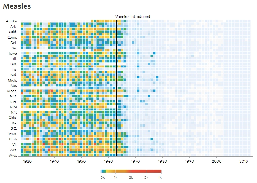
The aim of this challenge is to recreate the plot below originally published in The Wall Street Journal. The plot is a heatmap showing the normalized number of cases of measles across US states from 1928 to 2003. X-axis shows years and y-axis shows the names of states. The color of the tiles denote the number of measles cases per 100,000 people. Introduction of the measles vaccine is shown as the black line in 1963.
3.1 Data
Download the data csv file.
Start by reading in the data. This .csv file has two lines of comments so we need to skip 2 lines while reading in the data.
me <- read.csv("assets/data_wsj.csv", header = TRUE, skip = 2)
head(me)| YEAR | WEEK | ALABAMA | ALASKA | ARIZONA | ARKANSAS | CALIFORNIA | COLORADO | CONNECTICUT | DELAWARE | DISTRICT.OF.COLUMBIA | FLORIDA | GEORGIA | HAWAII | IDAHO | ILLINOIS | INDIANA | IOWA | KANSAS | KENTUCKY | LOUISIANA | MAINE | MARYLAND | MASSACHUSETTS | MICHIGAN | MINNESOTA | MISSISSIPPI | MISSOURI | MONTANA | NEBRASKA | NEVADA | NEW.HAMPSHIRE | NEW.JERSEY | NEW.MEXICO | NEW.YORK | NORTH.CAROLINA | NORTH.DAKOTA | OHIO | OKLAHOMA | OREGON | PENNSYLVANIA | RHODE.ISLAND | SOUTH.CAROLINA | SOUTH.DAKOTA | TENNESSEE | TEXAS | UTAH | VERMONT | VIRGINIA | WASHINGTON | WEST.VIRGINIA | WISCONSIN | WYOMING |
|---|---|---|---|---|---|---|---|---|---|---|---|---|---|---|---|---|---|---|---|---|---|---|---|---|---|---|---|---|---|---|---|---|---|---|---|---|---|---|---|---|---|---|---|---|---|---|---|---|---|---|---|---|
| 1928 | 1 | 3.67 | - | 1.90 | 4.11 | 1.38 | 8.38 | 4.50 | 8.58 | - | 0.21 | 1.17 | - | - | 0.50 | 1.34 | 0.16 | 0.81 | 3.08 | 1.89 | 4.52 | 10.87 | 25.66 | 5.68 | 0.31 | - | 1.19 | 0.18 | 1.60 | - | - | 3.55 | 14.90 | 7.60 | 47.86 | - | 2.51 | 4.86 | 4.91 | 6.97 | 1.18 | 42.04 | 5.69 | 22.03 | 1.18 | 0.40 | 0.28 | - | 14.83 | 3.36 | 1.54 | 0.91 |
| 1928 | 2 | 6.25 | - | 6.40 | 9.91 | 1.80 | 6.02 | 9.00 | 7.30 | - | 0.49 | 5.96 | - | 0.45 | 0.77 | 2.71 | - | 1.35 | 1.99 | 3.00 | 7.40 | 15.47 | 28.50 | 7.59 | 0.23 | - | 0.83 | 0.18 | 0.29 | - | - | 4.74 | 11.06 | 9.65 | 119.70 | 0.15 | - | 2.56 | 4.91 | 8.74 | 0.74 | 83.90 | 6.57 | 16.96 | 0.63 | - | 0.56 | - | 17.34 | 4.19 | 0.96 | - |
| 1928 | 3 | 7.95 | - | 4.50 | 11.15 | 1.31 | 2.86 | 8.81 | 15.88 | - | 0.42 | - | - | 0.45 | 0.61 | 1.71 | - | 1.41 | 5.26 | 2.33 | 6.78 | 21.43 | 34.76 | 9.39 | 0.15 | - | 1.69 | 0.74 | 0.36 | - | - | 6.68 | 14.90 | 8.54 | 110.90 | 1.20 | 4.86 | 6.27 | 3.63 | 8.12 | 2.65 | 77.46 | 2.04 | 24.66 | 0.62 | 0.20 | 1.12 | - | 15.67 | 4.19 | 4.79 | 1.36 |
| 1928 | 4 | 12.58 | - | 1.90 | 13.75 | 1.87 | 13.71 | 10.40 | 4.29 | 4.18 | 0.91 | 8.65 | - | - | 0.81 | 4.11 | 3.51 | 1.14 | 5.49 | 4.02 | 9.41 | 22.67 | 31.28 | 8.66 | 0.12 | - | 1.58 | - | 0.44 | - | 14.53 | 6.78 | 27.64 | 9.32 | 131.60 | 3.91 | 4.40 | 4.74 | 2.24 | 8.39 | 0.15 | 64.75 | 2.19 | 18.86 | 0.37 | 0.20 | 6.70 | - | 12.77 | 4.66 | 1.64 | 3.64 |
| 1928 | 5 | 8.03 | - | 0.47 | 20.79 | 2.38 | 5.13 | 16.80 | 5.58 | 4.59 | 0.49 | 10.82 | - | 0.22 | 1.11 | 2.49 | 3.06 | 1.51 | 7.99 | 10.27 | 7.90 | 31.30 | 35.24 | 9.84 | 0.31 | - | 2.22 | - | 0.22 | - | 3.42 | 9.25 | 37.74 | 10.64 | 119.01 | 0.90 | 6.13 | 4.61 | 4.59 | 15.17 | 1.03 | 74.99 | 3.94 | 20.05 | 1.57 | 0.40 | 6.70 | - | 18.83 | 7.37 | 2.91 | 0.91 |
| 1928 | 6 | 7.27 | - | 6.40 | 26.58 | 2.79 | 8.09 | 17.76 | 3.43 | 7.52 | 1.67 | 6.75 | - | - | 1.33 | 5.04 | 2.65 | 1.19 | 11.53 | 9.54 | 5.52 | 34.97 | 37.89 | 4.09 | 0.08 | - | 2.69 | 0.55 | 0.22 | - | 15.60 | 10.66 | 36.30 | 12.60 | 153.60 | 2.56 | 5.33 | 5.72 | 4.91 | 11.52 | 0.74 | 82.12 | 2.04 | 12.54 | 3.44 | 0.60 | 1.12 | - | 17.73 | 5.01 | 3.25 | 10.45 |
Check the data type for the fields.
str(me)'data.frame': 3952 obs. of 53 variables:
$ YEAR : int 1928 1928 1928 1928 1928 1928 1928 1928 1928 1928 ...
$ WEEK : int 1 2 3 4 5 6 7 8 9 10 ...
$ ALABAMA : chr "3.67" "6.25" "7.95" "12.58" ...
$ ALASKA : chr "-" "-" "-" "-" ...
$ ARIZONA : chr "1.90" "6.40" "4.50" "1.90" ...
$ ARKANSAS : chr "4.11" "9.91" "11.15" "13.75" ...
$ CALIFORNIA : chr "1.38" "1.80" "1.31" "1.87" ...
$ COLORADO : chr "8.38" "6.02" "2.86" "13.71" ...
$ CONNECTICUT : chr "4.50" "9.00" "8.81" "10.40" ...
$ DELAWARE : chr "8.58" "7.30" "15.88" "4.29" ...
$ DISTRICT.OF.COLUMBIA: chr "-" "-" "-" "4.18" ...
$ FLORIDA : chr "0.21" "0.49" "0.42" "0.91" ...
$ GEORGIA : chr "1.17" "5.96" "-" "8.65" ...
$ HAWAII : chr "-" "-" "-" "-" ...
$ IDAHO : chr "-" "0.45" "0.45" "-" ...
$ ILLINOIS : chr "0.50" "0.77" "0.61" "0.81" ...
$ INDIANA : chr "1.34" "2.71" "1.71" "4.11" ...
$ IOWA : chr "0.16" "-" "-" "3.51" ...
$ KANSAS : chr "0.81" "1.35" "1.41" "1.14" ...
$ KENTUCKY : chr "3.08" "1.99" "5.26" "5.49" ...
$ LOUISIANA : chr "1.89" "3.00" "2.33" "4.02" ...
$ MAINE : chr "4.52" "7.40" "6.78" "9.41" ...
$ MARYLAND : chr "10.87" "15.47" "21.43" "22.67" ...
$ MASSACHUSETTS : chr "25.66" "28.50" "34.76" "31.28" ...
$ MICHIGAN : chr "5.68" "7.59" "9.39" "8.66" ...
$ MINNESOTA : chr "0.31" "0.23" "0.15" "0.12" ...
$ MISSISSIPPI : chr "-" "-" "-" "-" ...
$ MISSOURI : chr "1.19" "0.83" "1.69" "1.58" ...
$ MONTANA : chr "0.18" "0.18" "0.74" "-" ...
$ NEBRASKA : chr "1.60" "0.29" "0.36" "0.44" ...
$ NEVADA : chr "-" "-" "-" "-" ...
$ NEW.HAMPSHIRE : chr "-" "-" "-" "14.53" ...
$ NEW.JERSEY : chr "3.55" "4.74" "6.68" "6.78" ...
$ NEW.MEXICO : chr "14.90" "11.06" "14.90" "27.64" ...
$ NEW.YORK : chr "7.60" "9.65" "8.54" "9.32" ...
$ NORTH.CAROLINA : chr "47.86" "119.70" "110.90" "131.60" ...
$ NORTH.DAKOTA : chr "-" "0.15" "1.20" "3.91" ...
$ OHIO : chr "2.51" "-" "4.86" "4.40" ...
$ OKLAHOMA : chr "4.86" "2.56" "6.27" "4.74" ...
$ OREGON : chr "4.91" "4.91" "3.63" "2.24" ...
$ PENNSYLVANIA : chr "6.97" "8.74" "8.12" "8.39" ...
$ RHODE.ISLAND : chr "1.18" "0.74" "2.65" "0.15" ...
$ SOUTH.CAROLINA : chr "42.04" "83.90" "77.46" "64.75" ...
$ SOUTH.DAKOTA : chr "5.69" "6.57" "2.04" "2.19" ...
$ TENNESSEE : chr "22.03" "16.96" "24.66" "18.86" ...
$ TEXAS : chr "1.18" "0.63" "0.62" "0.37" ...
$ UTAH : chr "0.40" "-" "0.20" "0.20" ...
$ VERMONT : chr "0.28" "0.56" "1.12" "6.70" ...
$ VIRGINIA : chr "-" "-" "-" "-" ...
$ WASHINGTON : chr "14.83" "17.34" "15.67" "12.77" ...
$ WEST.VIRGINIA : chr "3.36" "4.19" "4.19" "4.66" ...
$ WISCONSIN : chr "1.54" "0.96" "4.79" "1.64" ...
$ WYOMING : chr "0.91" "-" "1.36" "3.64" ...Looking at this dataset, there is going to be quite a bit of data clean-up and tidying before we can plot it. Here are the steps we need to take:
- The data needs to be transformed to long format.
- Replace all “-” with NAs
- The number of cases across each state is a character and needs to be converted to numeric
- Collapse (sum) week-level data to year.
- Modify state names
3.2 Tidy Data
Convert the wide format to long format using the function pivot_longer() from package tidyr.
me1 <- me |> pivot_longer(cols = -c(YEAR, WEEK), names_to = "state", values_to = "value")
head(me1)| YEAR | WEEK | state | value |
|---|---|---|---|
| 1928 | 1 | ALABAMA | 3.67 |
| 1928 | 1 | ALASKA | - |
| 1928 | 1 | ARIZONA | 1.90 |
| 1928 | 1 | ARKANSAS | 4.11 |
| 1928 | 1 | CALIFORNIA | 1.38 |
| 1928 | 1 | COLORADO | 8.38 |
Now, replace all ‘-’ with NA in the field value. We use the function str_replace() from R package stringr. Then convert the value field to numeric.
me2 <- me1 |> mutate(
  value = str_replace(value, "^-$", NA_character_),
  value = as.numeric(value)
)
head(me2)| YEAR | WEEK | state | value |
|---|---|---|---|
| 1928 | 1 | ALABAMA | 3.67 |
| 1928 | 1 | ALASKA | NA |
| 1928 | 1 | ARIZONA | 1.90 |
| 1928 | 1 | ARKANSAS | 4.11 |
| 1928 | 1 | CALIFORNIA | 1.38 |
| 1928 | 1 | COLORADO | 8.38 |
Sum up the week-level information to year-level information. This means rather than having
  YEAR WEEK   state value
1 1928    1 ALABAMA  3.67
2 1928    2 ALABAMA  6.25
3 1928    3 ALABAMA  7.95
...
5501 1957   41 ALASKA  2.16
5502 1957   42 ALASKA  0.43
5503 1957   43 ALASKA  1.30
...
we should have one value per year per state.
  YEAR    state value
1 1928  ALABAMA  3.67
2 1929  ALABAMA  3.20
...
5501 1957  ALASKA  2.16
5502 1958  ALASKA  2.05
...
The solution is to sum up all the cases for a state for all weeks within a year into one value for that year. This can be done using the summarise() function from package dplyr.
- A custom function is used to sum over weeks. If all values are NA, then result is NA. If some values are NA, the NAs are removed and the remaining numbers are summed.
- The dots in state names are replaced by spaces and the words are converted to title case (First letter capital and rest lowercase).
- We also convert the column names to lowercase for consistency.
fun1 <- function(x) ifelse(all(is.na(x)), NA, sum(x, na.rm = TRUE))

me3 <- me2 |>
  group_by(YEAR, state) |>
  summarise(total = fun1(value)) |>
  ungroup() |>
  mutate(
    state = str_replace_all(state, "[.]", " "),
    state = str_to_title(state)
  ) |>
  rename_with(tolower)
head(me3)| year | state | total |
|---|---|---|
| 1928 | Alabama | 334.99 |
| 1928 | Alaska | NA |
| 1928 | Arizona | 200.75 |
| 1928 | Arkansas | 481.77 |
| 1928 | California | 69.22 |
| 1928 | Colorado | 206.98 |
str(me3)tibble [3,876 × 3] (S3: tbl_df/tbl/data.frame)
$ year : int [1:3876] 1928 1928 1928 1928 1928 1928 1928 1928 1928 1928 ...
$ state: chr [1:3876] "Alabama" "Alaska" "Arizona" "Arkansas" ...
$ total: num [1:3876] 335 NA 200.8 481.8 69.2 ...The data is now ready for plotting.
3.3 Tile
We can build up a basic ggplot and heatmap tiles can be plotted using the geom geom_tile. ‘year’ is mapped to the x-axis, ‘state’ to the y-axis and fill color for the tiles is the ‘total’ value.
ggplot(me3, aes(x = year, y = state, fill = total)) +
  geom_tile()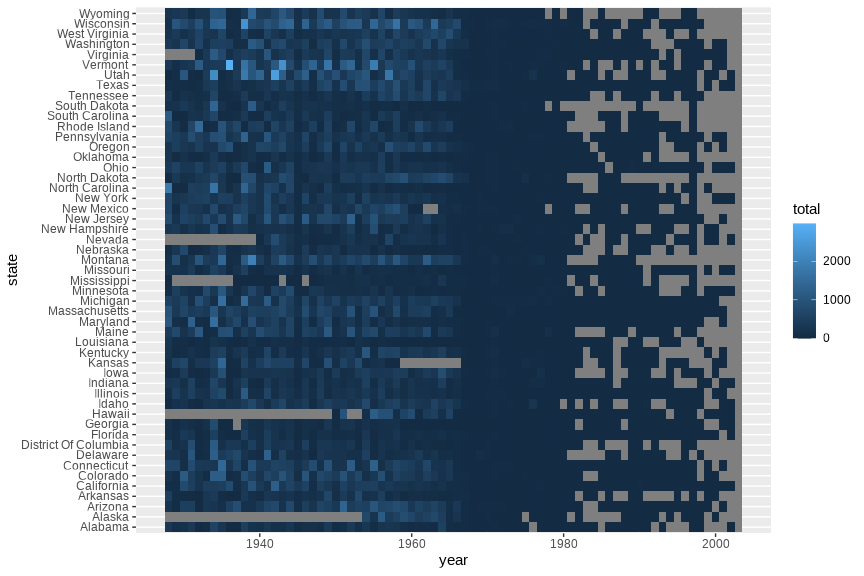
Add borders around the tiles. We use reorder(state,desc(state)) to reverse the order of states so that it reads A-Z from top to bottom.
p <- ggplot(me3, aes(x = year, y = reorder(state, desc(state)), fill = total)) +
  geom_tile(color = "white", linewidth = 0.25)
p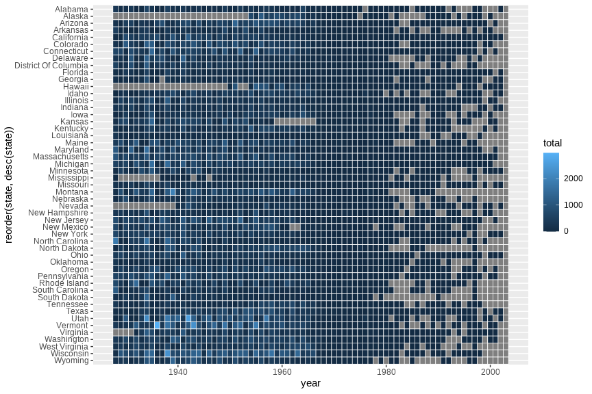
3.4 Scales
The extra space on left and right (gray) of the plot is removed using argument expand in scales. X-axis breaks are redefined at 10 year intervals from 1930 to 2010. Custom colors are used for the tiles: "#e7f0fa","#c9e2f6","#95cbee","#0099dc","#4ab04a", "#ffd73e","#eec73a","#e29421","#f05336","#ce472e". Since the color scale is a fill color on a continuous value and we want to supply n new colors, we use scale_fill_gradientn. Tiles with missing value is set to the color "grey90".
cols <- c("#e7f0fa", "#c9e2f6", "#95cbee", "#0099dc", "#4ab04a", "#ffd73e", "#eec73a", "#e29421", "#f05336", "#ce472e")

p + scale_y_discrete(expand = c(0, 0)) +
  scale_x_continuous(expand = c(0, 0), breaks = seq(1930, 2010, by = 10)) +
  scale_fill_gradientn(colors = cols, na.value = "grey90")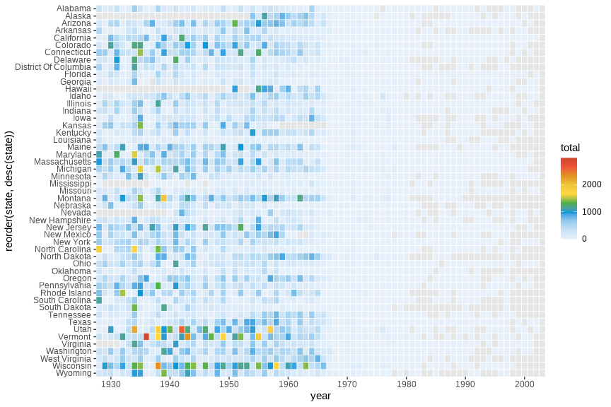
The fill scale can be further refined to resemble that of the original plot.
cols <- c("#e7f0fa", "#c9e2f6", "#95cbee", "#0099dc", "#4ab04a", "#ffd73e", "#eec73a", "#e29421", "#f05336", "#ce472e")

p <- p + scale_y_discrete(expand = c(0, 0)) +
  scale_x_continuous(expand = c(0, 0), breaks = seq(1930, 2010, by = 10)) +
  scale_fill_gradientn(
    colors = cols, na.value = "grey95",
    limits = c(0, 4000),
    oob = scales::squish,
    values = c(0, 0.01, 0.02, 0.03, 0.09, 0.1, 0.15, 0.25, 0.4, 0.5, 1),
    labels = c("0k", "1k", "2k", "3k", "4k"),
    guide = guide_colourbar(
      ticks = TRUE, nbin = 50,
      barheight = .5, label = TRUE,
      barwidth = 10
    )
  )
p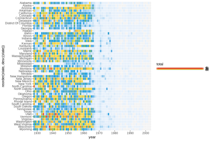
3.5 Title
We can remove the x and y axes titles and add a plot title.
p <- p + labs(x = "", y = "", fill = "", title = "Measles")
p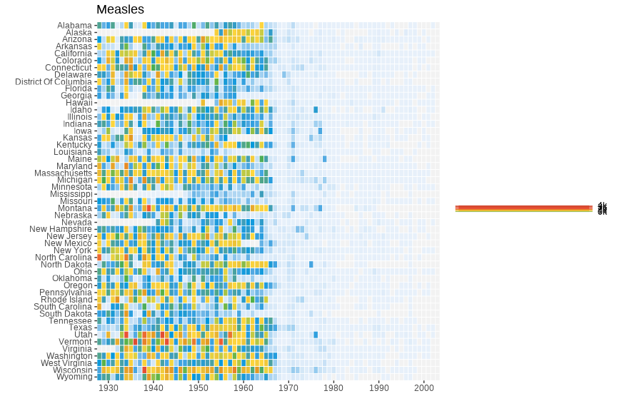
3.6 Fixed Coords
We can use coord_fixed() to fix the coordinates for equal values in x and y direction. This should render perfectly square tiles.
p <- p + coord_fixed()
p
3.7 Annotation
Add the annotation line and text to denote the introduction of the vaccine. The line is at the position 1963. Custom font ‘Slabo 27px’ is used here. This can be skipped.
p <- p + geom_segment(x = 1963, xend = 1963, y = 0, yend = 51.5, linewidth = .6, alpha = 0.7) +
  annotate("text",
    label = "Vaccine introduced", x = 1963, y = 53,
    vjust = 1, hjust = 0, size = I(3), family = "Slabo 27px"
  )
p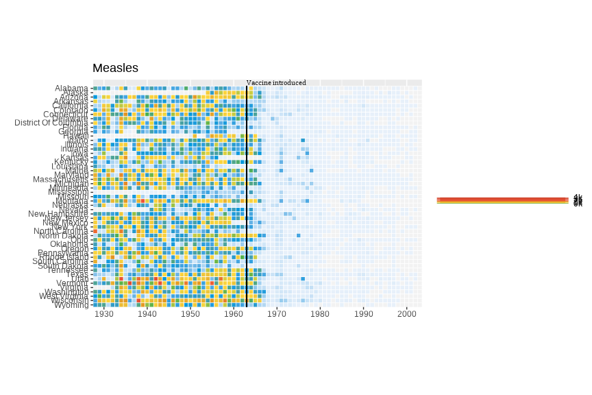
3.8 Theme
Here we change the following aspects of the plot using theme:
- Change theme to
theme_minimalto remove unnecessary plot elements. - Optional custom font. See ‘Custom font’ section under ‘Economist Scatterplot’.
- Position the legend to bottom center.
- Set legend font to color grey20.
- Adjust size and justification of x and y axes text
- Align title to the left of the plot rather than panel area
- Adjust title justification
- Remove all gridlines
p + theme_minimal(base_family = "Slabo 27px") +
  theme(
    legend.position = "bottom",
    legend.justification = "center",
    legend.direction = "horizontal",
    legend.text = element_text(color = "grey20"),
    axis.text.y = element_text(size = 6, hjust = 1, vjust = 0.5),
    axis.text.x = element_text(size = 8),
    axis.ticks.y = element_blank(),
    plot.title.position = "plot",
    plot.title = element_text(hjust = 0, vjust = 1),
    panel.grid = element_blank()
  )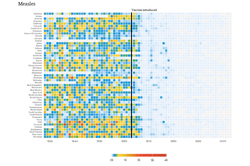
Our plot is ready and we can compare it to the original version.
The full code for this challenge is here:
# custom summing function
fun1 <- function(x) ifelse(all(is.na(x)), NA, sum(x, na.rm = TRUE))

# read data
me3 <- read.csv("assets/data_wsj.csv",
  header = TRUE,
  skip = 2
) |>
  pivot_longer(cols = -c(YEAR, WEEK), names_to = "state", values_to = "value") |>
  mutate(
    value = str_replace(value, "^-$", NA_character_),
    value = as.numeric(value)
  ) |>
  group_by(YEAR, state) |>
  summarise(total = fun1(value)) |>
  mutate(
    state = str_replace_all(state, "[.]", " "),
    state = str_to_title(state)
  ) |>
  rename_with(tolower)

# custom colors
cols <- c("#e7f0fa", "#c9e2f6", "#95cbee", "#0099dc", "#4ab04a", "#ffd73e", "#eec73a", "#e29421", "#f05336", "#ce472e")

# plotting
ggplot(me3, aes(x = year, y = reorder(state, desc(state)), fill = total)) +
  geom_tile(color = "white", linewidth = 0.25) +
  scale_y_discrete(expand = c(0, 0)) +
  scale_x_continuous(expand = c(0, 0), breaks = seq(1930, 2010, by = 10)) +
  scale_fill_gradientn(
    colors = cols, na.value = "grey95",
    limits = c(0, 4000),
    oob = scales::squish,
    values = c(0, 0.01, 0.02, 0.03, 0.09, 0.1, 0.15, 0.25, 0.4, 0.5, 1),
    labels = c("0k", "1k", "2k", "3k", "4k"),
    guide = guide_colourbar(
      ticks = TRUE, nbin = 50,
      barheight = .5, label = TRUE,
      barwidth = 10
    )
  ) +
  labs(x = "", y = "", fill = "", title = "Measles") +
  coord_fixed() +
  geom_segment(x = 1963, xend = 1963, y = 0, yend = 51.5, linewidth = .9) +
  annotate("text",
    label = "Vaccine introduced", x = 1963, y = 53,
    vjust = 1, hjust = 0, size = I(3), family = "Slabo 27px"
  ) +
  theme_minimal(base_family = "Slabo 27px") +
  theme(
    legend.position = c(.5, -.13),
    legend.direction = "horizontal",
    legend.text = element_text(color = "grey20"),
    plot.margin = grid::unit(c(.5, 0, 1.5, 0), "cm"),
    axis.text.y = element_text(size = 6, hjust = 1, vjust = 0.5),
    axis.text.x = element_text(size = 8),
    axis.ticks.y = element_blank(),
    plot.title.position = "plot",
    plot.title = element_text(hjust = 0, vjust = 1),
    panel.grid = element_blank()
  )
4 Session
Click here
sessionInfo()R version 4.5.3 (2026-03-11)
Platform: x86_64-conda-linux-gnu
Running under: Ubuntu 26.04 LTS
Matrix products: default
BLAS/LAPACK: /home/roy/miniforge3/envs/r-4.5/lib/libopenblasp-r0.3.33.so; LAPACK version 3.12.0
locale:
[1] LC_CTYPE=en_US.UTF-8 LC_NUMERIC=C
[3] LC_TIME=en_US.UTF-8 LC_COLLATE=en_US.UTF-8
[5] LC_MONETARY=en_US.UTF-8 LC_MESSAGES=en_US.UTF-8
[7] LC_PAPER=en_US.UTF-8 LC_NAME=C
[9] LC_ADDRESS=C LC_TELEPHONE=C
[11] LC_MEASUREMENT=en_US.UTF-8 LC_IDENTIFICATION=C
time zone: Europe/Stockholm
tzcode source: system (glibc)
attached base packages:
[1] stats graphics grDevices utils datasets methods base
other attached packages:
[1] showtext_0.9-8 showtextdb_3.0 sysfonts_0.8.9 ggrepel_0.9.8 ggplot2_4.0.3
[6] stringr_1.6.0 tidyr_1.3.2 dplyr_1.2.1
loaded via a namespace (and not attached):
[1] Matrix_1.7-5 gtable_0.3.6 jsonlite_2.0.0 compiler_4.5.3
[5] tidyselect_1.2.1 Rcpp_1.1.1-1.1 splines_4.5.3 scales_1.4.0
[9] yaml_2.3.12 fastmap_1.2.0 lattice_0.22-9 R6_2.6.1
[13] labeling_0.4.3 generics_0.1.4 curl_7.1.0 knitr_1.51
[17] htmlwidgets_1.6.4 tibble_3.3.1 pillar_1.11.1 RColorBrewer_1.1-3
[21] rlang_1.2.0 stringi_1.8.7 xfun_0.59 S7_0.2.2
[25] otel_0.2.0 cli_3.6.6 mgcv_1.9-4 withr_3.0.3
[29] magrittr_2.0.5 digest_0.6.39 grid_4.5.3 nlme_3.1-169
[33] lifecycle_1.0.5 vctrs_0.7.3 evaluate_1.0.5 glue_1.8.1
[37] farver_2.1.2 rmarkdown_2.31 purrr_1.2.2 tools_4.5.3
[41] pkgconfig_2.0.3 htmltools_0.5.9